4 Methods for Increasing Site Search Clicks
Author: Rick Swette, UX Research
Date: June 2020
Overview
We know good search drives business impact. It increases conversions and transactions, reduces search bounce rate, and boosts overall customer satisfaction. The issue is that, on average, only 15% of visitors to a website use site search (in some cases, it's as low as 3%), opting instead to browse via traditional site navigation. Most of this is just user muscle memory and having grown accustomed to 20 years of terrible site search. So how do we change these ingrained behaviors and expectations? How do we get more people to trust and use site search? We embarked on a study to find this out.
Our Testing Methodology
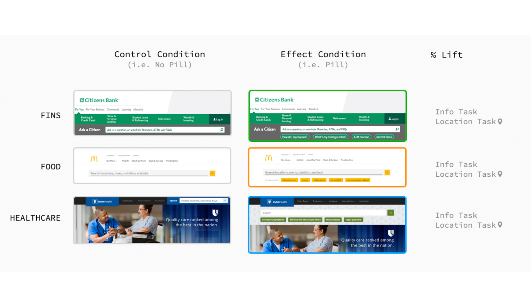
We ran 7 unique experiments that compared the volume of clicks to a traditional site search experience (our 'control condition') with those to an experience we modified (our 'effect conditions'). For each experiment, there were 40 unique participants assigned to the control condition and 40 for the effect condition (a "between participants" experiment design). Each experiment was run separately once per vertical, totaling 21 experiments of 80 participants each.
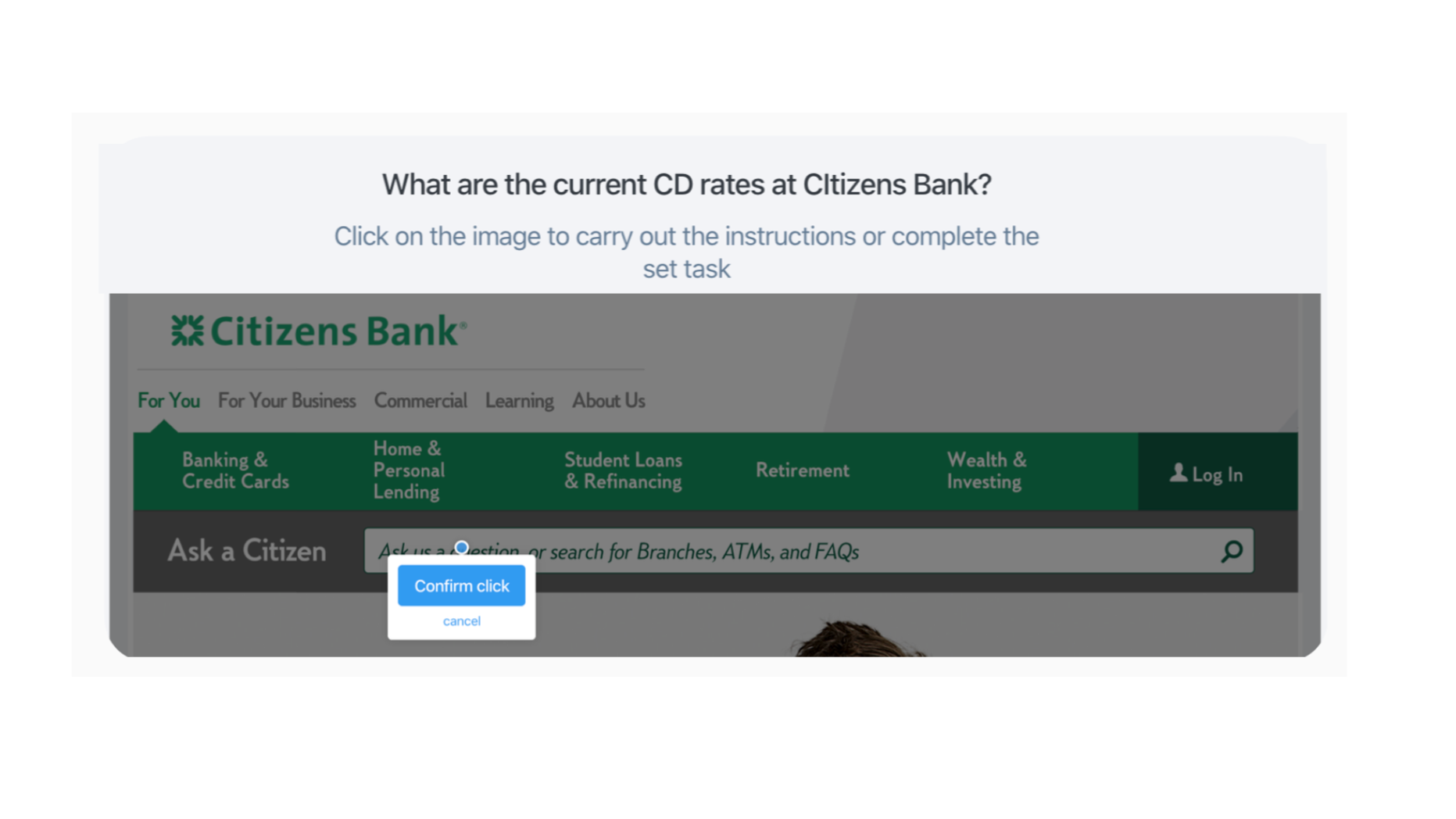
For each experiment, participants were given three tasks corresponding to a prompt such as, "What are the current CD rates at Citizens Bank?". Participants were then instructed to "click on the image to best carry out the instructions or complete the task".
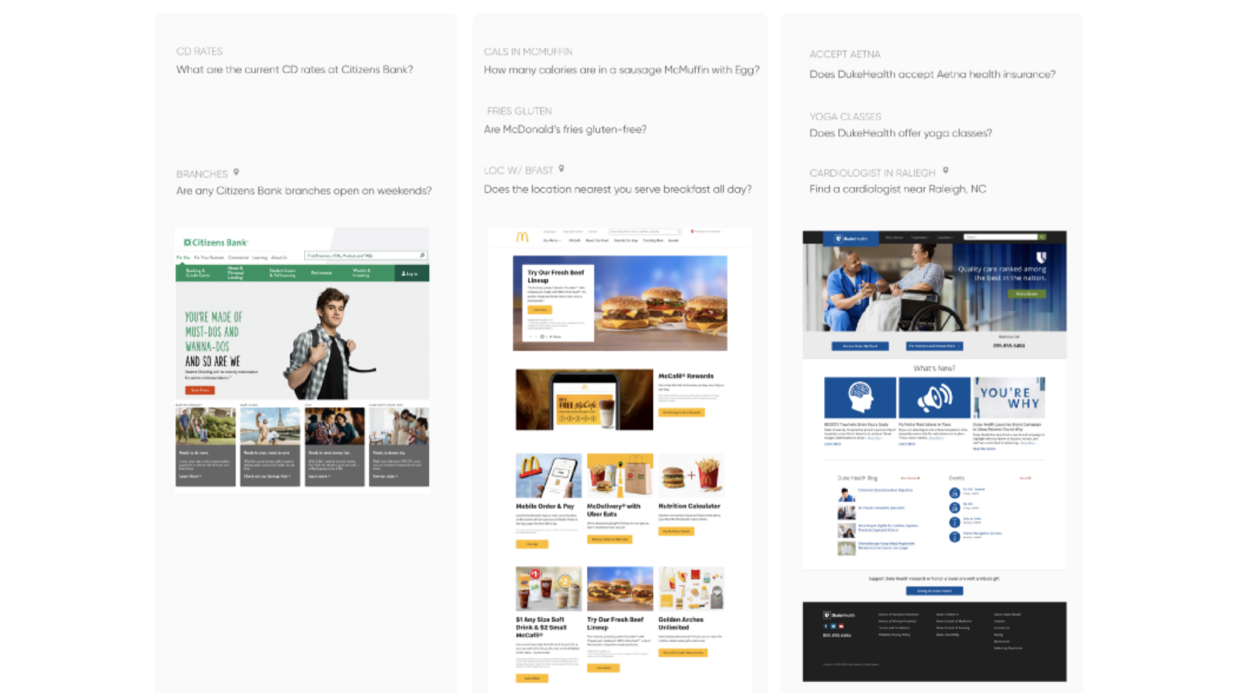
We divided taks into two types: Location tasks and Info tasks. We defined "Location tasks" as prompts in which users are likely to use a website's "Locator" (ie. inputting an address to find restaurants, branches, or doctors). "Info tasks," on the other hand, are defined as tasks oriented around solving for a query that does not involve location. (ie. "Are McDonald's fries gluten-free?").
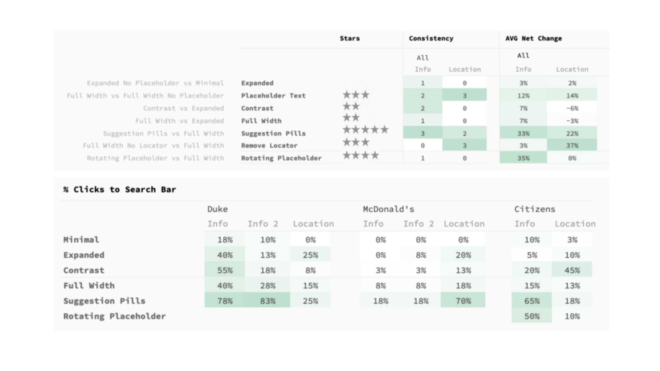
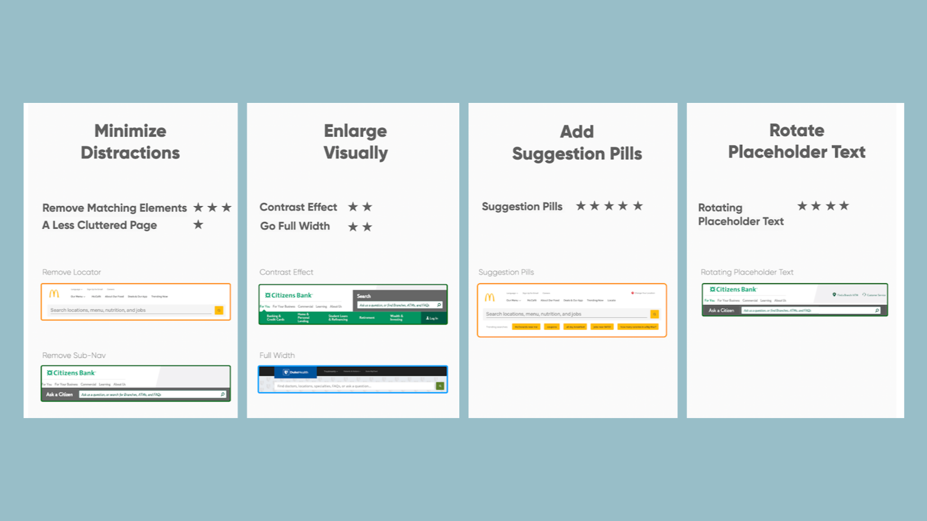
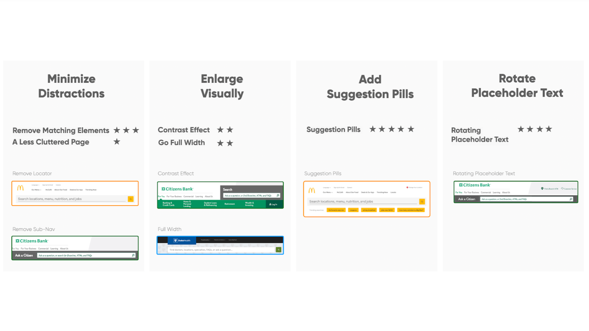
To summarize our results, we assigned star ratings from 1-5, with 5 indicating the highest-impact method(s) for increasing clicks on the search bar. The ratings were based on how consistently a Net Change in % Clicks to the search bar was detected across the three verticals.
Based on these experiments, the following four principles had the biggest impact when it came to getting more site search clicks.
- Minimize Distractions
In this category, we looked at the effect of removing elements from the page. These fall into two categories: removing matching elements and removing non-matching elements, which we are also referring to as "clutter." Matching elements are those which would be expected to receive clicks for a given task, such as removing a "find doctors" link for a location task.
A Less Cluttered Page ★
Even though we gave this a one-star rating (with "one star" signifying lowest impact), this is still a very important takeaway. A less cluttered page can enhance usability in many ways beyond just letting the search bar shine.
Removing the Locator increased search clicks for unrelated tasks
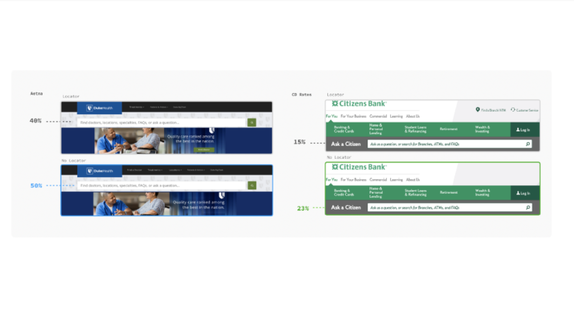
While the Locator had nothing to do with either the DukeHealth Aetna task, or the Citizens Bank CD rates task, simply removing this element from the navigation area resulted in an increase in search clicks.
An uncluttered McDonald's page design saw no change in search clicks from methods that made the search bar more noticeable
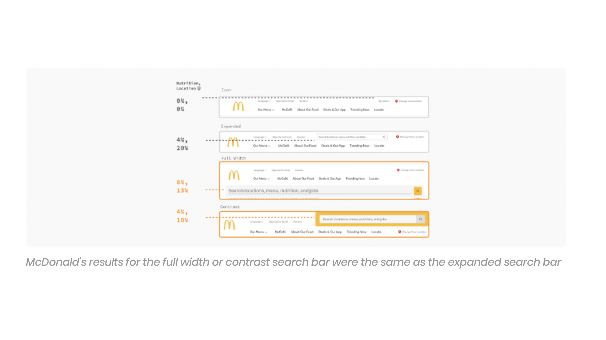
Citizens Bank and DukeHealth saw gains in % Clicks to the Search Bar when making the search bar full width (ie. search bar spans the entire width of the page) or adding a contrast effect (ie. adding a contrasting background color to the area that contains the search bar). However, McDonald's did not. We therefore attributed this to their uncluttered design.
This result suggests that in the context of an uncluttered webpage, site search can receive substantial clicks without having to add visual elements to the search bar. And that is our recommendation: independent of what you do to improve how noticeable your search bar is, consider removing redundant elements on the page. Conveniently, a good search bar, because it can handle such a variety of user tasks, can also facilitate this decluttering process.
The effect of proximity
Part of a clean or uncluttered design is the principle of proximity, another beloved design principle. Similar items should be grouped together by proximity, which facilitates better "chunking" of the visual scene, resulting in a less overwhelming page. Our experiments revealed two examples where proximity was in play.
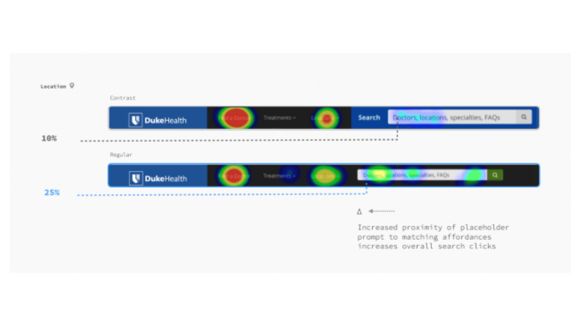
First, for DukeHealth, the addition of the prefix "Search" resulted in fewer search bar clicks. The "Search" prefix reduced the proximity of the search bar to other key elements like the "Find a Doctor" link in the navigation header. It is evident when looking at the heatmap above that this variation drew less clicks towards the search bar and generally the right side of the page.
This result also suggests an "ordering effect" in which the order of words (and perhaps the first word especially, known as a "primacy effect") in the prompt could also have an impact on search clicks. Further research could observe how this pattern would have differed if "Doctors" was the last item in the placeholder text.
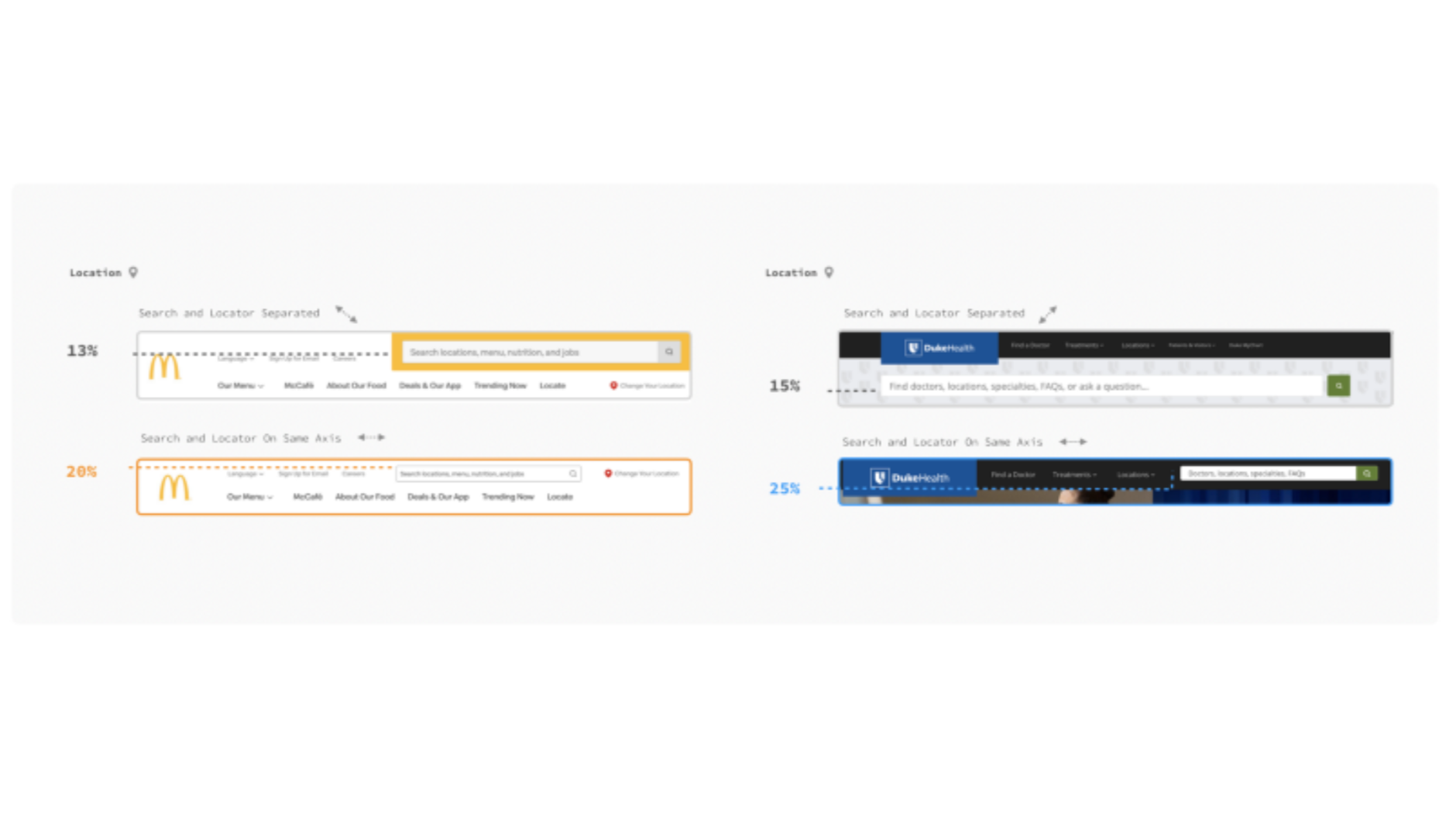
Second, for Locator tasks, we observed small decreases in search clicks from moving the search bar off-axis from the Locator. These results were not deemed significant, but with more trials there is a good chance they would be.
Yet, the point is still made: designers should be mindful how their site search bar is "lined up" with other key navigation elements.
Removing Matching Elements ★★★
Unsurprisingly, removing matching elements proved to be more powerful than removing non-matching elements or "clutter". Removing the matching Locator consistently increased search clicks from 3x to 9x for the Location-related tasks.
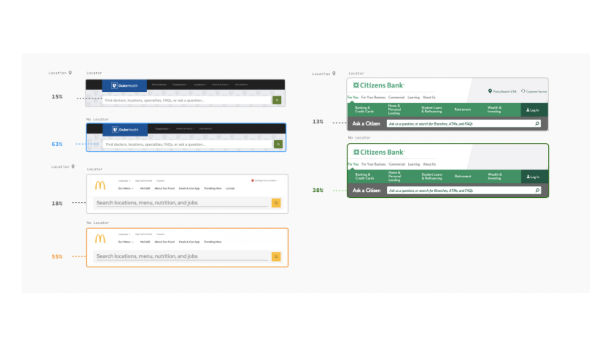
Additionally, removing the matching green sub-navigation bar resulted in a 2x increase in search clicks for the Citizens CD rates task.

Key Takeaways
- A decluttered web page enables ample search clicks without having to try other visual strategies to get the search bar used.
- Don't introduce an unnecessary "Search" prefix in placeholder text and consider ordering and primacy effects of the words or phrases used in the placeholder text.
- Consider the effects of proximity and adhering to a grid when positioning search alongside other key navigation elements.
- Make the Search Bar Visually Prominent
Full Width ★★
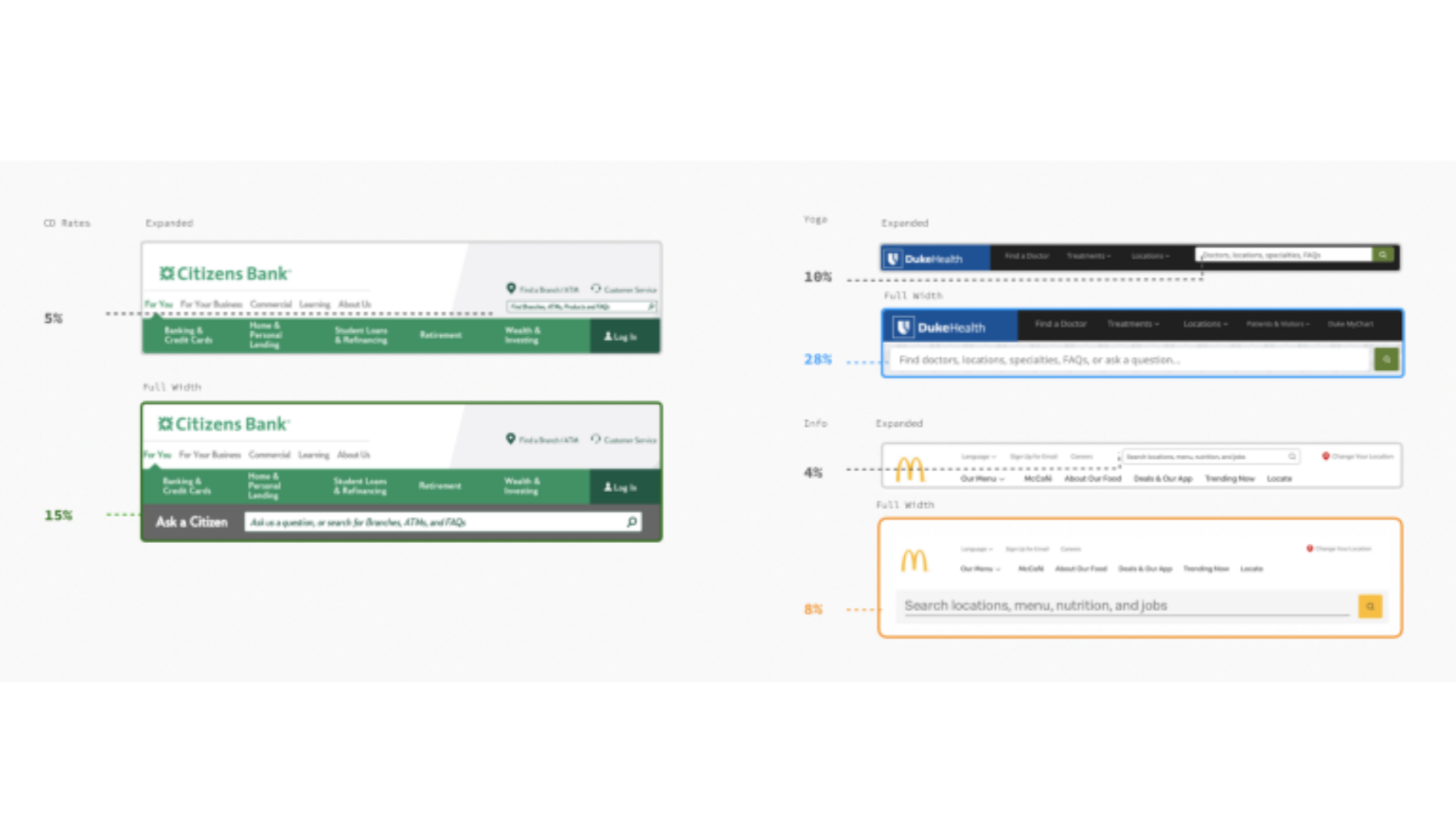
Making the search bar span the full width of the page increased search clicks 4x for the Citizens Bank CD rates task and 2.2x for the DukeHealth yoga task. However, there was no effect for Mcdonald's or any location tasks.
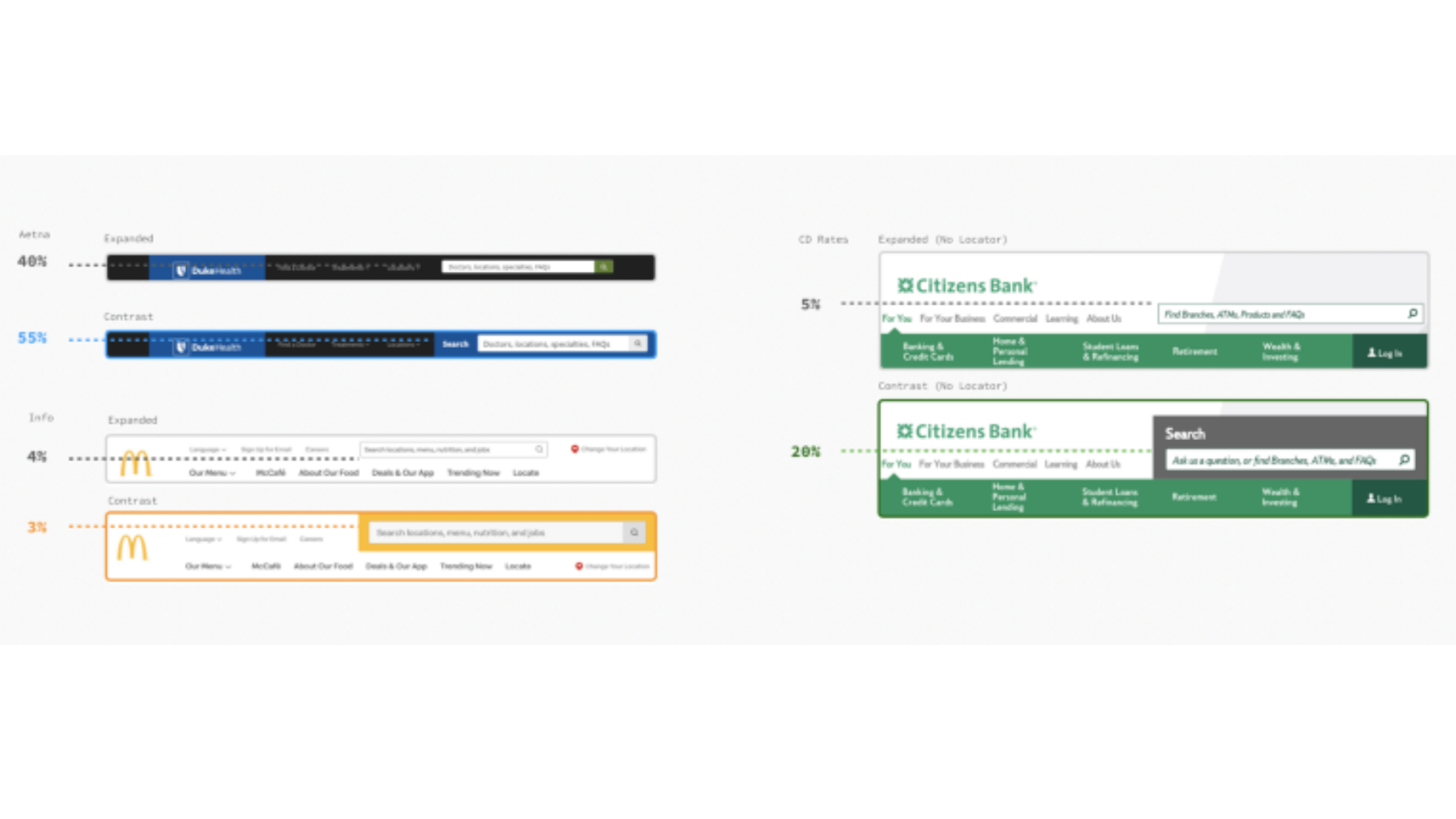
Contrast Effect ★★
Adding a contrast effect to the top right expanded version increased clicks 1.4x for the DukeHealth Aetna task and a surprising 4x for the Citizens CD Rates task. There was no effect for Mcdonald's or any location tasks.
Key Takeaway
Simply put, making the search bar more visually prominent increases search clicks.
These results suggest that a full width search bar may not provide enough value for the real estate commitment required, especially when compared to simply adding a contrast effect.
- Add Suggestion Pills ★★★★★
Before diving into our top -rated methods in the following sections, we must first introduce the effect of placeholder text.
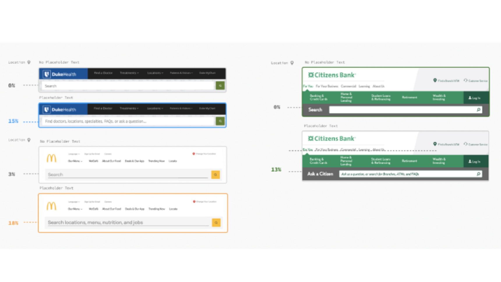
A full width search bar with placeholder text, compared to a search bar without resulted in an increase in clicks across the board. Additionally, the full width search bar did not show an increase in clicks compared to a normal width search bar when the placeholder text was not present.
These results demonstrate how users will truly "read" a page, scanning for words that match the task prompt.
Key Takeaway
Placeholder text is a must have for a modern search bar, and the specific words to include in the text should not be underestimated. Pay close attention to every word used in the placeholder text and how it should reflect the most frequent and important user paths on your site.
---------------------
Suggestion Pills employ placeholder text in abundance, allowing the user to see many suggested queries they can run before interacting with the search bar.
Overall, we found that Suggestion Pills had the most consistent and largest effect on increasing search clicks. They also resulted in the highest amount of search clicks overall, with 80% of clicks for Info tasks and 70% for Location tasks.
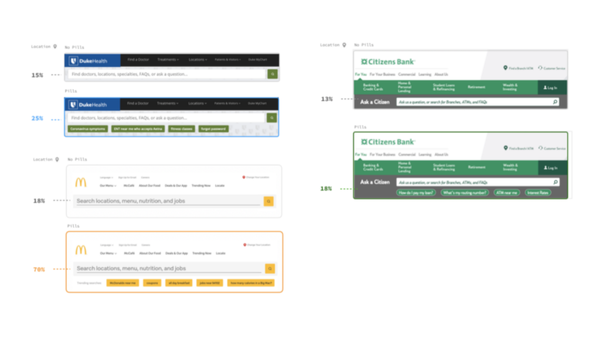
In essence, Suggestion Pills take the word matching effect observed in the placeholder text experiment and allow the user to scan up to 5 separate prompts that may match their task.
Suggestion Pills also generally created visual prominence for the search bar. They performed especially well for McDonald's tasks, compared to the DukeHealth and Citizens Bank tasks. This could be attributed to McDonald's overall clean design, and how both the color and size of text font in the Pills provided more of a contrast against the white background.
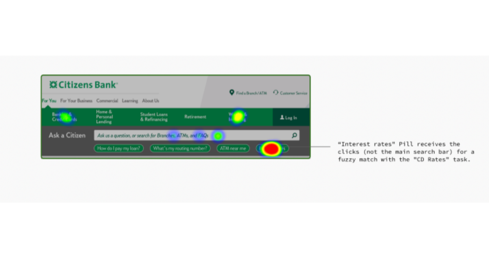
Lastly, looking at exactly where clicks occurred on the Citizens Suggestion Pills, we observed most of the clicks went directly to the Pills. This result highlights how Suggestion Pills can speed up the process of getting to results. Further research will explore if users may use the pills to get to results and reformulate their query, versus just entering their desired query from the outset.
Key Takeaway
Our working theory for why the Suggestion Pill Search bar was so successful is as follows:
- It shows the user that the search bar is advanced and can interpret complicated queries such as "ENT near me who accepts Aetna.
- It Show "What" and "How" users can search Since Pills can display multiple prompts within one view, they give users multiple ideas for how they can use the search bar. We love the idea that our clients can include frequently searched topics like "forgot password" alongside more complicated queries that emphasize the advanced nature of the search bar.
- Rotate Placeholder Text ★★★★
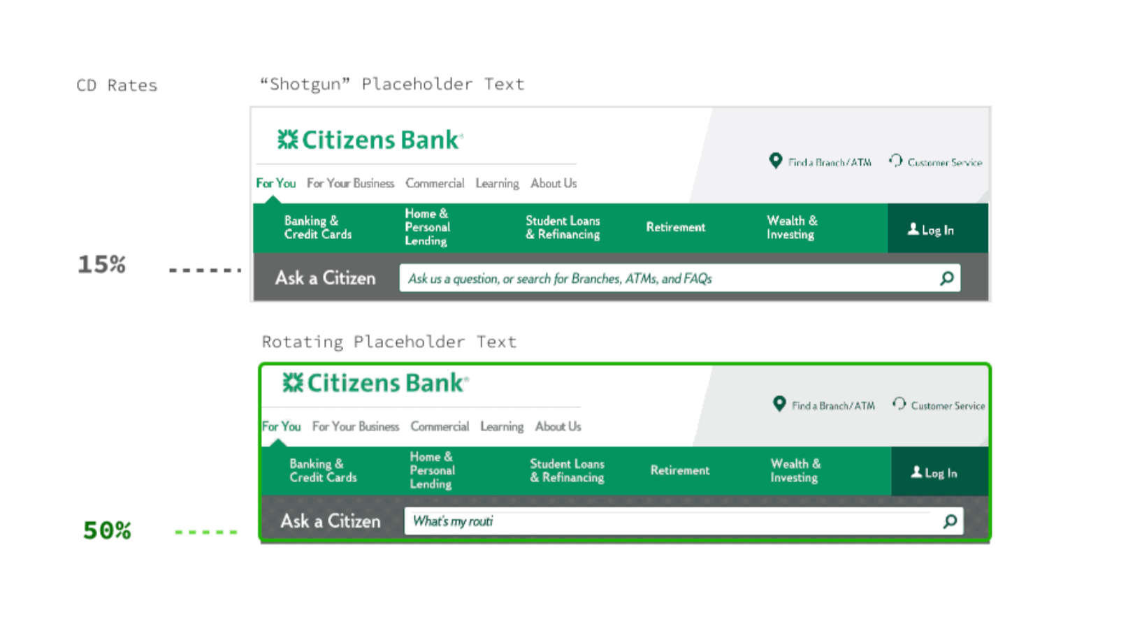
Rotating placeholder text is an intriguing tactic because it mimics the effect of Suggestion Pills without occupying additional page real estate. Instead of showing multiple suggested queries at once, this method does so by simply rotating which prompt is present at any given moment.
This method also achieves visual prominence via motion. In fact, our perceptual system has special "pre-attentive" processors dedicated to motion detection.
Key Takeaway
Rotating placeholder text is not merely an effective strategy to increase search clicks; it is especially compelling given the lack of page real estate required.
In Conclusion
Let's recap with 3 summary observations from the results we just discussed:
- We were surprised to find that simply enlarging a search bar to make it full width will not generate more search clicks. You should strongly consider adding descriptive placeholder text that helps users understand how and why to use the search bar.
- Given the strong effects of placeholder text, it's no surprise then that Suggestion Pills were the most effective tactic for increasing search clicks. This outcome suggests the potential for adding not just one placeholder prompt, but a set of them. Expect Yext to have more research-backed guidelines on how to best take advantage of a multi-placeholder text search interface.
- Not every piece of content can be prominently surfaced to users through browsing. A quality site search relieves this tension. Therefore, you could argue that a quality site search enables a more minimalist approach to surfacing content.
Our research shows that, if you create more minimalist UI experiences, your search bar does not need to be full width or utilize extra contrasts in order to get noticed.