

 Back
Back
Step 4: Match Your Brand's Styling
We are no longer implementing new Page Builder sites. This guide is for existing Page Builder clients to maintain their existing Page Builder sites.
We’ve launched a new Pages in-platform experience for marketers. To learn more, check out the guide here.
For current Pages customers interested in accessing these new capabilities in addition to the current experience, talk to your account team to learn more about how to rebuild your pages on this new experience.
We want Pages to blend into your website naturally, using the same primary brand colors and basic styling. In this step, we’ll walk you through how to update these in the Pages Design tab as well as in the modules themselves.
This can be done in a couple of different ways:
- Point-and-click options, which allow you to select colors from a color picker or select from a list of fonts
- Customize the HTML and CSS of a specific module or the global theme
Point-and-Click Styling
In the Design tab of a page template, you can modify variables that will make global styling updates. Think of this like your overarching stylesheet that will apply to all pages using this template. We’ll walk through how you can customize the styling of your pages below.
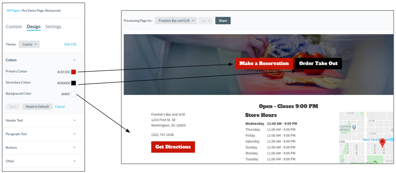
Colors
Under the Colors section, you can select the primary, secondary, and background colors.
The primary color will update all of the primary call-to-action buttons in various modules (this will either be the first call-to-action button if the module has two or the only call-to-action button), and the announcement bars.
Select the color from the color picker, or enter the desired hex color code in the textbox (like #0f70f0).
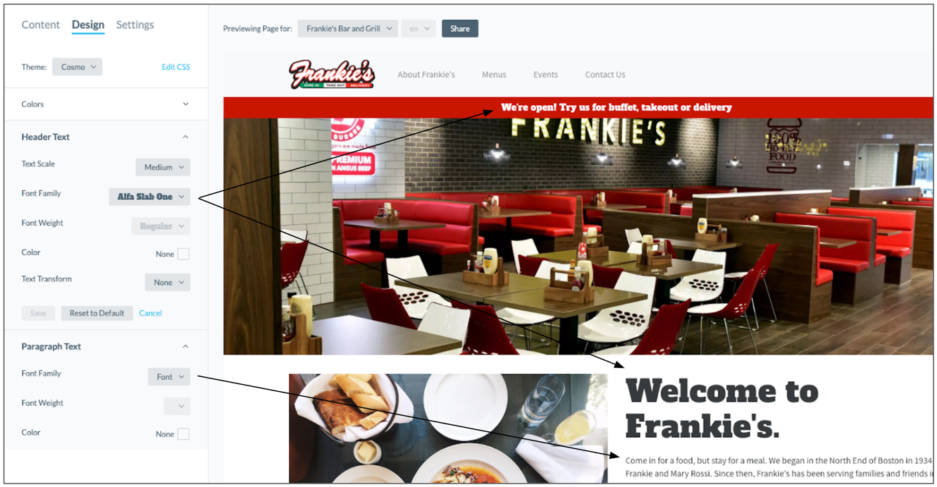
Text Formatting
You can select fonts and do some basic text styling in the next three sections for Header Text, Paragraph Text, and Buttons.
Below is a list of all customizations that can be made to each text type:
| Header Text | Paragraph Text | Buttons | |
|---|---|---|---|
| Text Scale |  |
 |
|
| Font Family | |
|
|
| Font Weight | |
|
|
| Color | |
|
|
| Text Transform | |
|
|
Text Scale: Choose whether you want the header text to be Small, Medium, or Large.
Font Family: Select your desired font.
Font Weight: Choose whether you want the font to be Light, Regular, Semi-bold, or Bold. Font styling can vary for each font, so you may not be able to select certain options for certain fonts depending on their settings.
Color: Select a specific color for the text element (headers or paragraphs).
Text Transform: Select your desired capitalization option. You can select Uppercase, Lowercase, Capitalize, or None. Capitalize will capitalize the first letter of each word in the header. None will display the text exactly as it was entered in the Knowledge Graph or the constant value textbox.
Buttons
The Buttons section has two additional styling properties on top of text formatting: button size and button radius.
Button Size: Choose whether you want the button to be small, medium or large. This will adjust the amount of padding between the text and the edge of the button.
Button Radius (px): This allows you to round the sides of your button. The higher the number, the more rounded the edges. Note: this will max out at half the height of your button.
Add Custom CSS
If you want to add custom styling outside of the preset options for colors and fonts, you can add custom CSS either to a specific module or to the :
- Specific module: When editing a module under the Content tab, click on the Edit CSS link next to the name of the module. This custom styling will be applied to the specific module.
- Global styling of the template: Under the Design tab, click on the Edit CSS link next to the Theme dropdown. This custom styling will apply CSS to the template’s theme to adjust the global styling of the template.
Clicking Edit CSS will open an editor that will allow you to enter custom styling. With either option, the styling applied will display across all of the pages using this template.