
 Back
Back
Facets and Filters (Backend) | Yext Hitchhikers Platform
What You’ll Learn
By the end of this unit, you will be able to:
- Define static filters, facets, and inferred filters
- Explain the logic of choosing multiple facets within the same facet set and across facet sets
- Explain best practices on when to implement facets and which type to choose
Overview
Facets and static filters are both useful methods for allowing the end user to refine the search results using various attributes of your content. Inferred filters are chosen by the Search algorithm. There are some important distinctions between them:
- Static Filters: Filters that are applied before the query is run, to limit the results that are searched on
- Facets: Filters that are generated after the query is run, to refine the results that are returned
- Inferred Filters: Filters that are applied by the search algorithm based on the best exact matches
You’ll find all three on the Filters tab of a vertical configuration.
Since they’re all filters, these are best applied to enum/option fields with finite values.
Static Filters
Static filters are applied “pre-search” and are not dependent on the search query. They are defined on the client-side so whenever a user queries an experience, any enabled static filter is submitted as an additional filter with the query, restricting the results that are returned.
Good use cases for static filters are:
- Time filters for blog entity types (only show blogs that were written in the last week)
- Location filters (only show locations in a specific state)
Implementing Static Filters
Once you decide what fields you want to enable as a static filter, you need to configure both the Search backend and frontend:
Edit via the Platform UI
To configure static filters in the UI, navigate to the Verticals screen, choose the desired vertical, and then select the Filters tab. Find the static filter section. Add a field by clicking + Add/Update Fields in the top right of the section to bring up a field modal and check off the fields you want to include. Uncheck any fields you want to remove, or click the trash can icon next to the field on the Filters screen.
Edit via the JSON Editor
In the JSON instance of the Search configuration, fields are referenced by their API name (check out the
View Field API Name
help article to learn how to find this). To set a field as a static filter, add the API name of the field to the searchable fields object and set staticFilter to true, like so:
"verticals": {
  "products": {
    "searchableFields": {
      "c_category": {
        "staticFilter": true,
      },
    },
  },
}
Add to Search Frontend
Add static filters to your frontend. Check out the Facets and Filters unit for the Theme, or the StaticFilters React component reference doc.
You can also use static filters for filter search, in which users select static filters to conduct their search. Learn more in the FilterSearch React component reference doc.
Facets
Facets are applied “post-search”, since they’re dependent on the search query, and can be used to further refine a query. They are returned by the API (from the server) and then displayed client-side. Depending on the results that are returned, the user will see facet options with a number next to each one indicating the result count. If no results are returned in the query for a given facet option, that option will not appear.
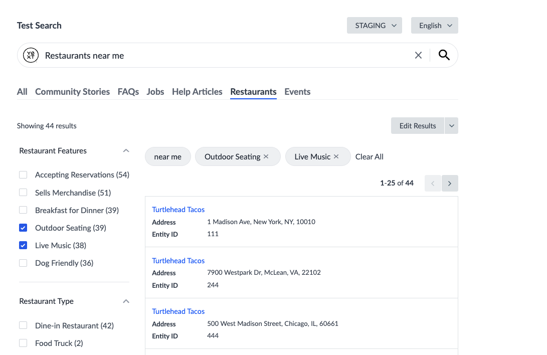
Users can toggle a facet option checkbox on to further refine the search results. In the example below, the Restaurants vertical has facets for Restaurant Features and Restaurant Type. After searching for “restaurants near me,” the user is now presented with options to narrow down their search. Maybe they like the idea of listening to live music while eating their tacos outside, but they didn’t know this was an option until they saw it in the facets.
Facet Logical Operators
Within a single facet, if multiple options are selected (let’s call them option A and option B) the results will display any entities that contain either option A OR option B. In the above example, the Restaurant Features facet set has multiple facet options selected. The results will show all entities that have either outdoor seating or live music.
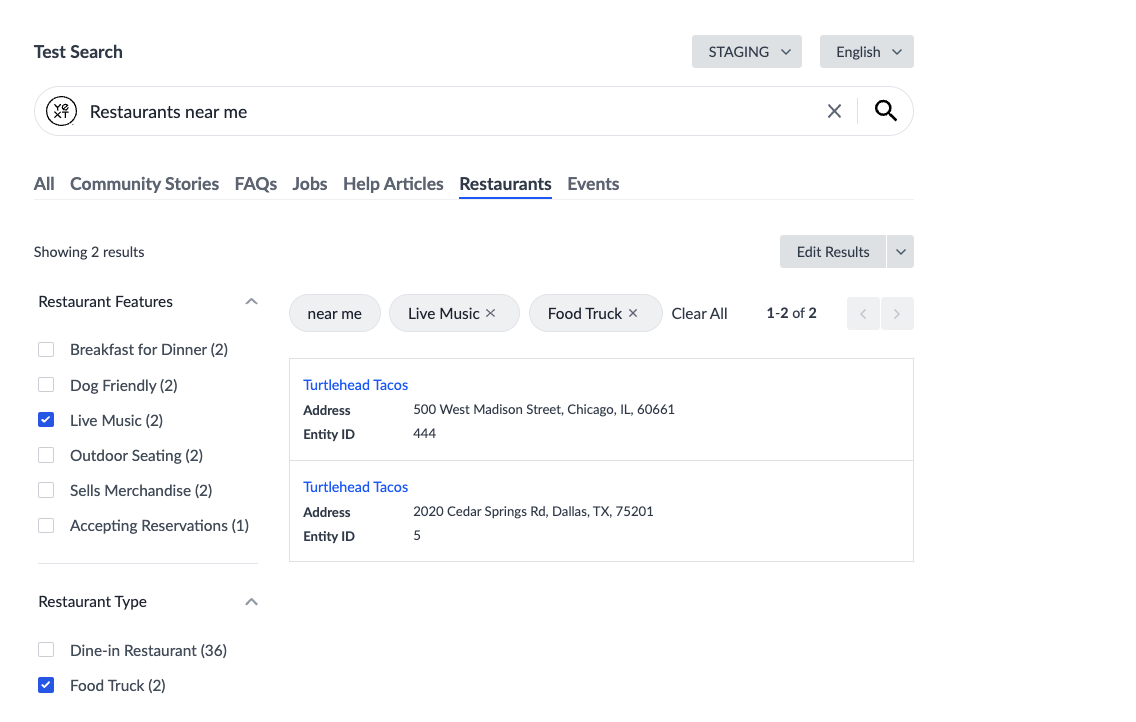
However, when there are multiple different facets, selecting an option in both facet sets will cause the results to display only entities that contain both selected options from each facet set. In the below example, both the Restaurant Features facet set and the Restaurant Type facet set has options selected. The results will show all entities that have both live music and is a food truck.
Facet Best Practices
When deciding whether to implement facets, think about the types of queries your users are searching for and how they would want to refine these searches. In most cases, facets are encouraged. You’ll want to find the balance in number of facets that matches your users’ needs: having facets are helpful, but too many facets can be overwhelming.
For example, take the query: “I need a doctor.” This is a pretty generic query that healthcare providers may get often. To help users narrow down their search, you might want to offer up facets for “Conditions Treated,” “Insurances Accepted,” or “Speciality.”
Example use cases include:
- Sizes for the Product entity type: XS, S, M, L, XL
- Menu sections for the Menu Item entity type: Appetizers, Pasta, Pizza, Salads, Sides, Dessert
- Employment Offerings for the Job entity type: Full Time, Part Time, Flexible Hours
- Services for the Location entity type: Drive-thru, ATM
Types of Facets
We distinguish between three different kinds of facets in our platform: standard facets, numerical facets, and hierarchical facets.
Standard facets are the ones you see above, where the field values are pulled in directly as facet options.
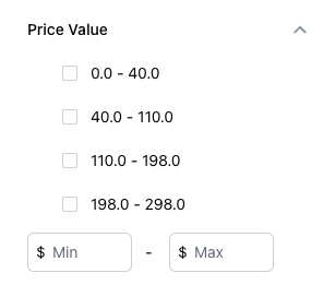
Numerical facets allow you to use static number ranges as facets, which is particularly useful for price ranges, multipack options, and more.
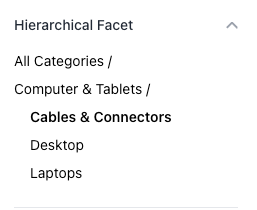
Hierarchical facets allow users to click through a ‘hierarchy’ of categories to filter the results. The most common use case for using Hierarchical Facets are for category fields. Hierarchical facets are only supported in Search UI React, and not the Hitchhikers Theme.
Facet Order
You can customize the order in which facets appear on the frontend for each vertical object. As the facets at the top of the list will get the most attention, consider placing the most general, high-level filter categories at the top of the list and the more specific ones at the bottom. If you don’t specify an order, the algorithm will determine this for you.
Implementing Facets
Once you decide what fields you want to enable as facets (check out the Searchable Fields Best Practices reference doc for more tips on choosing fields), you need to configure both the Search backend and frontend.
Also check out the Set up Standard Facets , Set up Numerical Facets , and Set up Hierarchical Facets guides for end-to-end instructions and the Facets and Sorting (Code Snippets) reference doc for code snippets to customize your facets.
Edit via the Platform UI
To configure facets in the UI, navigate to the Verticals screen, choose the desired vertical, and then select the Filters tab. Find the facets section. Add a field by clicking + Add/Update Fields in the top right of the section to bring up a field modal and check off the fields you want to include. Uncheck any fields you want to remove, or click the trash can icon next to the field on the Filters screen.
Review the Add Facets to a Search Vertical help article for step-by-step instructions. Numerical facets take a bit more setup on the backend.
To set facet order in the UI, drag the facets into the order you want them to appear.
Edit via the JSON Editor
In the JSON instance of the Search configuration, fields are referenced by their API name (check out the
View Field API Name
help article to learn how to find this). To set a field as a facet, add the API name of the field to the searchable fields object and set facet to true shown below.
To set facet order in the JSON editor, include a property called facetOrder in your vertical and include an array of facet fields in the order you want them to appear. Any facets that appear on a given search that are not included in the facetOrder property will be shown in an arbitrary but consistent order, chosen by the algorithm.
For example, to switch the facet order of the Restaurants example above, we would use the following JSON configuration:
  "verticals": {
    "restaurants": {
      "facetOrder": [
        "c_restaurantType",
        "c_restaurantFeatures"
      ],
      "searchableFields": {
        "builtin.entityType": {
          "nlpFilter": true
        },
        "builtin.location": {
          "nlpFilter": true
        },
        "c_restaurantFeatures": {
          "facet": true,
          "nlpFilter": true
        },
        "c_restaurantType": {
          "facet": true
        },
        "name": {
          "textSearch": true
        }
      }
    }
  },
Add to Search Frontend
Add facets to your frontend. Check out the following resources based on which frontend method you’re using:
- Hitchhikers Theme: Review the Facets and Filters unit. Both standard facets and numerical facets use the same setup. Hierarchical facets are not supported in the Theme.
- Search UI React: Check out the React component reference docs for StandardFacet , NumericalFacet , and HierarchicalFacet .
Inferred Filters
Inferred filters were discussed as a search algorithm in the Searchable Fields unit, but it’s worth mentioning again here. They work similarly to the static filters and facets above in that applying one applies a black-and-white filter that eliminates anything that doesn’t match the filter.
The difference is that inferred filters are automatically applied by the Search algorithm when you run a search, instead of by the user.
Inferred Filter Order
There may be cases when the same filter value exists in two different fields that are enabled with inferred filters. In a scenario like this, the actual filter that is selected and applied is arbitrary. With inferred filter order, you can specify the order in which you’d like inferred filters to be selected when conflicts happen.
Implementing Inferred Filters
Edit via the Platform UI
To configure inferred filters in the UI, navigate to the Verticals screen, choose the desired vertical, and then select the Filters tab. Find the inferred filters section. Add a field by clicking + Add/Update Fields in the top right of the section to bring up a field modal and check off the fields you want to include. Uncheck any fields you want to remove, or click the trash can icon next to the field on the Filters screen.
To set inferred filter order in the UI, drag the fields into the order you want them to selected when conflict occur.
Edit via the JSON Editor
In the JSON instance of the Search configuration, fields are referenced by their API name (check out the
View Field API Name
help article to learn how to find this). To set a field as an inferred filter, add the API name of the field to the searchable fields object and set nlpFilter to true shown below.
To set inferred filter order in the JSON editor, include a property called nlpFilterOrder in your vertical and include an array of inferred filter fields in the order you want them to appear. Any fields listed in this array must be set as a searchable field with inferred filter (nlpFilter) enabled.
A common example is for healthcare clients who want to prioritize their list of specialties ahead of the Yext built-in list of medical conditions:
    "facilities": {
      "entityTypes": [
        "healthcareFacility"
      ],
      "name": "Facilities",
      "nlpFilterOrder": [
        "specialties",
        "builtinFile.medicalConditions"
      ],
      "searchableFields": {
        "builtinFile.medicalConditions": {
          "nlpFilter": true
        },
        "specialties": {
          "nlpFilter": true
      },
      "source": "YEXT"
} Daily Quiz Streak: 0
 Quiz Accuracy Streak: 0
 Question 1 of 4
What is the main difference between static filters and facets?
Question 2 of 4
Why are facets useful? (select all that apply)
Question 3 of 4
On a Products vertical, you select facets for Black and Blue under Color and Shirts under Category. What result set will show?
Question 4 of 4
Which fields would make good options for facets? (select all that apply)
Way to go, you passed! 🏁
