
 Back
Back
Custom Search Result Cards | Yext Hitchhikers Platform
What You’ll Learn
In this section, you will:
- Generate the Typescript types that represent entity search results
- Create custom search result cards for the “jobs” vertical
Overview
In this module, you’re going to be building a job searcher for Turtlehead Tacos. Up to this point, you have used the StandardCard component for displaying search results on the page. This component is useful for getting up and running, but it doesn’t display all the data you need.
In this unit, you’re going to define a custom JobCard component to display more information for each job search result.
1. Switch Verticals
To start, you need to switch to search on the “jobs” vertical in src/templates/search.tsx. Change the vertical key in your headlessConfig object from “faqs” to “jobs”.
// src/templates/search.tsx

// other imports and code...

const headlessConfig: HeadlessConfig = {
  apiKey: "Your API Key Here",
  experienceKey: "turtlehead",
  locale: "en",
  verticalKey: "jobs",
  environment: Environment.SANDBOX,
};
2. Add a Heading and Search Bar Placeholder Text
Run npm run dev in the terminal if your application isn’t already running. Now searching for “waiter” or “chef” will return jobs with their name and description fields displayed on each card.
Add some heading text and pass the placeholder prop to SearchBar:
const Search: Template<TemplateRenderProps> = () => {
  return (
    <SearchHeadlessProvider searcher={searcher}>
      <div className="px-4 py-8">
        <div className="mx-auto flex max-w-5xl flex-col">
          {/* new code starts here... */}
          <h1 className="pb-4 text-center text-3xl font-bold text-red-700">
            Turtlehead Tacos Careers
          </h1>
          <SearchBar placeholder="Search job title, department, or employment type" />
          {/* ...and ends here */}
          <SpellCheck />
          <ResultsCount />
          <VerticalResults
            CardComponent={StandardCard}
            displayAllOnNoResults={false}
          />
        </div>
        <Pagination />
      </div>
    </SearchHeadlessProvider>
  );
};
3. Search Result Types
Search results represent Knowledge Graph entities and therefore can take on any shape or size. Rather than define your own Typescript interfaces for each vertical, you can use the Yext CLI to generate types for you.
In your terminal, run:
yext types generate search src/types --experienceKey turtleheadThis will generate a new file for each vertical in your search experience inside the src/types folder.
4. Custom Job Card
Create a new folder src/components with a new file called JobCard.tsx. Add the following code.
// src/components/JobCard.tsx
import { CardComponent, CardProps } from "@yext/search-ui-react";
import Job from "../types/jobs";
const JobCard: CardComponent<Job> = ({
result,
}: CardProps<Job>): JSX.Element => {
const job = result.rawData;
// function that takes a date in the format YYYY-MM-DD and returns date in the format Month Day, Year
const formatDate = (date: string): string => {
if (!date) return "";
const dateObj = new Date(date);
const month = dateObj.toLocaleString("default", { month: "long" });
const day = dateObj.getDate();
const year = dateObj.getFullYear();
return `${month} ${day}, ${year}`;
};
return (
<div className="mb-4 justify-between rounded-lg border bg-zinc-100 p-4 text-stone-900 shadow-sm">
<div className="flex flex-col">
<div className="text-lg font-semibold text-red-700">{job.name}</div>
<div>{job.c_jobDepartment}</div>
<div className="flex gap-1">
{job.employmentType && (
<div className="flex rounded bg-gray-600 px-1 text-sm text-gray-100">
{`${job.employmentType}`}
</div>
)}
{job.c_salary && (
<div className="flex rounded bg-gray-600 px-1 text-sm text-gray-100">
{`$${job.c_salary}/hour`}
</div>
)}
</div>
<div className="py-2 ">{job.description}</div>
{job.datePosted && (
<div className="text-sm">{`Date Posted: ${formatDate(
job.datePosted
)}`}</div>
)}
</div>
</div>
);
};
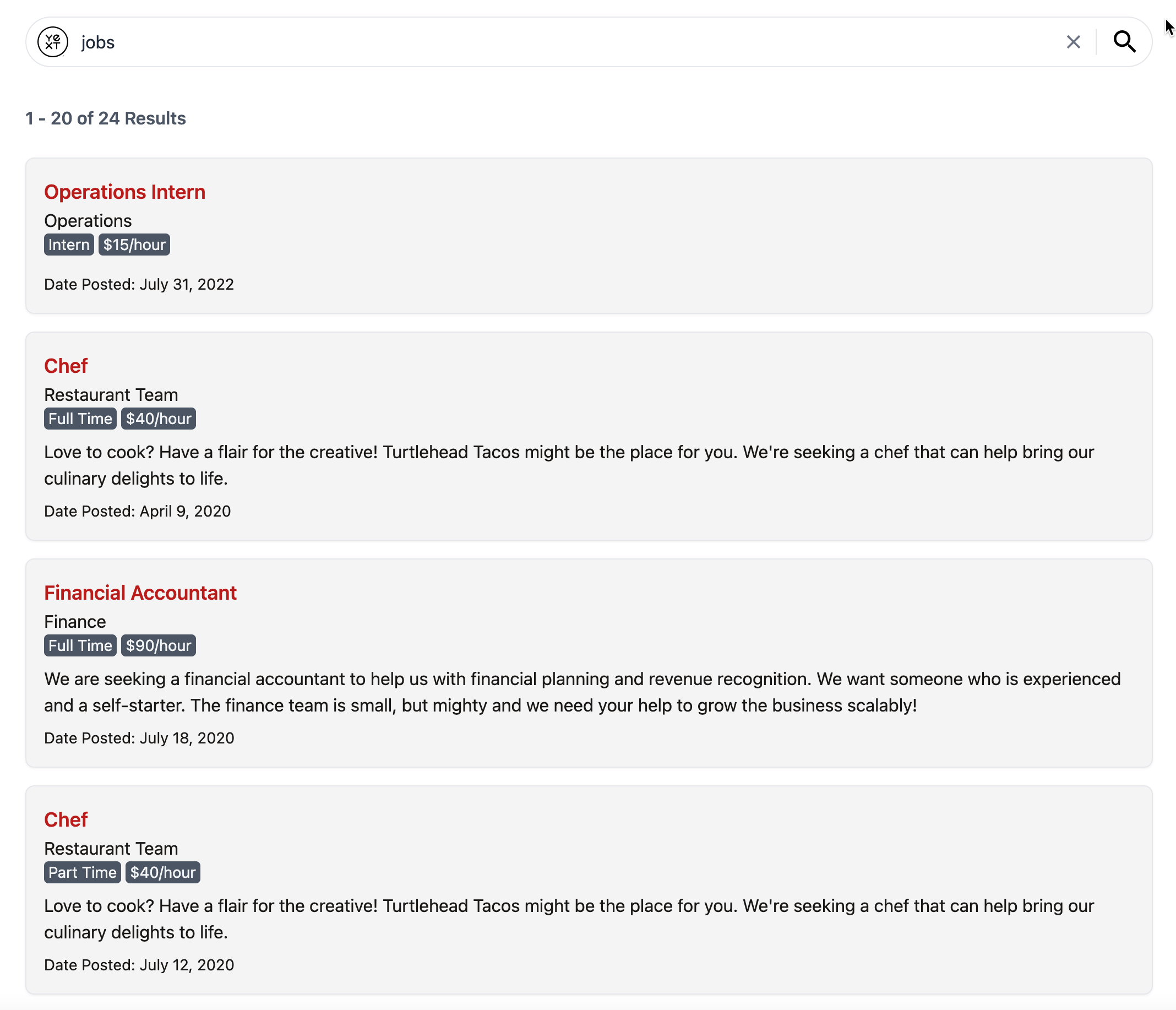
export default JobCard;Let’s review what you just added:
JobCardis aCardComponentwhich is a generic type. This means when theCardPropsare providedJobas a type parameter,result.rawDatawill be typed as aJob.- In addition to the Job
nameanddescription, you’re also displaying thec_jobDepartment,employmentType,c_salary, and formatteddatePostedfield. - You’ve also added some custom styling to your card. In future units, you’ll add some custom styles to other components to match.
5. Add a Custom Card to VerticalResults
Now that we have created the JobCard, we need to add it to our search experience.
In search.tsx, pass the JobCard as the CardComponent prop to VerticalResults.
// src/templates/search.tsx

// other imports...

import JobCard from "../components/JobCard";
import Job from "../types/jobs";

// other code...

const Search: Template<TemplateRenderProps> = () => {
  return (
    <SearchHeadlessProvider searcher={searcher}>
      <div className="px-4 py-8">
        <div className="mx-auto flex max-w-5xl flex-col">
          <h1 className="pb-4 text-center text-3xl font-bold text-red-700">
            Turtlehead Tacos Careers
          </h1>
          <SearchBar placeholder="Search job title, department, or employment type" />
          <SpellCheck />
          <ResultsCount />
					{/* new code starts here... */}
          <VerticalResults<Job>
            CardComponent={JobCard}
            displayAllOnNoResults={false}
          />
					{/* ...and ends here */}
        </div>
        <Pagination />
      </div>
    </SearchHeadlessProvider>
  );
};
Refresh the page and run a new search to see your new Job search results!
 Daily Quiz Streak: 0
 Quiz Accuracy Streak: 0
 Question 1 of 2
Which files were generated for you when you ran `yext types generate search src/types --experienceKey turtlehead`?
Question 2 of 2
Which fields are now visible on each job search result?
You're a star! ⭐
