What is CSS? | Yext Hitchhikers Platform
What You’ll Learn
In this section, you will learn:
- Basics about CSS
- Basic CSS Example
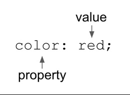
Cascading Style Sheets (CSS) define how elements are positioned and displayed on a webpage. CSS is composed of a series of key/value pairs called rules, that define the value for a given property.

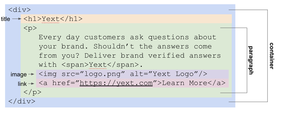
These HTML elements can be targeted using their attributes or CSS selectors.
Starting with a simple example, let’s go back to the ‘Learn More’ call to action in our example html.

We can add the following style rules to the a tag to make a red button with white text:
Walking through each property:
- color sets the color of the text.
- background-color sets the color of the background.
- font-size sets the size of the font, and font-weight defines the boldness of the font.
- text-decoration defines whether the text is underlined.
- padding defines the spacing of the element between itself and its surroundings.
- border-radius sets the curvature of the border, defined in pixels
&:hoverallows us to define the behavior on hover - here, we’re adding an underline on hover.
These are only some of the properties you’re able to define via CSS, but it gives you a good sense of the elements you can easily customize.
Because we’re targeting the <a> HTML tag selector, any <a> tag we add to my HTML will get this same styling.
Try playing around for yourself! Change the background color to green and increase the font size to 36px.
CSS Selectors
The way we target the specific sections to apply the rules to is through selectors. The most common ones are listed below.
| Type | Example | CSS Syntax | Used for? |
|---|---|---|---|
| id | <div id=”learn-more”>Learn More</div> |
#learn-more { | Targeting styling for a single element |
| class | <div class=”learn-more”>Learn More</div> |
.learn-more { | Targeting styling for all elements with this class |
| html tag name | <div>Learn More</div> |
div { | Targeting all elements of this type |
| pseudo-classes | <a href=”google.com”>Link</a> |
a:hover { | Targeting different states of an element (ex. hover state for a button) |
Pseudo-classes
Pseudo-classes aren’t explicitly defined in the HTML, but rather refer to states of an element, most often for interactive elements like links.
| State | CSS Syntax | Limited to | How to activate |
|---|---|---|---|
| hover | .learn-more:hover | n/a | On desktop, hover over element |
| focus | .learn-more:focus | Input elements: <a>,<button>,<input> |
On desktop, tab through input |
| visited | .learn-more:visited | Links and buttons: , | Always occurs after active |
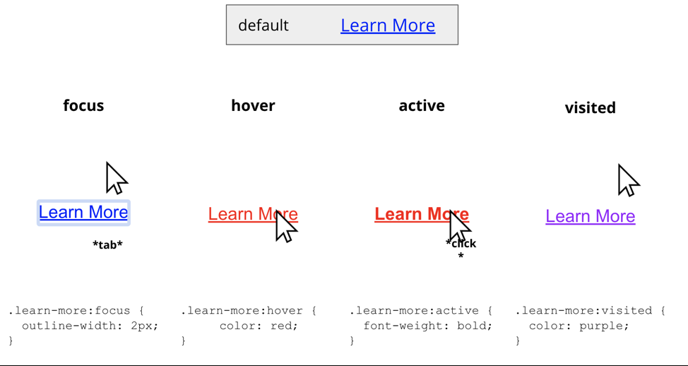
Here are some examples of the different states visually.

Most often, you’ll be playing with the hover state of interactive elements. See our example below, where, in addition to underlining on hover, we change the background-color to a darker red using a hex value, the cursor to a pointer, and increase the padding to grow the button larger. Try changing or adding any values for the hover state!
Use these resources to keep learning about CSS and refer back to available CSS properties:
What does the CSS of the page control?
What kind of properties can be defined via CSS? (Select all that apply)
Climbing that leaderboard! 📈

