
 Back
Back
Component Styling | Yext Hitchhikers Platform
What You’ll Learn
- How to use the
customCssStylesprop to customize the styling of the Search UI React components
Overview
Every Search UI React component can be customized by passing the customCssClasses prop. Styles passed by this object override the default styles used by the components.
Note
Under the hood, the Search UI React components use
tailwind-merge
. This useful library ensures that whichever Tailwind CSS classes you pass to the Search UI React components will be merged with the default styles with no conflicts.
In this unit, you’ll add a bit of custom stying to your Search components.
1. Use the customCssClasses Prop
Pass the customCssClasses prop to the SpellCheck, Facets, and Pagination components:
const Search: Template<TemplateRenderProps> = () => {
return (
<SearchHeadlessProvider searcher={searcher}>
<div className="px-4 py-8">
<div className="mx-auto flex max-w-5xl flex-col">
<h1 className="pb-4 text-center text-3xl font-bold text-red-700">
Turtlehead Tacos Careers
</h1>
<SearchBar placeholder="Search job title, department, or employment type" />
{/* new code starts here... */}
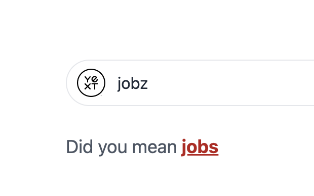
<SpellCheck
customCssClasses={{
link: "text-red-700 underline",
}}
/>
<ResultsCount />
<div className="flex">
<div className="mr-5 w-56 shrink-0">
<div className="flex flex-col rounded border bg-zinc-100 p-4 shadow-sm">
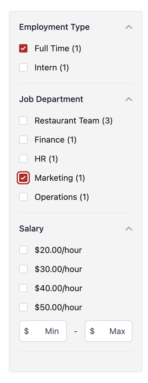
<Facets
customCssClasses={{
optionInput: "text-red-700 focus:ring-red-700",
optionLabel: "text-stone-900",
}}
/>
</div>
</div>
<VerticalResults<Job>
CardComponent={JobCard}
displayAllOnNoResults={false}
/>
</div>
</div>
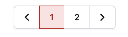
<Pagination
customCssClasses={{
icon: "text-stone-900",
label: "text-stone-900",
selectedLabel: "text-red-700 border-red-700 bg-red-100",
}}
/>
{/* and ends here... */}
</div>
</SearchHeadlessProvider>
);
};Let’s review the styling you just added:
- The
SpellChecklink matches the red heading text color and underline. - The
Facetslabel text color matches that of JobCard and their checkboxes have a red ring when checked. - The selected page in the
Paginationcomponent now has a red border and light red background.
You made some pretty minimal styling changes, but the customCssClasses prop provides the flexibility for you to customize your components any way you’d like.
unit Quiz
+20 points
 Daily Quiz Streak: 0
 Quiz Accuracy Streak: 0
 Question 1 of 1
Which of the following customCssClasses fields did you override in Facets?
Soon you'll be your brand's hero! 🎓
You've already completed this quiz, so you can't earn more points.You completed this quiz in 1 attempt and earned 0 points! Feel free to review your answers and move on when you're ready.
1st attempt
0 incorrect

Sign up for Hitchhikers to start earning points!
If you're already a Hitchhiker, log in to access this content.
<% elem.innerText %>