

Integration Properties | Yext Hitchhikers Platform
This reference doc will walk through the descriptions for the properties involved in the ScriptTagProps interface, organized by component context for clarity.
Below is an example of what the script tag integration code looks like. You can add or remove properties as desired.
<link rel="stylesheet" href="https://assets.sitescdn.net/chat/v0/chat.css" />
<script defer src="https://assets.sitescdn.net/chat/v0/chat.umd.js" onload="initChat()"></script>
<script>
  function initChat() {
    window.ChatApp.mount({
      apiKey: "3f787a8ed5b5092b61932982f6837316",
      botId: "hitchhikers-chat",
      title: "Hitchhikers Chat",
      // showRestartButton: true,
      // onClose: () => { /* Your logic here */ },
      // showFeedbackButtons: true,
      // showTimestamp: true,
      // footer: "Powered by Yext",
      // placeholder: "Type a message...",
      // stream: true,
      // inputAutoFocus: true,
      // handleError: (e) => { /* Your error handling logic here */ },
      // onSend: () => { /* Your logic here */ },
      // messageSuggestions: ["What is Yext Chat?"],
      // openOnLoad: true,
      // showHeartBeatAnimation: true,
      // showUnreadNotification: true,
      // showInitialMessagePopUp: true,
      // ctaLabel: "Ask Our Chat Assistant!",
      // saveToSessionStorage: true,
      // ctaLabel: "Ask Me Anything!"
    });
  }
</script>
This code is also available on the Integrations screen of Chat within the platform. See this training unit to learn more.
Header Component Properties
| Property | Type | Description |
|---|---|---|
title |
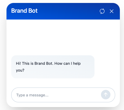
string | Specifies the title text of the header, serving as the chat window’s identifier to the user. |
showRestartButton |
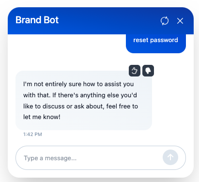
boolean | (Optional) When enabled, displays a restart button allowing users to reset and restart the conversation. It is not shown by default. |
onClose |
function | (Optional) Defines a callback function that is executed when the close button is clicked, allowing for custom close behavior. Format is as follows: onClose: () => { /* Your logic here */ } |
Below is an example of setting showRestartButton to true. The result is a button that displays in the top right corner next to the close button.
Message Bubble Component Properties
| Property | Type | Description |
|---|---|---|
showFeedbackButtons |
boolean | (Optional) Controls the visibility of feedback buttons on message bubbles, enabling users to react to messages. Visible by default. Displays by default. |
showTimestamp |
boolean | (Optional) Determines whether to display the timestamp for each message within its bubble. Enabled by default.Displays by default. |
formatTimestamp |
function | (Optional) Provides a function for custom formatting of message timestamps, given in ISO format, with a default format of “HH:MM A”. |
By default feedback buttons and message time stamps appear when you hover over messages in the panel. This is what it looks like:
Chat Input Component Properties
| Property | Type | Description |
|---|---|---|
placeholder |
string | (Optional) Sets the placeholder text for the chat input field when empty, with a default value of “Type a message…”. |
stream |
boolean | (Optional) Enables experimental streaming behavior by making requests to the Chat Streaming API. Off by default. |
inputAutoFocus |
boolean | (Optional) Automatically focuses the chat input box when available. Disabled by default. |
handleError |
function | (Optional) Assigns a function to handle errors from the Chat API while processing messages, with a default behavior of logging errors to the console and updating the state with an error message. Format is as follows: handleError: (e) => { /* Your error handling logic here */ } |
onSend |
function | (Optional) A callback function that is triggered whenever a user sends a message. Format is as follows: onSend: () => { /* Your logic here */ } |
The placeholder text where users input queries can be modified. Below the property is set to its default of placeholder: "Type a message...":
Panel Component Properties
| Property | Type | Description |
|---|---|---|
footer |
string | (Optional) Defines markdown text to be rendered at the bottom of the chat panel. |
messageSuggestions |
array of strings | (Optional) Offers a set of predefined initial messages that users can select to start a conversation without typing. |
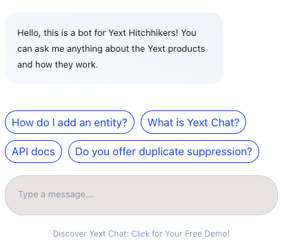
If you want to add a footer to the chat panel you can add the footer property followed by the text you want displayed. In this example we used footer: "Discover Yext Chat: Click For Your Free Demo.
You can also add multiple message suggestions to help guide users on how to interact with your bot. The code should be formatted like this:
messageSuggestions: ["How do I add an entity?","What is Yext Chat?", "API Docs"]
PopUp Component Properties
| Property | Type | Description |
|---|---|---|
customCssClasses |
object | (Optional) Allows for custom CSS class definitions to style the component. For example, customCssClasses: { "yext-chat-header__title": "my-custom-header-css" } |
openOnLoad |
boolean | (Optional) Controls whether the panel is displayed immediately upon page load. Off by default. |
showInitialMessagePopUp |
boolean | (Optional) Shows an initial message popup when the panel is hidden at load, disabled by default. |
showHeartBeatAnimation |
boolean | (Optional) Activates a heartbeat animation on the popup button when the panel is hidden, intended to attract user attention. Off by default. |
showUnreadNotification |
boolean | (Optional) Displays a notification for the number of unread messages. Off by default. |
ctaLabel |
string | (Optional) Sets a “Call to Action” label next to the popup button, overriding the showInitialMessagePopUp setting if provided. |
The pop up component properties are set to false by default. Here is an example of what it would look like to turn on the initial showInitialMessagePopUp, showHeartBeatAnimation, showUnreadNotification. The intial message shown is set in the General Settings screen of your bot settings.
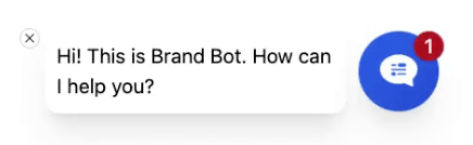
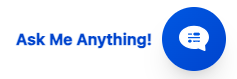
If you want to display a message that differs from the intial messages of your bot, you can instead use the ctaLabel property. In this example we use ctaLabel: "Ask Me Anything!":
Headless Config Properties
| Property | Type | Description |
|---|---|---|
saveToSessionStorage |
boolean | (Optional) Determines if the chat’s conversation state should be saved to session storage, enabled by default. |
analyticsConfig |
object | (Optional) Configures chat analytics, including a base event payload for the Analytics Events API and settings for session tracking and analytics API endpoint customization. |
Core Config Properties
| Property | Type | Description |
|---|---|---|
botId |
string | Identifies the bot to interact with within the chat interface. |
apiKey |
string | Provides the API key required for the chat experience. |
businessId |
number | (Optional) Specifies the ID of the account associated with the chat bot. |
version |
string | (Optional) Sets the version of the chat bot configuration, defaulting to LATEST. |
env |
string | (Optional) Defines the API domain environment, defaulting to PRODUCTION. |
region |
string | (Optional) Indicates the region for request routing, defaulting to US. |