
 Back
Back
Overview of Cards | Yext Hitchhikers Platform
What You’ll Learn
By the end of this unit, you will be able to:
- Define what a card is and what type of information it displays
- Identify various built-in cards
- List the two files that make up a card and what updating each file will do
Overview
As you learned in the previous unit, the Pages config file references a cardType property which maps to the result card used to show each result in the vertical.
Each card in the Answers Hitchhikers Theme, whether built-in or custom, is represented by two different files:
- A
card > template.hbsHandlebars file that defines the layout of the card - A
card > component.jsJavaScript file that defines the data mappings to each section on the card
Cards can either display dynamic data from entity fields or hardcoded content specified in the repository. You can create a card type specific to each vertical or reuse cards across verticals.
Cards Built-in to the Theme
We have a number of built-in card types in the Theme. These are predefined cards that are already built out with card structure and data mappings.
The cards included in the theme have a naming convention of: [[entityTypeName]]-[[description]].
Below are a few examples on built-in card types. To see a full list of all card types, see the Built-in Card Types reference doc.
Location Standard Card (location-standard)

FAQ Accordion Card (faq-accordion)

Job Standard Card (job-standard)

Card Handlebars Template
In each card folder, the template.hbs file is a Handlebars template that defines the components on the card and the layout of those components.
You only need to make changes to this file if you are moving pieces around on the card or adding or removing pieces. Thus you typically will not need to update these templates. If you do, you’ll learn how to do so in the Updating Result Card Structure unit.
Card Javascript File
In each card folder, the component.js file defines how the data on an entity profile is mapped to the sections of a card, as well as some other configuration options.
This will be the majority of what you’ll update for your own custom cards, which you will learn about in the next unit. This means that you can change what content is shown for each section of a card within the existing card structure. If you want to use a built-in card, you don’t need to update anything.
Here is an example of a card’s data mappings:
{{> cards/card_component componentName='StandardCard'}}

class StandardCardComponent extends BaseCard.StandardCard {
  constructor(config = {}, systemConfig = {}) {
    super(config, systemConfig);
    this.setTemplate(`{{{read 'cards/standard/template' }}}`);
  }

  /**
   * This returns an object that will be called `card`
   * in the template. Put all mapping logic here.
   *
   * @param profile profile of the entity in the card
   */
  dataForRender(profile) {
    // Extract the data for the primary and secondary CTAs from the profile.
    // Apply a sane default if not present in the profile.
    const primaryCTAData = profile.c_primaryCTA || {};
    const secondaryCTAData = profile.c_secondaryCTA || {};

    return {
      title: profile.name, // The header text of the card
      url: profile.website || profile.landingPageUrl, // If the card title is a clickable link, set URL here
      target: '_top', // If the title's URL should open in a new tab, etc.
      // image: '', // The URL of the image to display on the card
      // tagLabel: '', // The label of the displayed image
      titleEventOptions: this.addDefaultEventOptions(),
      // subtitle: '', // The sub-header text of the card
      details: profile.description, // The text in the body of the card
      // If the card's details are longer than a certain character count, you can truncate the
      // text. A toggle will be supplied that can show or hide the truncated text.
      showMoreDetails: {
        showMoreLimit: 750, // Character count limit
        showMoreText: 'Show more', // Label when toggle will show truncated text
        showLessText: 'Show less' // Label when toggle will hide truncated text
      },
      // The primary CTA of the card
      CTA1: {
        label: primaryCTAData.label, // The CTA's label
        iconName: 'chevron', // The icon to use for the CTA
        url: primaryCTAData.url, // The URL a user will be directed to when clicking
        target: '_top', // Where the new URL will be opened
        eventType: 'CTA_CLICK', // Type of Analytics event fired when clicking the CTA
        eventOptions: this.addDefaultEventOptions()
      },
      // The secondary CTA of the card
      CTA2: {
        label: secondaryCTAData.label,
        iconName: 'chevron',
        url: secondaryCTAData.url,
        target: '_top',
        eventType: 'CTA_CLICK',
        eventOptions: this.addDefaultEventOptions()
      }
    };
  }
}

ANSWERS.registerComponentType(StandardCardComponent);
Don’t be alarmed! This is simply defining every element of the cards; you’ll only need to modify and tweak to get to the card you want. There are a number of helpful comments within the file as well to help you understand what each item is controlling.
Here, we’ll see that the default standard card will map to things like:
- The name field for the card title
- The website (or landingPageUrl, if website is not populated) field for the card title URL
- The description field for the card details
To leverage a built-in card, and thus the standard mappings, you don’t have to do anything besides name that built-in card in your [[page-name]].json file as the cardType. However, if you want to alter this at all, you’ll need to fork the card, which you’ll learn in the next unit.
Setting the Card Type
When you set the cardType on a Page, you are specifying what kind of card you want to use for that page. You can choose to specify a built-in card from the Theme (e.g., standard), or you can use the name of a new card that you have added using the information in the section above.
As mentioned in the Pages unit, the universal page will display the cards for each vertical as indicated in each of the vertical JSON files by default. However, you can override this by specifying the full vertical in the verticalsToConfig object in the index.json file. This is a convenience layer to reduce duplicative work but also provide flexibility to change things between universal and vertical search pages, if desired.
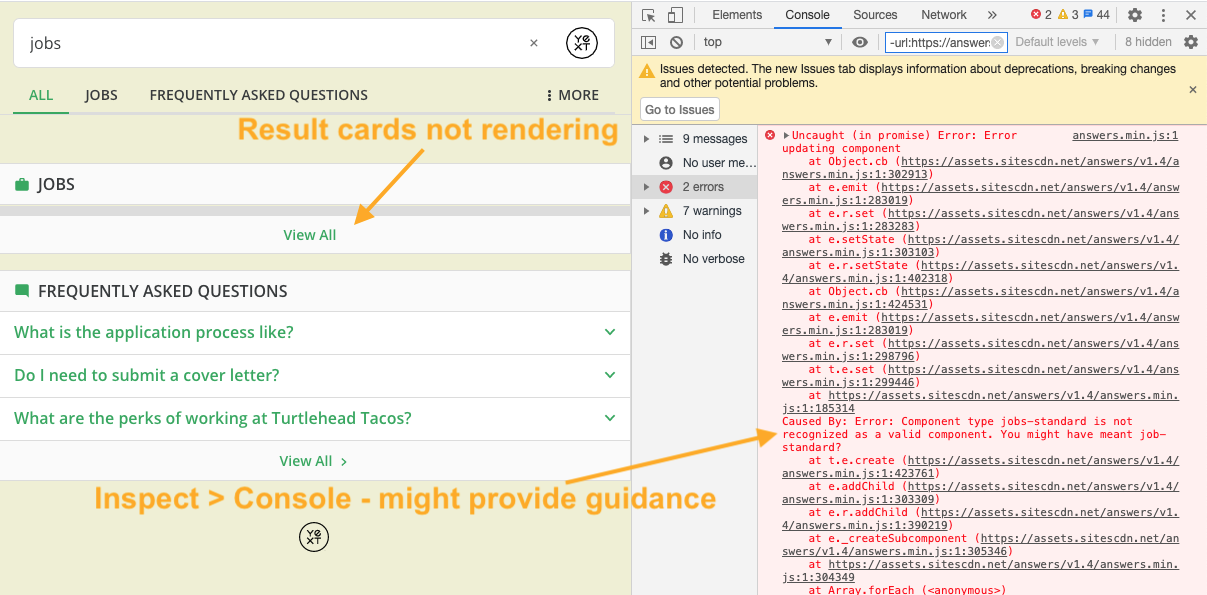
Note that card names in the Theme are case sensitive. Make sure that you specify the card name exactly as it exists in the Theme or in your repository. If you specify the wrong card name, you’ll see that the results won’t render on the page. If this happens, you can inspect the page and go to the console tab.
You should see an error that looks something like this: Caused By: Error: Component type jobs-standard is not recognized as a valid component. You might have meant job-standard?
Use this to help you debug!
 Daily Quiz Streak: 0
 Quiz Accuracy Streak: 0
 Question 1 of 4
Which file or files is a card comprised of?
Question 2 of 4
Which of the following are examples of built-in cards?
Question 3 of 4
What does the JavaScript (component.js) file of a card do?
Question 4 of 4
What does the Handlebars (template.hbs) file of a card do?
Soon you'll be your brand's hero! 🎓
