
 Back
Back
Change Card Structure | Yext Hitchhikers Platform
What You’ll Learn
By the end of this unit, you will be able to:
- Identify which files need to be updated to add various features to a card
- List the two main steps for adding a simple feature, like an icon, to a card
- Add a feature to a card that requires additional data mappings
Overview
Because data is inherently different customer to customer, there may be situations where you want to modify the layout and structure of our standard cards. To do this, you’ll need to fork a card, which you learned in the
Customize Result Cards
unit, which allows you to override the component.js and template.hbs files.
Similar to search pages, you will look to the Handlebars .hbs file to modify the layout and HTML within a card.
Add an Additional Feature to a Card
The most common use case for updating the Handlebars or HTML of a card is to add additional features. This can be things like adding additional lines of text or adding an icon that isn’t on the card by default. Depending on the complexity of the update, you may need to update data mappings which will require you to modify more than the template.hbs file. We will walk through some examples below.
Just like updating pages, whenever you are adding custom HTML to a file, you will need to then add custom CSS styling. Since you are adding custom code, our libraries don’t have default styling set up for those new features.
In the examples below, there was additional CSS added to make the card styling cohesive that isn’t mentioned in depth.
Adding HTML Without Additional Data Mappings
Adding an image or icon to a card is an example of a simpler modification to a card. This type of change requires you to add a line of HTML to the template.hbs.
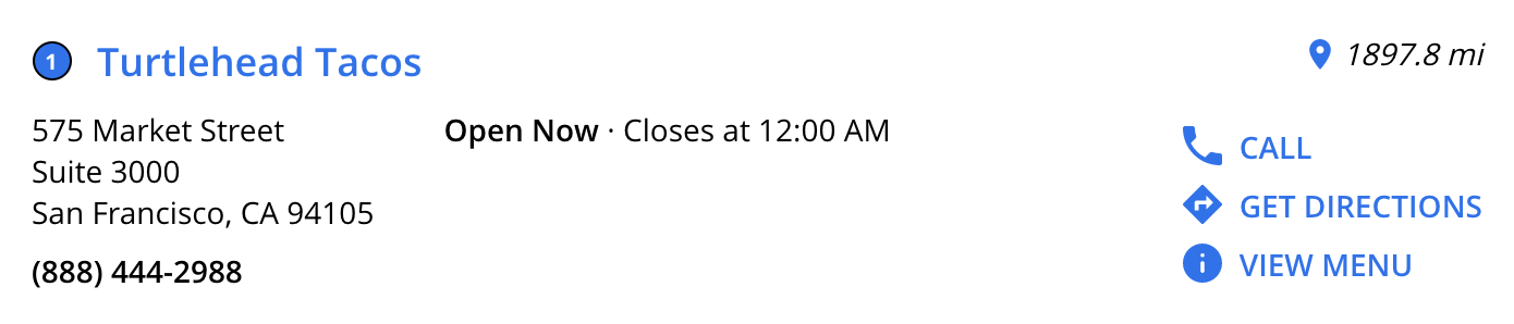
One example might be adding a pin icon next to the distance listed on a location card:
To add the pin, we’ll add in an
SVG
to the template.hbs file within the existing div for HitchhikerLocationStandard-distance. The code for the icon will go before the distance ({{card.distance}}) so that it appears to the left of the text.
We will also contain the icon in a div with a class of HitchhikerLocationStandard-distanceIcon so we can apply styling later.
{{#*inline 'distance'}}
{{#if card.distance}}
<div class="HitchhikerLocationStandard-distance">
  <div class="HitchhikerLocationStandard-distanceIcon">
    <svg xmlns="http://www.w3.org/2000/svg" width="20" height="20" viewBox="0 0 14 20"><path d="M7 0C3.13 0 0 3.13 0 7c0 5.25 7 13 7 13s7-7.75 7-13c0-3.87-3.13-7-7-7zm0 9.5C5.62 9.5 4.5 8.38 4.5 7S5.62 4.5 7 4.5 9.5 5.62 9.5 7 8.38 9.5 7 9.5z"></path></svg>
  </div>
  {{card.distance}}
</div>
{{/if}}
{{/inline}}
Adding HTML With Additional Data Mappings
In cases where we want to add additional content that isn’t hardcoded (i.e., content from fields of an entity), we will need to account for data mappings.
This will require two major file changes:
- template.hbs - to add the HTML feature to the card and indicate which data to pull from
- component.js - to add additional fields to the data mappings in order to return the proper field information (e.g., text or URLs)
Say for example, you want to add a card feature such as a third CTA; you might want a ‘View Menu’ CTA in addition to the default ‘Call’ and ‘Get Directions’ CTAs on a Restaurant card.
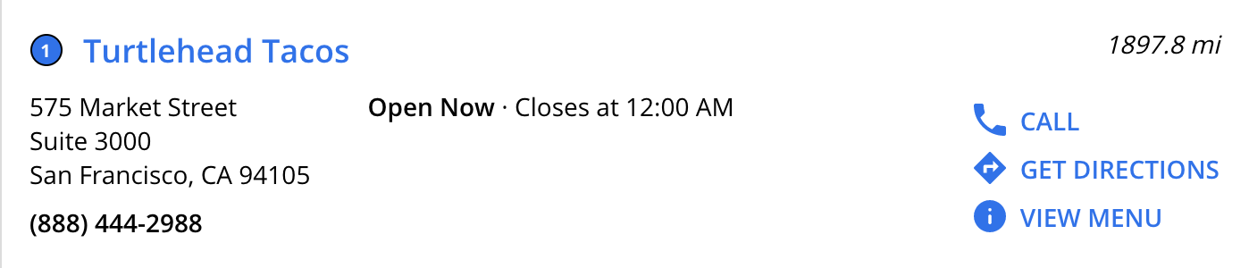
template.hbs
You will first add the third CTA where the other two CTAs are referenced. By adding {{> CTA card.CTA3 ctaName="tertiaryCTA" }} in the CTAs partial, you’re indicating that a third CTA will be added after the primaryCTA and secondaryCTA. This also indicates that the content found in card.CTA3 (which you will define in your component.js file) is what should be pulled in and displayed on the card.
You also will need to check if the data exists in the CTA3 field before trying to place the CTA on the page - you can do this by adding (all card.CTA3 card.CTA3.url) to the if statement.
{{#*inline 'ctas'}}
{{#if (any (all card.CTA1 card.CTA1.url) (all card.CTA2 card.CTA2.url) (all card.CTA3 card.CTA3.url))}}
<div class="HitchhikerLocationStandard-ctasWrapper">
  {{> CTA card.CTA1 ctaName="primaryCTA" }}
  {{> CTA card.CTA2 ctaName="secondaryCTA" }}
  {{> CTA card.CTA3 ctaName="tertiaryCTA" }}
</div>
{{/if}}
{{/inline}}
component.js
Now that we know where to add the third CTA visually on the card, we need to update the data mappings so the proper text and URLs are returned on the card.
Just like we have objects defining CTA1 and CTA2, we’ll add a third object, CTA3, with the same attributes. Then we can adjust what fields we want to return. In this case we are using the menu URL field as the url for the CTA.
CTA1: { // The primary call to action for the card
  iconName: 'phone', // The icon to use for the CTA
  label: 'Call', // The label of the CTA
  url: Formatter.phoneLink(profile), // The URL a user will be directed to when clicking
  target: '_top', // If the URL will be opened in a new tab, etc.
  eventType: 'TAP_TO_CALL', // Type of Analytics event fired when clicking the CTA
  eventOptions: this.addDefaultEventOptions(), // The analytics event options for CTA clicks
},
CTA2: { // The secondary call to action for the card
  label: 'Get Directions',
  iconName: 'directions',
  url: Formatter.getDirectionsUrl(profile),
  target: '_top',
  eventType: 'DRIVING_DIRECTIONS',
  eventOptions: this.addDefaultEventOptions(),
},
CTA3: { // The tertiary call to action for the card
  label: 'View Menu',
  iconName: 'info',
  url: profile.menuUrl ? profile.menuUrl.url : null,
  target: '_top',
  eventType: 'CTA_CLICK',
  eventOptions: this.addDefaultEventOptions(),
} Daily Quiz Streak: 0
 Quiz Accuracy Streak: 0
 Question 1 of 3
What files would you need to change if you'd like to add a third CTA to a card using data from the Knowledge Graph?
Question 2 of 3
True or False: You must fork a card in order to change the layout.
Question 3 of 3
Select the examples where you would edit a card's template.hbs file.
A Hitchhiker in the making! 🔥
