

Custom Result Card Styling Code Examples | Yext Hitchhikers Platform
The following code snippets cover examples of styling result cards.
For code snippets on changing the structure of result cards, check out the Custom Result Card Structure Code Examples reference doc.
Box Shadow Around Card on Hover
Add the following to the answers.scss file:
.[[card name]] {
  transition: box-shadow 0.3s;

  &:hover {
    box-shadow: 0 0 11px rgba(33, 33, 33, 0.2);
  }
}
Universal Search Results with Only Top and Bottom Borders
Add the following to the answers.scss file:
.HitchhikerResultsStandard-title {
  border-left: none;
  border-right: none;
  border-top: none;
  border-bottom: 1px solid #c5bbb1;
}

.HitchhikerResultsStandard-titleLabel {
  border-left: none;
  border-right: none;
  border-top: none;
  border-bottom: none;
}

.HitchhikerResultsStandard-Card {
  border-left: none;
  border-right: none;
  border-top: none;
  border-bottom: 1px solid #c5bbb1;
  padding-bottom: 30px;
  padding-top: 7px;
}

.HitchhikerResultsStandard-viewMore {
  border-left: none;
  border-right: none;
  border-bottom: none;
  border-top: none;
}

.yxt-Card {
  border-left: none;
  border-right: none;
  border-top: none;
  border-bottom: 1px solid #c5bbb1;
}
Prominent Image Unification
The object-fit properties help define the behavior of the image if it isn’t inherently the fixed dimensions.
Add the following to the answers.scss file:
.HitchhikerProductProminentImage-imgWrapper {
  justify-content: center;
  padding: 0.5rem;
}
.HitchhikerProductProminentImage-img {
  width: auto;
  height: 200px;
  object-fit: cover;
  object-position: center;
}
This will standardize your images to all have a height of 200px, with a .5rem border around your images.
Add Circular Headshots
The best way to accomplish this is to do so via the object-fit property. Learn more about this property
here
.
The below CSS would make the images circular, focusing on the center of the image, with a standard size.
Add the following to the answers.scss file:
.HitchhikerProductProminentImage-img {
  width: 100%;
  height: 200px;
  object-fit: cover;
  object-position: center;
  border-radius: 50%;
  padding: 1rem;
}
If you would like to differentiate certain properties for the Desktop and Mobile experiences you can use media queries :
.HitchhikerProductProminentImage-img {
  width: 100%;
  height: 200px;
  object-fit: cover;
  object-position: center;
  border-radius: 50%;
  padding: 1rem;

  @media only screen and (max-width: 768px) {
    border-radius: 0px;
    padding: 0px;
  }
}
Display a List without Bullets
You will utilize list-style-type to display a list on cards and exclude the bullet points.
Add the following to the answers.scss file:
.HitchhikerMenuItemStandard-listItems {
  list-style-type: NONE;
}
Center CTAs Vertically
With the default Handlebars template, the CTAs container will align with the details container on a card. If you’d like to change the alignment, you’ll need to modify the card template slightly.
If you want to shift the CTAs up to align them vertically within the card, rather than align them with the details container, you can move the title and subtitle into the ‘info’ div.
1. Update template.hbs
<div class="HitchhikerProfessionalStandard {{cardName}}">
  {{> image }}
  <div class="HitchhikerProfessionalStandard-body">
    <div class="HitchhikerProfessionalStandard-contentWrapper">
      <div class="HitchhikerProfessionalStandard-info">
        {{> title }}
        {{> subtitle }}
        {{> details }}
        {{> list }}
        {{> phone }}
      </div>
      {{> ctas }}
    </div>
  </div>
</div>
2. Add Styling
You can ensure the contentWrapper div extends the whole height of the card, and use justify-content and align-self to align the CTAs to the middle of the card.
Add the following to the answers.scss file:
.HitchhikerProfessionalStandard-contentWrapper {
  height: 100%;
}

.HitchhikerProfessionalStandard-ctasWrapper {
  justify-content: center;
  align-self: center;
}
Fix CTAs to Bottom of Card
An easy way to make sure the CTAs are fixed to the bottom of the card is to use Flexbox to our advantage.
Assuming you’re using the product-prominentImage card (or a forked version of it), add the following to the answers.scss file:
.HitchhikerProductProminentImage {
  &-body {
    height: 100%;
    display: flex;
    flex-direction: column;
  }

  &-contentWrapper {
    height: 100%;
    justify-content: space-between;
  }
}
This accomplishes the following:
- Specifies the
.HitchhikerProductProminentImage-bodyclass to useflexand take up the full height of the card available after the image - Allows the
.HitchhikerProductProminentImage-contentWrapperclass to take up the full height of the container, and specifies the spacing between the description & the CTAs to bespace-between, forcing the CTAs to the end of the card.
If you don’t have a description, the following CSS may help you as it will set the top margin to fix the CTAs container to the bottom of the card.
.HitchhikerProductProminentImage-ctasWrapper {
  margin-top: auto;
}
Add Dynamic Text Highlighting to a Result Card
When a user inputs a query and Search finds that a certain field is highlighted, that information can be displayed on result cards with the isHighlighted utility function and highlightField formatter.
When you add these to a card, users will see text formatted as "[[field name]]" mentions [[highlighted text]]. For example, if a users searches “Pulitzer Prize” to see which authors have received that award, any authors that are returned will have text on their result card noting that the text in the query matches data in the awards field.
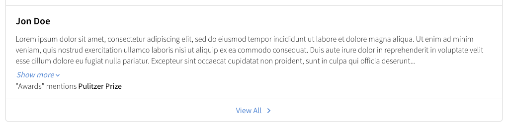
This is to cover the cases where you have keyword search or document search on a field, but it’s not displayed on your card by default.
To do this:
- Create a custom card where you’d like the dynamic highlighting displayed. If you have a custom card already created that you want to add this to, then move to the next step.
In the card’s component.js file, navigate to
dataForRenderobject and add the followingdynamicHighlightsvariable://check if "c_awards" is highlighted var dynamicHighlights = []; if (HitchhikerJS.isHighlighted("c_awards", profile.d_highlightedFields)) { const fullHighlight = profile.d_highlightedFields["c_awards"]; dynamicHighlights.push({ "fieldName": "Awards", "value": Formatter.highlightField(fullHighlight.value, fullHighlight.matchedSubstrings) }); }If you want to check a different field for text matches to highlight, you will update the references to “c_awards” in the code block as well as update
fieldName. For example, if you want to return text from thenamefield, you would use the following://check if "c_awards" is highlighted var dynamicHighlights = []; if (HitchhikerJS.isHighlighted("name", profile.d_highlightedFields)) { const fullHighlight = profile.d_highlightedFields["name"]; dynamicHighlights.push({ "fieldName": "Name", "value": Formatter.highlightField(fullHighlight.value, fullHighlight.matchedSubstrings) }); }List fields also work very similarly. Instead, you’d need to iterate through the items before adding them to your
dynamicHighlightsarray. Here’s an example of adding dynamic highlights with the “Languages” built-in field:if (profile.d_highlightedFields["languages"]) { const fullHighlight = profile.d_highlightedFields["languages"]; for (const item in fullHighlight) { if (fullHighlight[item].matchedSubstrings && fullHighlight[item].matchedSubstrings.length > 0) { dynamicHighlights.push({ "fieldName": "Languages", "value": Formatter.highlightField(fullHighlight[item].value, fullHighlight[item].matchedSubstrings) }); } }; }
In the same component.js file, add a new property,
highlightedField, to the return statement. Set it up to reference the newdynamicHighlightsvariable you just created:highlightedField: dynamicHighlights,When it is complete, the
dataForRenderin your component.js should look something like this:dataForRender(profile) { //check if "c_awards" is highlighted var dynamicHighlights = []; if (HitchhikerJS.isHighlighted("c_awards", profile.d_highlightedFields)) { const fullHighlight = profile.d_highlightedFields["c_awards"]; dynamicHighlights.push({ "fieldName": "Awards", "value": Formatter.highlightField(fullHighlight.value, fullHighlight.matchedSubstrings) }); } return { title: profile.name, // The header text of the card url: profile.website || profile.landingPageUrl, target: '_top', // If the title's URL should open in a new tab, etc. titleEventOptions: this.addDefaultEventOptions(), details: profile.description, // The text in the body of the card highlightedField: dynamicHighlights, //new showMoreDetails: { showMoreLimit: 750, // Character count limit showMoreText: 'Show more', // Label when toggle will show truncated text showLessText: 'Show less' // Label when toggle will hide truncated text } }; }Now add the highlights to the card’s template.js file. Start by adding this code to the bottom of the file:
{{#*inline 'highlightedField'}}
{{#if card.highlightedField}}
<ul class="highlights">
{{#each card.highlightedField}}
  <li class="highlight">"{{this.fieldName}}" mentions {{{this.value}}}</li>
{{/each}}
</ul>
{{/if}}
{{/inline}}
{{!-- other partials below --}}
At the top of your file, there is a code block with the structure of the card. You will see things like title, subtitle, and details in the order that appear on the card. Add
{{> highlightedField}}in the position you want it to display on the card. In most cases you will want to add it below the{{> details}}like so:<div class="HitchhikerStandard {{cardName}}"> {{> image }} <div class="HitchhikerStandard-body"> {{> title }} {{> subtitle }} <div class="HitchhikerStandard-contentWrapper"> <div class="HitchhikerStandard-info"> {{> details }} {{> highlightedField }} </div> {{> ctas }} </div> </div> </div>