

 Back
Back
Step 3: Customize Content
We are no longer implementing new Page Builder sites. This guide is for existing Page Builder clients to maintain their existing Page Builder sites.
We’ve launched a new Pages in-platform experience for marketers. To learn more, check out the guide here.
For current Pages customers interested in accessing these new capabilities in addition to the current experience, talk to your account team to learn more about how to rebuild your pages on this new experience.
Now it’s time to customize your template! The template you created is set up with a default series of modules based on the page type and entity type you selected. These are optimized for that entity type to help you get started adding content and building out your page.
Below we’ll walk through how to customize the modules in your template and the parameters and data mappings in the modules.
Navigating Page Builder Templates
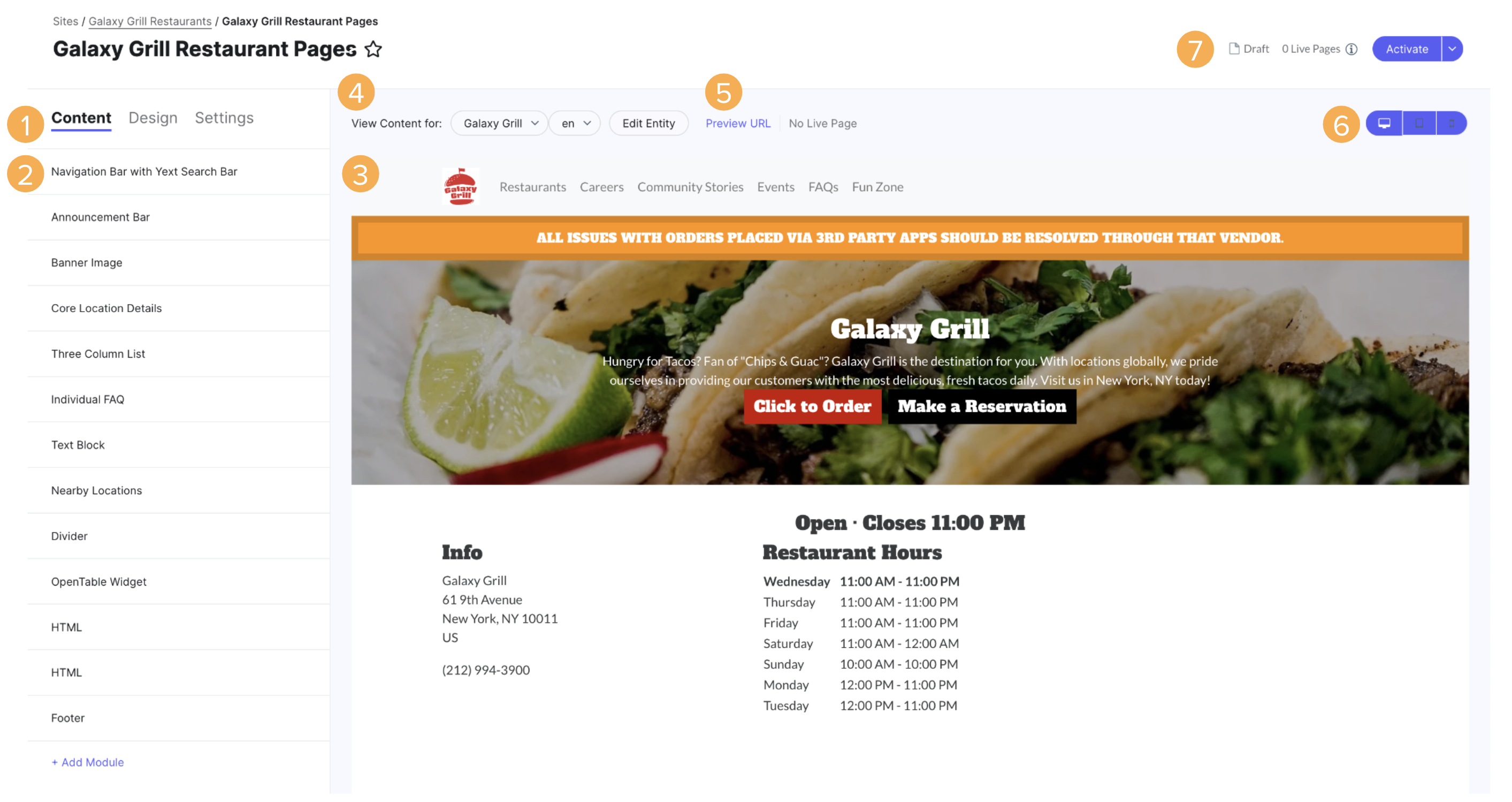
Here, you’ll see a visual editor you can use to edit the template. You can use the tools on the page to:
Navigate between editing the Content, Design (see Step 4: Match Your Brand’s Styling), and Settings (see Step 5: Page Settings & Meta Data) of the template. We’ll discuss editing Content below.
View an outline of the modules in the template. Add, delete, and reorder modules in the outline. Click into a module to edit component properties, such as mapping content to an entity field or a constant value. Clicking into a module will automatically navigate you to that module in the page preview and gray out the rest of the page.
View what the page will look like once it is published for a specific entity. Changes update in the page preview as you click save.
Toggle the entity and locale you want to preview. Click Edit Entity to open the entity in the Knowledge Graph and make any content changes.
- When you are editing a template, remember that you are previewing the template for one entity. To ensure that your pages are configured correctly for each entity, you have the ability to preview what this page will look like for all of your entities.
Open the page preview and live page in new tabs, so you can view the page as a full webpage in a browser. This allows you to share these links to get buy-in and feedback from others. The preview URL will include all local changes, while the live page will only include published changes. Note there is a unique link for each page. Select your desired entity to access the link for a different page.
Change the viewport between mobile, tablet, and desktop views.
Publish your local changes. The first time you do this, you will have to Activate your page template, indicating that you’re ready for it to go live. Once it is live, you can Update your page template when you have local changes that are ready to be published.
Manage Modules
Modules are horizontal segments of content used to build your pages. In Page Builder, there is a wide variety of built-in modules that you can select from to build your pages. Check out the Pages Module Glossary for a list of all available modules.
If you want to add something more custom to your page, you can use an HTML module, which allows you to write your own code, including HTML, JavaScript via <script> tags, and CSS via <style> tags. However, you should use the built-in modules as much as possible as they are browser-tested, device-tested, and represent user experience best practices. Only use the HTML module if none of the built-in ones fit your use case.
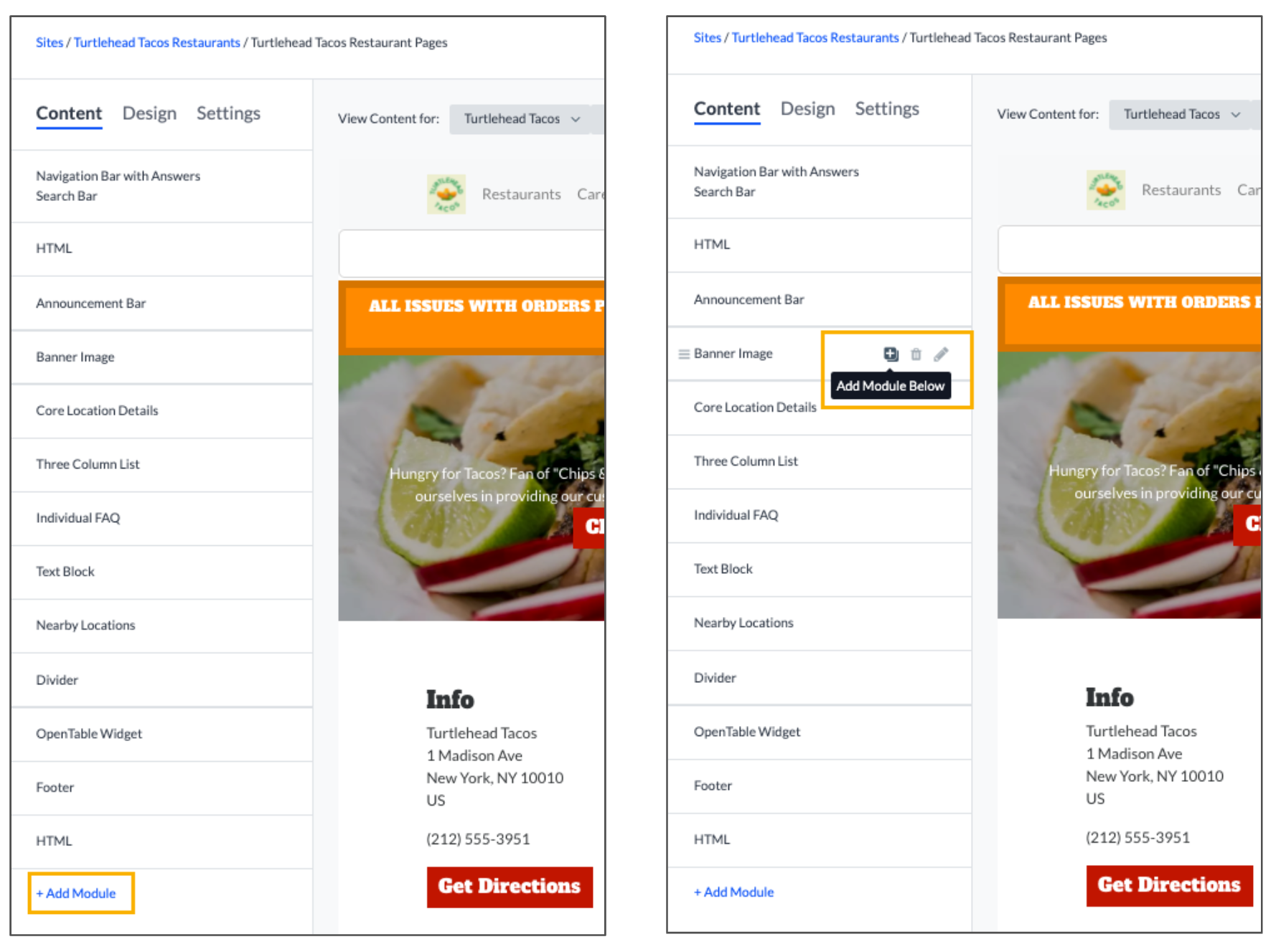
Add Modules
There are two ways to add modules to your pages:
- Click on the + Add Module link at the bottom of the module list. This will add the module to the bottom of the page.
- Click on the plus sign next to the name of a module that has already been added to the page. This will add the new module directly below that module.
Once you click add, a modal will pop up with the list of available modules. Select the desired module and click Add.
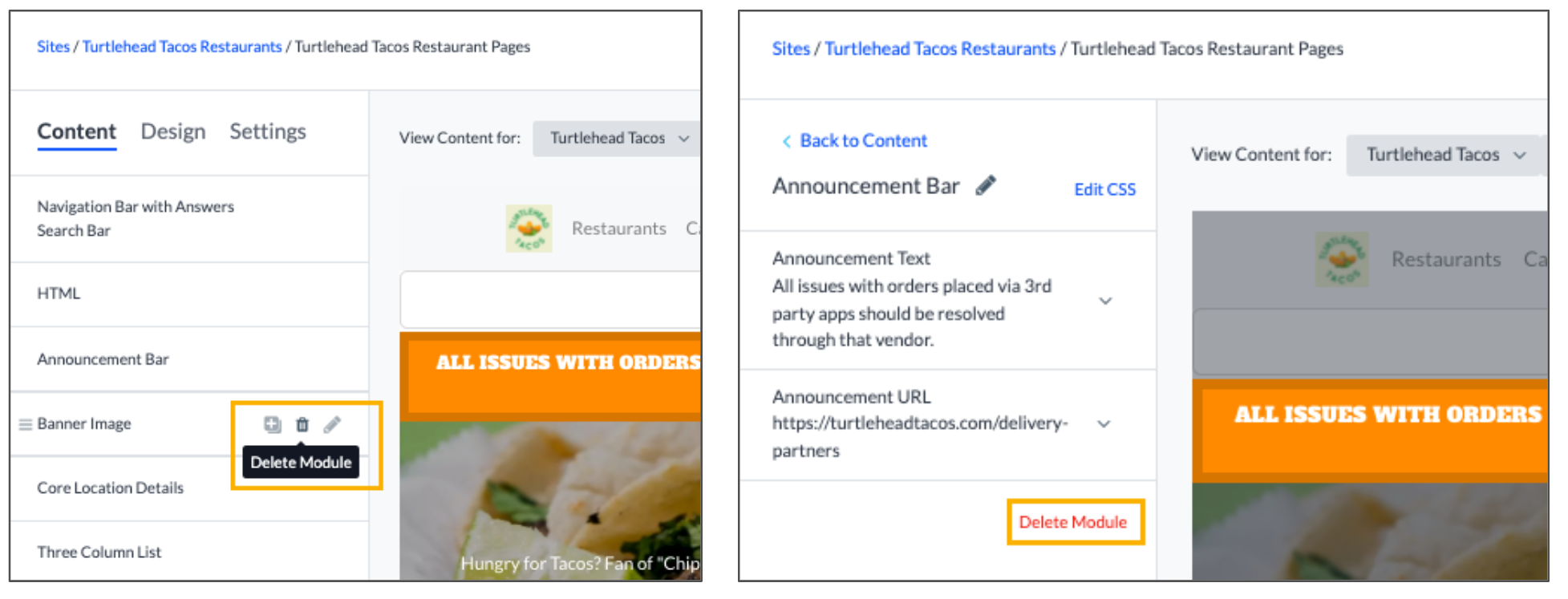
Delete Modules
Just like adding modules, there are also two ways to delete modules:
- Click on the trashcan next to the module name.
- While editing a module, click on the Delete Module link from within the module.
Rearrange Modules
Modules can be dragged and dropped so content is displayed on the page in the desired order. To do this, click on the three lines and drag the module into the desired order.
Edit Modules
There are also two ways to edit modules:
- Click on the module name.
- Click on the pencil icon next to the module name.
Each module is made up of a set of parameters. This is an individual piece of content like headline text, an image, or a button. When you click to edit a module, you will see all of the parameters that make up each module. From there, you can edit and configure each parameter of the module. You can choose how to display content and whether parameters should be displayed or removed from the page.
Data Mapping
Content in module parameters can either be dynamic or hardcoded. Dynamic content is pulled in from a field in the Knowledge Graph.
When mapping content to your pages, you have three options:
Use a constant value: Add hardcoded content, which allows you to display the same text or image on every page (e.g. standard header, call-to-action button).
- If you want to remove a parameter from displaying across all of your pages, select “Use a constant value” and delete the text or the image in the parameter.
Map to an entity field: Select a Knowledge Graph field to pull content for the corresponding entity to display entity-specific information (e.g., location address, start time for an event)
- This option is only available for page templates and static pages.
Map to another entity: Select either a field on a specific entity and display that across all pages (e.g., image of the flagship location, corporate-level branding) or a list of entities associated with the entity of the page, which can vary entity to entity (e.g., nearby locations, services offered at a specific location)
Not all modules will have every option available. To identify which options are available for a specific parameter, click More options.
For HTML modules, using constant HTML will display the same content across all pages. Mapping the content of an HTML module to dynamic content stored in a field in the Knowledge Graph will allow you to customize the HTML per entity. You can use embedded fields to do this automatically or manually change the content.
Dynamic Content
Using the “Map to an entity field” and “Map to another entity” options, any content in your Knowledge Graph can be displayed on your pages. If you want to add content to your pages that is not natively built-in to the Knowledge Graph, you can add it as a custom field .
In order to update content on your pages configured to display dynamically, you will need to update the underlying content in the Knowledge Graph. Updates to the content in the Knowledge Graph will automatically be reflected on your Pages. If content is added or removed from a field in the Knowledge Graph that is mapped to your pages, that content will automatically be added or removed from your page. Thus, it is important to preview the page for each entity to ensure the page looks correct based on the information that is being pulled in from the Knowledge Graph.
When you select a field to map to, you will see a preview of that content next to the field name in the sidebar. Once you click Save, the content will appear in the Live Preview on the right. If the field you selected does not have any content, the module field will not appear in the preview until the content is added in the Knowledge Graph.
When selecting fields to map to, you will only see options of the same field type. For example, if you are mapping a URL field, you can only select from a list of URL fields.
Map to Other Entities
You can map content to other entities through a list of linked entities on each entity, a list of linked entities from a specific entity, or a list of entities in a saved filter .
Mapping content to linked entities on that entity is the best way to dynamically display content from other entities. This pulls from the list of associated entities, which can vary per entity. For example, if one location has three associated entities, and one location has two associated entities, the pages for those locations will display three or two entities on the page accordingly.
To set up the Knowledge Graph to link entities, you will need to create an entity relationship custom field and add it to the entity. Follow the Link Entities help article for instructions. If the type of content you want to link does not yet exist in the Knowledge Graph, you can Create a Custom Entity Type . Then fill in the field with the relevant content.
Once you’ve set up your Knowledge Graph, add a list module to your pages to display information from the linked entities on the page. When editing the module, click Choose List Source to choose the list the content should come from. Then map each individual parameter to the field on the linked entity.
The callouts for dynamic content above also apply here.
Now that you’ve read about the options you have for customizing your content, apply it to your own template!
Appendix: Common Use Cases for HTML Modules
Below are some common examples of using HTML modules, should you decide to use them. You can edit both the HTML and the CSS of these modules, which you’ll learn more about in the Match Your Brand’s Styling step.
Header or Footer
Every website needs a header and footer, and HTML modules are great ways to get that done if they want something slightly different than the built-in modules. Here’s a simple example of both — a header fixed to the top of the page with a few links, and a basic footer.
Header Example

Footer Example

<!--HTML-->
<header class="header">
  <a class="header-logo" href="company.com">
    <img class="header-logo-img" src="https://dynl.mktgcdn.com/p/GNjiogcWU_0N0rVIqQ9IklYOJkkNtxj0MA85hoDNTtQ/3000x3000.png" alt="Header Logo"/>
  </a>
  <div class="header-links">
    <a class="header-link" href="/who-we-are">Who We Are</a>
    <a class="header-link" href="/what-we-do">What We Do</a>
    <a class="header-link" href="how-to-join">How to Join</a>
  </div>
</header>

<footer class="footer">
  Copyright Turtlehead Tacos 2020, All Rights Reserved
</footer>

<!--CSS-->
<style>
  .header
  {
    width: 100vw;
    top: 0;
    left: 0;
    position: fixed;
    display: flex;
    justify-content: space-between;
    align-items: center;
    background-color: #EFEFD4;

    &-logo
    {
      padding: 10px;

      &-img
      {
        width: 65px;
        height: 60px;
      }
    }

    &-links
    {
      height: 100%;
      display: flex;
      align-items: center;
    }

    &-link
    {
      margin: 0 20px;
      color: green;

      &:hover
      {
        opacity: 0.75;
      }
    }
  }

  .footer
  {
    width: 100%;
    padding: 10px 20px;
    background-color: black;
    color: white;
    text-align: center;
  }
</style>
Custom Layout
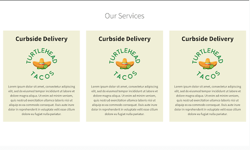
Here’s a custom module written with HTML and a bit of CSS to style. You’ll see from the source code how the HTML code defines the structure of the website between child elements and parents, and how CSS can enhance that structure. One thing you’ll notice in the code that isn’t immediately obvious in the screenshot — the cards are interactive, and can lead you to different parts of the site.
Modified Three Column Layout
<!--HTML-->

<h1 class="services-title">Our Services</h1>
<div class="services">
  <a class="services-item" href=".">
    <h3 class="services-item-title">Curbside Delivery</h3>
    <img class="services-item-img" src="https://dynl.mktgcdn.com/p/GNjiogcWU_0N0rVIqQ9IklYOJkkNtxj0MA85hoDNTtQ/3000x3000.png">
    <p class="services-item-description">Lorem ipsum dolor sit amet, consectetur adipiscing elit, sed do eiusmod tempor incididunt ut labore et dolore magna aliqua. Ut enim ad minim veniam, quis nostrud exercitation ullamco laboris nisi ut aliquip ex ea commodo consequat. Duis aute irure dolor in reprehenderit in voluptate velit esse cillum dolore eu fugiat nulla pariatur.</p>
  </a>
</div>

<!--CSS-->
<style>
  .services
  {
    display: flex;
    flex-direction: row;

    &-title
    {
      width: 100%;
      text-align: center;
      margin: 50px 0;
    }

    &-item
    {
      display: flex;
      flex-direction: column;
      justify-content: center;
      align-items: center;
      margin: 0 15px;
      padding: 10px 20px;
      color: black;
      background-color: #EFEFD4;

      &-img
      {
        width: 200px;
        height: 180px;
        margin-bottom: 10px;
      }

      &-title
      {
        font-weight: bold;
        font-size: 32px;
        margin: 10px 0;
      }

      &-description
      {
        text-align: center;
      }
    }
  }
</style>
Embedding Javascript or HTML Widgets
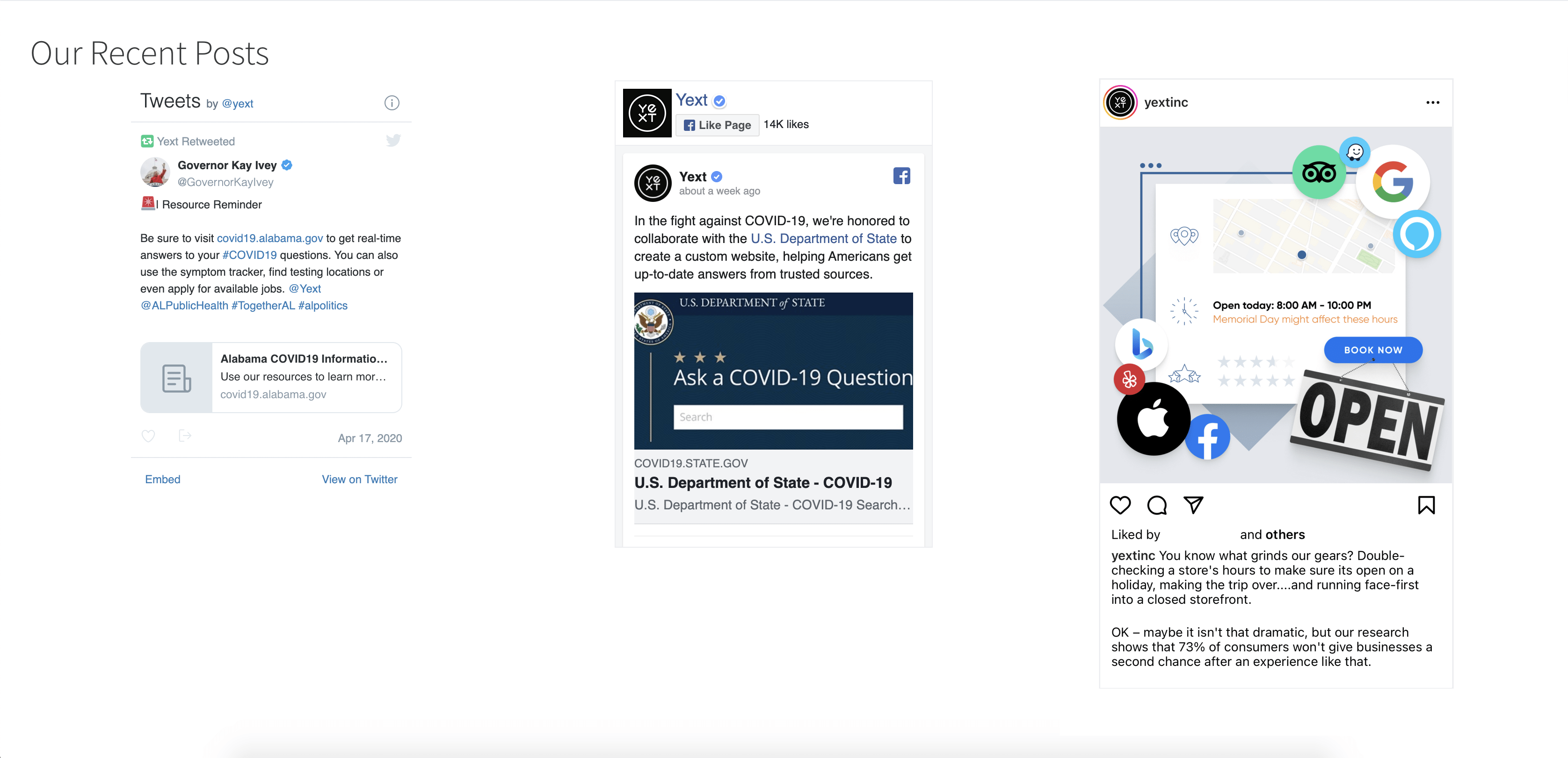
One use case for the HTML Module is embedding third-party JS or HTML snippets that add additional content or functionality to your site. Oftentimes, these third-party providers will give you the code that you will need to simply copy and paste into the HTML module.
In this example, we’ve added three social media widgets — a Twitter widget pulling in recent tweets from Yext, a Facebook Widget pulling in Facebook posts from Yext, and a recent Instagram post of @yextinc.
You can find instructions on how to get the embed codes for your specific accounts below:
<!--HTML-->
<h1>Our Recent Posts</h1>
<div class="social-media">
<div class="social-media-item twitter">
<a class="twitter-timeline" data-height="450" href="https://twitter.com/yext?ref_src=twsrc%5Etfw">Tweets by yext</a>
<script async src="https://platform.twitter.com/widgets.js" charset="utf-8"></script>
</div>
<div class="social-media-item facebook">
<iframe src="https://www.facebook.com/plugins/page.php?href=https%3A%2F%2Fwww.facebook.com%2FYextInc&tabs=timeline&width=340&height=500&small_header=true&adapt_container_width=true&hide_cover=true&show_facepile=false&appId" width="340" height="500" style="border:none;overflow:hidden" scrolling="no" frameborder="0" allowTransparency="true" allow="encrypted-media"></iframe>
</div>
<div class="social-media-item instagram">
<blockquote class="instagram-media" data-instgrm-captioned data-instgrm-permalink="https://www.instagram.com/p/B4NhjMilxYJ/?utm_source=ig_embed&utm_campaign=loading" data-instgrm-version="12" style=" background:#FFF; border:0; border-radius:3px; box-shadow:0 0 1px 0 rgba(0,0,0,0.5),0 1px 10px 0 rgba(0,0,0,0.15); margin: 1px; max-width:540px; min-width:326px; padding:0; width:99.375%; width:-webkit-calc(100% - 2px); width:calc(100% - 2px);"><div style="padding:16px;"> <a href="https://www.instagram.com/p/B4NhjMilxYJ/?utm_source=ig_embed&utm_campaign=loading" style=" background:#FFFFFF; line-height:0; padding:0 0; text-align:center; text-decoration:none; width:100%;" target="_blank"> <div style=" display: flex; flex-direction: row; align-items: center;"> <div style="background-color: #F4F4F4; border-radius: 50%; flex-grow: 0; height: 40px; margin-right: 14px; width: 40px;"></div> <div style="display: flex; flex-direction: column; flex-grow: 1; justify-content: center;"> <div style=" background-color: #F4F4F4; border-radius: 4px; flex-grow: 0; height: 14px; margin-bottom: 6px; width: 100px;"></div> <div style=" background-color: #F4F4F4; border-radius: 4px; flex-grow: 0; height: 14px; width: 60px;"></div></div></div><div style="padding: 19% 0;"></div> <div style="display:block; height:50px; margin:0 auto 12px; width:50px;"><svg width="50px" height="50px" viewBox="0 0 60 60" version="1.1" xmlns="https://www.w3.org/2000/svg" xmlns:xlink="https://www.w3.org/1999/xlink"><g stroke="none" stroke-width="1" fill="none" fill-rule="evenodd"><g transform="translate(-511.000000, -20.000000)" fill="#000000"><g><path d="M556.869,30.41 C554.814,30.41 553.148,32.076 553.148,34.131 C553.148,36.186 554.814,37.852 556.869,37.852 C558.924,37.852 560.59,36.186 560.59,34.131 C560.59,32.076 558.924,30.41 556.869,30.41 M541,60.657 C535.114,60.657 530.342,55.887 530.342,50 C530.342,44.114 535.114,39.342 541,39.342 C546.887,39.342 551.658,44.114 551.658,50 C551.658,55.887 546.887,60.657 541,60.657 M541,33.886 C532.1,33.886 524.886,41.1 524.886,50 C524.886,58.899 532.1,66.113 541,66.113 C549.9,66.113 557.115,58.899 557.115,50 C557.115,41.1 549.9,33.886 541,33.886 M565.378,62.101 C565.244,65.022 564.756,66.606 564.346,67.663 C563.803,69.06 563.154,70.057 562.106,71.106 C561.058,72.155 560.06,72.803 558.662,73.347 C557.607,73.757 556.021,74.244 553.102,74.378 C549.944,74.521 548.997,74.552 541,74.552 C533.003,74.552 532.056,74.521 528.898,74.378 C525.979,74.244 524.393,73.757 523.338,73.347 C521.94,72.803 520.942,72.155 519.894,71.106 C518.846,70.057 518.197,69.06 517.654,67.663 C517.244,66.606 516.755,65.022 516.623,62.101 C516.479,58.943 516.448,57.996 516.448,50 C516.448,42.003 516.479,41.056 516.623,37.899 C516.755,34.978 517.244,33.391 517.654,32.338 C518.197,30.938 518.846,29.942 519.894,28.894 C520.942,27.846 521.94,27.196 523.338,26.654 C524.393,26.244 525.979,25.756 528.898,25.623 C532.057,25.479 533.004,25.448 541,25.448 C548.997,25.448 549.943,25.479 553.102,25.623 C556.021,25.756 557.607,26.244 558.662,26.654 C560.06,27.196 561.058,27.846 562.106,28.894 C563.154,29.942 563.803,30.938 564.346,32.338 C564.756,33.391 565.244,34.978 565.378,37.899 C565.522,41.056 565.552,42.003 565.552,50 C565.552,57.996 565.522,58.943 565.378,62.101 M570.82,37.631 C570.674,34.438 570.167,32.258 569.425,30.349 C568.659,28.377 567.633,26.702 565.965,25.035 C564.297,23.368 562.623,22.342 560.652,21.575 C558.743,20.834 556.562,20.326 553.369,20.18 C550.169,20.033 549.148,20 541,20 C532.853,20 531.831,20.033 528.631,20.18 C525.438,20.326 523.257,20.834 521.349,21.575 C519.376,22.342 517.703,23.368 516.035,25.035 C514.368,26.702 513.342,28.377 512.574,30.349 C511.834,32.258 511.326,34.438 511.181,37.631 C511.035,40.831 511,41.851 511,50 C511,58.147 511.035,59.17 511.181,62.369 C511.326,65.562 511.834,67.743 512.574,69.651 C513.342,71.625 514.368,73.296 516.035,74.965 C517.703,76.634 519.376,77.658 521.349,78.425 C523.257,79.167 525.438,79.673 528.631,79.82 C531.831,79.965 532.853,80.001 541,80.001 C549.148,80.001 550.169,79.965 553.369,79.82 C556.562,79.673 558.743,79.167 560.652,78.425 C562.623,77.658 564.297,76.634 565.965,74.965 C567.633,73.296 568.659,71.625 569.425,69.651 C570.167,67.743 570.674,65.562 570.82,62.369 C570.966,59.17 571,58.147 571,50 C571,41.851 570.966,40.831 570.82,37.631"></path></g></g></g></svg></div><div style="padding-top: 8px;"> <div style=" color:#3897f0; font-family:Arial,sans-serif; font-size:14px; font-style:normal; font-weight:550; line-height:18px;"> View this post on Instagram</div></div><div style="padding: 12.5% 0;"></div> <div style="display: flex; flex-direction: row; margin-bottom: 14px; align-items: center;"><div> <div style="background-color: #F4F4F4; border-radius: 50%; height: 12.5px; width: 12.5px; transform: translateX(0px) translateY(7px);"></div> <div style="background-color: #F4F4F4; height: 12.5px; transform: rotate(-45deg) translateX(3px) translateY(1px); width: 12.5px; flex-grow: 0; margin-right: 14px; margin-left: 2px;"></div> <div style="background-color: #F4F4F4; border-radius: 50%; height: 12.5px; width: 12.5px; transform: translateX(9px) translateY(-18px);"></div></div><div style="margin-left: 8px;"> <div style=" background-color: #F4F4F4; border-radius: 50%; flex-grow: 0; height: 20px; width: 20px;"></div> <div style=" width: 0; height: 0; border-top: 2px solid transparent; border-left: 6px solid #f4f4f4; border-bottom: 2px solid transparent; transform: translateX(16px) translateY(-4px) rotate(30deg)"></div></div><div style="margin-left: auto;"> <div style=" width: 0px; border-top: 8px solid #F4F4F4; border-right: 8px solid transparent; transform: translateY(16px);"></div> <div style=" background-color: #F4F4F4; flex-grow: 0; height: 12px; width: 16px; transform: translateY(-4px);"></div> <div style=" width: 0; height: 0; border-top: 8px solid #F4F4F4; border-left: 8px solid transparent; transform: translateY(-4px) translateX(8px);"></div></div></div></a> <p style=" margin:8px 0 0 0; padding:0 4px;"> <a href="https://www.instagram.com/p/CeBhpTqOpbG/?utm_source=ig_embed&utm_campaign=loading" style=" color:#000; font-family:Arial,sans-serif; font-size:14px; font-style:normal; font-weight:normal; line-height:17px; text-decoration:none; word-wrap:break-word;" target="_blank">You know what grinds our gears? Double-checking a store's hours to make sure its open on a holiday, making the trip over....and running face-first into a closed storefront. OK – maybe it isn't that dramatic, but our research shows that 73% of consumers won't give businesses a second chance after an experience like that.</a></p> <p style=" color:#c9c8cd; font-family:Arial,sans-serif; font-size:14px; line-height:17px; margin-bottom:0; margin-top:8px; overflow:hidden; padding:8px 0 7px; text-align:center; text-overflow:ellipsis; white-space:nowrap;">A post shared by <a href="https://www.instagram.com/yextinc/?utm_source=ig_embed&utm_campaign=loading" style=" color:#c9c8cd; font-family:Arial,sans-serif; font-size:14px; font-style:normal; font-weight:normal; line-height:17px;" target="_blank"> Yext</a> (@yextinc) on <time style=" font-family:Arial,sans-serif; font-size:14px; line-height:17px;" datetime="2019-10-29T17:57:36+00:00">Oct 29, 2019 at 10:57am PDT</time></p></div></blockquote>
<script async src="//www.instagram.com/embed.js"></script>
</div>
</div>
<!--CSS-->
<style>
margin: 32px;
.social-media
{
display: flex;
flex-direction: row;
justify-content: space-around;
&-item
{
margin: 0px 16px;
}
}
</style>