
 Back
Back
CSS Units of Measurement - Absolute vs. Relative | Yext Hitchhikers Platform
What You’ll Learn
In this section, you will learn:
- How to define the absolute size of elements
- How to define the relative size of elements
An important aspect of CSS is defining the size of elements on the page - the font-size of text, the height and width of containers, and the margin or padding of an element, to name a few examples. There are a few ways you can define these units of measurement. We’ll go through the most common ways below.
Absolute Sizing
Pixels
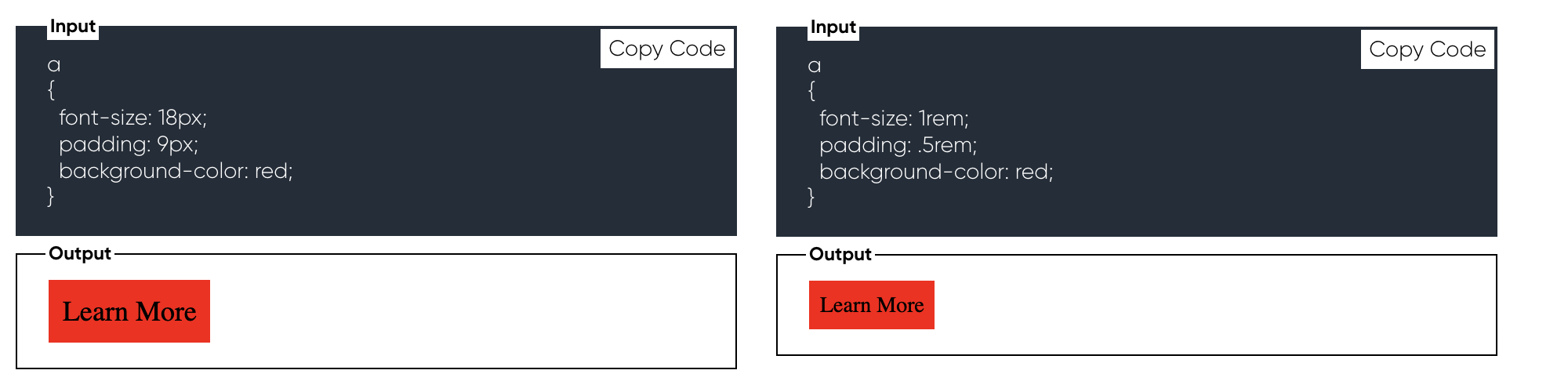
Pixels (written as px in CSS) are used most to define the absolute size of an element. If you define an attribute in pixels, this will not change no matter a user’s screen size. See an example below.
Here, we’re setting the font-size to be 18px, and the padding to be 9px. However, this sizing isn’t very flexible - we won’t be able to resize the font & padding to optimize for screen size, nor will users who opt to view elements in large-text for accessibility be able to increase or decrease the size.
Relative Sizing
Relative sizing allows you to dynamically size components based on a constant value. This allows for a more responsive and accessible design.
rem and em
- rem will size the element relative to the root - aka, whatever the base sizing of your
htmlelement is. - em will size the element relative to its parent container.
We’ll typically use rem in order to keep sizing consistent and relative to the same thing.
See an example below:
This may look exactly the same as the absolute example (because it is!). However, try decreasing your browser width. You’ll notice that the first example stays constant, while the second resizes to be smaller on smaller screens because this page defines the <html> font-size to be different across screen sizes.
We recommend using rem whenever possible. You’ll see this appear in Page Builder and Search CSS.
Percentages
A common way to indicate the width and height of elements is through percentages. This will indicate the percentage of the parent container that the element should occupy.
For example, in the below example, the container will take 75% of the width of its container.
Try changing this to 33% and see what happens!
 Daily Quiz Streak: 0
 Quiz Accuracy Streak: 0
 Question 1 of 3
What are the different ways you can define relative size? (Select all that apply)
Question 2 of 3
True or False: Pixels are best for responsive design.
Question 3 of 3
True or False: rem is sizing relative to the child container
A Hitchhiker in the making! 🔥
