

 Back
Back
Step 4: Optionally Further Style the Search Bar
The Yext Search Bar is designed to look great out of the box. You can further style it to fit your brand’s needs. Here are the most important CSS classes.
| Class | Details |
|---|---|
| .yxt-SearchBar-container | Controls border and radius of the container |
| .yxt-SearchBar-input | The input itself |
| .yxt-SearchBar-button | Search Button |
| .yxt-SearchBar-clear | Clear Button |
| .yxt-SearchBar-form | Form |
| .yxt-AutoComplete-wrapper | Wrapper around autocomplete |
| .yxt-AutoComplete-option | Autocomplete option |
| .yxt-AutoComplete-option.yxt-selected | Selected autocomplete (using keyboard) |
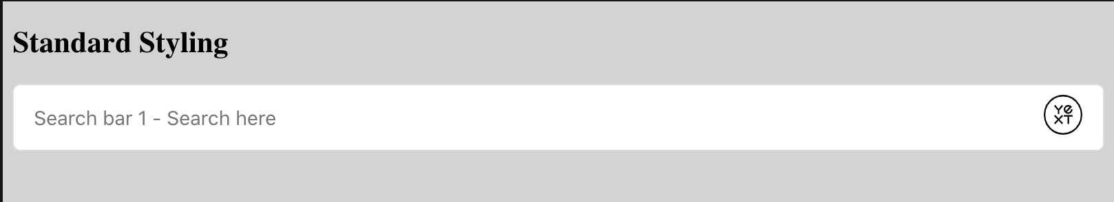
The Standard Searchbar Styling could look as follows:
Below are examples of search bars styled in different ways.
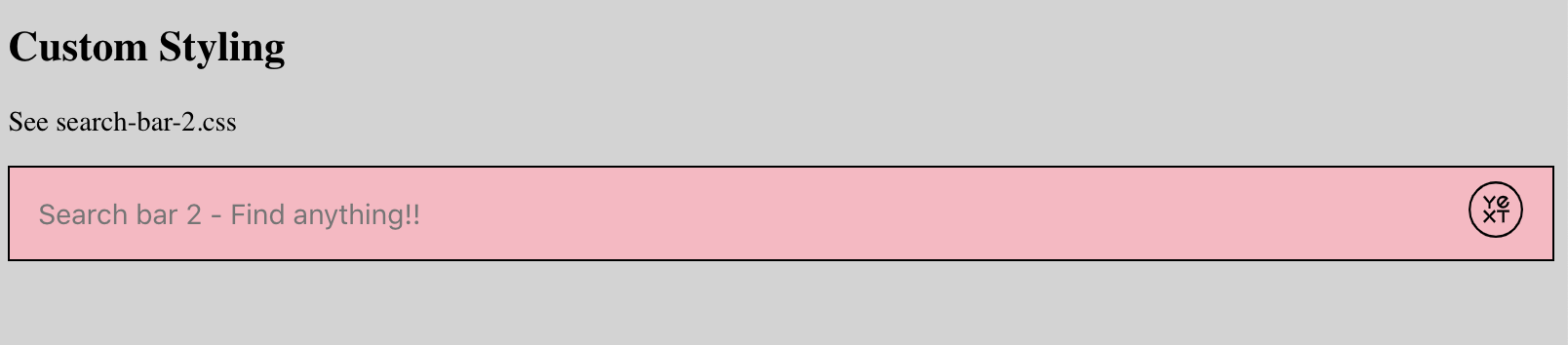
Changing the Color of the Search Bar
The first Custom styling example uses the following CSS:
/* Border and Radius */
.search-bar-container-2 .yxt-SearchBar-container {
  border-radius: 0px;
  border: 1px solid black;
}

/* Background Color */
.search-bar-container-2 .yxt-SearchBar-button,
.search-bar-container-2 .yxt-SearchBar-clear,
.search-bar-container-2 .yxt-SearchBar-form,
.search-bar-container-2 .yxt-AutoComplete-wrapper {
  background-color: lightpink;
}

/* Seperator bewteen autocomplete and search bar */
.search-bar-container-2 .yxt-AutoComplete:before {
  background-color: black;
}

.search-bar-container-2 .yxt-AutoComplete-option.yxt-selected,
.search-bar-container-2 .yxt-AutoComplete-option:hover {
  background-color: darkorchid;
  color: white;
}
This renders a pink toned search bar like so:
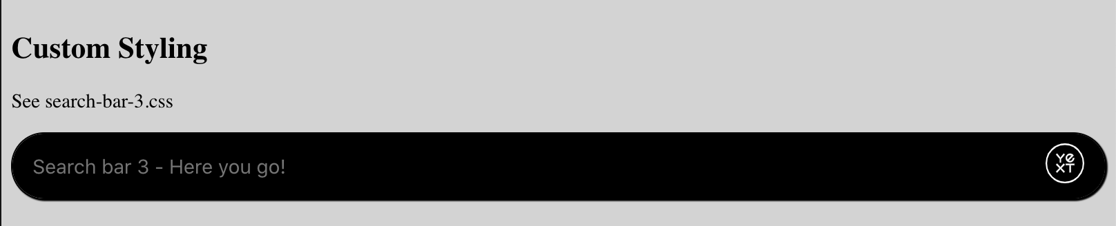
Search Bar with Rounded Edges
Another Custom styling example could use this CSS:
/* Border and Rdadiu */
.search-bar-container-3 .yxt-SearchBar-container {
  border-radius: 28px;
  border: 1px solid black;
  box-shadow: 1px 1px 1px black;
  color: white;
}

/* Background Color */
.search-bar-container-3 .yxt-SearchBar-button,
.search-bar-container-3 .yxt-SearchBar-clear,
.search-bar-container-3 .yxt-SearchBar-form,
.search-bar-container-3 .yxt-AutoComplete-wrapper {
  background-color: black;
}

/* Text Color */
.search-bar-container-3 .yxt-AutoComplete-option,
.search-bar-container-3 .yxt-SearchBar-input {
  color: white;
}

/* Seperator bewteen autocomplete and search bar */
.search-bar-container-3 .yxt-AutoComplete:before {
  background-color: black;
}

/* Hover / Selected State */
.search-bar-container-3 .yxt-AutoComplete-option.yxt-selected,
.search-bar-container-3 .yxt-AutoComplete-option:hover {
  background-color: darkblue;
  color: white;
}

/* Changing the icon color */
.search-bar-container-3 .yxt-SearchBar-clear,
.search-bar-container-3 svg {
  color: white;
  fill: white;
}

.search-bar-container-3 path {
  stroke: white;
}
This renders the search bar black with round edges like so:
Visit this Code Sandbox below to see live working code that renders these custom styled search bars:
Typed Animation
One nice UI trick to encourage more users to search is to show a user typing in the input. In fact, our UX research team undertook a research study to try and better understand what tactics prompted more people to use site search over others. We found that rotating, animated placeholder text takes advantage of multiple descriptive prompts and goes beyond Suggestion Pills with a search box that truly grabs attention. View the full UX research report here .
While the Search JS library doesn’t support this by default, this can easily be added using Typed.js .
First we will get the options via the /autocomplete endpoint and then we feed those options into the Typed. This should happen after the
SearchBar component is added to the page. We are using axios to handle the API request.
<html lang="en">
  <head>
    <meta charset="UTF-8" />
    <meta name="viewport" content="width=device-width, initial-scale=1.0" />
    <meta http-equiv="X-UA-Compatible" content="ie=edge" />
    <title>Search bar with Typed</title>
    <link
      rel="stylesheet"
      type="text/css"
      href="https://assets.sitescdn.net/answers/v1.5/answers.css"
    />
    <script src="https://assets.sitescdn.net/answers/v1.5/answers.min.js"></script>
    <script src="https://cdn.jsdelivr.net/npm/typed.js@2.0.11"></script>
    <script src="https://cdn.jsdelivr.net/npm/axios/dist/axios.min.js"></script>
  </head>
  <body>
    <div class="search-bar-container"></div>
    <script>
      const apiKey = "REPLACE_ME_API_KEY";
      const experienceKey = "REPLACE_ME_EXPERIENCE_KEY";
      const experienceVersion = "PRODUCTION";
      const businessId = "REPLACE_ME_BUSINESS_ID";
      const locale = "en";
      const cloudRegion = "us";
      const cloudChoice = "multi";
      ANSWERS.init({
        apiKey: apiKey,
        experienceKey: experienceKey,
        businessId: businessId,
        experienceVersion: experienceVersion,
        locale: locale,
        cloudRegion: cloudRegion,
        cloudChoice: cloudChoice,
        onReady: function() {
          this.addComponent("SearchBar", {
            container: ".search-bar-container",
          });

          // Make API Call to Options
          var url = 'https://liveapi-cached.yext.com/v2/accounts/me/answers/autocomplete';
          url += '?v=20190101';
          url += '&api_key=' + apiKey;
          url += '&sessionTrackingEnabled=false';
          url += '&experienceKey=' + experienceKey;
          url += '&input=';
          url += '&version=' + experienceVersion;
          url += '&locale=' + locale;

          axios.get(url).then(function(response) {
            // Get strings from response
            const strings = response.data.response.results.map(function(r) {
              return r.value;
            });

            // Set up Typed
            var options = {
              strings: strings,
              showCursor: true,
              cursorChar: "|",
              typeSpeed: 45,
              backSpeed: 20,
              smartBackspace: true,
              loop: true,
              startDelay: 500,
              backDelay: 2000,
              attr: "placeholder",
            };

            var typed = new Typed(".js-yext-query", options);
          });
        },
      });
    </script>
  </body>
</html>
Typed Animation for EU Cloud Region
If you want to host your data in the EU, you should reference the URL https://cdn-cached.eu.yextapis.com/v2/accounts/me/answers/autocomplete instead of https://liveapi-cached.yext.com/v2/accounts/me/answers/autocomplete. The changes from step 1 still apply, so your code snippet should look something like:
<html lang="en">
  <head>
    <meta charset="UTF-8" />
    <meta name="viewport" content="width=device-width, initial-scale=1.0" />
    <meta http-equiv="X-UA-Compatible" content="ie=edge" />
    <title>Search bar with Typed</title>
    <link
      rel="stylesheet"
      type="text/css"
      href="https://assets.eu.sitescdn.net/answers/v1.5/answers.css"
    />
    <script src="https://assets.eu.sitescdn.net/answers/v1.5/answers.min.js"></script>
    <script src="https://cdn.jsdelivr.net/npm/typed.js@2.0.11"></script>
    <script src="https://cdn.jsdelivr.net/npm/axios/dist/axios.min.js"></script>
  </head>
  <body>
    <div class="search-bar-container"></div>
    <script>
      const apiKey = "REPLACE_ME_API_KEY";
      const experienceKey = "REPLACE_ME_EXPERIENCE_KEY";
      const experienceVersion = "PRODUCTION";
      const businessId = "REPLACE_ME_BUSINESS_ID";
      const locale = "en_GB";
      const cloudRegion = "eu";
      const cloudChoice = "gcp";
      ANSWERS.init({
        apiKey: apiKey,
        experienceKey: experienceKey,
        businessId: businessId,
        experienceVersion: experienceVersion,
        locale: locale,
        cloudRegion: cloudRegion,
        cloudChoice: cloudChoice,
        onReady: function() {
          this.addComponent("SearchBar", {
            container: ".search-bar-container",
          });

          // Make API Call to Options
          var url = 'https://cdn-cached.eu.yextapis.com/v2/accounts/me/answers/autocomplete';
          url += '?v=20190101';
          url += '&api_key=' + apiKey;
          url += '&sessionTrackingEnabled=false';
          url += '&experienceKey=' + experienceKey;
          url += '&input=';
          url += '&version=' + experienceVersion;
          url += '&locale=' + locale;
          url += '&cloudRegion=' + cloudRegion;
          url += '&cloudChoice=' + cloudChoice;

          axios.get(url).then(function(response) {
            // Get strings from response
            const strings = response.data.response.results.map(function(r) {
              return r.value;
            });

            // Set up Typed
            var options = {
              strings: strings,
              showCursor: true,
              cursorChar: "|",
              typeSpeed: 45,
              backSpeed: 20,
              smartBackspace: true,
              loop: true,
              startDelay: 500,
              backDelay: 2000,
              attr: "placeholder",
            };

            var typed = new Typed(".js-yext-query", options);
          });
        },
      });
    </script>
  </body>
</html>
Using a Sandbox Account
To test typed animation for a Search experience built in sandbox, the API call of the above code snippet should look like:
var url = 'https://liveapi-sandbox.yext.com/v2/accounts/me/answers/autocomplete';
url += '?v=20190101';
url += '&api_key=' + 'exampleapikey123';
url += '&sessionTrackingEnabled=false';
url += '&experienceKey=' + experienceKey;
url += '&input=';
url += '&version=' + experienceVersion;
url += '&locale=' + locale;
Notice the URL uses a sandbox link. Additionally, add the API key as is without a prepended “sandbox”. This differs from the code snippet in the first step which did prepend “sandbox” to initialize the library.
Example
Here is a working example:
Updating the Logo
If you would like to replace the Yext logo when integrating the search bar on your site, you have the option of using a built-in icon from our library or using your own icon. To do so, add one of the following to the addComponent call to initialize the search bar from step 1:
- submitIcon: “magnifying_glass”`
- The
submitIconproperty allows you to use a built-in icon from our library that you loaded in step 1. - If you use an icon, we recommend choosing the magnifying glass to indicate to users this is a search bar, but you can choose any built-in icon you want to use.
- The
- customIconUrl: “static/assets/images/icon-arrow-right.svg”
- The
customIconUrlproperty allows you to add a custom icon - Update the value to the URL the image is at. You can either use a URL or reference an image you’ve uploaded to your site.
- The
Here’s what the addComponent call will look like:
ANSWERS.addComponent("SearchBar", {
  container: ".search_form",
  name: "search-bar", //Must be unique for every search bar on the same page
  redirectUrl: "REPLACE_ME_SEARCH_RESULT_URL",
  placeholderText: "Search...",
  submitIcon: 'magnifying_glass' // Choose a built-in icon
});
Or
ANSWERS.addComponent("SearchBar", {
  container: ".search_form",
  name: "search-bar", //Must be unique for every search bar on the same page
  redirectUrl: "REPLACE_ME_SEARCH_RESULT_URL",
  placeholderText: "Search...",
  customIconUrl: "static/assets/images/icon-arrow-right.svg" // Choose an icon from an image URL
});
This result will look something like this:
To learn more about where you can update or remove the Yext Logo within Search, you can follow this reference doc .