
 Back
Back
Update Standard Branding Elements | Yext Hitchhikers Platform
What You’ll Learn
By the end of this unit, you will be able to:
- Navigate and make edits to the
answers-variables.scssfile - Identify the components or features that a pre-defined variable controls
- Recall best practices for updating standard branding elements
Overview
The Theme uses CSS and SASS to customize frontend experiences. CSS variables gives you the flexibility to use variables to define things like colors, fonts, borders, and more in one place to use it across several CSS rules. Refer to the Introduction to CSS module if you need more practice with CSS.
The files we’ll be handling can be found under static > scss.
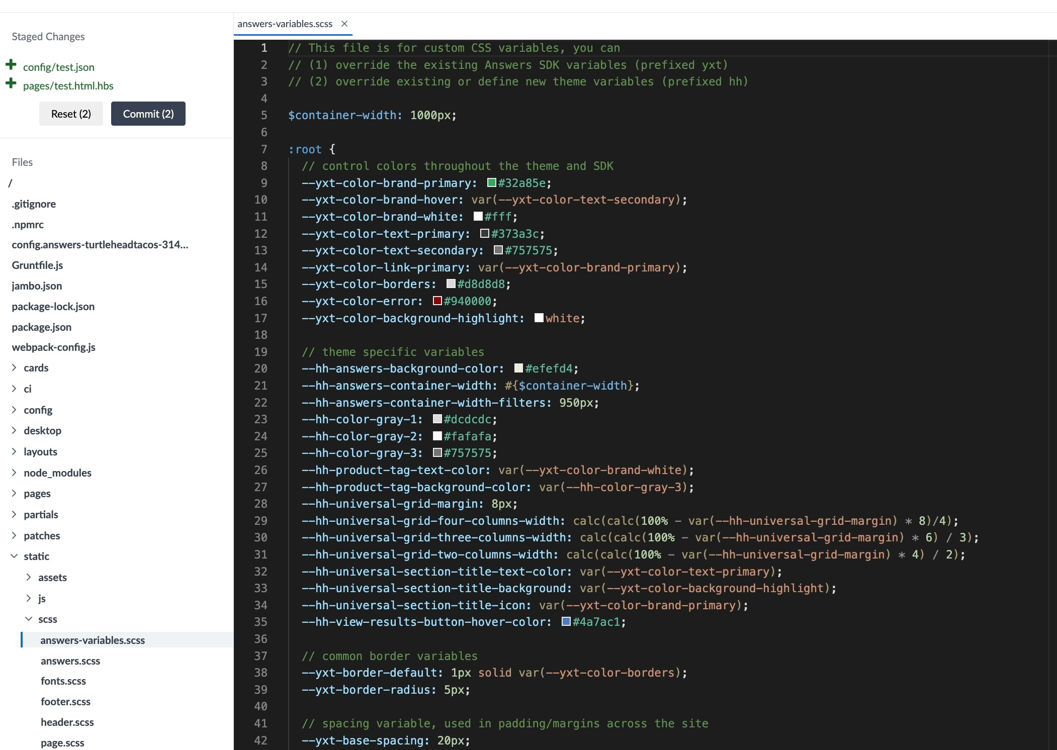
The Answers Variables File
We store many commonly used variables in the answers variables file (found at static/scss/answers-variables.scss), where we can define the value of multiple CSS properties without having to update the CSS of all sections that should use that variable. See the
Standard Branding Elements
reference doc for the default version of file found in the Theme. We’ll also walk through common variables to update and what changes would look like.
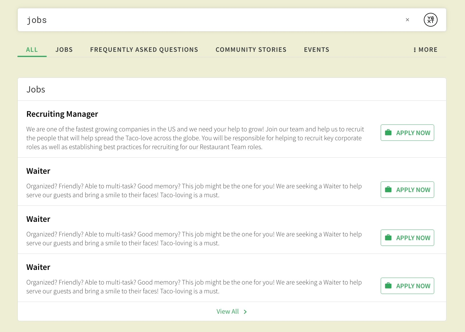
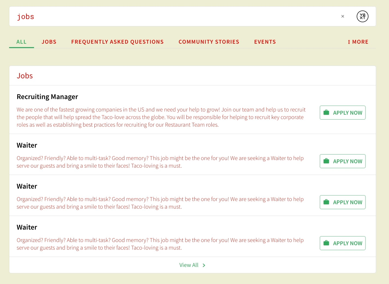
For example, if you want to update the primary text color from black to red, you can update the value of one variable --yxt-color-text-primary instead of having to individually target each text class (e.g., navigation text, description text, result bar text). You will learn more about customizing individual elements in the next unit.
If you are curious about which elements are controlled by which variable, you can always inspect an element within live preview.
Best Practices
Variable Naming Convention
Variables prefixed with yxt are variables used in the Search UI SDK library (and can also be referenced in the Theme), while those prefixed with hh are variables defined only in the Theme. If you want to add new variables in your variables files, we recommend you prefix them with something like hh to ensure there are no conflicts with other CSS variables your customer may be setting.
Brand-Specific Colors
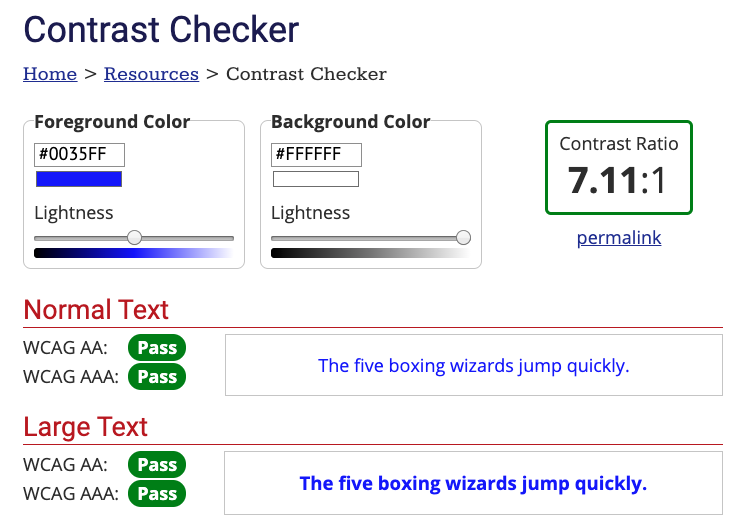
You’ll want to inspect a customer’s website to ensure you’re adhering to their styles as much as possible. Customers might even have a style guide that will give you the specific colors and other styles to apply. For example, we can pull the Yext blue color by inspecting the CTA on the homepage, and grabbing the value #0f70f0 to use as our --yxt-color-brand-primary.
Contrast Checker
For the --yxt-color-brand-primary and --yxt-color-text-primary, we recommend pulling colors that have enough contrast against your chosen background color for accessibility purposes. You can use a tool like
WebAim’s Contrast Checker
to verify if this passes sufficient contrast. Typically, we aim for a contrast above 7:1 to pass all the tests.
 Daily Quiz Streak: 0
 Quiz Accuracy Streak: 0
 Question 1 of 3
Why should we use CSS variables?
Question 2 of 3
What variable would you use to update the color of the Title link on a card? (Hint: Check out the Standard Branding Elements reference doc)
Question 3 of 3
What variable would you use to update the background color of the entire Search experience?
Wahoo - you did it! 🙌
