

Standard Branding Elements | Yext Hitchhikers Platform
We store many commonly used variables in the answers variables file (static/scss/answers-variables.scss). These variables that define things like colors, fonts, and more so that you can manage them in one place rather than having to update each element indididually. You can read more about this file in the
Updating Standard Branding Elements training unit
.
Default Configuration
// This file is for custom CSS variables, you can
// (1) override the existing Answers SDK variables (prefixed yxt)
// (2) override existing or define new theme variables (prefixed hh)

$container-width: 1000px;

:root {
  // control colors throughout the theme and SDK
  --yxt-color-brand-primary: #5387d7;
  --yxt-color-brand-hover: var(--yxt-color-text-secondary);
  --yxt-color-brand-white: #fff;
  --yxt-color-text-primary: #212121;
  --yxt-color-text-secondary: #757575;
  --yxt-color-link-primary: var(--yxt-color-brand-primary);
  --yxt-color-borders: #d8d8d8;
  --yxt-color-error: #940000;
  --yxt-color-background-highlight: white;

  // theme specific variables
  --hh-answers-background-color: white;
  --hh-answers-container-width: #{$container-width};
  --hh-answers-container-width-filters: 950px;
  --hh-color-gray-1: #dcdcdc;
  --hh-color-gray-2: #fafafa;
  --hh-color-gray-3: #757575;
  --hh-product-tag-text-color: var(--yxt-color-brand-white);
  --hh-product-tag-background-color: var(--hh-color-gray-3);
  --hh-universal-grid-margin: 8px;
  --hh-universal-grid-four-columns-width: calc(calc(100% - var(--hh-universal-grid-margin) * 8)/4);
  --hh-universal-grid-three-columns-width: calc(calc(100% - var(--hh-universal-grid-margin) * 6) / 3);
  --hh-universal-grid-two-columns-width: calc(calc(100% - var(--hh-universal-grid-margin) * 4) / 2);
  --hh-universal-section-title-text-color: var(--yxt-color-text-primary);
  --hh-universal-section-title-background: var(--yxt-color-background-highlight);
  --hh-universal-section-title-icon: var(--yxt-color-brand-primary);
  --hh-view-results-button-hover-color: #4a7ac1;

  // common border variables
  --yxt-border-default: 1px solid var(--yxt-color-borders);
  --yxt-border-radius: 5px;

  // spacing variable, used in padding/margins across the site
  --yxt-base-spacing: 20px;

  // component specific variable overrides
  --yxt-autocomplete-text-font-size: 16px;
  --yxt-results-title-bar-text-color: var(--yxt-color-text-primary);
  --yxt-results-title-bar-background: var(--yxt-color-background-highlight);
  --yxt-searchbar-button-background-color-base: white;
  --yxt-searchbar-button-background-color-hover: #e9e9e9;
  --yxt-searchbar-button-background-color-active: white;
  --yxt-searchbar-button-text-color-hover: var(--yxt-color-brand-primary);
  --yxt-filter-options-options-max-height: none;
  --yxt-filters-and-sorts-font-size: var(--yxt-font-size-md);
  --yxt-filter-options-option-label-line-height: 20px;
  --yxt-alternative-verticals-emphasized-font-weight: var(--yxt-font-weight-semibold);
  --yxt-text-snippet-highlight-color: #eef3fb;
  --yxt-text-snippet-font-color: var(--yxt-color-text-primary);
  --yxt-direct-answer-view-details-font-weight: var(--yxt-font-weight-normal);
  --yxt-search-loading-opacity: 0.5;
  --yxt-product-prominentimage-height: 300px;

  // interactive map variables
  --yxt-maps-search-this-area-background-color: white;
  --yxt-maps-search-this-area-text-color: var(--yxt-color-text-primary);
  --yxt-maps-mobile-detail-card-height: 225px;
  --yxt-maps-desktop-results-container-width: 410px;
  --yxt-maps-mobile-results-header-height: 185px;
  --yxt-maps-mobile-results-footer-height: 97px;
  --yxt-maps-desktop-height: 820px;
  --yxt-maps-mobile-height: 620px;
}

// breakpoint variables for use in media queries within the theme styling
$breakpoint-mobile-max: 767px;
$breakpoint-mobile-min: 768px;

$breakpoint-mobile-sm-max: 575px;
$breakpoint-mobile-sm-min: 576px;

$breakpoint-collapsed-filters: $container-width + 279px;
$breakpoint-expanded-filters: $container-width + 280px;
Common Variables to Update
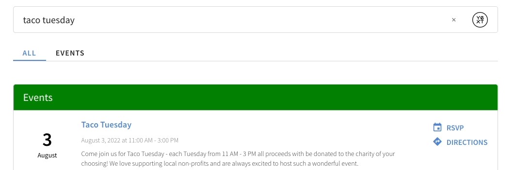
Below are common variables, brands typically update to match their business needs and website. In these examples, we will be using the color green for each property so you can note which properties are being updated.
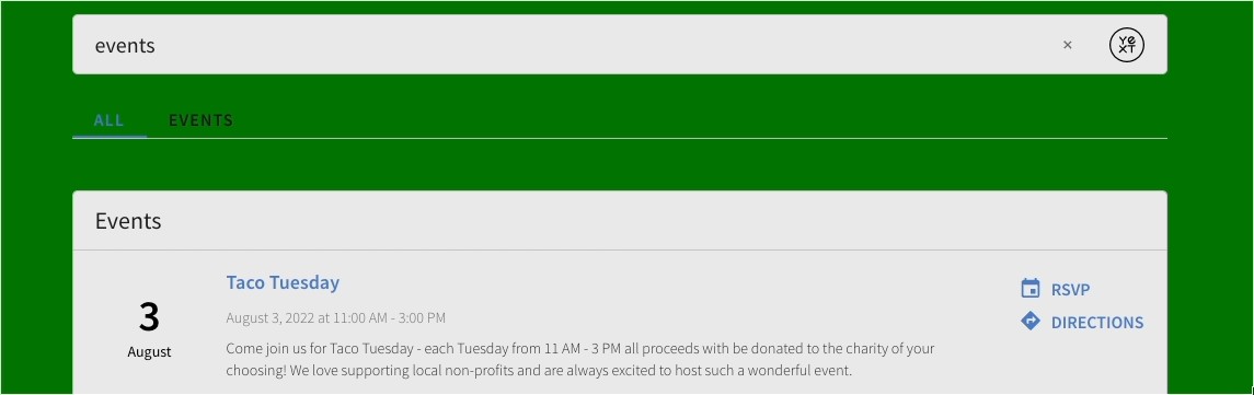
Page Background Color
--hh-answers-background-color: green;By default, the background color of the Search experience will be white. However, altering the background to match a customer’s existing background color may help with brand consistency.
Brand Colors
--yxt-color-brand-primary: #0f70f0;
--yxt-color-text-primary: #212121;
These variables give you the most bang-for-your-buck. They control the color of many different elements across the Search experience.
--yxt-color-brand-primary will control the color of several elements on the page - from title links, to CTAs, to the nav menu items and view all links.
--yxt-color-text-primary will update the text color of the search bar text, the card text, the nav bar text, and the vertical title text. In the example below, we’ve set it to #881111, but most often you’ll change this to a black or dark gray color.
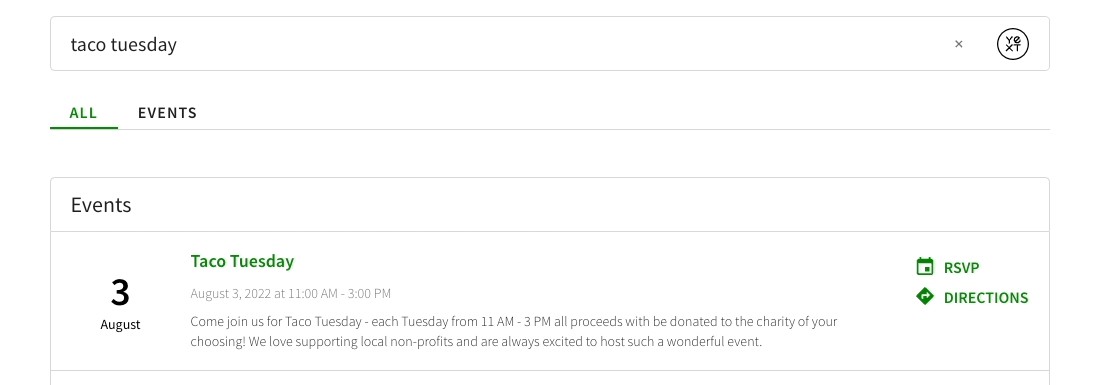
Title Bar Colors
--hh-universal-section-title-text-color: var(--yxt-color-text-primary);
--hh-universal-section-title-background: green;
The --hh-universal-section-title variables help us control the colors for the title bar on Universal pages. As you can see below, we can change the background color to green and the text color to white to achieve a more prominent title bar.
There will be some additional tweaks necessary to ensure the icon and View All text is updated, but you’ll learn more about how to do that in the Updating Custom Elements unit .