

Navigation | Yext Hitchhikers Platform
Background
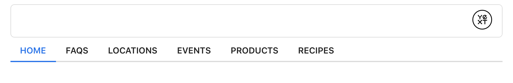
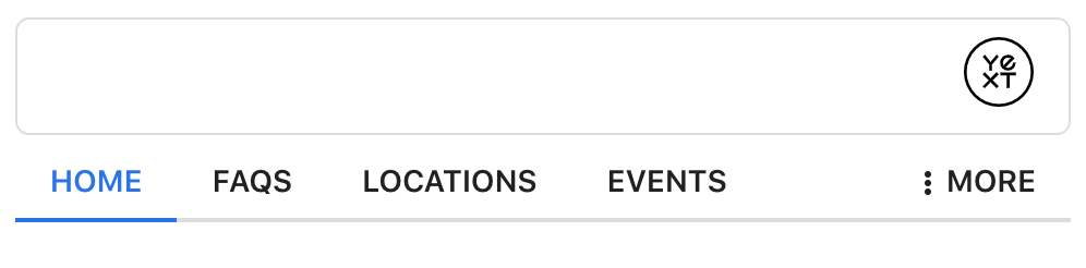
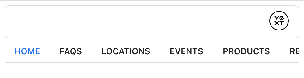
The navigation component is made of up of tabs that link to universal and vertical search pages. You’ll typically see it appear just below the search bar.
When conducting a search from universal, the tabs will reorder based on the order of the search results. By default, tabs that do not fit in the container will be placed inside a dropdown menu. This can be configured for mobile (see mobileOverflowBehavior in API Properties below).
The pages that appear in the navigation are configured in
the ANSWERS.init’s verticalPages configuration
.
We don’t recommend dynamically changing the width of the overflow button, as this can impact it’s behavior unintentionally (there is logic that checks for changes to Navigation width to update the More dropdown content). If you need to include a border on the button, we recommend using an
outlineinstead.
Configuration
<div class="navigation-container"></div>ANSWERS.addComponent('Navigation', {
container: '.navigation-container',
// mobileOverflowBehavior: 'COLLAPSE',
// ariaLabel: 'Search Page Navigation',
// overflowLabel: 'More',
// overflowIcon: null
})Example
Navigation API
| Property | Type | Default | Description |
|---|---|---|---|
|
ariaLabel
|
string
|
Search Page Navigation
|
Optional, the aria-label to set on the navigation. |
|
mobileOverflowBehavior
|
string
|
COLLAPSE
|
Optional, controls if navigation collapses to a more tab, or uses inner scroll on mobile. Options are COLLAPSE or INNERSCROLL.
|
|
overflowLabel
|
string
|
More
|
Optional, the label to display on the dropdown menu button when it overflows. |
|
overflowIcon
|
string
|
three stacked dots
|
Optional, name of the icon to show on the dropdown button instead when it overflows. |