

AppliedFilters | Yext Hitchhikers Platform
Check out this Storybook to visualize and test this component.
The <AppliedFilters /> component displays any facets/filters applied to the search results. This is a common pattern on many site search experiences, for example Best Buy’s product search here:
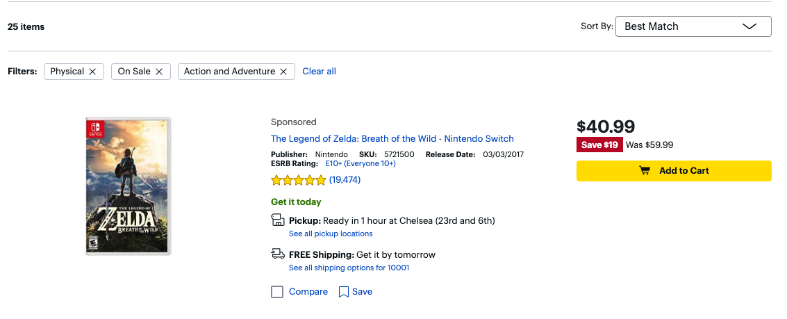
The “Filters” section at the top is the exact functionality we aim to replicate with the <AppliedFilters /> component. Just like the Best Buy example, our Applied Filters show each filter as a pill with an “x” to clear a certain filter, as well as a “Clear all” button to clear all the filters at once.
Here’s what the <AppliedFilters /> component looks like:
Basic Example
You can use the <AppliedFilters /> component like so:
import {
  VerticalResults,
  ResultsCount,
  AppliedFilters,
  StandardCard,
} from "@yext/search-ui-react";

const App = (): JSX.Element => {
  return (
    <div className="flex justify-center px-4 py-6">
      <div className="w-full max-w-5xl">
        <ResultsCount />
        <AppliedFilters />
        <VerticalResults CardComponent={StandardCard} />
      </div>
    </div>
  );
};

export default App;
Basic Customization
Like the rest of our components, you can customize the elements of the Standard Facets using the customCssClasses prop.
The following example takes the above example and adds some styling to the card:
<AppliedFilters
customCssClasses={{
appliedFiltersContainer: "mx-4",
clearAllButton: "bg-slate-300 rounded border-2 border-black p-2",
removableFilter: "bg-sky-500 text-white",
}}
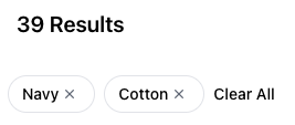
/>The resulting Applied Filters look like this:
Component API
Check out the component properties in the Search UI React Github repo .