

Hitchhikers Theme Changelog | Yext Hitchhikers Platform
This changelog outlines changes introduced in each minor version of the Hitchhikers Theme. For step-by-step instructions on how to upgrade the Theme and SDK, check out the Upgrade Theme for Search Frontend Experiences guide.
Theme 1.36
January 9, 2026
We are excited to announce our Hitchhikers Theme v1.36 as well as Search UI SDK 1.19!
Autocomplete Limit
Users can now customize the number of results displayed in the search autocomplete dropdown, which was previously hardcoded to a maximum of 10. This update provides greater control over the search UI, allowing you to optimize the density and layout of autocomplete suggestions for your end users.
To adjust this limit, add the autocompleteLimit property to the verticalsToConfig object within your configuration files:
- Universal Search: Update
index.json. Vertical Pages: Update the corresponding
config/pageName.jsonfor each specific page."verticalsToConfig": { "Universal": { "autocompleteLimit": 12, // new property "isFirst": "true", "label": "All" }, }
Theme 1.35
February 26, 2025
We are excited to announce our Hitchhikers Theme v1.35 as well as Search UI SDK 1.18!
Generative Answers
Generative Answers are AI-generated summaries of search results displayed at the top of the page. Generative Answers synthesize information from top search results to help users quickly find relevant information without having to sift through multiple results, improving efficiency and reducing friction in the search experience.
To support this in the theme, we are introducing a Generative Answers component for pages, a Generative Answers card, and a new click type citation_click, which will track when users click on sources in Generative Answers.
Upgrade Implications
Once you enable Generative Answers in the backend config and run the Jambo command to upgrade the theme, you will need to:
- Enable Generative Answers by setting
useGenerativeDirectAnswerstotrue(currently commented out) inconfig/global_config.json. - Add the Generative Answers component to every universal or vertical page you want to add Generative Answers to (see details below)
- Add the component to each vertical
pages.html.hbsHandlebars file - (Optional) Add optional configurations in each vertical
config.jsonfile
- Optionally, add source URL fields to link out to in the sources
- Add the component to each vertical
For the second step, net-new verticals you add to your experiences will have the Generative Answer component and partials commented out by default when you use the Jambo Command “Add Vertical”. Comment these in to use this feature.
To add Generative Answers to existing verticals, you can use one of the following approaches (see below for detailed steps for each approach):
- Replace all the content in each vertical file with the content from the theme file. Then comment in any previously commented in filters, sorting, etc. that you would like to use.
- For the vertical
page.html.hbsfile, use the theme file atthemes/answers-hitchhiker-theme/templates/[page-template]/page.html.hbs. - For the vertical
config.jsonfile, use the theme file atthemes/answers-hitchhiker-theme/templates/[page-template]/page-config.json.
- For the vertical
- Update each vertical file manually by copying only new content from the theme files.
- Recreate each vertical using the Jambo Command “Add Vertical” and then comment in the appropriate lines.
[page-template] refers to the page template used by each vertical. This would be vertical-standard, vertical-grid, vertical-full-page-map, or vertical-map.
Once you add Generative Answers, you can also customize the sourceUrlFields property to include any URL fields you want to link out to in the sources.
Option A: Replace all page content with content from theme files
- For each universal or vertical page you would like Generative Answers on, replace all the content in the
page.html.hbsfile with the theme file atthemes/answers-hitchhiker-theme/templates/[page-template]/page.html.hbs:
- Open the vertical
page.html.hbsfile (for universal search, the page name isindex, so you would navigate topages/index.html.hbs). - Take note of what components are currently commented in and being used.
- Open the theme
page.html.hbsfile (navigate tothemes/answers-hitchhiker-theme/templates/[page-template]/page-html.hbs). - Copy all the contents in the theme file and use it to replace the contents in your vertical file.
- Comment in the three Generative Answers partials (note
universal-standardwill be replaced with the name of the template used by the vertical):
{{> generativedirectanswercards/all }}{{> templates/universal-standard/script/generativedirectanswer }}{{> templates/universal-standard/markup/generativedirectanswer }}
- Comment in any previously commented in filters, sorting, or other components you would like to use.
- Open the vertical
- For each universal or vertical page you would like Generative Answers on, replace all the content in the
config.jsonfile with the theme file atthemes/answers-hitchhiker-theme/templates/[page-template]/page-config.json:
- Open the vertical
config.jsonfile (for universal search, the page name isindex, so you would navigate toconfig/index.json). - Take note of what components are currently commented in and being used.
- Open the theme
config.jsonfile (navigate tothemes/answers-hitchhiker-theme/templates/[page-template]/page-config.json). - Copy all the contents in the theme file and use it to replace the contents in your vertical file.
- Comment in the
GenerativeDirectAnswercomponent and make any changes to thesourceUrlFieldsarray. - Comment in any previously commented in filters, sorting, or other components you would like to use.
- Open the vertical
Option B: Copy new content from theme files
- For each universal or vertical page you would like Generative Answers on, copy new content into the
config.jsonfile from the theme file atthemes/answers-hitchhiker-theme/templates/[page-template]/page-config.json:
- Open the vertical
config.jsonfile (for universal search, the page name isindex, so you would navigate toconfig/index.json). - Open the theme
config.jsonfile (navigate tothemes/answers-hitchhiker-theme/templates/[page-template]/page-config.json). - Copy the new
GenerativeDirectAnswercomponent and paste it into your vertical file in the same location. - Make any changes to the
sourceUrlFieldsarray.
- Open the vertical
- For each universal or vertical page you would like Generative Answers on, copy new content into the
page.html.hbsfile from the theme file atthemes/answers-hitchhiker-theme/templates/[page-template]/page.html.hbs:
- Open the vertical
page.html.hbsfile (for universal search, the page name isindex, so you would navigate topages/index.html.hbs). - Open the theme
page.html.hbsfile (navigate tothemes/answers-hitchhiker-theme/templates/[page-template]/page-html.hbs). - Copy the three Generative Answers partials and paste it into your vertical file in the same locations. Make sure to comment them in. Note
universal-standardwill be replaced with the name of the template used by the vertical.
{{> generativedirectanswercards/all }}{{> templates/universal-standard/script/generativedirectanswer }}{{> templates/universal-standard/markup/generativedirectanswer }}
- Open the vertical
Option C: Recreate the vertical page
For each universal or vertical page you would like Generative Answers on, delete the old vertical and add a new one.
- Open the vertical
config.jsonfile (for universal search, the page name isindex, so you would navigate toconfig/index.json). - Take note of what components are currently commented in and being used.
- Click the menu icon next to the file and select Delete.
- Open the vertical
page.html.hbsfile (for universal search, the page name isindex, so you would navigate topages/index.html.hbs). - Take note of what components are currently commented in and being used.
- Click the menu icon next to the file and select Delete.
- Go to Tools > Jambo Commands, select Add Vertical, and click Continue.
- Fill in the page name, vertical key, card name, and page template using the existing configuration.
- Open each new file and comment in any previously commented in filters, sorting, or other components you would like to use.
Custom Generative Answers Card
You also have the option to create a custom Generative Answers card, just as you would with a Direct Answers card. If you want to make any changes to the Generative Answers card, you must create a custom one. To do so:
- Click Tools > Jambo Commands, select Add Generative Direct Answer (GDA) Card and click Continue.
- Name the card and select
generativedirectanswercards/generative-standardas the template. Click Submit. - In the Code Editor files left pane, open
generativedirectanswercards/[[card name you just created]]/template.hbs. - Make any edits to the card in this file. Note since the Generative Answer gets pulled in as a partial, you can’t make changes to the answer directly. Here you can change the structure of the card by moving components around or changing the hardcoded copy on the card.
- Open the
config.jsonfile for each vertical you include Generative Answers on and change theGenerativeDirectAnswercardTypeproperty to match the name of the card you just created.
Theme v1.34.3
September 17, 2024
Cloud Choice Support
Previously, the frontend was able to use any of our consumer serving regions powered by AWS or GCP. We now support limiting queries to only use GCP-based regions. Add the "cloudChoice" property to the global_config.json file. Set it to "multi" to use the all-region default or to "gcp" to use only GCP-based regions.
Theme v1.33
August 14, 2023
The new Hitchhikers Theme 1.33 updates the built-in FAQ accordion card to support the addition of Rich Text v2 fields to Yext Knowledge Graph via the answerV2 field.
FAQ Accordion Card Supports Rich Text v2 Fields
The faq-accordion and multilang-faq-accordion cards were updated to account for the newly supported Rich Text v2 fields. They check to see whether FAQ entities are using the answerV2 or answer field and set the card description accordingly.
Upgrade Implications
If you are using rich text V2 or converted your FAQs to use rich text V2 and you forked either the faq-accordion card or multilang-faq-accordion card, you must refork them or update them based on changes from
this PR
to get support for rich text V2.
Theme v1.32
July 26, 2023
The new Hitchhikers Theme 1.32 supports the addition of Rich Text v2 and Markdown fields to the Yext Knowledge Graph.
Support for Rich Text v2 and Markdown Fields
This will walk through how to enable your Search experience to render the new Rich Text v2 and Markdown fields in the frontend. Follow the Migrate Legacy Rich Text Fields and Field Types guide for end-to-end instructions.
Knowledge Graph: Add Field
The platform does not allow you to change a field’s Field Type, so even if you currently have a rich text field you’ll need to create a net-new field. Then you’ll need to add content to the newly added field for the appropriate entities.
Backend Config: Edit Properties
- Navigate to Search > [[Your Experience]] > Edit as JSON.
Add a top-level config property to convert rich text to HTML.
- For Rich Text v2 fields, the
richTextV2ToHTMLproperty needs to be set to true. For Markdown fields, the
markdownToHTMLproperty needs to be set to true.{ "$schema": "https://schema.yext.com/config/answers/answers-config/v1", "$id": "test", "name": "test", "verticals": {}, "richTextV2ToHTML": true, "markdownToHTML": true }
- For Rich Text v2 fields, the
If you are already using the display fields property, add the new custom field to the displayFields array.
{
 "verticals": {
   "products": {
     "displayFields": [
       "photoGallery",
       "name",
       "c_testRTDescription",
       "c_testMarkdown"
     ]
   }
 },
 "richTextV2ToHTML": true,
 "markdownToHTML": true
}
Frontend: Render the Field
Hitchhikers Theme
To render the field in the Code Editor, use the html subfield of the field you just added when mapping profile fields to properties in the card component.js file. Both rich text and markdown fields will be converted to HTML.
  dataForRender(profile) {
    return {
      title: profile.name,
      details: profile.c_testRTDescription ? profile.c_testRTDescription['html'] : null
    }
  }
Search UI React
In order to render the fields in the frontend, take a look at the example cards in the following repo :
For Markdown Fields that haven’t been converted to HTML, you will need to do the additional following steps:
- Make sure
"markdownToHTML": false,in the backend config - Run this command in your terminal:
npm i @uiw/react-md-editor
- Make sure
Check out the Update a Result Card to Support Rich Text help article for step-by-step instructions on display rich text on a result card.
Theme v1.31 and Search UI SDK 1.16
May 10, 2023
The new Hitchhikers Theme 1.31 supports the addition of EU cloud choice.
EU Cloud Choice Support
Assets are now available through our EU CDN at https://assets.eu.sitescdn.net/.
Previously, data could only be hosted in the US. If you are located in the EU and you want your data to be hosted in the EU, update "cloudRegion" to "eu" within the global_config.json file.
Theme v1.30 and Search UI SDK 1.15
November 16, 2022
We are excited to announce our Hitchhikers Theme v1.30 as well as Search UI SDK 1.15!
Auto-Initialization
The main update in this theme is auto-initialization in the code editor in situations where the intitializeManually feature is being used. Some administrators use initializeManually for advanced use cases like: tracking visitor analytics or query sources, or dynamically enabling session tracking based on different cookie consent policies. Previously, you could not use the code editor to preview your experience if you set intitiliazeManually to true.
This new theme automatically initializes itself in dev mode by looking for environment variables that are present in dev mode, making it now possible to preview experiences while using initializeManually.
Upgrade Implications
You will also need to update your ci/serve_setup.sh file. Specifically, you will need to add a line so that it looks like the following:
#!/bin/sh
export NODE_OPTIONS="--max-old-space-size=1024"

#This will use development mode while in the Yext code editor. Set to "false" to test the production build.export IS_DEVELOPMENT_PREVIEW='true'

npx jambo build
grunt webpack
This ensures that the initial Preview of your page has auto-initialization.
Theme v1.29 and Search UI SDK 1.14
May 10, 2022
We are excited to announce our Hitchhikers Theme 1.29 and Search UI SDK 1.14!
This version includes breaking changes - all upgrades to Theme 1.29 or later must follow the upgrade implication instructions below. The breaking changes have been consolidated into the breaking changes sections at the bottom this theme version post.
You can find the full list of features and bug fixes below:
Support for RTF Truncation
You can now use the Show More/Show Less truncation functionality with rich text fields. Previously, truncation was not supported with rich text because we risked cutting off a closing HTML tag, which could break the page.
Upgrade Implications
For the full process on adding rich text and rich text truncation to your card, follow the steps in the Rich Text section of the Common Formatters reference doc. The following highlights the changes needed for rich text truncation if you already have rich text on your card.
In built-in theme cards that use ANSWERS.formatRichText, we have updated the showMoreDetails object to take in a new truncatedDetails property, so you will only get this property by default if you add these cards after upgrading to Theme 1.29 or later. If you want to use RTF truncation on a previously forked card or on a card you added RTF to, use truncatedDetails in place of showMoreLimit for the RTF card showMoreDetails property.
Your card will look something like:
return {
   title: profile.name,// The header text of the card
   url: profile.landingPageUrl,// If the card title is a clickable link, set URL here
   ...
   details: profile.richTextDescription ? ANSWERS.formatRichText(profile.richTextDescription, 'richTextDescription', linkTarget) : null,// The text in the body of the card
   // If the card's details are longer than a certain character count, you can truncate the
   // text. A toggle will be supplied that can show or hide the truncated text.
   // Note: If you are using rich text for the details, you should not enable this feature.
   showMoreDetails: {
     truncatedDetails: profile.richTextDescription ? ANSWERS.formatRichText(profile.richTextDescription, 'richTextDescription', linkTarget, 38) : null,// Character count limit
     showMoreText: 'Show more',// Label when toggle will show truncated text
     showLessText: 'Show less'// Label when toggle will hide truncated text
   },
   ...
}
The value for truncatedDetails is similar to details, but passes an additional parameter to ANSWERS.formatRichText: the character count that the rich text content will be truncated at, in this case 38. This character count will ignore all non-text characters, such as HTML tags and formatting. Any string value can be passed into truncatedDetails.
By default, an ellipsis is added to the end of the truncated text. This can be customized by adding one more parameter to ANSWERS.formatRichText to specify the suffix.
For example, to remove the ellipsis completely, you could specify a blank string instead:
ANSWERS.formatRichText(
  profile.richTextDescription,
  "richTextDescription",
  linkTarget,
  38,
  ""
);
Finally, showMoreLimit can still be used for truncating non-rich text, but truncatedDetails must be used instead of showMoreLimit for RTF fields.
Customize Autocomplete Prompts
You can now set custom autocomplete prompts client side, in the Theme and Search UI SDK (rather than just the Search backend) to allow you to modify the prompts based on the page where the search results live. Note that these prompts will always appear above any other prompts in the configuration. They will not be bolded as users type.
Upgrade Implications
There are several ways to set custom prompts, either through the theme or the SDK:
SDK search bar configuration: When initializing the library for the search bar, add a string array with the custom prompts in the
autocomplete.customPromptsfield. It will look something like:ANSWERS.addComponent("SearchBar", { container: ".search_form", ... autocomplete: { customPrompts: [ 'This is a custom prompt', 'Here is another example' ] } ... });SDK autocomplete component: Use the
setCustomPromptsfunction to customize the autocomplete component after ANSWERS is initialized (note that this will override any existing custom prompts set in the init):ANSWERS.components.getActiveComponent('AutoComplete')..setCustomPrompts(['This is a a custom prompt','Here is another example' ])Theme componentSettings: In the
config.jsonfile for each page you want to customize, specify custom prompts in theautocomplete.customPromptsfield:"componentSettings": { "SearchBar": { "placeholderText": "Search", ... "autocomplete": { "customPrompts": [ "This is a custom prompt", "Here is another example" ] } ... } }Theme iFrame: If your search results page is iFramed, set custom prompts with runtimeConfig or through
AnswersExperienceFrame.init(note that this will override any existing custom prompts set in theme’scomponentSettings):window.AnswersExperienceFrame.runtimeConfig.set("customPrompts", [ "custom prompt from iframe", ]);
Numerical Facets
We have made a number of updates to our faceting framework to better support numerical facets. You can now use static number ranges as facets using the Hitchhikers Theme, which is particularly useful for price ranges, multi-pack options, and more.
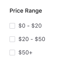
Upgrade Implications
Check out the Set Up Numerical Facets guide for step-by-step instructions. To use numerical facets, you will have to make changes in both the frontend and backend:
- Backend Configuration: Add the new
facetsattribute to each vertical using one of three options to set number facet ranges. Plus set the field as a facet under searchableFields. - Frontend Theme: Turn on facets how you normally would. If facets are already on for this vertical, no other changes need to be made. Note you must be on Theme 1.29 or higher to use this feature.
Note: Only Search UI React allows users the ability to input a minimum and maximum value in numerical facets.
Backend Configuration
You will need to add the new facets attributes to each vertical object in the JSON editor (this is not yet configurable in the UI). Just as before, you will still need to set the field as a facet under searchableFields. This will look like the below:
{
  "$schema": "https://schema.yext.com/config/answers/answers-config/v1",
  "$id": "ecommerce",
  "name": "Ecommerce",
  "supportedLocales": [ ... ],
  "countryRestrictions": [],
  "verticals": {
    "products": {
      "name": "Products",
      "directAnswers": { ... },
      "entityTypes": [ ... ],
      "facets": {
        "fields": [
          {
            "fieldId": "price",
            "sortCriteria": "ASC",
            "ranges": [ ... ] | { ... }
          }
        ]
      },
      "searchableFields": {
        "price": {
          "facet": true
        },
      ...// other fields
      },
      "sortBys": [ ... ],
      "source": "YEXT"
    }
    ...// other verticals
  },
// truncated
}
The properties in the facets attribute are:
fieldId: The field for which this config applies. Required.sortCriteria: How to sort the field. Options are”ASC”or”DESC”. If not specified, the default is ASC.ranges: There are three options to configure numerical facet ranges:- Explicitly set ranges (set with an array)
- Generate either dynamic or static ranges with the backend (set with an object)
Option 1: Explicitly Set Ranges
Explicitly set ranges that will not change when the results set changes. Static ranges with a result count of 0 are not returned. Also note that the display names will not be internationalized.
"facets": {
  "fields": [
    {
      "fieldId": "price",
      "sortCriteria": "ASC",
      "ranges": [
        {
          "start": 0,
          "end": 70,
          "displayName": "Up to $70"
        },
        {
          "start": 70,
          "end": 100,
          "displayName": "$70 - $100"
        },
        {
          "start": 100,
          "displayName": "Over $100"
        }
      ]
    }
  ]
}
ranges takes an array of objects with the following properties:
start: The start of the range (inclusive). If not specified, the range is unbounded.end: The end of the range (exclusive). If not specified, the range is unbounded.displayName: The label for this facet option. If not specified, this defaults to"[start] - [end]""> [start]"if end is not specified"< [end]"if start is not specified
Option 2: Dynamic Range Generated by the Backend
Setting the algorithm property as ”DYNAMIC” will distribute all the entities (not just the ones returned for that search) roughly evenly across the maximum number of buckets specified by bucketCount. If not specified, bucketCount defaults to 4.
"facets": {
  "fields": [
    {
      "fieldId": "price",
      "sortCriteria": "ASC",
      "ranges": {
        "algorithm": "DYNAMIC",
        "bucketCount": 3
      }
    }
  ]
}
The above configuration may give the following buckets (results count in parentheses):
- 0 - 23 (20)
- 23 - 60 (20)
- 60 - 120 (20)
Option 3: Static Range Generated by the Backend
Setting the algorithm property as ”STATIC” will create buckets of length specified by bucketLength (required).
"facets": {
  "fields": [
    {
      "fieldId": "price",
      "sortCriteria": "ASC",
      "ranges": {
         "algorithm": "STATIC",
         "bucketLength": 24
      }
    }
  ]
}
With the same set of data as the dynamic ranges example, the above configuration may give different buckets (results count in parentheses):
- 0 - 24 (19)
- 24 - 48 (10)
- 48 - 72 (12)
- 72 - 96 (14)
- 96 - 120 (5)
If a number field is set as a facet in searchableFields or facets, but no facets config object is provided, the field will be set up as a dynamic range with four buckets. This is added on the next save.
Frontend Theme
Turn on facets how you normally would. If facets are already on for this vertical, no other changes need to be made. Note you must be on Theme 1.29 and Search UI SDK 1.14 or higher to use this feature.
For a refresher on how to add facets to your frontend, check out the Facets training unit .
Update universalLimit for Vertical Grid Templates
We’ve updated the universalLimit for vertical grid templates to three to better fit the three-column grid layout.
Upgrade Implications
The new default universal limit of three will only be applied to net-new vertical-grid pages you add after you upgrade your theme. Feel free to customize this default or change the universal limit to this suggested default on existing pages by updating the universalLimit property in the config.json file for each vertical you want to change.
Collapsible Filters Tab Order (WCAG) - Breaking Change
We’ve addressed an issue with the tab ordering for collapsible filters. To ensure the tab order is correct when users tab through the site, we moved the view results button markup further down the page in each vertical page template.
Note: This is a breaking change - all upgrades to Theme 1.29 or later must follow the upgrade implication instructions below.
Upgrade Implications
Every vertical pages.html.hbs file in your experience must be refreshed if you upgrade to theme 1.29 or later. You can do this with one of the following approaches:
Replace all the content in each vertical
pages.html.hbsfile with the content from the theme file (find this atthemes/answers-hitchhiker-theme/templates/[page-template]/page.html.hbs). Then comment in any previously commented in filters, sorting, etc. that you would like to use. (Recommended)Recreate each vertical page using the Jambo Command “Add Vertical”.
Move the
viewresultsbuttonmarkup manually in each verticalpages.html.hbsfile.
[page-template] refers to the page template used by each vertical. This would be vertical-standard, vertical-grid, vertical-full-page-map, or vertical-map.
Option #1 (replacing content with content from the theme) is the recommended approach as it is less time consuming than option #2 and less error prone than option #3. However, if you have a highly customized vertical, you may want to make the updates manually with option #3. To do so, follow the breaking changes post below which consolidates both of the breaking changes from this release.
Move aria-expanded onto Search Input (WCAG)
We’ve adjusted the aria-expanded attribute on the search bar, which will now update based on whether or not there are autocomplete results.
Upgrade Implications:
If you wrote a custom template for the search bar component (or autocomplete or filtersearch), you’ll need to update it with the latest changes .
Fix Filter and Footer Collision - Breaking Change
Previously, when filters extended past the height of the results, the bottom of the filters container was cut off and not accessible. We have fixed this issue by updating the page layout. This only applies to the vertical-standard and vertical-grid page layouts.
Note: This is a breaking change - all upgrades to Theme 1.29 or later must follow the upgrade implication instructions below.
Upgrade Implications
Every vertical pages.html.hbs file in your experience that uses either the vertical-standard or vertical-grid template must be refreshed if you upgrade to theme 1.29 or later. You can do this with one of the following approaches:
Replace all the content in each vertical
pages.html.hbsfile with the content from the theme file (find this atthemes/answers-hitchhiker-theme/templates/[page-template]/page.html.hbs). Then comment in any previously commented in filters, sorting, etc. that you would like to use. (Recommended)Recreate each vertical page using the Jambo Command “Add Vertical”. This approach is recommended.
Update the page layout manually in each
vertical pages.html.hbsfile. Since this change affects a major portion of the files, only use this approach if you know what you are doing.
[page-template] refers to the page template used by each vertical. This would be vertical-standard or vertical-grid. Note this change does not apply to either map page template.
Option #1 (replacing content with content from the theme) is the recommended approach as it is less time consuming than option #2 and less error prone than option #3. However, if you have a highly customized vertical, you may want to make the updates manually with option #3. To do so, follow the breaking changes post below which consolidates both of the breaking changes from this release.
Search Complete State for API Errors
Previously if the API returns an error, the search is not complete and the page loading indicator keeps spinning. We have updated this so that if the backend returns an error, we now set the search complete state. We have also added a search error state.
Theme v1.29 Breaking Changes
This version includes breaking changes - all upgrades to Theme 1.29 or later must follow the upgrade implication instructions below. The breaking changes have been consolidated into this section from the two breaking changes above:
- Fix Filter and Footer Collision
- Additional WCAG Update: Collapsible Filters Tab Order
Every vertical pages.html.hbs file in your experience must be refreshed if you upgrade to theme 1.29 or later. You can do this with one of the following approaches:
- Replace all the content in each vertical
pages.html.hbsfile with the content from the theme file (find this atthemes/answers-hitchhiker-theme/templates/[page-template]/page.html.hbs). Then comment in any previously commented in filters, sorting, etc. that you would like to use. (Recommended) - Recreate each vertical page using the Jambo Command “Add Vertical”.
- Update the page layout manually in each vertical
pages.html.hbsfile. Since this change affects a major portion of the files, only use this approach if you know what you are doing.
[page-template] refers to the page template used by each vertical. This would be vertical-standard, vertical-grid, vertical-full-page-map, or vertical-map. Note the filter and footer collision fix does not apply to either map page template.
Option #1 (replacing content with content from the theme) is the recommended approach as it is less time consuming than option #2 and less error prone than option #3. However, if you have a highly customized vertical, you may want to make the updates manually with option #3.
To make these updates manually, follow the instructions below:
- First, update the page layout for Fix Filter and Footer Collision:
- Find the
changes outlined here
by template (
vertical-standard,vertical-grid). - For each page in your experience, find the changes in the file corresponding to that page’s template. Changes include moving a
divup and adding newdivcontainers. Red highlights show where code was moved from (deleted) and green highlights show where code was moved to (added) or added net-new. - Make the corresponding change for each page in your experience.
- Find the
changes outlined here
by template (
- Then, move the markup for Additional WCAG Update: Collapsible Filters Tab Order:
- Find the
changes outlined here
by template (
vertical-standard,vertical-grid,vertical-full-page-map, andvertical-map). - For each page in your experience, find the changes in the file corresponding to that page’s template. The changes in each file should only include moving the
viewresultsbuttonmarkup. The red highlight shows where the line was moved from (deleted) and the green highlight shows where the line was moved to (added). For example, the screenshot below shows that in the vertical-standard template, theviewresultsbuttonmarkup line was moved from line 47 to line 54. - Make the corresponding change for each page in your experience.
- Find the
changes outlined here
by template (
Theme v1.28
February 9, 2022
With the new Hitchhikers Theme 1.28, we’ve added a new multi-language document search card, bug fixes, and more.
You can find the full list of features and bug fixes below:
Multi-Lang Document Search Card
We are introducing a multi-language document search card! Feel free to use this card for any verticals where you’re showing documents within a multi-language site. Note this is only compatible on verticals with document search on at least one field.
Upgrade Implications
After upgrading to Theme 1.28, navigate to the config.json file of your chosen vertical, and update the cardType to multilang-document-standard.
Configure Map Scrolling on Universal
We’ve encountered an undesirable UX on the universal page where a user can sometimes get caught in the map while scrolling down the page. We’ve turned the map scrolling off by default on the Universal Page for Mapbox: scrollZoom in the providerOptions is set to false. If you set providerOptions.scrollZoom to true in your config.json, users will be able to scroll in the map. Remember that anything in providerOptions is just a pass through to the map provider.
Upgrade Implications
If you are using a map on universal search, you should delete and re-add the page. Alternatively, you can copy scrollZoom in the providerOptions into the config.json file for any vertical where you use a map on the universal page.
If you forked templates/universal-standard/script/universalresults.hbs, you will need to refork or update based on changes in
this PR
.
Update universalSectionTemplate for Vertical Grid Pages
Currently the universalSectionTemplate for the vertical-grid page-config.json template is set to standard. We have updated the default to be grid-three-columns for the universal search layout to match the vertical search layout.
Upgrade Implications
The new default "universalSectionTemplate": "grid-three-columns" will only be applied to net-new vertical-grid pages you add after you upgrade your theme. Feel free to customize this default or change the universalSectionTemplate property to this suggested default on existing pages.
Additionally, if you forked templates/vertical-grid/page-config.json, you will need to refresh the file to get this update for future vertical-grid pages.
Jambo Card Issue with Name Replacement
We have corrected an issue where using the original card name in the name of a forked card resulted in an improperly named class name for the card.
For example, using the Jambo command “Add Card” to add a card named standard-override with the standard card as a template should result in a card with class standard_overrideCardComponent (shown in line 3 of the card component.js file). However certain cards were added with class standard-override_overrideCardComponent which would not bring in the proper structure and styling of the card. This has now been fixed.
Upgrade Implications
If you previously forked a card and included the original card name and a hyphen in the card name, check that the class name in the card component.js file is named properly. If not, re-fork the card after upgrading your theme. Additionally, if you forked files in the commands folder, you will need to update them based on this commit.
Close Autocomplete on Clicks Outside of iFrame
We have corrected an issue where clicking outside of an iFrame does not close the autocomplete component. Typically, if a user clicks into the search bar, the autocomplete shows hardcoded prompts. Clicking outside of the search bar closes the autocomplete. However, we found a bug where clicking outside of the iFrame did not close the autocomplete. This has now been fixed.
Upgrade Implications
If you’ve forked:
static/js/iframe-common.jslayouts/html.hbs
You will need to re-fork these files, or view the PR for the changes made and copy changes to your files.
Events Card Missing RTF Styling
We have corrected an issue where Rich Text Format (RTF) styling was missing from the event-standard card. Note if you want to use rich text formatting on your events card, you’ll need to use the function ANSWERS.formatRichText on the details field.
Upgrade Implications
If you forked static/scss/answers/cards/event-standard.scss, you should refork, or
see the PR
for changes and copy the changes to your files.
Theme v1.27
January 12, 2022
With the new Hitchhikers Theme 1.27, we’ve added support for consumer auth, UI updates, bug fixes, and more. You can find the full list of features and bug fixes below:
Direct Answers on Vertical Search - Built-In Support
Direct Answers are now available in Vertical Search as part of the Hitchhiker Theme. Direct Answers on vertical search was previously released as a feature you could add custom to your Search experience, so we’re excited to have it built into the UI by default as part of the theme!
A direct answer is a concise result like a phone number, calorie count, or another piece of information that addresses the query’s intent. Direct Answers can also easily be surfaced in Vertical Search for any vertical that has Direct Answers configured.
Upgrade Implications
Net-new verticals you add to your experiences will have the Direct Answer component and partials commented out by default when you use the Jambo Command “Add Vertical”. Comment these in to use this feature.
To add Direct Answers to existing verticals, either:
- add the component to the
config.jsonfile and add the partials to thepage.html.hbsfile - re-add the vertical and comment in the component and partials
Option 1: Add the Direct Answers components to an existing page.
Add the
DirectAnswerconfiguration to theconfig.jsonfile for that page:"componentSettings": { "DirectAnswer": { "types": { "FEATURED_SNIPPET": { "cardType": "documentsearch-standard" }, "FIELD_VALUE": { "cardType": "allfields-standard" } } }, // other components hereAdd the three Direct Answers partials below to the
page.html.hbsfile for the vertical you want to use Direct Answers on.- Add the directanswerscards partial
{{> directanswercards/all }}below the {{> cards/all }} partial. - Add the direct answer script
{{> templates/vertical-standard/script/directanswer }}below the navigation script partial. - Add the direct answer markup
{{> templates/vertical-standard/markup/directanswer }}before the spell check markup partial.
- Add the directanswerscards partial
Replace vertical-standard with the page template used for this vertical. To see where to place these partials in the file, navigate to the page templates (theme/answers-hitchhiker-theme/templates), find the template you want, and open the page.html.hbs file.
If you are using the vertical-standard page template, the page.html.hbs file will look something like the below, with the new partials bolded.
{{#> layouts/html }}
  {{#> script/core }}
    {{> cards/all }}
    {{> directanswercards/all }}
    {{!-- {{> templates/vertical-standard/collapsible-filters/page-setup }} --}}
    {{> templates/vertical-standard/script/appliedfilters }}
    {{> templates/vertical-standard/script/verticalresultscount }}
    {{> templates/vertical-standard/script/searchbar }}
    {{> templates/vertical-standard/script/spellcheck }}
    {{> templates/vertical-standard/script/navigation }}
    {{> templates/vertical-standard/script/directanswer }}
    {{> templates/vertical-standard/script/verticalresults }}
    {{> templates/vertical-standard/script/pagination }}
    {{> templates/vertical-standard/script/locationbias }}
    …
    <div class="Answers-container Answers-resultsWrapper">
      {{> templates/vertical-standard/markup/directanswer }}
      {{> templates/vertical-standard/markup/spellcheck }}
      <div class="Answers-resultsHeader">
        {{> templates/vertical-standard/markup/verticalresultscount }}
        {{> templates/vertical-standard/markup/appliedfilters }}
     …
Option 2: Re-create the vertical page
Alternatively, you can re-add the vertical you want Direct Answers on using the Jambo Command “Add Vertical”. Navigate to the page.json file and comment in the DirectAnswer component above. Navigate to the page.html.hbs file and comment in the three Direct Answers partials above. vertical-standard will be replaced with the page template used for this vertical.
Additional Support for Consumer Auth:
- Consumer Auth in Sandbox is now supported by setting the environment attribute in the global_config.json to “sandbox” and using a jwt.
- Functionality to Call AnswersExperience.init(); in on-document-load partial
Photo Formatter Update
We’ve updated the photo formatter to instead take advantage of a
dynamic URL
(instead of the static thumbnails returned in the API response). The dynamic URL will be the source for the resultant <img>. This dynamic URL will provide a more ideal size than just the static thumbnails, and aligns the theme with other consumer serving products at Yext.
Upgrade Implications
If you forked formatters-internal.js, and modified the image formatter, you should copy in the updated image formatter from the theme’s formatters-internal.js.
Spell Check Moved Above Result Count
We’ve moved the spell check component above the result count on all vertical templates. This places the result count right above the results for a better UI.
Upgrade Implications:
If you want this update, you’ll need to re-add the vertical pages using the Jambo Command “Add Vertical” for each page you want this update for.
Alternatively, you can also move the spellcheck partial in the pages.html.hbs file to match the vertical template. Move it from around line 43 in the Answers-results class to about line 33 after the directanswer partial in the Answers-container class. Check out the page templates in the theme to see the updated order: navigate to the page templates (theme/answers-hitchhiker-theme/templates), find the template you want, and open the page.html.hbs file. For example, if you are using the vertical-standard template, it’ll look something like the below.
Before:
    <div class="Answers-container Answers-resultsWrapper">
      <div class="Answers-resultsHeader">
        {{> templates/vertical-standard/markup/verticalresultscount }}
        {{> templates/vertical-standard/markup/appliedfilters }}
        {{!-- {{> templates/vertical-standard/collapsible-filters/markup/filterlink }} --}}
        {{!-- {{> templates/vertical-standard/collapsible-filters/markup/viewresultsbutton }} --}}
      </div>
<!-- Uncomment the following div if you want to include filters, facets, or sort options  -->
      {{!-- <div class="Answers-filtersWrapper js-answersFiltersWrapper CollapsibleFilters-inactive"> --}}
        {{!-- {{> templates/vertical-standard/markup/sortoptions }} --}}
        {{!-- {{> templates/vertical-standard/markup/filterbox }} --}}
        {{!-- {{> templates/vertical-standard/markup/facets }} --}}
      {{!-- </div> --}}
      <div class="Answers-results js-answersResults">
        {{> templates/vertical-standard/markup/spellcheck }}
        {{> templates/vertical-standard/markup/verticalresults }}
        {{> templates/vertical-standard/markup/pagination }}
        {{!-- {{> templates/vertical-standard/markup/qasubmission }} --}}
      </div>
    </div>
After:
    <div class="Answers-container Answers-resultsWrapper">
      {{> templates/vertical-standard/markup/directanswer }}
      {{> templates/vertical-standard/markup/spellcheck }}
      <div class="Answers-resultsHeader">
        {{> templates/vertical-standard/markup/verticalresultscount }}
        {{> templates/vertical-standard/markup/appliedfilters }}
        {{!-- {{> templates/vertical-standard/collapsible-filters/markup/filterlink }} --}}
        {{!-- {{> templates/vertical-standard/collapsible-filters/markup/viewresultsbutton }} --}}
      </div>
<!-- Uncomment the following div if you want to include filters, facets, or sort options  -->
      {{!-- <div class="Answers-filtersWrapper js-answersFiltersWrapper CollapsibleFilters-inactive"> --}}
        {{!-- {{> templates/vertical-standard/markup/sortoptions }} --}}
        {{!-- {{> templates/vertical-standard/markup/filterbox }} --}}
        {{!-- {{> templates/vertical-standard/markup/facets }} --}}
      {{!-- </div> --}}
      <div class="Answers-results js-answersResults">
        {{> templates/vertical-standard/markup/verticalresults }}
        {{> templates/vertical-standard/markup/pagination }}
        {{!-- {{> templates/vertical-standard/markup/qasubmission }} --}}
      </div>
    </div>
Update Default Universal Limit on Vertical Pages
Based on our review of search quality across Search experiences, we have found a best practice is to limit the results for each vertical on universal search with universalLimit. Having a larger universalLimit pushes relevant second and third verticals too far “below the fold.” This can be a bad user experience if there are relevant results in lower verticals and users may not scroll down far enough to find what they are looking for.
We have updated the default universal limit to four on all vertical page templates. This provides a better UI and easily shows users results across different verticals on universal search without them needing to scroll far.
This change will only affect net-new pages you create. You can still change the universal limit on any or all of your verticals by updating the universalLimit property in the config.json file for each vertical you want to change.
To learn more about the universal limit, check out the Edit Page Settings unit .
Upgrade Implications
The new default universal limit of four will only be applied to net-new pages you add after you upgrade your theme.
Remove Scrollbar from Facets Box
We have corrected an issue where a scroll bar would show for certain experiences when you hover over the facets box, even though all facet options were already showing. We determined this issue occurs when an experience uses a custom font with a text height larger than the line height of the label.
We have added the variable --yxt-filter-options-option-label-line-height to the answers-variables.scss file, which controls the line height of the option label in the filter options component. This is now set explicitly in the theme and can be overridden if you add a custom font and see this issue. We have also made adjustments to the padding and margin of the facets to give more leeway with custom fonts.
Upgrade Implications
If you are upgrading, you will not have this variable by default. To remedy this, copy the --yxt-filter-options-option-label-line-height variable into your answers-variables.scss file, like below.
// component specific variable overrides
--yxt-filters-and-sorts-font-size: var(--yxt-font-size-md);
--yxt-filter-options-option-label-line-height: 20px;
Fix Font Preloads on Multilang Sites
We fixed an issue where fonts were not correctly preloading on multi-lang sites. This will improve page speed and perceived flashes on those pages.
Upgrade Implications
If you forked the layouts/preloads-fonts.hbs, or static/webpack-config.js, you should refresh those files to get this fix.
Escape Angle Brackets in highlightField Formatter
The highlightField formatter is used to highlight relevant inline text when you have document search turned on for a long-form text field, such as help articles and documents. Occasionally, these fields include HTML tags, such as a code snippet you can use in the Yext platform! We found an issue where HTML tags in rich text fields did not display correctly on the card. This has now been corrected.
Upgrade Implications
If you wrote a custom highlightField formatter, you’ll need to refresh it with the one in the theme (see themes/answers-hitchhiker-theme/static/js/formatters-internal.js) and carry over any custom changes.
Theme v1.26 and Search UI SDK 1.12
November 17, 2021
With the new Search Hitchhikers Theme 1.26 and Search UI SDK 1.12, we’ve added new feedback buttons, WCAG support, bug fixes, and more.
You can find the full list of features and bug fixes below:
Feedback Buttons on Theme Cards
Previously, we only had the thumbs up/thumbs down feature on direct answers cards. We are now adding this feature to all entity cards, so that we can get feedback more holistically on Search experiences.
To add the thumbs up/thumbs down button, navigate to the card > component.js file and set the feedback: true in the dataForRender object. You can also set the text that shows when a feedback button is clicked (feedbackTextOnSubmission) and that will be used by screen readers for accessibility (positiveFeedbackSrText and negativeFeedbackSrText). The default will look something like (depending on the card you choose):
dataForRender(profile) {
return {
  title: profile.name,
  url: profile.website || profile.landingPageUrl,
  target: linkTarget,
  details: profile.description,
  showMoreDetails: { ... },
  feedback: false,// Shows thumbs up/down buttons to provide feedback on the result
  cardfeedbackTextOnSubmission: 'Thank you for your feedback!',// Text to display after a thumbs up/down is
  clickedpositiveFeedbackSrText: 'This answered my question',// Screen reader only text for
  thumbs-upnegativeFeedbackSrText: 'This did not answer my question',// Screen reader only text for thumbs-down
  CTA1: { ... },
  CTA2: { ... }
  };
}
Here’s an example of the thumbs up/thumbs down button on an FAQ card:
Upgrade Implications
If you forked your cards, you will need to re-fork them to get this functionality.
Also note the functionality is in a shared partial under themes/answers-hitchhiker-theme/cards/common-partials/thumbsfeedback.hbs. If you want to customize functionality for a specific card, re-fork the card and remove the reference to the shared partial in the handlebars file. Then copy the partial and paste it inline before customizing the code.
Send New Attributes with Analytics Events on Thumbs Up/Down
When a user clicks on the new feedback buttons, analytics events will fire with eventType as THUMBS_UP or THUMBS_DOWN. The event will also pass attributes for searcher (universal or vertical search), verticalKey, and entityId.
As an example, on the click of the thumbs up/down on an entity card, the frontend will pass the following:
{
  directAnswer: false
  eventType: "THUMBS_UP",
  experienceKey: "yextanswersconfig",
  experienceVersion: "PRODUCTION",
  queryId: "99def4ff-5e90-4144-ae63-0236212753b0",
  searcher: "UNIVERSAL",//or "VERTICAL"
  verticalKey: "offices",//If this is on universal search, should be the vertical key for the section in the universal results
  entityId: "entity-1"
}
In Report Builder, you can now use the metrics Thumbs Up Events and Thumbs Down Events.
To learn more about analytics events, check out the Search Analytics Event Types reference doc. To see examples of the new THUMBS_UP and THUMBS_DOWN event types used in Report Builder, check out the Common Search Analytics Reports .
SDK Support for Token and the Visitor
We added support for passing a jwt in the authorization header, and passing visitor information to analytics. More info to come on these features with our upcoming winter release, which will introduce support for Authorized Search!
Additional WCAG Support
- Pagination Controls Work with Keyboard Enter: We have added support so that when users tab through pagination, they can hit ‘enter’ to activate the controls and go to said control’s page.
- Upgrade Implications: If you wrote a custom pagination component, you will need to update it with the latest changes .
- Navigation Incorporates
aria-current: We have addedaria-current="page"to the current tab since the link to the current page is indicated visually.- Upgrade Implications:If you wrote a custom template for the navigation component, you will need to update it with the latest changes .
- Updated Hover Color on Search Bar: The hover color of the search bar has been updated so that the clear button and search bar icon have clear focus states. In the
answers-variables.scssfile, the variable--yxt-searchbar-button-background-colorwas updated to#e9e9e9.- Upgrade Implications: If you want this update, you’ll need to set the
--yxt-searchbar-button-background-color-hovervariable inanswers.scssto#e9e9e9instead of white.
- Upgrade Implications: If you want this update, you’ll need to set the
- Improved Screen Reader Support for the Search Bar: We have added additional WCAG support to the search bar for screen readers:
- When someone focuses on the search bar, the screen reader will say: “When autocomplete results are available, use up and down arrows to review and enter to select.”
- Screen readers should also read out the number of autocomplete options available, such as “five autocomplete suggestions”.
- Upgrade Implications: If you wrote a custom template for the search bar component (or autocomplete or filtersearch), you’ll need to update it with the latest changes .
- AutoComplete
aria-liveLabel Present on Page Load: We have movedaria-livewrappers to be present on page load for screen readers to announce the number of results even with empty content.- Upgrade Implications: If you wrote a custom template for the search bar component (or autocomplete or filtersearch), you’ll need to update it with the latest changes .
- AutoComplete Incorporates
aria-activedescendant: We have added WCAG support so that as the user traverses autocomplete options, theidof the currently highlighted option is referenced byaria-activedescendanton the text field.- Upgrade Implications: If you wrote a custom template for the search bar component (or autocomplete or filtersearch) , you’ll need to update it with the latest changes .
Bug Fixes
- Full Page Map on iFrame Integrations: We have corrected an issue where full page maps fired a second query in iFrame integrations when
searchOnMapMovewas enabled.- Upgrade Implications: If you forked the vertical full page map previously, you will need to re-fork to get this fix.
- Add allow=microphone to iFrame JS: We have corrected an issue where iFramed search results pages could not access the microphone for voice search.
- Upgrade Implications: if you forked
iframe-common.js, you’ll need to re-fork.
- Upgrade Implications: if you forked
Resize Custom Submit Icons: We have corrected an issue where custom submit icons appeared too large on the page. Users can use custom submit icons by setting the property in the SearchBar component of
componentSettings, like so:"SearchBar": { "placeholderText": "Search",// The placeholder text in the search bar "allowEmptySearch": true, "submitIcon": "magnifying_glass" },- Upgrade Implications: If you added custom styling to the search bar icon or forked the theme’s
static/scss/answers/legacy-aeb/lanswers-overrides.scssfile, you may not get the fix. You will need to remove the custom styling so that it does not override the default styling.
- Upgrade Implications: If you added custom styling to the search bar icon or forked the theme’s
Update Styling in More Tab: We have corrected an issue where long vertical names could have a line break in the middle of a word. We have also updated the padding and line height of the More tab.
- Upgrade Implications: If you forked the
scss/answers/theme.scssfile, you may need to re-fork, or add this update , to get this fix.
- Upgrade Implications: If you forked the
Null Check for Direct Answers documentsearch-standard Card: We have corrected an issue on the
directanswerscards > documentsearch-standardcard that included the line “Read more about [link]” even for entities that did not have a link by adding a null check.- Upgrade Implications: If you forked
formatters-internal.js, you should refresh thegetUrlWithTextHighlightformatter to the latest version. EIther replace the formatter with the latest version in the themeformatter-internal.jsfile or re-fork the file and copy over your customizations.
- Upgrade Implications: If you forked
Align Distance on Professional Location Cards: The distance shown on the
financial-professional-locationandprofessional-locationcards now align right.- Upgrade Implications: If you previously forked either the
financial-professional-locationorprofessional-locationcard, you’ll need to re-fork to get the fix.
- Upgrade Implications: If you previously forked either the
Theme v1.25 and Search UI SDK 1.11
October 13, 2021
With the new Hitchhikers Theme 1.25 and Search UI SDK 1.11, we’ve added support for facet order options and bug fixes. You can find the full list of features and bug fixes below:
Facet Options Order
Previously, the ordering of facet options was controlled by the number of options per facet. However, ordering by count does not always make sense. You may want to:
- Show options in order, such as showing days of the week as Monday through Friday
- Pin a facet to the top of the list, like a special product or promo
- Show options alphabetically
We are adding the ability to show facet options in alphabetical order (or reverse alphabetical order) and in a defined custom order. To set the facet option order, navigate to the vertical config.json file and find the Facets object in ComponentSettings. In the fields configuration, you will set either optionsOrder or optionsOrderList:
optionsOrder: Use this to sort the facet options alphabetically. Specify either “ASC” or “DESC”.
Note: Facets on numbers will be stored as strings. You’ll need a custom sorting function to handle numbers correctly. Reach out or comment below if you’re implementing this - we’d love to hear more about your use case!
"ComponentSettings": {
  "Facets": {
    "expand":false,
    "fields": {
      "insurancesAccepted": {
        "placeholderText": "Search",
        "optionsOrder": "ASC",
      }
    }
  }
optionsOrderList: Use this to set a custom order. Provide the full list of display names in an array. Note this list is case sensitive.
- Any options not provided will be displayed at the end of the list, ordered by result count.
In the case that an option is included in the array, but has zero results, the option will not display in the frontend.
"ComponentSettings": {
  "Facets": {
    "expand":false,
    "fields": {
      "c_daysOfTheWeek": {
        "placeholderText": "Search",
        "optionsOrderList": ["Monday", "Tuesday", "Wednesday", "Thursday","Friday", "Saturday", "Sunday"],
      }
    }
  }
Note: Only one of optionsOrder and optionsOrderList should be defined. If both are defined, optionsOrderList will take precedence and you will see a build warning in your console.
Updates to vertical-grid’s page-config.json
We are adding properties for verticalLimit and universalLimit to the page-config.json file for the vertical-grid layout template that will be commented out by default. This will make it easier for Admins to use these properties by commenting them in and also adds consistency between the other page templates. The verticalsToConfig object will look like:
"verticalsToConfig": {
  "<REPLACE ME>": {// The vertical key from your search configuration
    // "label": "", // The name of the vertical in the section header and the navigation bar
    // "verticalLimit": 15, // The result count limit for vertical search
    // "universalLimit": 5, // The result count limit for universal search
    "cardType": "standard",// The name of the card to use - e.g. accordion, location, custom-card
    "icon": "star",// The icon to use on the card for this vertical
    "universalSectionTemplate": "standard"
  }
}
Upgrade Implications
If you previously added a page using the vertical-grid layout, they won’t have the verticalLimit and universalLimit properties by default. If you want to use these properties, we recommend copying them into your verticalsToConfig object from the theme.
Page Icons Commented Out
Page icons will now be commented out by default. These show on universal search for that particular vertical.
Admins can add and customize the page icon by commenting in the icon property in the verticalsToConfig object in the config.json file for each vertical they want to customize.
"verticalsToConfig": {
  "<REPLACE ME>": {// The vertical key from your search configuration
    // "label": "", // The name of the vertical in the section header and the navigation bar
    // "verticalLimit": 15, // The result count limit for vertical search
    // "universalLimit": 5, // The result count limit for universal search
    "cardType": "standard",// The name of the card to use - e.g. accordion, location, custom-card
    // "icon": "star", // The icon to use on the card for this vertical
    "universalSectionTemplate": "standard"
  }
}
Upgrade Implications
New verticals added to your experience will not have icons by default. If you would like to add icons, comment in the icon property.
Handle Edge Case in Direct Answers Analytics
Previously, if a businessId wasn’t supplied to a site, the thumbs up or down quality report for document search broke, since no Analytics events can be fired without a business ID.
To fix this, the document search thumbs up and down buttons will not show unless a business ID is provided. If you’re using Jambo, the business ID will always be provided to your site automatically!
-yxt-color-text-primaryStyling Regression
We have corrected an issue where the paragraph font color on cards was not pulling from the --yxt-color-text-primary variable.
Upgrade Implications
Check your --yxt-color-text-primary variable to make sure it is still the font color you want to use for the paragraph text on your cards. If changing this variable failed to change the colors on a previous theme, make the update now and check that it pulls through.
Theme v1.24
September 14, 2021
With the Hitchhikers Theme 1.24, we’ve added several new formatters, styling updates, and more. You can find the full list of features and bug fixes below, with additional details below:
Open Status Automation
Previously, if you wanted to update translations for open status messages, you would need to go to table-string-i18n.js file and and open-status-i18n.js. With this update, we’ve moved the open status strings to the PO files, which is the same place as all the other translations (they are no longer special flowers!). To edit open status translations, you can update the translations directly in those PO files. To locate them, shadow the relevant po file, and search for the string, and update it as needed.
Upgrade Implications
If you forked the stringlocalizer.js and formatter-internals.js, you’ll need to re-fork. All translations should be in the respective .po files now instead of in the table-string-i18n.js file and and open-status-i18n.js file, which previously contained static translation string map to each language.
New Formatter for Currency
We’ve added a new formatter for price currency when using the price range field (a builtin field for location entities). This function will convert the $ to the correct currency of your experience. take two arguments, the field value and a locale. The locale should default to the locale of the experience.
New Formatter for Categories
We’ve added a new formatter built-in to make it easier to show Categories on the frontend of your experience.
The builtin.medicalSpecialty field is a special field that exposes the categories for a Healthcare Professional to the Search Algorithm in the backend. You can use this in your backend configuration, but what if you want to be able to show the specialties on your card? If you remember, we can only expose data that’s returned to us in the API response. Looking at the response that returns Healthcare Professionals, you’ll see that the category IDs are returned.
"categoryIds": [
  "1502017",
  "1257"
],
Building Your Category Mappings
You can find the Category ID to Name mappings in your Knowledge Graph > Configuration tab, under Additional Information > Category Lists.
Once you navigate here, you can download an Excel workbook with the ID to Name Mappings.
From this excel, you’ll need to format it into a JSON object so we can reference it in our JS file easily. I recommend a site like CSV to JSON - CSVJSON .
- Removed the leading categories and > by find/replacing in Excel for “*> “. This removes everything before the last > character as well as the space after it.
- Renamed the column headers to lowercase “id” and “category” for ease of use in my function.
- Pasted the content into CSV to JSON - CSVJSON2 to get a JSON array of objects, each containing an id and a category attribute.
Once you have the category mappings, go to Jambo commands > Override Theme. Select static > js > custom-modules.js.
Paste the array in this file, and export it as a variable (we’ll call it “Mappings”). This is what it will look like (but much longer):
export const Mappings = [
  {
    id: "1322910",
    category: "Category 1!",
  },
  {
    id: "1111",
    category: "Category 2",
  },
];
You can now reference this variable using HitchhikerJS.CustomModules.Mappings in any of your cards or elsewhere in the experience!
In the card where you’d like to display the category mappings, use this new variable and the getCategoryNames formatter, like so:
subtitle: profile.categoryIds ? Formatter.joinList(
  Formatter.getCategoryNames(profile.categoryIds, HitchhikerJS.CustomModules.Mappings),
  ","
) : "";
Styling for Video and Prominent Image Card
We added a new variable for fixed height so that all images will be the same height. You can edit this fixed height of 300px in your answers-variables.scss file. We’ve also moved the video to the top of the video card, to ensure that the videos are aligned.
Upgrade Implications
Add the new variable yxt-product-prominentimage-height to your answers-variables file when you upgrade. This controls the height of the image on the product prominent image card.
If you’ve forked the video card, you should refork to get these updates. If you would like your video card to stay the same, before you upgrade:
- Fork the card
- Fork the card’s scss:
static/scss/answers/cards/product-prominentvideo.scss
Text Highlighting for Google Chrome to view details on document-search standard cards
We’ve added a new formatter to document search direct answer card! This new formatter will allow that when you click View Details it will highlight the answer on the page (only available in Google Chrome).
Upgrade Implications
If you forked the document-standard card you’ll need to re-fork to take advantage of this feature. The viewDetailsLink will have new syntax in the components.js file.
Theme v1.23 and Search UI SDK 1.10
July 23, 2021
Introducing Hitchhiker Theme 1.23 and Search UI 1.10! We’re very excited to bring you a series of new features with these releases.
With HH Theme 1.23 we’ve added several features to improve the user experience, manage your analytics, and improve overall page performance.
You can find the full list of features and bug fixes below:
Ability to Toggle Session Tracking
Session tracking can now be toggled on and off through the runtime configuration.
With the increasing importance of internet privacy, we’ve added even more support for controlling the use of session tracking in a Search experience.
The Search UI supports a sessionTrackingEnabled boolean, which can be set in the ANSWERS.init, or set via a function, ANSWERS.setSessionsOptIn(true). It passes this boolean to the API in the form of a sessionTrackingEnabled param. By default, sessionTrackingEnabled is true. If true, Search will try to use session storage and session cookies to store the session ID. If sessionTrackingEnabled is false, Search will not store any session information.
You can set sessionTrackingEnabled during the integration process when initializing the library. sessionTrackingEnabled is a top-level config option in the ANSWERS.init. If not specified, defaults to true.
ANSWERS.init({
  // Required, your Yext Answers API key
  apiKey: '<API_KEY_HERE>',
  // Required, the key used for your Answers experience
  experienceKey: '<EXPERIENCE_KEY_HERE>',
  onReady: function () {},
  // Optional, whether or not to submit user interaction analytics events
  sessionTrackingEnabled: true,
  // Optional*, Yext businessId, *required to send analytics events, should be set if analyticsTrackingEnabled == false
  businessId: 'businessId',
  //etc
});
It is also an option in the theme’s global_config.json:
{
  "sdkVersion": "1.8",
  // "apiKey": "<REPLACE ME>",
  // "experienceVersion": "<REPLACE ME>",
  // "businessId": "<REPLACE ME>","logo": "",
  "favicon": "",
  "googleTagManagerName": "dataLayer",
  "googleTagManagerId": "",
  "googleAnalyticsId": "",
  "conversionTrackingEnabled":true, // Whether or not conversion tracking is enabled for all pages
  "sessionTrackingEnabled":true, // Whether or not session tracking is enabled for all pages
  "analyticsTrackingEnabled":true //Whether or not to submit user interaction analytics events}
Upgrade Implications
In order to adjust sessionTrackingEnabled, make sure to upgrade to theme 1.23!
Ability to Disable User Interactions
With the increasing importance of internet privacy, we’ve added additional support for storing user engagements with Search. You will now find an analyticsEventEnabled boolean option to either enable or disable all user interaction events.
analyticsEventsEnabled is a top-level config option in the ANSWERS.init. If not specified, defaults to true.
ANSWERS.init({
  // Required, your Yext Search API key
  apiKey: '<API_KEY_HERE>',
  // Required, the key used for your Search experience
  experienceKey: '<EXPERIENCE_KEY_HERE>',
  onReady: function () {},
  // Optional, whether or not to submit user interaction analytics events
  analyticsEventsEnabled: true,
  // Optional*, Yext businessId, *required to send analytics events, should be set if analyticsEventsEnabled == false
  businessId: 'businessId',
  sessionTrackingEnabled: true,
  //etc
});
It is also an option in the theme’s global_config.json.
{
  "sdkVersion": "1.8",
  // "apiKey": "<REPLACE ME>",
  // "experienceVersion": "<REPLACE ME>",
  // "businessId": "<REPLACE ME>",
  "logo": "",
  "favicon": "",
  "googleTagManagerName": "dataLayer",
  "googleTagManagerId": "",
  "googleAnalyticsId": "",
  "conversionTrackingEnabled":true, // Whether or not conversion tracking is enabled for all pages
  "analyticsEventsEnabled":true //Whether or not to submit user interaction analytics events}
When set to false, this configuration will prevent any user events from being submitted.
Page Performance improvements
This Summer Release features optimizations to the Search experience. Adding the Yext search bar to your website will have minimal to no effect on your page performance. We’ve also introduced backend improvements to boost Google’s user-centric performance metrics, and included a default loading indicator to reduce perceived latency of an experience. Please note the following updates for upgrade implications:
Replace all IconComponent usages with IconPartial
- Upgrade Implications: If you have forked any cards using the IconComponent, these cards will still work. To take advantage of the new IconPartial, re-fork your card.
Debounce the locator based on time: By adding a time based debouncer, we can avoid performing searches in quick succession which slows down the page. This feature will improve the UX when someone is navigating the map.
- Upgrade Implications: If you forked any internals of locator components (this means anything in the
static/js/theme-map/folder), you will need to re-shadow these files
- Upgrade Implications: If you forked any internals of locator components (this means anything in the
Add a loading indicator to the Theme
Upgrade Implications:
loadingIndicatorshould be set to true in the theme by default. This will involve updating the SearchBar component in all of theconfig.jsonfiles. Alternatively, you can add the following to yourSearchBarconfiguration underComponentSettings:"SearchBar": { "placeholderText": "Search", // The placeholder text in the answers search bar "allowEmptySearch": true, // Allows users to submit an empty search in the searchbar "loadingIndicator": { "display":true } },
Also make sure to add the --yxt-search-loading-opacity: 0.5; to your answers-variables.scss file.
Case Deflection Support
To better measure case deflection rates with Search, we’ve made some updates to automatically pass the query ID to the parent window using Window.postMessage in the JS Snippet Integration. By default, this will be turned on but will only send a query ID. If you want to send additional data, you will need to update the theme to add additional data. This work will allow for you to easily measure the number of times that Search prevented someone from submitting a support ticket.
Upgrade Implications
This change added new files to the theme and changed core.hbs, so if you forked core.hbs you will need to refork after upgrading.
Voice Integration
We’ve taken the Search experience to the next level with our Voice Search.
3.25 billion people are using voice search on programs like Alexa, Siri, and Google assistant. People want the ability to vocalize their intentions instead of having to type out a search. Using Yext Natural Language Processing technology, we can provide Search to real questions asked by real voices.
A microphone icon in the search bar will notify the user that voice search is available and act as the interface to start/stop a voice search. The feature is currently available for Chrome, Edge, Safari, and Samsung internet, as well as supporting most languages.
Upgrade Implications
You must be on Theme 1.23 to take advantage of Voice Search. In config/index.json, the admin can set the new field voiceSearch enabled to true to enable voice search:
{
  "pageTitle": "Search",// !!!REPLACE THIS VALUE!!! The contents of the title tag and meta open graph tag for title
  // "metaDescription": "", // The meta tag for open graph description
  // "canonicalUrl": "", // The link tag for canonical URL as well as the meta tag for open graph url
  // "keywords": "", // The meta tag for keywords
  "componentSettings": {
  /**
    "QASubmission": {
      "entityId": "", // Set the ID of the entity to use for Q&A submissions, must be of entity type "Organization"
      "privacyPolicyUrl": "" // The fully qualified URL to the privacy policy
    },
    **/
    "DirectAnswer": {
      "defaultCard": "allfields-standard"
    },
    "SearchBar": {
      "placeholderText": "Search",// The placeholder text in the answers search bar
      "voiceSearch": {
        "enabled":false// Whether or not voice search is enabled for all pages}
      }
    }
  }
Settings for voice search will appear by default as an object within the SearchBar component for any new pages.
To modify the colors of the loading indicator, target the .yxt-SearchBar-dot[NUMBER] in your answers.scss, like this:
.yxt-SearchBar-dot1 {
  fill: red;
}
.yxt-SearchBar-dot2 {
  fill: yellow;
}
.yxt-SearchBar-dot3 {
  fill: blue;
}
.yxt-SearchBar-dot4 {
  fill: green;
}
Voice search is hidden by default on mobile (users are more likely to use their keyboard’s native dictation button). However, if you’d like to enable it on mobile, add the following to your answers.scss:
@media (max-width: 47.9375rem) {
  .yxt-SearchBar-voiceSearch {
    display: block;
  }
}
Additional Language Support
We can now support several new languages in Search for Basic Text Search, Query Rules, Query Suggestions, and NLP Filtering (Named Entity Recognition). As of the Summer ‘21 Release, we now can support:
- Chinese (Traditional)
- Chinese (Simplified)
- Russian
- Polish
- Portuguese
- Dutch
- Arabic
- Korean
- Swedish
- Hindi
We will continue to expand our algorithm’s functionality across other languages and will be eager to share progress along the way!
Full Page Map ProviderOptions for Universal Search
This feature will allow you to pass any options to the map provider (for example, a custom style) in both Vertical and Universal Search. For sites built on the theme, this will apply to Universal Search (which uses the Answer Search UI’s map component). With ProviderOptions, You can specify a JSON object to pass through to the map provider (Google or Mapbox) in your mapConfig. There are a number of options you can specify under providerOptions to passthrough: See
Google Options
and
Mapbox Options
. If the options are not in JSON, they won’t be supported in this passthrough.
We cover the most common ones in the maps reference doc.
Here is one example you can leverage within providerOptions for either Mapbox or Google Mapbox has several predefined styles and here is one example “light” styling for Mapbox:
"mapConfig": {
  ...
  "providerOptions": {
      "style": "mapbox://styles/mapbox/light-v9"
    }
  ...
},
While previously this updated Vertical Search, this will now also render on Universal Search.
Note that the Search UI is on version v9 of Mapbox – any Mapbox styles should be referenced with v9, instead of v10. A future version of the Search UI will be updated to include v10 support.
Fixes and Small Features
In addition to a lot of great new features, Hitchhiker Theme 1.23 and Answers UI SDK 1.10 include a series of minor improvements and bug fixes!
- Removed fingerprinting of assets to optimize webpack performance.
- New User Specified Object for Answers Init - This will allow you to no longer fork core.hbs if you need to add attributes.
- Pin color on Hover - Corrected an issue where the color of the map pin on hover was not being respected.
Theme v1.22 and Search UI SDK v1.9
June 21, 2021
With the Hitchhikers Theme v1.22 and Search UI SDK v1.9, we’ve added several features to simplify tasks for administrators, improve page speed, and provide additional built-in cards for popular use cases.
You can find the full list of features and bug fixes below:
Runtime Config with Support for JWT and Link Targets
With the Spring release, we added support for secure Search API calls using JWT (JSON Web Tokens). For this June Monthly release, we’ve added support for a new configuration to better handle JWT in the Hitchhiker Theme. This will also include support for setting target attributes of links with an experience.
For a step by step on how to implement JWT, visit this guide .
Upgrade Implications
If you forked the core.hbs file, you will need to refresh the core.hbs file if you’re using the runtime config.
More Easily Use Search UI Feature Branches
We’re introducing a simpler way to use a dev or feature branch without the need to override the core.hbs file. Previously, you had to override core.hbs in order to use a feature branch of the Search UI. Now, you don’t have to fork anything, and you can just put either a dev branch or a feature branch name in your global_config.json.
To use a dev branch: Simply put the name of the branch in the sdkVersion attribute, i.e., "sdkVersion": "doc-search-without-storage-changes". Check out this
example
.
To use a feature branch: put the name of the branch in the sdkVersion attribute, but preface it with "feature-", i.e., "sdkVersion": "feature-standalone-search-bar". Check out this
example
.
For a specific release version, release-[[version number]], i.e., release-v1.9
Upgrade Implications
If you have forked any of the following files, you will need to refork them:
layouts/html.hbsscript/core.hbs
You can see the differences between the two files here .
Built-in Video Card
With the release of Theme 1.22, we are excited to introduce a brand new Video Card! This new card supports embedded videos from both Youtube and Vimeo. Below is a sneak peek of the card in action!
Upgrade Implications
After upgrading to Theme 1.22, navigate to the config.json file of your chosen vertical, and update the "cardType" to product-prominentvideo (or multilang-product-prominentvideo if multi-language site).
By default, this card is set up to support both Youtube and Vimeo links, but the process will look slightly different depending on your chosen format.
YouTube
To embed a Youtube video, it is important to utilize the default Videos field to store the video link as shown below. The new card is set up to convert the URL found in the Videos field into a Youtube Embed URL, allowing it to be successfully embedded in your result card. Vimeo
To embed a Vimeo video, you will create a custom, single-line text field called “Vimeo” to store the URL. This naming convention is important, as the new video card is set up to reference profile.c_vimeo for the URL.
Note: for all Vimeo videos, make sure you are using an Embed URL, which follows a different format from the default URL you see in your browser. For example, you may see a video with the following structure: A Better Way to Search (Extended) on Vimeo . Trying to embed this link will not work. The Embed URL of this same video would be: A Better Way to Search (Extended) from Yext on Vimeo . You can find this embed link by clicking “Share” on any Vimeo video, or you can simply follow the format shown here, substituting the unique ID of the particular video. Your embedded Vimeo links will look something like this:
Upgrade Implications
If you’ve previously created a custom video card in the past, we recommend that you switch to the new built-in Video Card to take advantage of any future updates to the card.
Page Speed Improvements
We have made a number of updates to improve Page Speed. Most notably, we added placeholders for navigation and searchbar components in order to reduce the flashing in page navigation. These improvements also include: optimizing the theme’s CSS with esbuild minifier, removing UtilityLayout.scss in the theme, enhancing the open status formatter, and separating SDK JS bundles.
Important call out
Due to the bundle optimization, your live previews will not work in IE11. If you need to preview something in IE11, update the IS_DEVELOPMENT_PREVIEW variable the ci/serve.sh file to false (export IS_DEVELOPMENT_PREVIEW=‘false’).
Upgrade Implications
- If you’ve forked any component templates or script partials for the nav or search bar (such as
templates/TEMPLATE_NAME/markup/navigation.hbsortemplates/TEMPLATE_NAME/script/navigation.hbs), you should refork them to get this update. If you do not refork, the page will still work but you simply won’t have the page speed updates. - If you forked
layouts/html.hbsorentry.js, you will need to refork, otherwise your site will stop working on IE11. - If you were using l-row-, l-col-, l-centeredColumn, these classes are no longer supported. If you were using them, refork
static/scss/answers/common/util/UtilityLayout.scssand add back lines 10-94 removed in the upgrade. - If you forked
static/js/hours/transformer.js, you should refork.
Rich Text Featured Snippet Support
As part of the June release, we are introducing a brand new type of featured snippet, Rich Text Featured Snippets.
In addition to supporting rich text formatting on the frontend, this new type of featured snippet will also take into account the underlying structure of a rich text field to determine the correct snippet to return.
Consider the below query, for example, and its associated Regular Featured Snippet. Due to the structure of the underlying content, only a small portion of the desired answer is displayed.
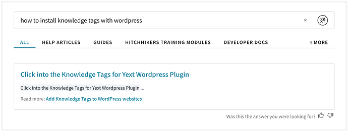
Now look at a similar query with Rick Text Featured Snippets enabled. Now the structure of the field content is accounted for, allowing the entire list of numbered directions to be given as a structured answer, similar to what you’d expect to see on Google:
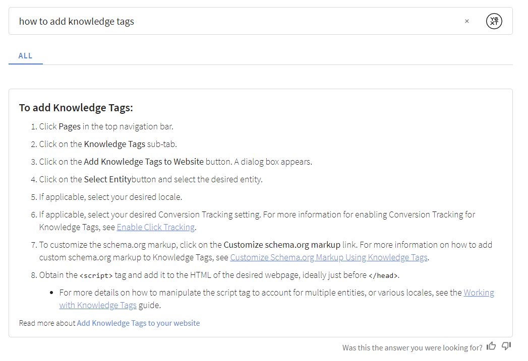
Upgrade Implications
- After upgrading, the existing
documentsearch-standarddirect answer card will support both Regular Snippets as well as Rich Text Snippets. - If you are using document search with a rich text field, and you have forked the
documentsearch-standarddirect answer card, you will need to refork in order to show rich text featured snippets on the frontend. In addition to updating the font size on rich text featured snippets, the direct answer font size for all document search direct answers is bumped slightly. If you’d like to change this, you can add the following to your
answers.scss:.HitchhikerDocumentSearchStandard-content { font-size: --yxt-font-size-md; }
Minor Bug Fixes/Improvements
Minor bug fixes will help improve your experience!
Theme v1.22 Upgrade Call Outs
Looking to upgrade to this version? If you forked any of these, you will need to re-fork them:
layouts/html.hbsscript/core.hbsentry.jsstatic/js/hours/transformer.js- If you are using document search with a rich text field, and you have forked the documentsearch-standard direct answer card, you will need to refork in order to show rich text featured snippets on the frontend.
- Optionally – If you’ve forked any component templates or script partials for the nav or search bar (such as
templates/TEMPLATE_NAME/markup/navigation.hbsortemplates/TEMPLATE_NAME/script/navigation.hbs), you should refork them to get this update. If you do not re-fork, the page will still work but you simply won’t have the page speed updates.
Theme v1.21
May 11, 2021
With the Hitchhikers Theme v1.21 we’ve added several features to expand built-in card options, enhance current styling, and improve speed.
Document Search Standard Card
With our recent launch of document search, we’ve now added an out of the box document-standard card! Feel free to use this card for any verticals where you’re showing documents, such as the Help Article entity. Note this is only compatible on verticals with document search on at least one field.
Note: Document Search and the Document Search Standard Card are currently only available in English.
Overlay Integration Speed Improvement
The current overlay waits for the page “load” event before loading the overlay.js script. With theme 1.21, we can improve performance by loading the overlay script immediately and cutting page load times.
Upgrade Implications
To use this feature with theme 1.21, delete the following from the answers tag in your integrated webpage:
(function () {
  var w = window;
  var d = document;
  function l() {
    var s = d.createElement("script");
    s.type = "text/javascript";
    s.async = true;
    s.src = w.YxtAnswersOverlaySettings.domain + '/overlay.js';
    var x = d.getElementsByTagName("script")[0];
    x.parentNode.insertBefore(s, x);
  }
  if (w.attachEvent) {
    w.attachEvent("onload", l);
  } else {
    w.addEventListener("load", l, false);
  }
})();
Now add the following tag above the answers script tag:
<script type="text/javascript" async src="https://answers.yext.com/overlay.js"></script>For an example, see the Adding an Overlay guide.
If you want to use this feature without upgrading theme 1.21, you will need to override static/js/overlay/parent-frame/yxtanswersoverlay.js.
In this file, replace:
if (!global.YxtAnswersOverlay) {
  global.YxtAnswersOverlay = new YextAnswersOverlay(window.YxtAnswersOverlaySettings);
}
with
if (!global.YxtAnswersOverlay) {
if (document.readyState === 'loading') {
   window.addEventListener('DOMContentLoaded', (event) => {
     global.YxtAnswersOverlay = new YextAnswersOverlay(window.YxtAnswersOverlaySettings);
   });
 } else {
   global.YxtAnswersOverlay = new YextAnswersOverlay(window.YxtAnswersOverlaySettings);
 }
}
Make sure to deploy this change to the Yext Search site so that the overlay uses the updated code.
Hours Time Zone Fix on Direct Answers
With this update, we corrected a bug where the user’s current time zone was not being taken into account when displaying the hours status on Direct Answers.
Upgrade Implications
If you forked your direct answer card to create a custom one, you should refork to get this update (it’s in the component.js file).
Alternatively, update the hours case in the component.js.
Replace
case 'hours':
  if (isArray) {
    arrayValue = answer.value.map((value) => `<div>${Formatter.openStatus({hours: value})}</div>`);
  } else {
    regularValue = `<div>${Formatter.openStatus({hours: answer.value})}</div>`;
  }
with
case 'hours':
  const timezoneOffsetForLocation = relatedItem?.data?.fieldValues?.timeZoneUtcOffset;
  if (isArray) {
    arrayValue = answer.value.map((value) => {
      const openStatus = Formatter.openStatus({
        hours: value,
        timeZoneUtcOffset: timezoneOffsetForLocation
      });
      return `<div>${openStatus}</div>`;
    });
  } else {
    const openStatus = Formatter.openStatus({
      hours: answer.value,
      timeZoneUtcOffset: timezoneOffsetForLocation
    });
    regularValue = `<div>${openStatus}</div>`;
  }
Separate “Hours Status” Class Names
Hours status texts (e.g. “Open”, “Closed”, “Open 24 Hours”) are now broken out into separate <span> tags to allow targeted styling. These can be viewed in the theme at static > js > hours > open-status > messagefactory.js, and styled in answers.scss.
CTA Alignment Fix with No Description
When there is no description on the product prominent image card, the CTA will now be fixed to the bottom of the card.
Margin Correction on Spell Check
Spellcheck suggestions are now left-aligned with the search bar and have consistent top / bottom margins.
Simplified Console Error Messaging
More concise error messages in console, especially when building new sites.
Minor Bug Fixes/Improvements
Minor bug fixes will help improve your experience.
Theme v1.21 Upgrade Call Outs
Looking to upgrade to this version? Here are some things to look out for:
- If you’ve overridden your
layouts/html.hbs file, you should re-fork. We renamed thebundle.jsfile, which is referenced in thehtml.hbsfile; you should refork to get the updated name.
Theme v1.20 and Search UI SDK 1.8
March 15, 2021
Introducing Hitchhiker Theme 1.20 and Search UI 1.8!
New Maps
Searching on maps is one of the most common use cases with Search! Whether it’s shops, healthcare professionals, restaurants, ATMs, or jobs, the map is often the star of the show. With Theme 1.20, we have added a series of changes to support a new full-page Maps experience with a new layout.
Besides the new fullscreen look, the new layout (called vertical-full-page-map) includes interactivity between result cards and maps pins, as well as a maps display on mobile.
Upgrade Implications
We will have two Layouts - Vertical with Map and Vertical with Full Page Map. These will be different files, and styling nested under different classes.
1. You’re upgrading and you don’t want to change your map.
No problem! You should be able to continue to use your original map layout. Just be mindful that the older map will not be upgraded, and not have our newer features.
2. You’re upgrading and you want the new map.
Great! The best way to do this is to re-add the location page, with the new map partials, and delete your old one. (Alternatively, you can keep your existing files and just copy the new hbs/json into them). If you forked the card you’re using you should also re-add it – we updated the card structure a bit for incorporate it into the new layout.
Once you add the new map, you will need to restart preview (if you don’t, you will not see the map fully loading in live preview).
Configuration for the New Map
By default, we will include the following attributes to configure in your JSON config when you create a new vertical-full-page-map page:
"mapConfig": {
  "mapProvider": "MapBox", // The name of the provider (e.g. Mapbox, Google)
  "noResults": {
  "displayAllResults": false // Set to FALSE to hide results on the map when a search returns no results
},
"pin": {
  "default": { // The pin in its normal state
    "backgroundColor": "#5387d7", // Enter a hex value or color for the pin background
    "strokeColor": "#2a446b",
    "labelColor": "white"
  },
  "hovered": { // The pin when it is hovered
    "backgroundColor": "#2f4d71",
    "strokeColor": "#172638",
    "labelColor": "white"
  },
  "selected": { // The pin when it is selected by mouse click or through a card click
    "backgroundColor": "#2f4d71",
    "strokeColor": "#172638",
    "labelColor": "white"
  }
}
You can add the following to your JSON Config to make changes but these will not be included by default:
enablePinClustering- Whether or not to cluster the pins
- false by default
apiKey- API key for the map provider
- Null by default
pinCluster.[default/hovered/selected].backgroundColor- Background color for the pin cluster
- #2f4d71 by default
pinCluster.[default/hovered/selected].labelColor- label color for the pin cluster
- white by default
pinCluster.[default/hovered/selected].strokeColor- stroke color for the pin cluster
- #2a446b and hovered/selected: #172638 by default
disableSearchOnMapMove- If the checkbox for searching when the map moves should be checked automatically
- False by default
providerOptions- A JSON pass through to the map provider: See Google Options4 and Mapbox Options6
- Note that if the options are not in JSON, they won’t be supported in this passthrough
- Null by default; we recommend setting
scrollToZoom zoom- Zoom for the map
- 14 by default
locale- This will default to locale of the config experience
- Note that if Google/Mapbox rejects the first two letters, they will fall back to English.
Document Search Support
Our brand new Search algorithm, Document Search, is the third component to our multi-algorithm story. Document Search allows consumers to search unstructured documents to return direct answers (via featured snippets) to their questions.
Document Search encompasses three distinct features:
- (Backend) Search algorithm to search unstructured documents and return direct answers
- (Frontend) Featured snippets to show the direct answer to search queries
- (Frontend) Inline snippets to highlight values relevant to search queries
Upgrade Implications
You can learn more about how to configure Document Search in your backend configuration in the Searchable Fields Best Practices reference.
Featured Snippets
Document search is able to pull out Search to user’s questions from long bodies of text, in the form of featured snippets. To add featured snippets to your experience, you’ll take advantage of our new “documentsearch-standard” direct answer card.
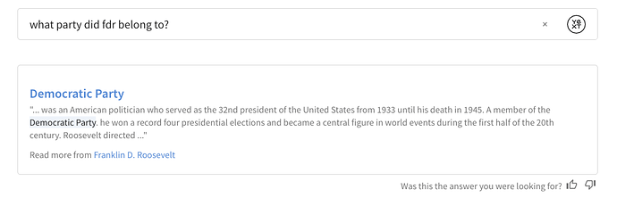
- If you’re creating a site from scratch, you won’t need to do anything.
If you’re upgrading from an older version of the theme, update the DirectAnswer component in your
index.jsonfile with the config in theme’stemplates/universal-standard/page-config.json. This DirectAnswer component will reference the correct cards. Here’s what it will look like:"DirectAnswer": { "types": { "FEATURED_SNIPPET": { "cardType": "documentsearch-standard" }, "FIELD_VALUE": { "cardType": "allfields-standard" } } }
Inline Snippets
Even if it doesn’t find a featured snippet, Document search will surface inline snippets, in the form of a snippet of text with highlighted values.
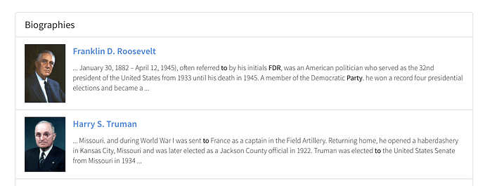
To take advantage of inline snippets:
- Fork the card on which you’d like to add document search. For example, you might use the standard card.
On the attribute where you’ll display the inline snippet, add the
highlightFieldformatter:details: profile.d_highlightedFields && profile.d_highlightedFields.s_snippet ? Formatter.highlightField(profile.d_highlightedFields.s_snippet.value, profile.d_highlightedFields.s_snippet.matchedSubstrings) : profile.body,// The text in the body of the cardIf the card has show more/show less, comment it out – the highlightField formatter returns HTML, so if you have show more/show less, it risks breaking the page
Unescape the highlighted portion in your html.hbs file using triple brackets
<div class="HitchhikerStandard-detailsText js-HitchhikerCard-detailsText{{#if showExcessDetailsToggle}} js-hidden{{/if}}">
{{{card.details}}}
</div>
Dynamic Text Highlighting
With Search Search UI SDK 1.8 and Search Hitchhiker Theme 1.20, we’ve made it easier to add Dynamic Text Highlighting with our isHighlighted utility function and highlightField formatter.
Use these two new formatters to check if a certain field is highlighted, and if so, display it on your card! This is to cover the case where you have textSearch or documentSearch on a field, but it’s not displayed in your card by default. To do this:
- Fork the card where you’d like the dynamic highlighting displayed.
In the
component.jsfile, add a variable in yourdataForRenderfor thedynamicHighlights. In this example, we’ll say that our “c_awards” field hastextSearchapplied, but it’s not shown in the card by default. We know that c_awards is a single line text field (not a list)//check if "c_awards" is highlighted var dynamicHighlights = []; if (HitchhikerJS.isHighlighted("c_awards", profile.d_highlightedFields)) { const fullHighlight = profile.d_highlightedFields["c_awards"]; dynamicHighlights.push({ "fieldName": "Awards", "value": Formatter.highlightField(fullHighlight.value, fullHighlight.matchedSubstrings) }); }Add that dynamicHighlights field to your return statement:
highlightedField: dynamicHighlights,. Your dataForRender in yourcomponent.jsshould look something like this:dataForRender(profile) { //check if "c_awards" is highlighted var dynamicHighlights = []; if (HitchhikerJS.isHighlighted("c_awards", profile.d_highlightedFields)) { const fullHighlight = profile.d_highlightedFields["c_awards"]; dynamicHighlights.push({ "fieldName": "Awards", "value": Formatter.highlightField(fullHighlight.value, fullHighlight.matchedSubstrings) }); } return { title: profile.name,// The header text of the card url: profile.website || profile.landingPageUrl, target: '_top',// If the title's URL should open in a new tab, etc. titleEventOptions: this.addDefaultEventOptions(), details: profile.description,// The text in the body of the card highlightedField: dynamicHighlights,//new showMoreDetails: { showMoreLimit: 750,// Character count limit showMoreText: 'Show more',// Label when toggle will show truncated text showLessText: 'Show less'// Label when toggle will hide truncated text} }; } }Add the highlights to your
template.jsfile:<div class="HitchhikerStandard {{cardName}}"> {{> image }} <div class="HitchhikerStandard-body"> {{> title }} {{> subtitle }} <div class="HitchhikerStandard-contentWrapper"> <div class="HitchhikerStandard-info"> {{> details }} {{> highlightedField }} </div> {{> ctas }} </div> </div> </div> {{#*inline 'highlightedField'}} {{#if card.highlightedField}} <ul class="highlights"> {{#each card.highlightedField}} <li class="highlight">"{{this.fieldName}}" mentions {{{this.value}}}</li> {{/each}} </ul> {{/if}} {{/inline}} {{!-- other partials below --}}
With this addition, the awards field will only appear on the card if it returns as a full text match.
List fields work very similarly – in step 2, you’d need to iterate through the items before adding them to your dynamicHighlights array. Here’s an example of adding dynamic highlights with the “Languages” built in field:
if (profile.d_highlightedFields["languages"]) {
  const fullHighlight = profile.d_highlightedFields["languages"];
  for (const item in fullHighlight) {
    if (fullHighlight[item].matchedSubstrings && fullHighlight[item].matchedSubstrings.length > 0) {
      dynamicHighlights.push({
        "fieldName": "Languages",
        "value": Formatter.highlightField(fullHighlight[item].value, fullHighlight[item].matchedSubstrings)
      });
    }
  };
}
“Create Vertical” Command
Adding new verticals to your search experience is one of the most common actions that Admins or Developers do when building out or optimizing an experience using the Hitchhiker Theme. Today, users need to use the “Add Page” command and then fill in things like the verticalKey and cardType, but we’ve found that this is one of the most error prone parts of the process.
We’re adding a new Command called “Create Vertical”, which will combine the inputs for the Page Layout (e.g., universal-standard, vertical-map, etc) with the verticalKey and cardType to make this process even smoother. The command will auto-insert the verticalKey everywhere it needs to be in the file and the cardType so your new vertical should be ready to go straight away.
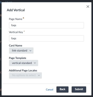
4 Column Layout
We’re introducing a new 4 column grid layout on both Universal and Vertical Search. Today, you can specify to have a grid layout in both Universal or Vertical Search with both two and three columns. This new layout will allow for a fourth column. Just as with two and three column layouts, you can choose to have this four column grid on only Universal, only Vertical or on both!
To add this in Vertical Search:
In the [pageName].html.hbs file for any vertical that was created using the vertical grid template, you should see a line like this:
<div class="Answers-container Answers-resultsWrapper Hitchhiker-3-columns">
If you update the “3” to “4” in that line, you can take advantage of four column grid layout!
To add this In Universal Search:
Update the Universal Section Template under verticalsToConfig to be grid-four-columns.
Note that, right now, this layout is best optimized using product prominent image cards on desktop.
Add Default Initial Search on Universal Search
The typical user journey is that a user enters a search into a search bar and then lands on the search results page with exactly the answer they’re looking for. However, sometimes users land on the search results page before a query has been run (or perhaps the brand didn’t have the bandwidth to build the preferred search bar so they only included a link to the search experience from their homepage). When this happens, they see an empty page!
Now, you can pin results to an empty query to automatically showcase specific results when this happens:
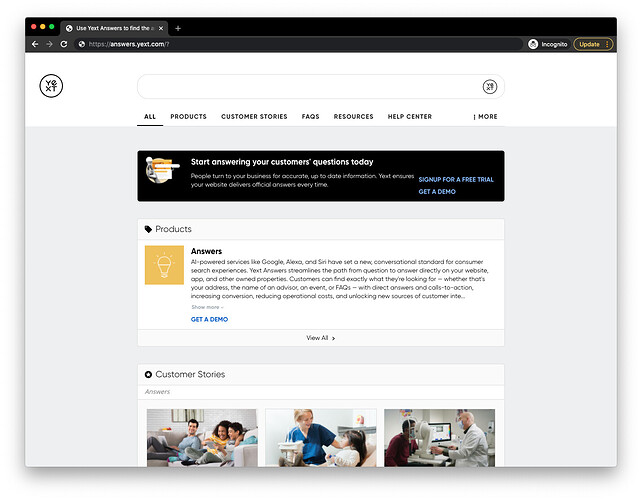
How to apply a default initial search:
- In your
index.json, update theSearchBarcomponent incomponentSettingswith"allowEmptySearch": true. In your
index.json, addpageSettingsto include the default initial search. This should go outside ofcomponentSettings(same place where it is in your verticals)."pageSettings": { "search": { "defaultInitialSearch": ""// Enter a default search term, should be your pinned query }, } "componentSettings": { "SearchBar": { "allowEmptySearch": true, // Allows users to submit an empty search in the searchbar }Update your backend search configuration to include a pinned result. You can read more about how pinned results work in the Query Rules reference doc. Here’s a sample:
{
  "criteria": {
    "searchTermMatchesRegex": "^$",
    "searchTypes": "UNIVERSAL"
  },
  "actions": [
    {
      "actionType": "RETURN_PINNED_RESULT",
      "verticals": [
        {
          "savedFilterId": "[[ENTER FILTER ID]]",
          "verticalKey": "videos"
        },
        {
          "savedFilterId": "[[ENTER FILTER ID]]",
          "verticalKey": "states"
        }
      ]
    }
  ],
  "name": "Default Search"
}
Confirm the search works! Note that these default initial searches count as a search (and therefore towards your search capacity).
Fixes and Small Features
In addition to a lot of great new features, Hitchhiker Theme 1.20 and UI SDK 1.8 include a series of minor improvements and bug fixes!
1. Remove Default Star Icon
You asked, we listened! If you don’t want to include an icon with your vertical headers in Universal Search, you can now omit that property in your vertical configuration. Previously, if no icon was explicitly provided, we would fallback on the ‘star’ icon.
- Upgrade Implications: If you are taking advantage of that fallback behavior and want to keep the star, make sure to include
"icon": "star"in yourverticalsToConfigif you’re using the Theme or inverticalPagesif you’re using the SDK directly.
Curious about what icons are available? Check out the Icons reference doc.
2. Null checks for CTAs
We’ve made sure to add additional null checking for the CTAs in the accordion card.
3. Hide Footer in Collapsible Filters
Previously, if you added a footer (using layouts/footer.hbs), it would not be concealed when collapsible filters were expanded. This has been fixed.
4. Financial Professional Location Template Misspelling
There was a misspelling in the Financial Professional Location card that has been corrected, so the card no longer throws an error.
5. CTA Link Types for International Sites
For international sites, non-URL link types were not displayed correctly. This is now fixed.
6. Small Logo
In theme 1.19, on mobile, the Yext logo in the searchbar was a little small. We’ve updated this so on mobile it remains a normal size.
7. Price Formatter
When price is entered in the Knowledge Graph, we were previously rounding to an incorrect value. This has been corrected.
Apply Filters from URL
A great search experience is one that brands want to link to from all sorts of places, besides a search bar! We have customers that want to link out to their search results from many different places within the site. Oftentimes, these are targeted or contextual use cases, like including a search to all doctors with a specialty from that Specialty’s landing page. While some customers have made this work, it took a lot of extra effort.
We’re making this even easier with the ability to apply filters from the URL directly. You will not need to do anything to get this extra functionality; hitting back and refreshing the page will show you how the filters remain applied. You’ll also notice that the filters themselves have changed. We no longer use index based filtering (like filterbox[0]=afilter), instead we represent the full field name. With a few exceptions, this matches the request we pass to the backend to apply the filter.
Upgrade Implications
This removes the old index based parameters; if you were relying on said parameters, be mindful when upgrading to this version, since they will be replaced with filters that more closely resemble the Live API filter language.
Boolean Support for Facets
Facets are one of the most powerful features of a search experience. They can help guide users to find the answer they’re searching for, or they can make it easier for a user who’s in “browse mode”.
You can now use Boolean fields for Facets! On the configuration side, this works like any other field.
By default, the frontend will display “true” or “false” as the options for all boolean type fields. You can override these by specifying different labels in a fieldLabels option under the fields configuration (you might remember using this configuration option previously – it’s the same place where you specify the label for a facet, and whether a facet should be searchable).
"ComponentSettings" : {
  "Facets": {
    "expand": false,
    "fields": {
      "c_acceptingNewPatients":  {
        "placeholderText": "Search",
        "fieldLabels": {
          "false": "not accepting patients",
          "true": "accepting patient"'
        }
      }
    }
  }
}
Theme v1.20 Upgrade Call Outs
In addition to the upgrade implications called out for each individual feature, we added a few new SCSS variables. If you are upgrading, you will not have these variables by default. To remedy this, copy the following variables into your answers-variables.scss file. We’ve added notes around where we put them stylistically, but so long as they are all within the :root { } object, they’ll work! Feel free to reference the full file
here
, or view it within the theme’s folder in your repo.
  // theme specific variables
--hh-universal-grid-four-columns-width: calc(calc(100% - var(--hh-universal-grid-margin) * 8)/4);

  // component specific variable overrides
--yxt-text-snippet-highlight-color: #eef3fb;
--yxt-text-snippet-font-color: var(--yxt-color-text-primary);
--yxt-direct-answer-view-details-font-weight: var(--yxt-font-weight-normal);

  // This is a NEW section, below "component specific variable overrides" but within the root.
  // interactive map variables
--yxt-maps-search-this-area-background-color: white;
--yxt-maps-search-this-area-text-color: var(--yxt-color-text-primary);
--yxt-maps-mobile-detail-card-height: 225px;
--yxt-maps-desktop-results-container-width: 410px;
--yxt-maps-mobile-results-header-height: 121px;
--yxt-maps-mobile-results-footer-height: 97px;
Theme v1.19
Jan 20, 2021
Refreshed UI
In Theme 1.19, we’ve introduced a series of updates to the theme to give it a more modern look!
These updates were made after user testing and user behavior research. The new default UI was updated to increase engagement with your search experience.
Here’s what we updated:
- Default colors
- Border radius (universal sections and sections on vertical will be rounded by default)
- Increased the default width of the experience
- Updated the default font to Source Sans Pro from Open Sans
- Updated default font sizes so the experience is slightly bigger
- Updated spacing
- Removed “Filters” title for Facets and removed lines between collapsed facets
Default UI Before:
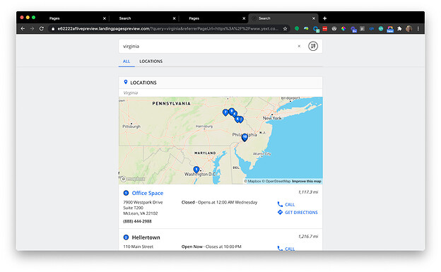
Default UI After:
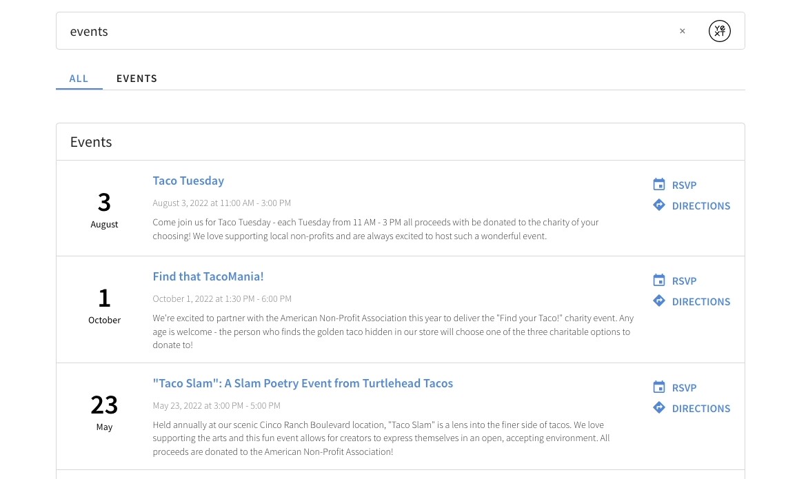
Upgrade Implications
You can choose to either:
- Embrace the new UI and update any top-level styling to align with the new look and feel
- Preserve your current UI and keep the styling the same
Both options will require some work when you upgrade.
Option One: Use Updated Styling
A video walkthrough of the below updates can be found here :
1. Default colors
We updated the default colors. Most noticeably, we’re encouraging a white background by default, since most website backgrounds are white. That said, you should update this to blend in with your website – Search should be an extension of your site’s branding.
If you are still using our default colors, feel free to update to them:
| Default value in v1.18 and prior | Default value in 1.19 |
|---|---|
// control colors |
// control colors |
--yxt-color-borders: #dcdcdc; |
--yxt-color-borders: #d8d8d8; |
--yxt-color-brand-primary: #0f70f0; |
--yxt-color-brand-primary: #5387d7; |
--yxt-color-background-highlight: #fafafa; |
--yxt-color-background-highlight: white; |
--hh-view-results-button-hover-color: #0c5ecb; |
--hh-view-results-button-hover-color: #4a7ac1; |
--hh-answers-background-color: #eeeff0; |
--hh-answers-background-color: white; |
2. Border radius (universal sections and sections on vertical will be rounded by default)
Our user testing showed us that rounder edges are more engaging than hard corners. So, we’re making the update! Some of you may have already done this using css overrides. As long as you haven’t explicitly updated this, this should just work for you when you upgrade. Are sharp corners part of your brand guidelines? No problem, you can use CSS to override.
In the future, if you want to update the border radius, you can add this variable to the answers-variables.scss file:
Under // common border variables, add --yxt-border-radius: 5px;
3. Increased the default width of the experience
This one we’re particularly excited about. Previously, the default width was pretty narrow - designed to really focus people on the page. But, you all have shown that you want to surface a lot of awesome content on result cards, so we decided to give you a bit more real estate to do this.
When you upgrade, you’ll need to add or update the following in answers-variables.scss file
| Default value in v1.18 and prior | Default value in 1.19 |
|---|---|
| n/a - new | $container-width: 1000px; |
//theme specific variables |
|
--hh-universal-grid-margin: 8px; |
|
// breakpoint variables |
|
$breakpoint-collapsed-filters: $container-width + 279px; |
|
| $breakpoint-expanded-filters: $container-width + 280px; | |
//theme specific variables |
//theme specific variables |
--hh-answers-container-width: 700px; |
--hh-answers-container-width: #{$container-width}; |
--hh-universal-grid-three-columns-width: 212px; |
--hh-universal-grid-three-columns-width: calc(calc(100% - var(--hh-universal-grid-margin) \* 6) / 3); |
--hh-universal-grid-two-columns-width: 326px; |
--hh-universal-grid-two-columns-width: calc(calc(100% - var(--hh-universal-grid-margin) \* 4) / 2); |
With the wider default width, you’ll notice the images on the product-prominent-image cards get pretty big. You may either want to add padding to the images, or increase the number of columns of your cards.
To accomplish the latter, you’ll need to override some of the width settings included in the three-column layout.
To ensure the universal section has four column, update the --hh-universal-grid-three-columns-width variable in your answers-variables.scss:
--hh-universal-grid-three-columns-width: calc(calc(100% - 8px * 8)/4);To update the vertical grid to have four columns, add the following to your answers.scss:
.AnswersVerticalGrid .Hitchhiker-3-columns .yxt-Card {
   width: 25%;
}
A future theme release will include these new options by default.
4. Updated Spacing
To allow the experience to breathe a bit more, we updated the base spacing. If you do not want this change, no need to update the --yxt-base-spacing variable.
| Default value in v1.18 and prior | Default value in 1.19 |
|---|---|
// spacing variable, used in padding/margins across the site |
// spacing variable, used in padding/margins across the site |
--yxt-base-spacing: 16px; |
--yxt-base-spacing: 20px; |
5. Updated the default font to Source Sans Pro from Open Sans
OpenSans is so 2020! Just kidding… But seriously, we decided to update our default font based on some more user testing to Source Sans Pro. Many of you have already overridden the font to use whatever font(s) you use on your main website, which is great! For those of you still using Open Sans, feel free to keep that. Or you can update to use our new font.
If you aren’t using custom fonts and want to switch over, navigate to the static/fonts.scss file and
A. Update the –yxt-font-family to use Source Sans Pro instead of “Open Sans”
--yxt-font-family: "Source Sans Pro","Open Sans",system-ui,"Segoe UI",Roboto,Oxygen-Sans,Ubuntu,Cantarell,"Helvetica Neue",sans-serif;B. Remove or comment out the Open Sans font declarations
In other words, remove or comment out the below:
@font-face
{
  font-family: "Open Sans";
  src: url('../assets/fonts/opensans-regular-webfont.woff') format("woff");
  font-weight: $font-weight-normal;
  font-style: normal;
  font-display: swap;
}
@font-face
{
  font-family: "Open Sans";
  src: url('../assets/fonts/opensans-bold-webfont.woff') format("woff");
  font-weight: $font-weight-bold;
  font-style: normal;
  font-display: swap;
}
@font-face
{
  font-family: "Open Sans";
  src: url('../assets/fonts/opensans-semibold-webfont.woff') format("woff");
  font-weight: $font-weight-semibold;
  font-style: normal;
  font-display: swap;
}
C. Add the new Source Sans Pro font declarations
@font-face
{
  font-family: "Source Sans Pro";
  src: url('../assets/fonts/source-sans-pro-v14-latin-300.woff') format("woff");
  font-weight: $font-weight-light;
  font-style: normal;
  font-display: swap;
}

@font-face
{
  font-family: "Source Sans Pro";
  src: url('../assets/fonts/source-sans-pro-v14-latin-regular.woff') format("woff");
  font-weight: $font-weight-normal;
  font-style: normal;
  font-display: swap;
}

@font-face
{
  font-family: "Source Sans Pro";
  src: url('../assets/fonts/source-sans-pro-v14-latin-600.woff') format("woff");
  font-weight: $font-weight-semibold;
  font-style: normal;
  font-display: swap;
}

@font-face
{
  font-family: "Source Sans Pro";
  src: url('../assets/fonts/source-sans-pro-v14-latin-700.woff') format("woff");
  font-weight: $font-weight-bold;
  font-style: normal;
  font-display: swap;
}
6. Updated default font sizes so the experience is slightly bigger
We decided to increase the font sizes - this is a fairly subtle change but we think it’s worth it! Again, you may have already overridden the font sizes to align with your brand, in which case feel free to skip this update, otherwise you can find our new suggested font sizes below. These should be included in your static/fonts.scss file.
Default value in v1.18 and prior
--yxt-font-size-xs: 10px;
--yxt-font-size-sm: 12px;
--yxt-font-size-md: 14px;
--yxt-font-size-md-lg: 16px;
--yxt-font-size-lg: 18px;
--yxt-font-size-xlg: 20px;
--yxt-font-size-xxlg: 40px;
Default value in 1.19
--yxt-font-size-xs: 12px;
--yxt-font-size-sm: 14px;
--yxt-font-size-md: 16px;
--yxt-font-size-md-lg: 18px;
--yxt-font-size-lg: 20px;
--yxt-font-size-xlg: 22px;
--yxt-font-size-xxlg: 42px;
Finally, add the following variables to your answers-variables.scss file (recommended under // component specific variable overrides.
--yxt-alternative-verticals-emphasized-font-weight: var(--yxt-font-weight-semibold);
--yxt-filters-and-sorts-font-size: var(--yxt-font-size-md);
7. Removed “Filters” title for Facets and removed lines between facets
Lastly, we made some updates to the facets UI to make it a bit simpler and cleaner. This includes:
- Removing the “Filters” title at the top
- Removed the lines between the Facet fields
If you want to keep the filter title, add this to your answers.scss file:
.AnswersVerticalStandard.CollapsibleFilters .yxt-FilterBox-titleContainer, .AnswersVerticalGrid.CollapsibleFilters .yxt-FilterBox-titleContainer {
   display: flex;
}
If you want to keep the lines between the facet fields, add this to your answers.scss file:
.yxt-FilterBox-filter+.yxt-FilterBox-filter {
  border-top: .0625rem solid var(--yxt-color-borders);
}

.AnswersVerticalStandard.CollapsibleFilters .yxt-FilterOptions-fieldSet, .AnswersVerticalGrid.CollapsibleFilters .yxt-FilterOptions-fieldSet {
  margin: .75rem 0;
}
Summary of Changes
If you want a summary of the changes by file, you can reference the below:
answers-variables.scss
| Default value in v1.18 and prior | Default value in 1.19 |
|---|---|
| n/a - new | $container-width: 1000px; |
//theme specific variables |
|
--hh-universal-grid-margin: 8px; |
|
// component specific variable overrides |
|
--yxt-alternative-verticals-emphasized-font-weight: var(--yxt-font-weight-semibold); |
|
--yxt-filters-and-sorts-font-size: var(--yxt-font-size-md); |
|
// breakpoint variables |
|
$breakpoint-collapsed-filters: $container-width + 279px; |
|
$breakpoint-expanded-filters: $container-width + 280px; |
|
// control colors |
// control colors |
--yxt-color-borders: #dcdcdc; |
--yxt-color-borders: #d8d8d8; |
--yxt-color-brand-primary: #0f70f0; |
--yxt-color-brand-primary: #5387d7; |
--yxt-color-background-highlight: #fafafa; |
--yxt-color-background-highlight: white; |
--hh-view-results-button-hover-color: #0c5ecb; |
--hh-view-results-button-hover-color: #4a7ac1; |
--hh-answers-background-color: #eeeff0; |
--hh-answers-background-color: white; |
//theme specific variables |
//theme specific variables |
--hh-answers-container-width: 700px; |
--hh-answers-container-width: #{$container-width}; |
--hh-universal-grid-three-columns-width: 212px; |
--hh-universal-grid-three-columns-width: calc(calc(100% - var(--hh-universal-grid-margin) \* 6) / 3); |
--hh-universal-grid-two-columns-width: 326px; |
--hh-universal-grid-two-columns-width: calc(calc(100% - var(--hh-universal-grid-margin) \* 4) / 2); |
// spacing variable, used in padding/margins across the site |
// spacing variable, used in padding/margins across the site |
--yxt-base-spacing: 16px; |
--yxt-base-spacing: 20px; |
fonts.scss
| Default value in v1.18 and prior | Default value in 1.19 |
|---|---|
--yxt-font-size-xs: 10px; |
--yxt-font-size-xs: 12px; |
--yxt-font-size-sm: 12px; |
--yxt-font-size-sm: 14px; |
--yxt-font-size-md: 14px; |
--yxt-font-size-md: 16px; |
--yxt-font-size-md-lg: 16px; |
--yxt-font-size-md-lg: 18px; |
--yxt-font-size-lg: 18px; |
--yxt-font-size-lg: 20px; |
--yxt-font-size-xlg: 20px; |
--yxt-font-size-xlg: 22px; |
--yxt-font-size-xxlg: 40px; |
--yxt-font-size-xxlg: 42px; |
| n/a - new | --yxt-autocomplete-text-font-size: var(--yxt-font-size-md-lg); |
Font declarations before
@font-face
{
  font-family: "Open Sans";
  src: url('../assets/fonts/opensans-regular-webfont.woff') format("woff");
  font-weight: $font-weight-normal;
  font-style: normal;
  font-display: swap;
}
@font-face
{
  font-family: "Open Sans";
  src: url('../assets/fonts/opensans-bold-webfont.woff') format("woff");
  font-weight: $font-weight-bold;
  font-style: normal;
  font-display: swap;
}
@font-face
{
  font-family: "Open Sans";
  src: url('../assets/fonts/opensans-semibold-webfont.woff') format("woff");
  font-weight: $font-weight-semibold;
  font-style: normal;
  font-display: swap;
}
Font declarations after
@font-face
{
  font-family: "Source Sans Pro";
  src: url('../assets/fonts/source-sans-pro-v14-latin-300.woff') format("woff");
  font-weight: $font-weight-light;
  font-style: normal;
  font-display: swap;
}

@font-face
{
  font-family: "Source Sans Pro";
  src: url('../assets/fonts/source-sans-pro-v14-latin-regular.woff') format("woff");
  font-weight: $font-weight-normal;
  font-style: normal;
  font-display: swap;
}

@font-face
{
  font-family: "Source Sans Pro";
  src: url('../assets/fonts/source-sans-pro-v14-latin-600.woff') format("woff");
  font-weight: $font-weight-semibold;
  font-style: normal;
  font-display: swap;
}

@font-face
{
  font-family: "Source Sans Pro";
  src: url('../assets/fonts/source-sans-pro-v14-latin-700.woff') format("woff");
  font-weight: $font-weight-bold;
  font-style: normal;
  font-display: swap;
}
Option Two: Preserve Current Styling
To completely preserve your current styling, get ready to start forking! If you want to keep everything as is, you just need to shadow the files from the Theme before you upgrade. Here are all of the files that we updated as part of the styling changes:
- Top level files
- static/scss/answers/theme.scss
- static/scss/answers/common/mixins.scss
- Pages
- static/scss/answers/templates/vertical-grid.scss
- static/scss/answers/templates/vertical-standard.scss
- static/scss/answers/templates/vertical-map.scss
- static/scss/answers/templates/universal-standard.scss
- Cards - shadow the scss for any cards you are using. Files will look like this:
- static/scss/answers/cards/standard.scss
- static/scss/answers/cards/faq-accordion.scss
- static/scss/answers/cards/link-standard.scss
- static/scss/answers/cards/location-standard.scss
- static/scss/answers/cards/menuitem-standard.scss
- static/scss/answers/cards/event-standard.scss
- static/scss/answers/cards/financial-professional-location.scss
- static/scss/answers/cards/job-standard.scss
- static/scss/answers/cards/product-prominentimage-clickable.scss
- static/scss/answers/cards/professional-location.scss
- static/scss/answers/cards/product-standard.scss
- Direct Answer
- static/scss/answers/directanswercards/allfields-standard.scss
- Universal sections:
- static/scss/answers/universalsectiontemplates/common.scss
- static/scss/answers/universalsectiontemplates/grid-three-columns.scss
- static/scss/answers/universalsectiontemplates/grid-two-columns.scss
- Templates:
- static/scss/answers/collapsible-filters/collapsible-filters-templates.scss
- static/scss/answers/collapsible-filters/collapsible-filters.scss
Faster Preview Generation
With Theme 1.19, when you create a live preview, we’ll now be using webpack’s development mode by default; this will reduce the time it takes to generate the preview!
If you want to use the full production mode (like we use for publishes), you can…
- Navigate to
ci/serve.sh. - The third line of the file says
export IS_DEVELOPMENT_PREVIEW='true'. Update this toexport IS_DEVELOPMENT_PREVIEW=‘false’. - Restart live preview.
Before deploying a site, we always recommend testing the full production build. You can do this in two ways:
- Publish the site on staging. This will publish with
IS_DEVELOPMENT_PREVIEW='false'always. - Update the variable in serve.sh to
IS_DEVELOPMENT_PREVIEW='false', then restart live preview and view the subsequent preview.
Upgrade Implications
If you are upgrading to this version, you won’t get the speediness by default. You should update the ci/serve.sh file as follows:
Before
#!/bin/sh
export NODE_OPTIONS="--max-old-space-size=1024"
serve -l 8080 desktop/ &
grunt watch
After
#!/bin/sh
export NODE_OPTIONS="--max-old-space-size=1024"
export IS_DEVELOPMENT_PREVIEW='true'

serve -l 8080 desktop/ &
grunt watch
Updated CTA Position on Product Cards
We’ve moved the CTAs to be fixed to the bottom of the product prominent image card.
A Few Minor Bug Fixes/Improvements
Theme 1.19 also includes a few bug fixes and general improvements:
1. Pagination Now Scrolls User to Top
Previously, for the JS snippet integration option, paginating would not move you to the top of the results. This is fixed in this theme version, so pagination will take you to the top of the page (where you can view the updated results).
2. Removed Build Warnings in Console
You’ll now see fewer disruptive build warnings in the console when previewing (and committing changes to) your site.
3. Page Speed Improvements
We’ve removed additional unnecessary whitespace in our JS and html files, and optimized which cards are shipped with a build.
Theme v1.18
Dec 14, 2020
With the Hitchhikers Theme v1.18 we’ve added a handful of small features and bug fixes, including a new way of pulling in Vertical Name, updates to Collapsible Filters styling, and passing the destination URL with the TITLE_CLICK event for all cards!
You can find the full list of features and bug fixes below:
Use Vertical Name in Section Headers, Nav and No Results
The Vertical Name that you set in your search configuration will now be used in the section headers, navigation and no results messaging!
You can set these vertical names in Additional Vertical Settings > Name, under the verticals configuration section.
Upgrade Implications
If you update the name in the search configuration, you’ll need to either rebuild your site or make a new commit in order to have the update reflected on the frontend. If the “name” property in your search configuration does not match what you want displayed in the navigation, override it in your config/pageName.json file with the verticalsToConfig.label property.
Corrected Collapsible Filters Breakpoint
Previously, collapsible filters had an intermediary state, where they would appear above the results set before collapsing. The filters now collapse as soon as the width of the screen becomes too narrow for them to left align, so you should never see the filters appear above the results.
Styling Fixes for Filters
Filter Alignment
Spacing in the filter rail on verticals without maps is now consistent and aligned on mobile (just as it is on verticals with maps)! You no longer need to add spacing to get your filters / sorts / facets to all line up.
Radio Buttons on iOS
iOS displays radio buttons as square, which can be confusing to a user (since it appears like a multi-option select). We’ve updated them to be round by default.
Hours Wrapping Now Consistent
When we introduced our new hours list formatter, we found that the hours were wrapping at different times, based on the length of the title. To standardize this, we automatically wrap the hours at a wider tablet breakpoint. You may see them wrap slightly earlier than you previously did, to guarantee this consistency.
Title Clicks Now Pass URL to Analytics
Clicks to any card’s title will now pass the destination URL to the TITLE_CLICK event. It’s passed as the url attribute.
Theme v1.17
Dec 1, 2020
Search Overlay
We’ve launched a new integration option called the Search Overlay! Learn more about it here .
New Clickable Product Card
We added a new card type, which is a fully clickable product card. This card uses the new product entity by default. Note that the entire card is clickable, which means you cannot use links (including from rich text) in the description on the card.
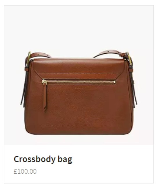
To use it, set your cardType to product-prominentimage-clickable in verticalsToConfig.
Product Card Updates
The current product cards in the HH theme (product-standard & product-prominentimage) have been updated to align with our new product entity. This includes adding price and rich text formatting for the details section of the product card.
Upgrade Implications
If you did not fork your card and were using product-standard or product-prominentimage, you should fork beforehand to keep your cards as-is, or use the new product entity and use the updated cards.
New Hours List Formatter
We added a new hours Formatter called hoursList. This Formatter has more flexibility around displaying hours, and the open status information on cards.
Before
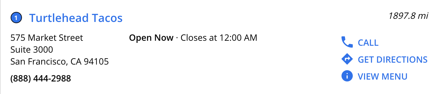
After
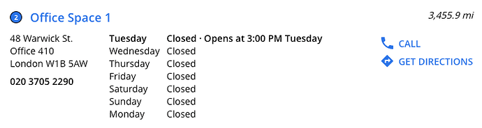
Basic Usage
To use the formatter out of the box, call the formatter in your card’s the following in your card’s hours field (under dataForRender):
hours: Formatter.hoursList(profile),Additional Formatter Options
The second parameter in the formatter allows you to add additional configuration. It accepts a JSON object with three optional keys:
isTwentyFourHourClock: Use 24 hour clock if true, 12 hour clock if false. Defaults based on locale if undefined.disableOpenStatus: If true, displays the hours intervals, rather than the open status string for today. Defaults to false.firstDayInList: A day name in English, e.g. “SUNDAY”, this day will be displayed first in the list. If unspecified, the current day will be at the top.
Advanced Examples
To use a twenty four hour clock:
hours: Formatter.hoursList(profile, { 'isTwentyFourHourClock': 'true'} ),To disable open status:
hours: Formatter.hoursList(profile, { 'disableOpenStatus': 'true'} ),To set the first day in the list to Sunday a twenty four hour clock:
hours: Formatter.hoursList(profile, { 'firstDayInList': 'SUNDAY'} ),Using a Different Hours Field or Locale
The formatter defaults to using the hours built-in filed. To use a different hours field, you’ll need to use the third parameter, and pass an empty object as the second.
hours: Formatter.hoursList(profile, {}, 'c_myCustomHoursField'),Finally, the locale used defaults to the page’s locale. You can override this in the fourth parameter if needed.
hours: Formatter.hoursList(profile, {}, 'hours', 'en'),Custom Formatters File and Tree Shaking
Theme 1.17 introduces more formalized tree shaking (a form of dead code elimination) to help with page speed.
With this version of the theme, there are 3 formatter files:
Formatter.js- list of formatters that will be usedFormatters-internal.js- list of theme formatter definitionsFormatters-custom.js- for custom formatters and formatter changes. Newly added with theme 1.17.
How to Update an Existing Formatter
Fork formatters-custom.js, copy over the formatter from formatters-internal.js and edit it as needed. So long as you use the same name, we’ll pick your custom one.
How to Create a New Formatter
Fork formatters-custom.js and define it there. (You don’t need to list it in imports and exports, since we include all formatters from formatters-custom.js by default.)
Tree Shaking
- Shadow
formatters.js - Confirm that the formatter is not being used in any of the cards you’re referencing
- Comment it out in both the import and export statement in
formatters.js
Upgrade Implications
We’ve made a couple of changes to formatters across the past few theme releases, so documenting them all here. The TL;DR is if you did special things with your formatters previously, they should not break when you upgrade to this version, but we’d recommend updating your formatter file pattern to match the most recent outlined above.
Upgrading to 1.17 from 1.13 or Older (Has formatters.js)
- If you haven’t forked your
formatter.jsfile: do nothing, and follow the above instructions. - If you previously forked your formatter.js file to either add a new formatter, remove a formatter or change an existing formatter: Do nothing, this will continue to work.
Upgrading to 1.17 from 1.14, 1.15 or 1.16 (Has formatters.js and formatters-internal.js)
- If you previously updated an existing formatter by forking
formatters-internal.jsand updating it there, this will continue to work. - If you previously created a new formatter by forking formatters-internal and defining it there, then listing in imports/exports in
formatters.js, that will also continue to work. Moving forward, you can define your custom formatters informatters-custom.js.
Target for redirectUrl in the SearchBar Component15
The Searchbar component in SDK 1.7.0 has a new redirectUrlTarget attribute. This controls the target for the redirectUrl. It expects a valid target: “_blank”, “_self”, “_parent”, “_top” or the name of a frame.
If you’d like the search bar to open the experience on a new page, or if it’s included within a modal, you can take advantage of this config option when adding the search bar to a site.
Note that the redirectUrlTarget defaults to “_self” if not specified (which is the browser default and used for all search bars today).
In the Theme
"SearchBar": {
  "redirectUrlTarget": "_blank"
},
SDK Directly (in the onReady):
this.addComponent('SearchBar', {
  container: '.search-bar-container',
  redirectUrl: 'https://myanswersexperience.com',
  redirectUrlTarget: "_blank"
}),
Iframe Title Attribute
With theme 1.17, the Iframe for client-hosted experiences now has a title attribute by default! This is pulled from the pageTitlefrom the config.jsonfile. This improves screenreader’s ability to understand the iframe’s purpose on the page.
If you haven’t forked iframe-common.js, you’ll see the title attribute for the iframe populated by default.
Search Via NPM
When using the SDK directly, you can now install search via NPM! The package can be found at @yext/answers - npm10 .
Sped Up Webpack Build
We’ve optimized our webpack build, meaning it takes less time to create live previews!
Bug fixes
With Theme 1.17.0 and SDK 1.7.0 we released a series of bug fixes:
- Width of Search Bar in Vertical with Map
The search bar on the location-standard layout was previously missing left/right padding in mobile. This has been fixed so it matches other verticals.
Upgrade Implications: The Searchbar in Vertical Maps Layout was previously: <div class="Answers-searchBar js-answersSearchBar" id="js-answersSearchBar"></div>.
We’ve updated it to <div class="Answers-search js-answersSearch" id="js-answersSearchBar"></div> to get the right styling. If you were previously targeting any of the old classes (Answers-searchBar js-answersSearchBar) or the old id (#js-answersSearchBar), in your theme, you will need to update said references.
2. Collapsible Filters - View Results Button Now Sticky in Iframe
When adding Collapsible filters for iframe integrations, the view results button will now be sticky by default for maps.
3. Collapsible Filters - Right Padding of View Results Button
Previously the left and right padding of the view results button was in equal. It is now .5rem on each side.
4. Aria Hidden Elements in FAQs are no Longer focusable
Previously, when you tabbed through an experience, links within FAQs would be focused (even though they are not visible). This is no longer the case, making the experience more accessible.
5. Pagination No Longer Has Top Margin When It’s Empty
Pagination previously had top margin when it was not shown; this has been removed.
6. Filter boxes now have a white background
All filters (static filters, sorting, facets) have a white background, instead of being transparent or grey.
7. Only Render Necessary Pagination
Previously, we’d render all pages in the pagination component, causing a lag on page speed. We now will only render the pagination you can see, improving page speed on larger results sets.
8. Updated Yext Logo
The footer yext logo used to include a copyright symbol. It no longer has the copyright symbol.
Upgrade Implications: If you previously forked your yext-logo.hbs or static/assets/images/yext-logo, you won’t get this update.
9. Fixed Issue with Google Maps on Mobile in Get Directions Formatter
For users with the Google Maps app, if you clicked a “get directions” link, we’d correctly open the Google Maps, but it would trigger a malformed search.
We introduced a fix in the Get Directions Formatter to correctly handle users with the Google Maps app.
10. Added Sort Options Focus State
Added a focus state to Sort Options to match similar behavior on Filters and Facets. This improves the accessibility of the experience.
11. Update Non-Internationalized Cards to Use toLocalizedDistance
Updated non-internationalized cards to use the new toLocalizedDistance Formatter instead of toMiles. That way, if your are using the english cards for profiles that require the metric system (like en_GB), you’ll see the correct formatting.
Upgrade Implications: If you have not forked your cards, you’ll use the new toLocalizedDistance formatter, but this will yield the same results as the toMiles formatter for english locales.
12. UI Fix for the location-standard card on Internet Explorer
On IE11, location standard cards with long bodies would overflow the card container. We introduced a styling to fix (.HitchhikerLocationStandard-infoWrapper {width: 100%;}), so that the card body always remains within the card.
13. Provide queryString to onVerticalSearch correctly
Previously, the queryString param in the onVerticalSearch hook was null for queries initiated by paginating and filter updates. This has been corrected in v1.7 of the SDK.
Upgrade Implications: None; if you were relying on the null value for the onVerticalSearch hook previously, you’ll need to update your logic.
14. Fixed Image Formatter Max Width
Made changes to the Image Formatter to respect a max width argument and improve expected outcome when using the Formatter. This helps page speed by picking the correct image size.
15. Recognize URI Schemes like tel: and mailto: as absolute units
Updated CTA Formatter to recognize tel: and mailto: links correctly.
16. Added Sourcemaps to SDK
We’ve added sourcemaps to this version of the SDK, so it’s easier to see SDK errors in the console.
17. Eliminated Parser Blocking JS in Theme
Changed parser behavior to defer all JS snippets for page speed improvements.
Theme v1.16
October 29, 2020
Internationalized Theme
We’ve added support to internationalization! Stay tuned for a more detailed module around how to use it in the next few weeks!
Page Speed - CSS and JS Inlining
By default, we now inline the theme’s CSS and JS, per page speed best practices. In your html.hbs file, you’ll now see the data-webpack-inline on the bundle.css and bundle.js, like this:
<link rel="stylesheet" type="text/css" href="{{relativePath}}/bundle.css" data-webpack-inline>The addition of data-webpack-inline has slight implications for debugging – since the JS and css is inlined, you can’t see the exact place where an error occurs when it’s printed to the console. When debugging, it may be helpful to remove the attribute just in live preview.
Upgrade Implications
This impacted the html.hbs file; if you previously overrode this file, you won’t get this update. If you’d like the update, please add the data-webpack-inline to the bundle.js and bundle.css tags or refresh your html.hbs file with the latest version.
If you have not previously overridden this file and you do not want this functionality, you can shadow html.hbs and remove all instances of data-webpack-inline.
New Card for Financial Professionals
We’ve added a new card for financial professionals, financial-professional-location! This card is the same as the professional-location card, but uses the entity name for the title. This can be useful for our new financial professionals entity.
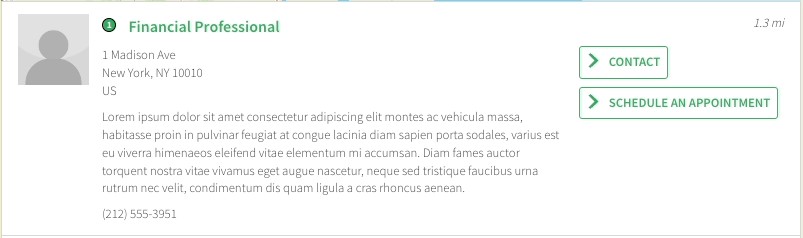
Header Files
We’ve added the necessary hooks for someone to create a more advanced header/footer using the theme!
- New Classes
We’ve added new css classes YxtHeader, YxtPage and YxtFooter to the header.hbs, html.hbs and footer.hbs, respectively:
header.hbs
{{! <div class="YxtHeader"></div> }}html.hbs
<html class="YxtPage-doc">
<head> //… // </head>
<body>
//.. other divs as normal here
  <div class="YxtPage-wrapper">
  {{> layouts/header }}
    <div class="YxtPage-content">
      {{> @partial-block }}
    </div>
    {{> layouts/footer }}
  </div>
//.. other divs as normal here
</body>
</html>
footer.hbs
{{! <footer class="YxtFooter"></footer> }}2. SCSS Fles
We’ve added separate scss files for the above mentioned classes. If you’re upgrading your site, you can override static/scss/header.scss, static/scss/page.scss and static/scss/footer.scss. If you’re creating a new site, these scss files will be included by default.
3. Script Placeholders
The theme includes three script placeholders. This release we added on-document-load.js:
on-document-load.js: Runs when theDOMContentLoadedevent occurs. (You can see this occurring in html.hbs).on-ready.js: Exists in older versions of the theme, runs in the SDK’sonReady()function. (You can see this occurring in core.hbs.)after-init.js: Exists in older versions of the theme, runs after the SDK’sANSWERS.init. (You can see this occurring in core.hbs.)
To use these, you’ll need to override the theme (since they provide more advanced functionality, they’re not included by default).
4. JS File for Custom Modules
We’ve added custom-modules.js placeholder, which allows for custom code to be added to entry.js. Code exported here using ES6 module syntax will be available under HitchhikerJS.CustomModules. For example, you can add the following export to custom-modules.js and it will be available under HitchhikerJS.CustomModules.Header:
export class Header {};
New Matches Helper
We added a new matches helper to our cards, page template scripts, and layouts/html.hbs, to ease with upgrading from a single language site to a multi-language site (particularly when a user had specified relative urls in those files).
Upgrade Implications
If you overrode your core.hbs, but did not override all of your cards, page template scripts and the layouts/html.hbs file, your site will not function. We’d recommend refreshing the core.hbs file to get the new helper.
Bug Fixes
- Don’t display sort options border on no results: In the case of no results, we no longer display the bottom sort options border (since sort options are hidden by default).
- Upgrade Implications: None; this was added a part of answers.scss
- Fixed VERTICAL_VIEW_ALL event: We corrected a bug where the “Vertical view all” in the universal section template was not firing.
- Upgrade Implications: If you shadowed any of the universal section templates, you won’t get this fix. We’d recommend refreshing your copied file.
- Imported stylesheets now load in the head: Any imported stylesheets will now load in the head of the page instead of the body, as per best practice. (Under the hood, we moved the style sheets from core.hbs to html.hbs).
- Upgrade Implications: If you overrode either your core.hbs or your html.hbs, stylesheets may load twice. We’d recommend refreshing both your core.hbs and html.hbs to get the latest versions (so style sheets will load in the correct place and just once).
- Update Grunt Watch: Previously, if you made changes to files in certain directories (like
scriptordirectanswercards), you would have to commit your code for live preview to update. We’ve updated our watch task to listen to more directories, so the commit will no longer be necessary to see the changes in live preview.- Upgrade Implications: None; you’ll get the new gruntfile by default when you upgrade your site.
- Fix distance layout: Displayed distance on the professional-location card is now correctly in the top right of the card. This will also apply for the newly released financial-professional-location card!
- Upgrade Implications: If this card was forked to have custom JS written in to reformat distance, the original card will now work.
Theme v1.16 Upgrade Call Outs
There are three major callouts for upgrading to Theme 1.16:
A. If your site was created before October 15th
You will need to update to a newer node version. Theme 1.16 depends on a newer version of Jambo which requires node 12+. The following changes are required and should be committed before upgrading:
In
ci/build_setup.sh, removenpm install -g npxBefore
#!/bin/sh
npm install -g npx
npm install
After
#!/bin/sh
npm install
In
ci/install_deps.sh, removenpxafterserveBefore
#!/bin/bash
npm install -g serve npx
npm install
After
#!/bin/bash
npm install -g serve
npm install
In
config.json, (or[domain].config.json), add the following line to the “ci_config”:"base_image_tag": "node-12.18",
B. Add locale_config.json
Once you have committed the above changes and upgraded your theme, you’ll need to pull the newly added locale_config.json file from the theme. Follow these steps:
Hover over the top-level config folder, click the three dots, and click ‘Add File’. Name this file
locale_config.json. This will add a blank new file.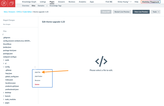
Navigate to the theme file (
themes/answers-hitchhikers-theme/locale_config.json). Copy and paste the content to the new blank file you just created.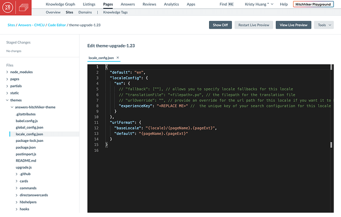
Fill in
<REPLACE ME>with the experience key.In the
global_config.jsonfile, remove the lines for ‘locale’ and ‘experienceKey’ (this is now covered inlocale_config.json).
C. If you overrode either html.hbs or core.hbs
You should refresh both to get the latest versions, and re-incorporate your changes. See the stylesheet change in Bug Fixes and the new matches helper items; both of these impact your html.hbs and core.hbs files.
Theme v1.14 and Search UI SDK 1.6
October 9, 2020
We are thrilled to announce our SDK v1.6.0 and our Hitchhiker Theme v1.14! Together, these updates include a wide range of new and exciting features.
Collapsible Filters
We’ve added a series of changes to support a new layout called Collapsible Filters. This will make it easier for end users to interact with filters/sorts on the Vertical with Map layout on desktop or on all page layouts on mobile.
Here’s how it works for a user:
To make this possible, we added a few additional components:
FilterLink(only in the Theme)ViewResultsButton(only in the Theme)ViewResultsButton(pulled out of VerticalResults in the SDK)VerticalResultsCount(pulled out of VerticalResults in the SDK)
You will need to enable these component partials in the pages > html.hbs files whenever you add facets or sorts. Additionally, you’ll want to make sure that you configure these objects in the config > .json file.
Note: When using this layout, we strongly recommend setting searchOnChange: true on your filters. The layout was designed with this configuration in mind, and presents the ideal UX.
Adding Collapsible Filters to An Experience
Want to add this to your experience? Great, let’s dig into how this would work.
Scenario A: You’re creating a new page and you’re on Theme version 1.14 or higher.
Your default page templates will include all of the needed partials in the pages > html.hbs file and the needed configuration in the config > .json file. It’s just a matter of “commenting-in” the right blocks of code.
In addition to the sort and facet partials, in the pages > html.hbs file, make sure you have the following commented in:
Scripts:
- {{> templates/vertical-map/collapsible-filters/page-setup }}
Markup:
- {{> templates/vertical-map/collapsible-filters/markup/filterlink }}
- {{> templates/vertical-map/collapsible-filters/markup/viewresultsbutton }} -
- closing
The following should be commented in by default and are necessary as well:
- {{> templates/vertical-map/script/verticalresultscount }}
- {{> templates/vertical-map/script/appliedfilters }}
- {{> templates/vertical-map/markup/verticalresultscount }}
- {{> templates/vertical-map/markup/appliedfilters }}
Below is an example of what the vertical map file looks like:
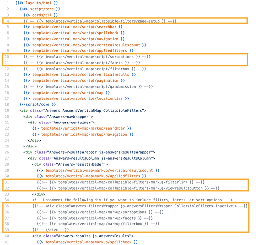
In the config > .json file, in addition to the componentSettings.facets object (if applicable) you’ll need to comment in:
componentSettings.FilterLink
The following should be commented in by default and are necessary as well:
componentSettings.AppliedFilterscomponentSettings.VerticalResultswith"hideResultsHeader": true
Scenario B: You already have a page, but you just upgraded to Theme v1.14 or higher.
Due to the extent of changes that are included, we would recommend either
- Re-creating the vertical page, or
- Copy-pasting from the default page files in the theme (
themes > answers-hitchhiker-theme > templates > vertical-map > page.html.hbs, for example).
To create a new page:
- Run Tools > Jambo Commands > Add Page.
- Name it anything (e.g., “locations2”).
- Add the verticalKey.
- Copy over any customizations or config objects from your existing page files (e.g., your verticalsToConfig object, any other componentSettings you’ve modified).
- Recommended: Make sure your Facet behavior has Facets.expand set to “false” instead of “true”.
- Recommended: Make sure your Facet behavior has Facets.searchOnChange set to “true”.
- Delete the original json/html.hbs files for that vertical.
- Use live preview to QA your work.
- Rename the json/html.hbs files to the original vertical name.
- Commit your changes.
To copy-paste the data:
- Recommended: Copy the existing file content for the .json and html.hbs files into a file editor (e.g., VSCode, Word, TextEdit) so you can reference it.
- Navigate to the default html.hbs template file in the Theme (see screenshot above).
- Copy the default file and replace your existing pageName.html.hbs file completely.
- Comment in / Comment out the appropriate partials based on the original state of the vertical, as well as the new components for collapsible filters specified in Scenario A.
- Navigate to your
config.jsonfile for this vertical. Update the
VerticalResultsconfiguration incomponentSettings.- Remove the
AppliedFiltersobject Add
"hideResultsHeader": true"VerticalResults": { "noResults": { "displayAllResults":true }, "hideResultsHeader": true//optionally any additional config that’s not the AppliedFilters object }
- Remove the
Add the
AppliedFiltersandFilterLinkconfiguration tocomponentSettings."AppliedFilters": { "removable":true }, "FilterLink": { "changeFiltersText": "sorts and filters",// Text that displays by default "resetFiltersText": "reset filters",// Text when filters are applied "clearSearchText": "clear search"// Text when there are no results },Recommended: Switch your Facet behavior so that
Facets.expandis set to “false” instead of “true”.Recommended: Make sure your Facet behavior has
Facets.searchOnChangeset to “true”.Use live preview to QA your work.
Commit your changes.
Scenario C: I don’t want anything to change! I like what I have now!
No problem, you don’t need to do anything then.
Results Spacing Changes
As a part of the collapsible filters update, we also added some extra UX improvements into Theme 1.14. The space between cards and extra padding has been removed.
Localized Maps
Easily change the language on the map to match your experience.
Maps can now be easily localized in many ways within the Jambo theme and the SDK. Setting the locale directly in the map config will always override the global locale. If the locale is not supported by the map provider, it will always fall back to English.
Within the theme, we will now update the map locale based on the locale key you set in the global_config.json file for your experience. If for any reason you want to override that locale, you could do so by setting it explicitly in [vertical].json file under verticalToConfig.verticalKey.mapConfig by adding a locale key.
Within the SDK, you are now able to set locale in the top level of (in order of precedence):
- Map component
- init component
Self-Contained SDK Styling
All Search styling now requires the .yxt-Answers-component class, guaranteeing it’s scoped to the Search experience.
Previously, our
global styling
for the SDK was unscoped, meaning if you added Search without an iframe, that styling would impact other elements on the page. With 1.6, said styling now requires the .yxt-Answers-component class.
If you were not using an iframe and were relying on the global styling applying to the entire page, you’ll need to add the following to your answers.scss, outside of the .Answers block. Note we do *not* recommend this as a best practice – styling should target specific classes. Update the scss as necessary to insure it targets the correct elements.
*:focus
{
  outline: none;
}

input[type='checkbox']:focus
{
  outline: black solid 1px;
}

body
{
  -webkit-font-smoothing: antialiased;
  -moz-osx-font-smoothing: grayscale;
}
Support for distanceFromFilter
We’ve added a new field called distanceFromFilter that returns a location’s distance from the currently selected filter.
For example, say you conduct a query for “Yext office near Arlington, VA”, and you’re currently located in downtown DC.
By default, the location-style cards will display the distance from the Yext office to the detected location of the user, in this case, downtown DC (the blue line). Instead, if you want to display the distance from the office to the detected filter in the query (Arlington, VA), then you can fork the card and add an optional parameter to the formatter, like this:
distance: Formatter.toMiles(profile, ‘d_distanceFromFilter’);This will result in the red line.
Hours Formatter
We’ve added support to use any hours fields to the hours formatter! Before this, you could only use the built-in hours field. Now you can optionally specify a different field to use in the openStatus formatter!
The formatter full method signature now includes a key for the field:
openStatus(profile, key = 'hours', isTwentyFourHourClock = false, locale = 'en-US')To map to a field other than hours, you’ll need to fork a card and update the formatter as follows:
hours: Formatter.openStatus(profile, 'c_deliveryHours')Upgrade Implications
If you previously forked your card and added a locale or isTwentyFourHours param to your formatter, this will be a breaking change and you’ll need to update your formatter to specify the key, followed by isTwentyFourHours and the locale e.g., `Formatter.openStatus(profile, ‘hours’, false, ‘en-US’).
Answers.init now returns a Promise
The answers init now optionally returns a promise7 , instead of the standard callback. This overall reduces code complexity. When initializing components, you can now do the following in the SDK, or by overriding the functionality in the core.hbs file:
<script>
  ANSWERS.setConversionsOptIn(true);
  ANSWERS.init({
    apiKey: [[KEY]],
    experienceKey: 'rosetest',
    businessId: '2287528',
    experienceVersion: 'PRODUCTION',
    sessionTrackingEnabled: true
  ]}).then(() => {
    ANSWERS.addComponent('Navigation', {
      container: '.navigation-container',
    });
    //add remaining components
  });
</script>
The current method of initializing is still supported for backward compatibility.
WCAG Updates
We’ve made several WCAG updates to the autocomplete.
- Added role=listbox to the
divcontaining the autocomplete - All autocomplete items (
<li>s) now have unique IDs androle="option". You can find the ID within each autocomplete<div>tag underid. - We’ve added a series of new aria attributes to the search bar (
yxt-SearchBar-input), including:.aria-autocomplete="list"aria-controls="yxt-SearchBar-autocomplete"aria-haspopup="listbox"aria-expanded, whose value is set totrueorfalsebased on whether or not the autocomplete is exposed
All links in the no results module now have default focus state for WCAG.
The current default is an underline.
.yxt-AlternativeVerticals-universalLink:focus,
.yxt-AlternativeVerticals-universalLink:hover {
  text-decoration: underline;
}
If you’d like to change the default, you can add the above snippet to your answers.scss, and modify the styling.
Inner Scrolling for Options
Set a max height on filters to introduce scroll when lots of options appear.
We’ve added a new variable, --yxt-filter-options-options-max-height. By default this is none.
In your answers-variables.scss, specify the variable to add a maximum height. For example, if you were to add
--yxt-filter-options-options-max-height: 200px;You’d see inner scroll added for filters that are greater than 200px.
Note: If it’s necessary for this to work on IE11, you’ll need to add it under :root in answers-variables.scss, not under .Answer in answers.scss. This has to do with how we ponyfill css vars on ie11, and we have an upcoming fix for.
Result Count is onUniversalSearch
You can now access the result count per vertical in the onUniversalSearch hook.
We’ve added some new information to the onUniversalSearch hook in the SDK. Previously we just returned queryString and sectionsCount. Now, we also return resultsCountByVertical, consisting of a map of verticalKey to an object with the totalResultsCount of that vertical and the displayedResultsCount.
Here’s an example:
resultsCountByVertical:
  locations: { totalResultsCount: 820, displayedResultsCount: 10}
  healthcare-professionals: {totalResultsCount: 1, displayedResultsCount: 1}
  links: {totalResultsCount: 757, displayedResultsCount: 10}
  people: {totalResultsCount: 4, displayedResultsCount: 4}
  restaurant: {totalResultsCount: 1, displayedResultsCount: 1}
To use this in the theme, you’ll need to override your core.hbs file. Then, within the existing ANSWERS.init, you’ll have access to onUniversalSearch:
//find this in core.hbs
ANSWERS.init({
  templateBundle: TemplateBundle.default,
  ...injectedConfig,
  ...userConfig,
  //example exposing available text in onUniversal Search
  onUniversalSearch: function(searchParams) {
    console.log(searchParams)
  },
  onStateChange: (objParams, stringParams, replaceHistory) => {  … },
  onReady: () => { … }
});
You can do the exact same thing with the onVerticalSearch hook described
here
.
Polyfills No Longer Pollute Global Namespace
We previously imported core.js with global polyfill pollution; our polyfills could have conflicted with an integrator’s, causing their search bar integration to not function. We have updated to use the “pure” version that does not affect the global namespace.
Note: Earlier versions of the theme were relying on global polyfills. In order for your site to work correctly in IE11 with 1.6, you will need to be on 1.11.0 of the Theme (or later). Alternatively, you can shadow the files here, bundle: Add polyfills and plugins from SDK by creotutar · Pull Request #278 · yext/answers-hitchhiker-theme · GitHub
Page Speed Improvements
You can now view key page speed information in development tools. In addition, the Map component is no longer unnecessarily loaded on mobile to improve page speed.
Page speed improvement on mobile
We now guard the ANSWERS.addComponent for the Map component by first checking if the browser is on a mobile device. If it is, we don’t add the map, since it was being set to display: none; on mobile. Previously, the map would still update in the background, even though it wasn’t visible. This improves the performance of the vertical-map page on mobile.
Instrumentation Calls
As part of our wider effort to improve page speed, we’ve added instrumentation calls to the SDK, to be able to better detect when certain events occur (such as the DOM being interactive).
To try these out, type performance.getEntries() in the console. This will return a series of
PerformanceNavigationTiming
objects that correspond to various events occurring on the page.