

SortOptions | Yext Hitchhikers Platform
Background
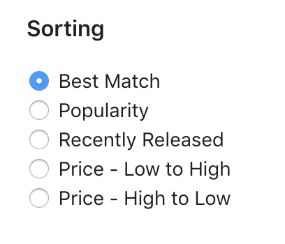
The SortOptions component shows optional sorting that a user can apply to a set of results. This component is only used on vertical search. SortOptions can be configured to include sorting by a field, distance (automatically calculated from the entity’s address), and relevance. The default sort is the order specified by the serverside configuration. Notably, any sorting applied client-side via this component does not replace what’s in the serverside configuration, it’s simply layered on top. Learn more about how to fully configure sorting in the
Sorting
training unit.
Basic Configuration
There are only a few required configuration options for SortOptions; the verticalKey and an options array. Within the options array, you must specify the type of sorting option (either FIELD, ENTITY_DISTANCE or RELEVANCE) and the label for that sorting option.
<div class="sort-options-container"></div>ANSWERS.addComponent('SortOptions', {
container: '.sort-options-container',
verticalKey: 'locations',
options: [
{
type: 'FIELD',
field: 'c_popularity',
direction: 'ASC',
label: 'Popularity',
},
{
type: "ENTITY_DISTANCE",
label: 'Distance'
},
{
type: 'RELEVANCE',
label: 'Relevance'
}
],
});Advanced Configuration
Beyond the basic configuration options, you can also control various settings similar to the
FilterOptions
and
Facets
. These include showMore, showMoreLimit, showMoreLabel, showLessLabel, searchOnChange and applyLabel.
Finally, you can control the defaultSortLabel, which is the label for the option that is selected on load and corresponds to the default sort. You can show a reset button via showReset, and the label of that button via resetLabel.
In the below example, we’ve updated the defaultSortLabel and the label for sorting. We’ve also added a reset button with the label “reset the sort”.
What Does Ascending and Descending Mean Per Field Type?
| Field | ASC | DESC |
|---|---|---|
Date |
Oldest to most recent, IE 1/1/1990, 1/1/2020 | Most recent to oldest, IE 1/1/2020, 1/1/1990 |
Number |
Smallest to largest | Largest to smallest |
Boolean |
False, True | True, False |
String |
Special characters, then A-Z | Z-A, then special characters |
SortOptions API
| Property | Type | Default | Description |
|---|---|---|---|
|
verticalKey
|
string
|
REQUIRED The vertical key for this vertical. | |
|
options
|
array
|
REQUIRED Array of sorting objects. Each object contains type, label, field and direction. | |
|
type
|
string
|
REQUIRED
The type of sorting option. Can be either FIELD (on a field),ENTITY_DISTANCE (distance), or RELEVANCE (relevance determined by search algorithm and any sorting logic in the serverside configuration, same as the default sort order).
|
|
|
label
|
string
|
REQUIRED The label for this sort option | |
|
field
|
string
|
Required if type is FIELD. The API name of the field on which to sort.
|
|
|
direction
|
string
|
Required if type is FIELD. Can be either ASC (ascending) or DESC (descending). The direction in which to sort.
|
|
|
defaultSortLabel
|
string
|
Best Match
|
The label used for the “default” sort (determined by search algorithm and any sorting logic in the serverside configuration), defaults to ‘Best Match’ |
|
optionSelector
|
array
|
.yxt-SortOptions-optionSelector
|
The selector used for options in the sort options template. |
|
searchOnChange
|
boolean
|
Whether or not changing an option triggers a search immediatley. If false the component also renders an apply button that applies the sort. If true, no apply button is shown. | |
|
showReset
|
boolean
|
Whether or not to show a “reset” in the component. If true, clicking reset will set the component back to the default label. | |
|
resetLabel
|
string
|
reset
|
The label to use for the reset button. |
|
showMore
|
boolean
|
true
|
Allow collapsing excess filter options after a limit, defaults to true. Note, screen readers will not read options hidden by this flag, without clicking show more first. |
|
showMoreLimit
|
string
|
5
|
The max number of filter options to show before collapsing extras. |
|
showMoreLabel
|
string
|
Show more
|
The label to show for displaying more options |
|
showLessLabel
|
string
|
Show less
|
The label to show for displaying fewer options. |
|
onChange
|
function
|
function() => {}
|
The callback function to call when changed. Runs before a search is triggered if searchOnChange is true.
|
|
label
|
string
|
Sorting
|
The label to be used in the legend above the sort options |
|
applyLabel
|
string
|
Apply
|
The label to be used on the apply button. Only appears if searchOnChange is false.
|