

Custom CTA Code Examples | Yext Hitchhikers Platform
The following code snippets cover examples of styling CTAs.
For code snippets on changing the structure of CTAs, including adding them to result cards, check out the Custom Result Card Structure Code Examples reference doc.
Invert Colors
You may want to emphasize CTAs by inverting the colors (white text on a color background, rather than color text on a white background). You can do so by updating color and background-color attributes on items with class HitchhikerCTA. We’ve also added some padding so it looks good on desktop and mobile.
.HitchhikerCTA{
  color: white;
  background-color: #0f70f0;
  padding: 4px 8px;
}
Underline Color on Hover
To customize the color of the underline on your CTA to be different than the text color, you will update the property text-decoration-color.
.HitchhikerCTA {
  &:hover{
    text-decoration-color: black;
  }
}
Color Fill on Hover
The following code sets the background color as a linear gradient with a hard line between colors and then enlarges/stretches it using background-size. Then the gradient shifts from one side of the CTA to the other based on the changing background-position from the CTA object to the hover state. Lastly, transition adjusts the time it takes for the linear gradient to fully shift position.
If you want to also change the text color as the CTA fills, you will need to add a hover state to the CTA icon label.
.HitchhikerCTA {
    border-radius: 30px;
    border: 1px solid #ddd;
    background: linear-gradient(to right, #1b64b9 50%, #fff 50%);
    background-size: 200% 100%;
    background-position: right bottom;
    transition: all .3s ease-out;
    padding: 10px;
    margin: 3px;
    color: #1b64b9;

    &:hover{
      background-position: left bottom;
      text-decoration: none;
      color: white;
    }
}
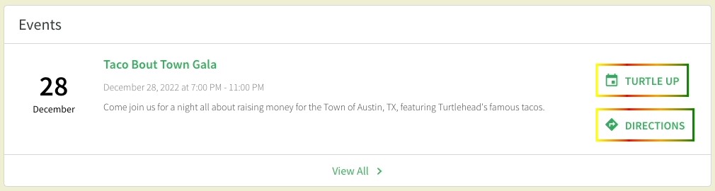
Diffused Border on Hover
To get this effect, you will first need to create a solid border around the CTA. Then you will add a box-shadow to the hover state to create that diffused look surrounding the border. The first portion of the box-shadow is inset, which affects how much the color diffuses/casts a shadow inward towards the CTA label. The second portion affects how much the shadow casts outward.
You can toggle with the box-shadow depending on how large and opaque you want the diffused border to be.
.HitchhikerCTA {
  border: 1px solid black;

  &:hover {
    box-shadow: 0 0 6px 0 black inset, 0 0 10px 1px black;
    }
  }
Multicolor Border
.HitchhikerCTA {
    border: 3.5px solid;
    border-image: linear-gradient(to right, yellow, red , orange , green) 1;
 }
Curved Multicolor Border with Filled Hover State
.HitchhikerCTA {
    background-image: linear-gradient(to right, red, orange);
    border: solid 3px transparent;
    border-radius: 20px;
    box-shadow: 2px 1000px 1px #fff inset;
    padding: 7px;
    margin: 5px;
    color: red;

    &:hover{
         box-shadow: none;
         color: white;
    }
}
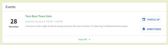
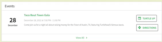
Styling Specific CTAs
Sometimes, you might want to style your CTAs differently depending on the card you’re using. You can use the parent/child relationships in the HTML of the cards to help target specific CTA classes, so you can modify CTAs in different verticals.
  .restaurant .HitchhikerCTA {
    color: white;
    background-color: black;
    padding: 1rem;
  }

  .event-standard .HitchhikerCTA {
    color: black;
    border: 1px solid black;
    padding: 1rem;
  }
You can also style CTAs within a vertical by targeting the primarty, secondary, or tertiary CTA.
  .HitchhikerEventStandard-primaryCTA .HitchhikerCTA {
    color: green;
  }

  .HitchhikerEventStandard-secondaryCTA .HitchhikerCTA {
    color: black;
  }
Custom CTA Icon
Typically, the icon associated with the CTA on an result card is defined through the iconName parameter within the CTA, using one of the built-in icons from the
icon library
. However, if you wish to use a custom image as the CTA icon, you can do so by defining the iconUrl parameter.
When working in the Code Editor, you will update the component.js file of the CTA you want to modify:
CTA1: { // The secondary call to action for the card
        label: 'UberEats',
        iconUrl: 'https://www.logolynx.com/images/logolynx/32/32ea592d61673edf18f39f3d8f9c1d4f.png',
        url: profile.c_uberEatsURL,
        target: '_top',
        eventType: 'CTA_CLICK',
        eventOptions: this.addDefaultEventOptions(),
        // ariaLabel: '',
      }
Text Wrapping for Long CTA Labels
There are situations where you might want to wrap CTAs for a specific vertical if they are particularly long. This could be both from UI perspective but also to create cleaner experiences on mobile.
The key property to do this is white-space, which specifies how white-space inside an element is handled. You can then use text-align to specify how you want the text to be aligned (to the left, centered, or to the right) within the CTA. If nothing is specified, the text will be centered by default.
.HitchhikerCTA-iconLabel {
  white-space: normal;
  text-align: left
}
Align CTAs Horizontally
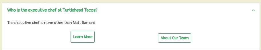
For card types that have CTAs stacked vetically (e.g., faq-accordian) by default, you can update them to appear next to each other.
.HitchhikerFaqAccordion-ctasWrapper {
    flex-direction: row;
    justify-content: space-evenly;
    display: flex;
}
You may want to update the width of the buttons to fill up more of the space on the card.
We recommend you test this on mobile though, and make sure it’s appearing as desired. You might want to make sure the CTAs are flex-direction: column on smaller breakpoints.