

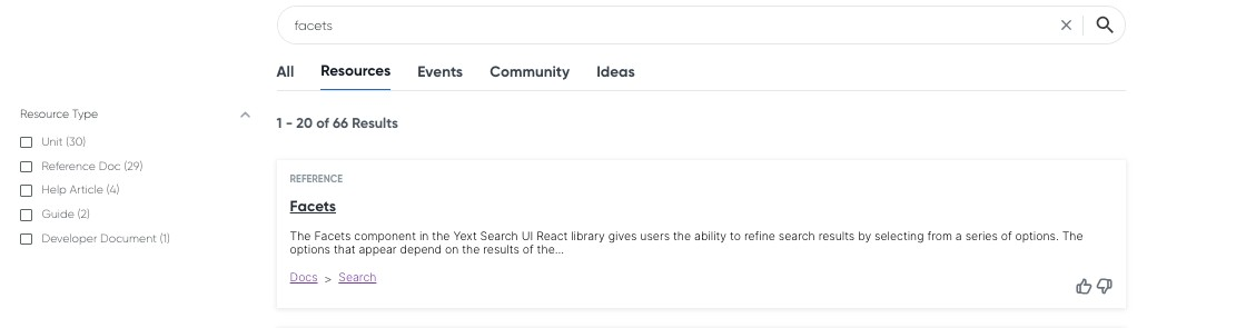
Facets | Yext Hitchhikers Platform
Facets are a useful component for refining your search results using various characteristics of your content. They are viewable “post-search”, since they’re dependent on the search query, and can be used to further refine a query. Note that this component is only used on vertical search.
Configuration
"Facets": {
  "container": ".facets-container",
  "title": "Filters", // Optional, title to display above the facets
  "showCount": true, // Optional, show number of results for each facet
  "searchOnChange": false, // Optional, execute a new search whenever a facet selection changes
  "resetFacet": false,// Optional, show a reset button per facet group
  "resetFacetLabel": "reset", // Optional, the label to use for the reset button above
  "resetFacets": true, // Optional, show a reset-all button for the facets control. Defaults to showing a reset-all button if searchOnChange is false.
  "resetFacetsLabel": "reset-all", // Optional, the label to use for the reset-all button above
  "showMore": true, // Optional, allow collapsing excess facet options after a limit
  "showMoreLimit": 5, // Optional, the max number of facets to show before collapsing extras
  "showMoreLabel": "show more", // Optional, the label to show for displaying more facets
  "showLessLabel": "show less", // Optional, the label to show for displaying less facets
  "expand": true, // Optional, allow expanding and collapsing entire groups of facets
  "showNumberApplied": true, // Optional, show the number of applied facets when a group is collapsed
  "placeholderText": "Search here...", // Optional, the placeholder text used for the filter option search input
  "searchable": false, // Optional, if true, display the filter option search input
  "searchLabelText": "Search for a filter option", // Optional, the form label text for the search input, defaults to 'Search for a filter option'
  // Optional, field-specific overrides for a filter
  "fields": {
    "c_customFieldName":  { // Field id to override e.g. c_customFieldName, builtin.location
      "placeholderText": "Search here...", // Optional, the placeholder text used for the filter option search input
      "showReset": false, // Optional, show a reset button per facet group
      "resetLabel": "reset", // Optional, the label to use for the reset button above
      "searchable": false, // Optional, if true, display the filter option search input
      "searchLabelText": "Search for a filter option", // Optional, the form label text for the search input, defaults to 'Search for a filter option'
      "control": "singleoption", // Optional, control type, singleoption or multioption
      "label": "My custom field", // Optional, override the field name for this facet
      "showMore": true, // Optional, allow collapsing excess facet options after a limit
      "showMoreLimit": 5, // Optional, the max number of facets to show before collapsing extras
      "showMoreLabel": "show more", // Optional, the label to show for displaying more facets
      "showLessLabel": "show less", // Optional, the label to show for displaying less facets
      "expand": true, // Optional, allow expanding and collapsing entire groups of facets
      "onChange": function() { console.log('Facet changed'); }, // Optional, callback function for when a facet is changed
      "optionSelector": '.js-yext-filter-option', // Optional, the selector used for options in the template, defaults to '.js-yext-filter-option'
    }
  },
  "applyLabel": "apply" // Optional, the label to show on the apply button
}
Example
There are a few common configuration options you may want to tweak for the facets component. Here is a standard example:
"Facets": {
  "searchOnChange": true,
  "showCount": false,
  "showMoreLimit": 2,
  "showMoreLabel": "More",
  "showLessLabel": "Less"
}
In this example… - showCount: false hides the number of results for each facet option - searchOnChange: true causes the search to automatically refresh as soon as the user selects a facet - showMoreLimit: 2 adds a “Show More” button to reveal more options when there are more than 2 facet options - showMoreLabel and showLessLabel control the labels of the resulting buttons.
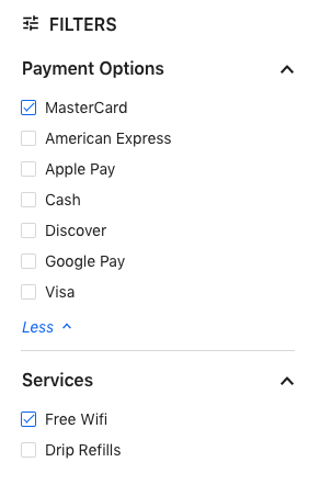
The resulting component looks something like this:
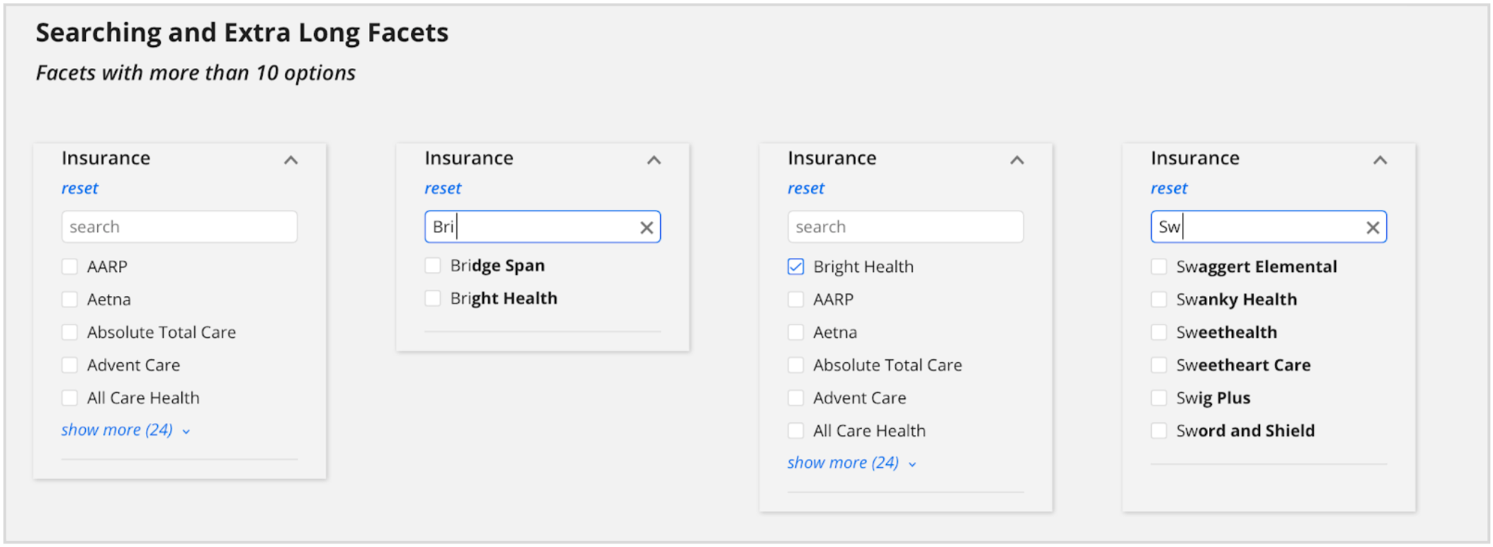
Searchable Facets
Some facet fields will have dozens or hundreds of options, so it doesn’t make sense to display them all to the user at once. A better way is to make the facet searchable, which allows the user to search for the particular option they’re looking for. This can be done for all facets (set “searchable”: true) or on a field by field basis in the ComponentSettings in the JSON file:
"Facets": {
  "searchable": true,
  "placeholderText": "Search here...", // Optional, the placeholder text  used for the filter option search input
}
The result looks like this:
Field-Specific Configuration
Often it doesn’t make sense to apply the same configuration to all facets in an experience. For example, some facet fields may have hundreds of options and should be made searchable, but others might not.
To apply configuration for particular facet fields, use the fields property within the Facets component. This property allows facets data to be fully customized.
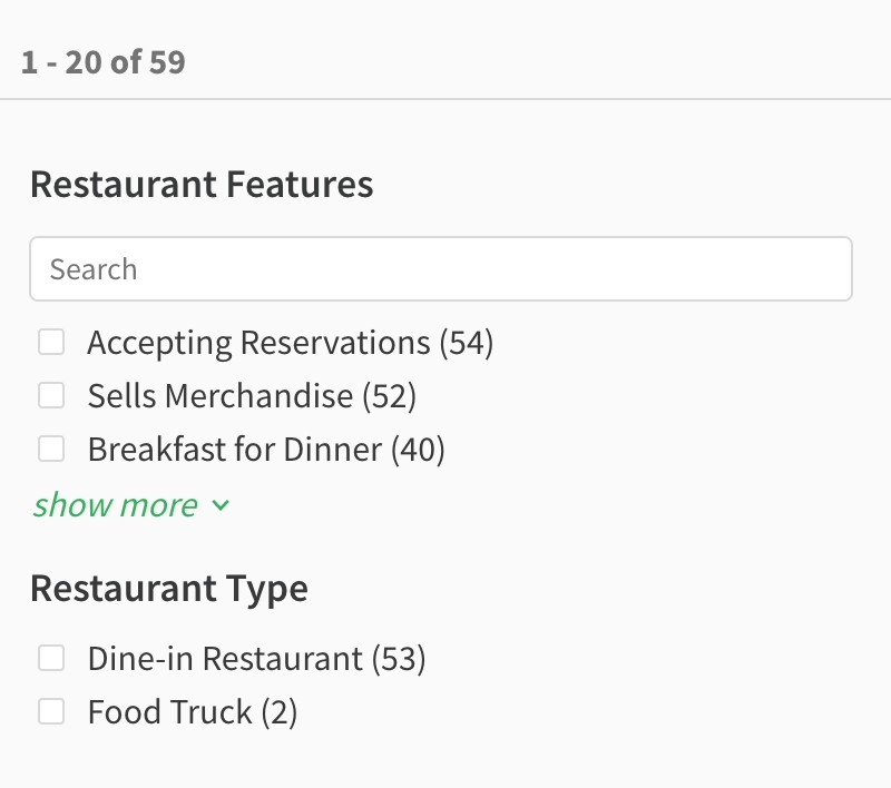
Here’s an example of using this option to customize one facet to make it searchable:
"Facets": {
  "expand": false, // Allow the user to expand and collapse the facets
  "showMore": true, // Display a link to see more facet options within a facet
  "searchOnChange": true, // Will automatically run a search as facets are selected or unselected. Set to false to only trigger updates with an Apply button.
  "showMoreLimit": 3,
  "fields": {
    "c_restaurantFeatures": {
      "searchable": true,
      "searchLabelText": "Search for our features",
      "placeholderText": "Search"
    }
  }
},
Setting Facet Options Order
Starting in Theme 1.25, you can also set the order in which facet options appear in the frontend by editing the config.json file for each vertical. By default, facet options are ordered by the number of options per facet. However, you may also choose to set them in alphabetical (or reverse alphabetical) order or by a custom order.
To do this, set either optionsOrder or optionsOrderList in the fields configuration of the Facets object.
Note: Only one of optionsOrder and optionsOrderList should be defined. If both are defined, optionsOrderList will take precedence and you will see a build warning in your console.
optionsOrder
Use optionsOrder to sort facet options alphabetically. Specify either “ASC” for alphabetical or “DESC” for reverse alphabetical. Note that facets on numbers will be stored as strings. You’ll need a custom sorting function to handle numbers correctly.
"componentSettings": {
  "Facets": {
    "fields": {
      "insurancesAccepted": {
         "placeholderText": "Search",
         "optionsOrder": "ASC"
      }
    }
  }
}
optionsOrderList
Use optionsOrderList to set a custom order for the facet options. Provide the full list of case sensitive display names in an array.
- Any options not provided will be displayed at the end of the list, ordered by result count.
In the case that an option is included in the array, but has zero results, the option will not display in the frontend.
"componentSettings": {
  "Facets": {
    "fields": {
      "c_daysOfTheWeek": {
        "placeholderText": "Search",
        "optionsOrderList": ["Monday", "Tuesday", "Wednesday", "Thursday","Friday", "Saturday", "Sunday"], //array, ["Monday", "Tuesday"]
      }
    }
  }
}
Boolean Support for Facets
By default, the frontend will display “true” or “false” as the options for all boolean type fields. You can override these by specifying different labels in a fieldLabels option under the fields configuration.
"ComponentSettings" : {
  "Facets": {
    "expand": false,
    "fields": {
      "c_acceptingNewPatients":  {
        "placeholderText": "Search",
        "fieldLabels": {
          "false": "Not Accepting Patients",
          "true": "Accepting Patients"
        }
      }
    }
  }
}