

Result Cards | Yext Hitchhikers Platform
Cards are used in universal/vertical results for configuring the UI for a result on a per-item basis. Each item is rendered as a Card.
Below are details on the built-in card configurations.
Built-In Card Configuration
Cards have three properties: cardType, dataMappings and callsToAction.
ANSWERS.addComponent('VerticalResults', {
  container: '.vertical-results-container',
  card: {
    cardType: 'Standard',
    dataMappings: () => {},
    callsToAction: () => []
  }
  //other properties here
}
cardType
cardType accepts a string and defines which card type you’d like to use.
There are three options: Standard, Accordion, and Legacy, all of which are shown at the bottom of this page.
dataMappings
The dataMappings option define how a card’s attributes, such as title and details, will be rendered. More information can be found in the Data Mapping section next.
callsToAction
Calls to Action (CTAs) are the key actions of a result card. See the Calls To Action section below for more information.
Card Data Mapping
The dataMappings option define how a card’s attributes, such as title and details, will be rendered. It accepts either:
- A function that accepts the result item from the API and returns a
dataMappingsobject. - A static
dataMappingsobject. Each attribute of adataMappingsobject is also either a function or a static value.
Example
Below is an example of dataMappings as function.
ANSWERS.addComponent('VerticalResults', {
  /* ...other vertical results config... */
  card: {
    /* ...other card config...*/
    dataMappings: item => ({
      title: item.name,
      subtitle: `Department: ${item.name} `,
      details: item.description,
      image: item.headshot ? item.headshot.url : '',
      url: 'https://yext.com',
      showMoreLimit: 500,
      showMoreText: "show more",
      showLessText: "put it back",
      target: '_blank'
    })
  }
  /* ...other vertical results config... */
})
And below is an example of dataMappings as an object with functions inside it. You can use both static attributes and function attributes together.
ANSWERS.addComponent('VerticalResults', {
  /* ...other vertical results config... */
  card: {
    /* ...other card config...*/
    dataMappings: {
      title: item => item.name,
      subtitle: item => `Department: ${item.name} `,
      details: item => item.description,
      image: item => item.headshot ? item.headshot.url : '',
      url: 'https://yext.com',
      showMoreLimit: 500,
      showMoreText: 'show more',
      showLessText: 'put it back',
      target: '_blank'
    }
  }
  /* ...other vertical results config... */
})
Each cardtype has standard attributes that it expects in the returned dataMappings object. You can read more about these in the Built-In Cards section below.
Card Calls To Action
Calls to Action (CTAs) are the key actions of a result card. In the example below each card has two CTAs, Call and Directions.
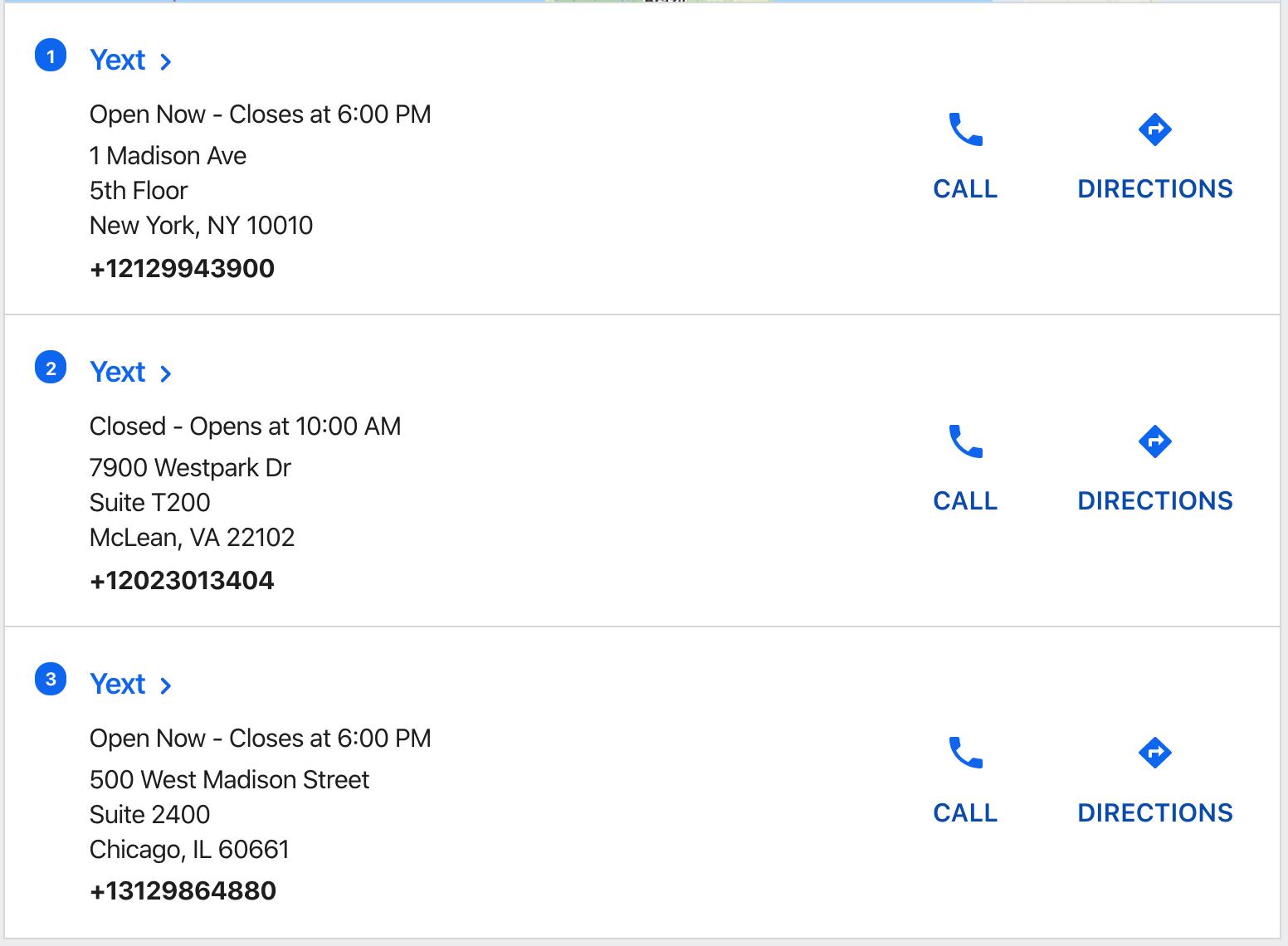
CTAs provide a visual button in the card and also record analytics events to make it easier to understand user bevhavior.
Note: A CTA without both a label and link will not be rendered.
Adding CTAs to Cards
callsToActions are added to the card object like so:
ANSWERS.addComponent("VerticalResults", {
  /* ...other vertical results config... */
  card: {
    /* ...other card config...*/
    callsToAction: (item) => [
      {
        label: (item) => item.name,
        url: "https://yext.com",
      },
    ],
  },
  /* ...other vertical results config... */
});
Static List of CTAs
The easiest way to specify CTAs is as an array of objects. Every CTA must have a label, url, analyticsEventType and eventOptions. (See below for more information on eventOptions.)
const callsToAction = [
  {
    label: "cta label",
    icon: "star",
    url: "https://yext.com",
    analyticsEventType: "CTA_CLICK",
    target: "_blank",
    eventOptions: (result) => {
      return {
        verticalKey: "people",
        entityId: result.id,
        searcher: "VERTICAL",
      };
    },
  },
];
If you want to use content from the item (e.g. the URL) to populate the CTA, you can return a function to any of the properties. In this example we are setting the label and URL to properties from the item.
const callsToAction = (item) => [
  {
    label: (item) => item.name,
    url: (item) => item.url,
    analyticsEventType: "CTA_CLICK",
    target: "_self",
    icon: "briefcase",
    eventOptions: (item) =>
      `{
				"verticalKey": "credit-cards",
				"entityId": "${item.id}",
				"searcher":"UNIVERSAL",
				"ctaLabel": "cards"
			}`,
  },
];
Dynamic List of CTAs
If you want to vary the types of CTAs by card, you can return a function to this property instead of a static array. This function should return an array, but it could vary its length or contents based on the item.
const callsToAction = (item) => [
  {
    label: item.name,
    url: "https://yext.com",
    analyticsEventType: "CTA_CLICK",
    target: "_blank",
    icon: "briefcase",
    eventOptions: `{
			"verticalKey": "credit-cards",
			"entityId": "${item.id}",
			"searcher":"UNIVERSAL",
			"ctaLabel": "cards"
		}`,
  },
  {
    label: "call now",
    url: "https://maps.google.com",
    analyticsEventType: "CTA_CLICK",
    target: "_blank",
    icon: "phone",
    eventOptions: `{
			"verticalKey": "credit-cards",
			"entityId": "${item.id}",
			"searcher":"UNIVERSAL",
			"ctaLabel": "cards"}
		`,
  },
];
eventOptions
In order for a click to a CTA to register in Answers Analytics, you’ll need to set the eventOptions attribute on the CTA. This attribute should return either a valid json string or an object.
Format Event Options as a valid JSON string
eventOptions: `{
  "verticalKey": "credit-cards",
  "entityId": "${item.id}",
  "searcher":"UNIVERSAL",
  "ctaLabel": "buy"
}`
Event Options as an Object
  eventOptions: result => {
    return {
      verticalKey: 'people',
      entityId: result.id,
      searcher: 'VERTICAL'
    };
  }
Properties:
verticalKey: The vertical key for the CTA. If unspecified, it will default to the vertical of the card on which this CTA is placed (either fromVerticalResultsorUniversalResults).entityId: The entity ID for the card on which this CTA is placed. If unspecified, it will default to theentityIdfield in platformsearcher:VERTICALorUNIVERSAL. If the CTA is on a card inside a vertical search, it will default to theVERTICAL. If it’s on a card inside a universal search, it will default toUNIVERSAL.ctaLabel: An optional additional label sent with the analytics request. For example, if you had two CTAs on a card, one that was “Buy Now” and the other that was “Get Directions”, you might add the CTA labels “Buy” and “Directions”, respectively.
Data Formatting
Rich Text Formatting
The Yext platform comes with rich text fields; these are fields that allow for bolding, italics, hyperlinks, and more! The Search UI SDK includes a formatRichText function translates CommonMark to HTML, therefore allowing for rich text to be displayed on a card.
Definition
ANSWERS.formatRichText(rtfFieldValue, eventOptionsFieldName = null, targetConfig = '')rtfFieldValueis the field reference (for exampleitem.c_myRichTextField)eventOptionsFieldName. When clicking any link in the resulting HTML, an analytics event will be fired. If theeventOptionsFieldNamehas been specified, theeventOptionwill include afieldNameattribute with the given value.targetConfigdictates where the link is opened: the current window, a new tab, etc. It can have either be a string or an objecttargetConfig = '_blank'- all RTF types will recieve a_blanktargettargetConfig = { url: '_blank', phone: '_self', email: '_parent' }- each type of RTF receives a differenttarget
Note that when using this function, you must ensure that the relevant template correctly unescapes the output HTML.
Example
In this example, rich text formatting is used on the details field for the FAQ.
ANSWERS.addComponent('VerticalResults', {
  /* ...other vertical results config... */
    card: {
        cardType: 'Accordion',
        dataMappings: {
            title: (item) => item.name,
            link: (item) => item.landingPageUrl,
            details: (item) => ANSWERS.formatRichText(item.answer, 'answer', '_self'),
            url: (item) => item.landingPageUrl,
            target: "_self"
        },
    }
}
Text Highlighting
You can optionally display highlighted fields in your card data mappings. A field becomes highlighted when it’s has either either a keyword search match or a document search match. The _highlighted object, will return the field highlighted with strong tags. You can accesss it in a custom item template.
this.addComponent("VerticalResults", {
    container: ".vertical-container",
    verticalKey: "locations",
    itemTemplate: `<div>
        {{#if result._highlighted.description}}
            {{{ result._highlighted.description }}}
        {{else}}
            {{result._raw.description}}
        {{/if}}
    </div>`
    });
This will display the text highlighting for the description field only when it returns, otherwise it will display the raw value.
Built-in Cards
Standard Card
The data mappings for a standard card has these attributes:
const dataMappings = (item) => {
  return {
    // Title for the card, defaults to the name of the entity
    title: item.title,
    // Subtitle, defaults to null
    subtitle: `Department: ${item.name} `,
    // Details, defaults to the entity's description
    details: item.description,
    // Image to display, defaults to null
    image: item.headshot ? item.headshot.url : "",
    // Url for the title/subtitle, defaults to the entity's website url
    // Note, a protocol like https://yext.com is required, as opposed to just yext.com
    url: item.link || item.website,
    // Character limit to hide remaining details and display a show more button, defaults to 350
    showMoreLimit: 350,
    // Text for show more button, defaults to 'Show More'
    showMoreText: "show more",
    // Text for show less button, defaults to 'Show Less'
    showLessText: "put it back",
    // The target attribute for the title link, defaults to '_self'. To open in a new window use '_blank'
    target: "_blank",
    // Whether to show the ordinal of this card in the results, i.e. first card is 1 second card is 2,
    // defaults to false
    showOrdinal: false,
    // A tag to display on top of an image, always overlays the image, default no tag
    tagLabel: "On Sale!",
  };
};
Accordion Card
The data mappings for an accordion card has these attributes:
const dataMappings = (item) => {
  return {
    // Title for the card, defaults to the name of the entity
    title: item.title,
    // Subtitle, defaults to null
    subtitle: `Department: ${item.name} `,
    // Details, defaults to the entity's description
    details: item.description,
    // Whether the first Accordion Card shown in vertical/universal results should be open on page load, defaults to false
    expanded: false,
  };
 };
Legacy Card
The Legacy Card is very similar to the Standard Card, but with the legacy DOM structure and class names from before v0.13.0. New users should not use the Legacy Card; instead, use the Standard Card.
The data mappings for a legacy card has these attributes:
const dataMappings = (item) => {
  return {
    // Title for the card, defaults to the name of the entity
    title: item.title,
    // Subtitle, defaults to null
    subtitle: `Department: ${item.name} `,
    // Details, defaults to the entity's description
    details: item.description,
    // Image to display, defaults to null
    image: item.headshot ? item.headshot.url : "",
    // Url for the title/subtitle, defaults to the entity's website url
    url: item.link || item.website,
    // The target attribute for the title link, defaults to '_self'. To open in a new window use '_blank'
    target: "_blank",
    // Whether to show the ordinal of this card in the results, i.e. first card is 1 second card is 2,
    // defaults to false
    showOrdinal: false,
  };
};