

Direct Answer | Yext Hitchhikers Platform
Background
The DirectAnswer component shows a Direct Answer to a query. It is usually shown above the UniversalResults component. Direct Answers are only returned on universal search.
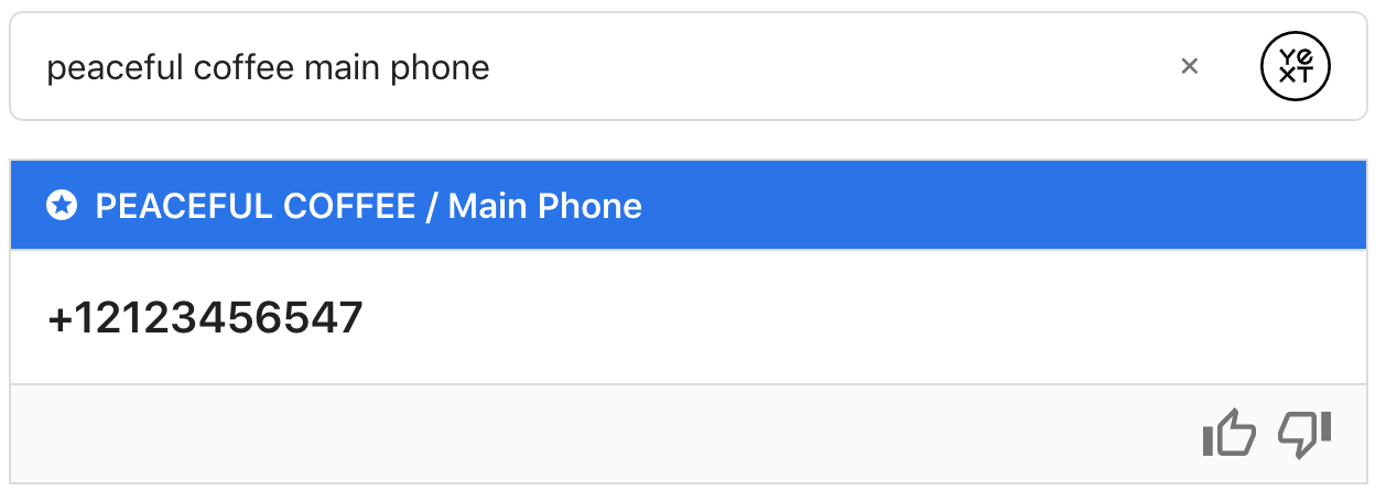
Default Styling
Here is the default styling for a Direct Answer:
Base Configuration
Here’s a basic example of adding a direct answer.
<div class="direct-answer-container"></div>ANSWERS.addComponent("DirectAnswer", {
container: ".direct-answer-container",
});Creating a Custom DirectAnswer Card
You can customize the look and behavior of your Direct Answer by creating a custom Direct Answer card.
A custom Direct Answer card is given the same data as the built-in card. That data will look something like the below:
{
  type: "FIELD_VALUE",
  answer: {
    entityName: "Entity Name",
    fieldName: "Phone Number",
    fieldApiName: "mainPhone",
    value: "+11234567890",
    fieldType: "phone"
  },
  relatedItem: {
    verticalConfigId: 'people',
    data: {
      id: "Employee-2116",
      type: "ce_person",
      fieldValues: {
        description: "This is the description field.",
        name: "First Last",
        firstName: "First",
        lastName: "Last",
        mainPhone: "+1234567890",
      }
    }
  }
}
A custom Direct Answer card needs a corresponding template. This can be added either inline by changing the component’s constructor to:
  constructor(config, systemConfig) {
    super(config, systemConfig);
    this.setTemplate(`<div> your template here </div>`)
  }
Or by including a custom template bundle, and adding:
  static defaultTemplateName () {
    return 'CustomDirectAnswerTemplate';
  }
Where CustomDirectAnswerTemplate is the name the template is registered under.
We will use the following template for our example card.
  <div class="customDirectAnswer">
    <div class="customDirectAnswer-type">
      {{type}}
    </div>
    <div class="customDirectAnswer-value">
      {{#each customValue}}
      {{#if url}}
        {{> valueLink }}
      {{else}}
        {{{this}}}
      {{/if}}
      {{/each}}
    </div>
    {{> feedback}}
  </div>

  {{#*inline 'feedback'}}
  <span class="customDirectAnswer-thumbsUpIcon js-customDirectAnswer-thumbsUpIcon"
    data-component="IconComponent"
    data-opts='{"iconName": "thumb"}'
  ></span>
  <span class="customDirectAnswer-thumbsDownIcon js-customDirectAnswer-thumbsDownIcon"
    data-component="IconComponent"
    data-opts='{"iconName": "thumb"}'
  ></span>
  {{/inline}}

  {{#*inline 'valueLink'}}
  <a class="customDirectAnswer-fieldValueLink" href="{{{url}}}"
    {{#if @root/eventType}}data-eventtype="{{@root/eventType}}"{{/if}}
    {{#if @root/eventOptions}}data-eventoptions='{{{ json @root/eventOptions }}}'{{/if}}>
    {{{displayText}}}
  </a>
  {{/inline}}
This specific example needs some css to flip the thumbs up icon the right way.
  .customDirectAnswer-thumbsUpIcon svg {
    transform: rotate(180deg);
  }
This is the javascript class for our custom Direct Answer card. It applies custom formatting to the Direct Answer, registers analytics events to the thumbs up/down icons, and passes custom event options into the template.
  class CustomDirectAnswerClass extends ANSWERS.Component {
    constructor(config, systemConfig) {
      // If you need to override the constructor, make sure to call super(config, systemConfig) first.
      super(config, systemConfig);

      // For simplicity's sake, we set this card's template using setTemplate(), as opposed to
      // a custom template bundle.
      this.setTemplate(`<div> your template here </div>`)
    }

    /**
     * setState() lets you pass variables directly into your template.
     * Here, data is the directAnswer data from the query.
     * Below, we pass through a custom direct answers value, customValue.
     * @param {Object} data
     * @returns {Object}
     */
    setState(data) {
      const { type, answer, relatedItem } = data;
      const associatedEntityId = data.relatedItem && data.relatedItem.data && data.relatedItem.data.id;
      const verticalConfigId = data.relatedItem && data.relatedItem.verticalConfigId;
      return super.setState({
        ...data,
        customValue: this.getCustomValue(answer),
        eventType: 'CUSTOM_EVENT',
        eventOptions: {
          searcher: 'UNIVERSAL',
          verticalConfigId: verticalConfigId,
          entityId: associatedEntityId,
        }
      });
    }

    /**
     * onMount() lets you register event listeners. Here, we register the thumbs up and thumbs
     * down buttons to fire an analytics event on click.
     */
    onMount() {
      const thumbsUpIcon = this._container.querySelector('.js-customDirectAnswer-thumbsUpIcon');
      const thumbsDownIcon = this._container.querySelector('.js-customDirectAnswer-thumbsDownIcon');
      thumbsUpIcon.addEventListener('click', () => this.reportQuality(true));
      thumbsDownIcon.addEventListener('click', () => this.reportQuality(false));
    }

    /**
     * reportQuality() sends an analytics event (either THUMBS_UP or THUMBS_DOWN).
     * @param {boolean} isGood true if the answer is what you were looking for
     */
    reportQuality(isGood) {
      const eventType = isGood === true ? 'THUMBS_UP' : 'THUMBS_DOWN';
      const event = new ANSWERS.AnalyticsEvent(eventType).addOptions({
        directAnswer: true
      });
      this.analyticsReporter.report(event);
    }

    /**
     * Formats a Direct Answer value based on its fieldType.
     * @param {Object} answer the answer property in the directAnswer model
     * @returns {string}
     */
    formatValue(answer) {
      const { fieldType, value } = answer;
      switch (fieldType) {
        case 'phone':
          return {
              url: 'http://myCustomWebsite.com/?mainPhone=' + value,
              displayText: value,
            };
        case 'rich_text':
          return ANSWERS.formatRichText(value);
        case 'single_line_text':
        case 'multi_line_text':
        default:
          return value;
      }
    }

    /**
     * Computes a custom Direct Answer. If answer.value is an array, this method
     * formats every value in the array and returns it, otherwise it just formats the single
     * given value.
     * @param {Object} answer
     * @returns {Array<string>}
     */
    getCustomValue(answer) {
      if (Array.isArray(answer.value)) {
        return answer.value.map(value => this.formatValue(answer))
      } else {
        return [ this.formatValue(answer) ];
      }
    }

    /**
     * The name of your custom direct answer card. THIS is the value you will use in any config,
     * such as defaultCard, when you want to specify this custom Direct Answer card.
     * @returns {string}
     */
    static get type() {
      return 'MyCustomDirectAnswerCard';
    }
  }

  // Don't forget to register your Direct Answer card within the SDK. Otherwise the SDK won't recognize your card name!
  ANSWERS.registerComponentType(CustomDirectAnswerClass);
Using Cardoverrides
Now that we’ve created a custom direct answer card, you can specify which card should be used based on the type of direct answer that returns. There are two possible types: FIELD_VALUE, which returns for inferred filters, and FEATURED_SNIPPET, which returns for document search.
Here, we’ve specified that any FEATURED_SNIPPET direct answers should use a custom card we’ve named MyCustomDirectAnswerCardDocSearch. FIELD_VALUE card types are a little more advanced, we’ll go into these below:
ANSWERS.addComponent("DirectAnswer", {
  container: ".direct-answer-container",
  types: {
    'FEATURED_SNIPPET': {
      cardType: "MyCustomDirectAnswerCardDocSearch",
    },
    'FIELD_VALUE': {
      cardType: "MyCustomDirectAnswerCard",
      cardOverrides: [
        {
          cardType: 'MyMenuCustomDirectAnswerCard',
          fieldName: 'description',
          entityType: 'ce_menuItem',
          fieldType: 'rich_text'
        }
      ]
    }
  }
});
FIELD_VALUE is using cardOverrides; with these, we can specify that a different card should be used based on the fieldName, entityType, and/or fieldType combination. This DirectAnswer component will pick the first condition matched, so the ordering of the cardOverrides is important. For example, if the following overrides were specified:
cardOverrides: [
  {
    cardType: 'MyCustomDirectAnswerCard',
    entityType: 'ce_menuItem',
  },
  {
    cardType: 'MyOtherCustomDirectAnswerCard',
    fieldName: 'description',
    entityType: 'ce_menuItem',
  },
]
All menu item entities would receive the MyCustomDirectAnswerCard, since it’s the first rule in the list that applies, even if a direct answer returned for the description field.
Formatting Data in a Direct Answer
You can format data in a direct answer using the transformData hook outlined
here
.
Example
In this example, we’ve overridden the viewDetailsText and the footerTextOnSubmission. We’re also using a
Custom Data Transform
to override the formatting for a phone number.
Direct Answer API
| Property | Type | Default | Description |
|---|---|---|---|
|
formEl
|
string
|
.js-directAnswer-feedback-form
|
The selector for the form used for submitting the feedback |
|
thumbsUpSelector
|
string
|
.js-directAnswer-thumbUp
|
The selector to bind ui interaction to for the thumbs up button |
|
thumbsDownSelector
|
string
|
.js-directAnswer-thumbDown
|
The selector to bind ui interaction to for the thumbs down button |
|
positiveFeedbackSrText
|
string
|
This answered my question
|
The screen reader text for the thumbs up button. |
|
negativeFeedbackSrText
|
string
|
This did not answer my question
|
The screen reader text for the thumbs down button. |
|
viewDetailsText
|
string
|
View Details
|
The display text for the View Details click to action link, which is the website URL of the entity. |
|
footerTextOnSubmission
|
string
|
Thank you for your feedback!
|
The footer text to display on submission of feedback |
|
defaultCard
|
string
|
DEPRECATED Optionally specify a custom direct answer card to use, which is the default when there are no matching card overrides. | |
|
cardOverrides
|
|
DEPRECATED Formerly used to specify a specific direct answer card based on the fieldName, entityType or fieldType | |
|
types
|
object
|
Specify card types and overrides based on the direct answer type (FEATURED_SNIPPET or FIELD_VALUE). Each property is nested under the direct answer type.
|
|
|
type.cardType
|
string
|
The name of the card to use for this direct answer type. | |
|
type.cardOverrides
|
array
|
Card overrides for this direct answer type. | |
|
fieldName
|
string
|
The field name for which this override should apply | |
|
entityType
|
string
|
The entity type name for which this override should apply | |
|
fieldType
|
string
|
The field type for which this override should apply | |
|
cardType
|
string
|
The card to use when this override is fulfilled |