Facets | Yext Hitchhikers Platform
Background
The Facets component allows users to filter their search results using the
facets returned by the Search API. Facets differ from static
filter components in that they are returned by the server, instead of being
defined by the client. This means that the server will decide which facets
are relevant to a particular query and what their options should be, as well
as how many of the results belong to each facet option.
For this reason, the facet component involves less configuration than other
filter components. Like other filter components, facets can only be used on a
VerticalSearch page. They can be added to an experience like this:
<div class="facets"></div>ANSWERS.addComponent('Facets', {
container: '.facets',
verticalKey: 'VERTICAL_KEY',
});Basic Configuration
There are a few common configuration options you may want to tweak for the facets component. Here is a standard example:
ANSWERS.addComponent('Facets', {
  container: '.facets',
  verticalKey: 'VERTICAL_KEY',
  searchOnChange: true,
  showCount: false,
  showMoreLimit: 2,
  showMoreLabel: 'More',
  showLessLabel: 'Less'
});
In this example…
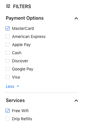
showCount: falsehides the number of results for each facet optionsearchOnChange: truecauses the search to automatically refresh as soon as the user selects a facetshowMoreLimit: 10adds a “Show More” button to reveal more options when there are more than 10 facet optionsshowMoreLabel and showLessLabelcontrol the labels of the resulting buttons
The resulting component looks something like this:

Searchable Facets
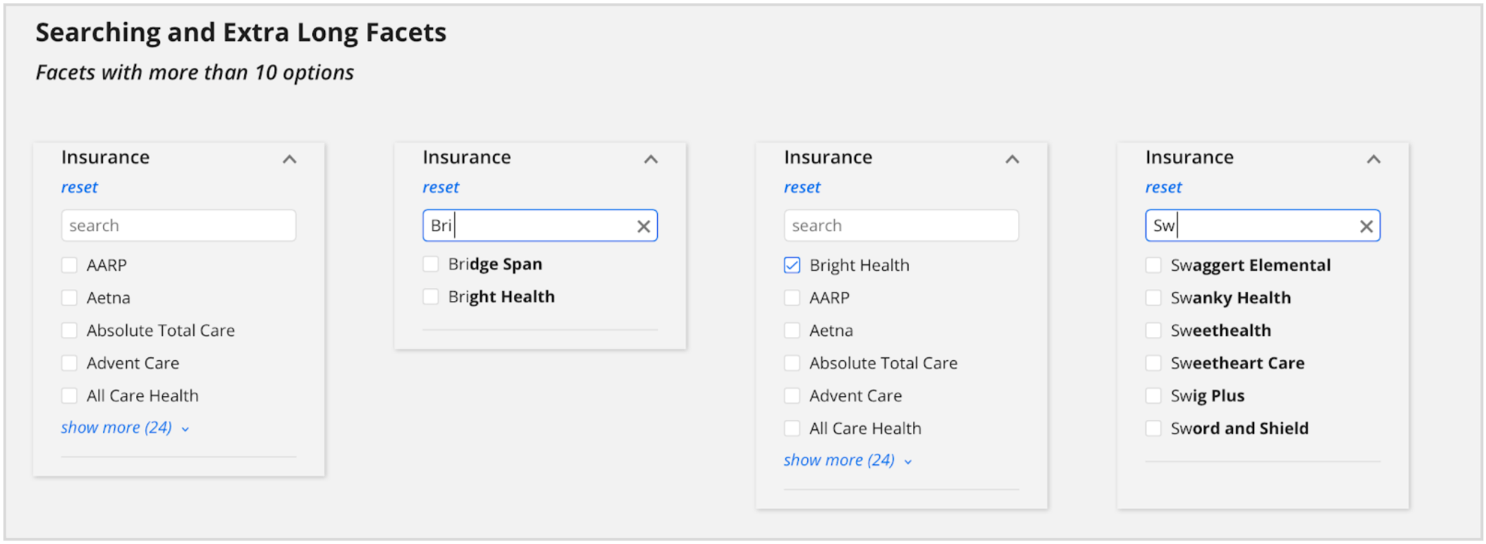
Some facet fields will have dozens or hundreds of options, so it doesn’t make sense to display them all to the user at once. A better way is to make the facet searchable, which allows the user to search for the particular option they’re looking for. Facets can be made searchable like so:
ANSWERS.addComponent('Facets', {
  container: '.facets',
  verticalKey: 'VERTICAL_KEY',
  searchable: true
});
The result looks like this:

Field-Specific Configuration
Often it doesn’t make sense to apply the same configuration to all facets in
an experience. For example, some facet fields may have hundreds of options and
should be made searchable, but others might not.
To apply configuration for particular facet fields, use the transformFacets option. The transformFacets option of the Facets component allows facets data to be fully customized. The function takes in and returns an array of the search-core displayable facet which is described
here
. The function also has access to the Facets config as the second parameter.
Here’s an example of using this option to customize a boolean facet and make it searchable.
transformFacets: (facets, config) => {
  console.log(config);
  return facets.map((facet) => {
    console.log(facet);
    const options = facet.options.map((option) => {
      let displayName = option.displayName;
      if (facet.fieldId === "c_acceptingNewPatients") {
        if (option.value === false) {
          displayName = "Not Accepting Patients";
        }
        if (option.value === true) {
          displayName = "Accepting Patients";
        }
      }
      return Object.assign({}, option, { displayName });
    });
    let searchable = false;
    if (facet.fieldId === "paymentOptions") {
      searchable = true;
    }
    return Object.assign({}, facet, { options, searchable });
  });
}
Facets API
| Property | Type | Default | Description |
|---|---|---|---|
|
verticalKey
|
string
|
the vertical for which these facets apply. Required if not included in the top level search configuration . | |
|
title
|
string
|
Filters
|
Title to display above the facets |
|
showCount
|
boolean
|
Whether to show the number of results for each facet option | |
|
searchOnChange
|
boolean
|
Whether to execute a new search whenever a facet selection changes | |
|
resetFacet
|
boolean
|
Show a reset button per facet group | |
|
resetFacetLabel
|
boolean
|
reset
|
If resetFacet is true, the label to use for the reset button per facet group
|
|
resetFacets
|
boolean
|
Show a reset-all button for the facets control. Defaults to true if searchOnChange is false. | |
|
resetFacetsLabel
|
string
|
reset-all
|
If resetFacets is true, the label to use to reset all.
|
|
showMore
|
boolean
|
true
|
Whether to allow collapsing of excess facet options after a limit |
|
showMoreLimit
|
boolean
|
true
|
The max number of filter options to show before collapsing extras |
|
showMoreLabel
|
string
|
show more
|
If showMore is true, the label for the button to display more facets
|
|
showLessLabel
|
string
|
show more
|
If showMore is true, the label for the button to display less facets
|
|
expand
|
boolean
|
true
|
Adds an expand/collapse per facet. |
|
showNumberApplied
|
boolean
|
true
|
When facet is collapsed, show the number of facet options applied. |
|
searchable
|
boolean
|
If true, make this facet searchable by displaying the filter option search input | |
|
placeholderText
|
string
|
Search here...
|
If searchable is true, the placeholder text used for the filter option search input
|
|
searchLabelText
|
string
|
Search for a filter option
|
The form label text for the search input |
|
fields
|
object
|
DEPRECATED Field-specific overrides | |
|
searchable
|
boolean
|
If true, make this facet searchable by displaying the filter option search input | |
|
placeholderText
|
string
|
If searchable is true, the placeholder text used for the filter option search input
|
|
|
control
|
string
|
singleopiton
|
Control type, either singleoption or multiopton |
|
transformFacets
|
function
|
Allows for custom transforms of facets as they return | |
|
applyLabel
|
string
|
apply
|
If searchOnChange is false, the label to show on the apply button
|

