

MapboxMap | Yext Hitchhikers Platform
Check out this Storybook to visualize and test this component.
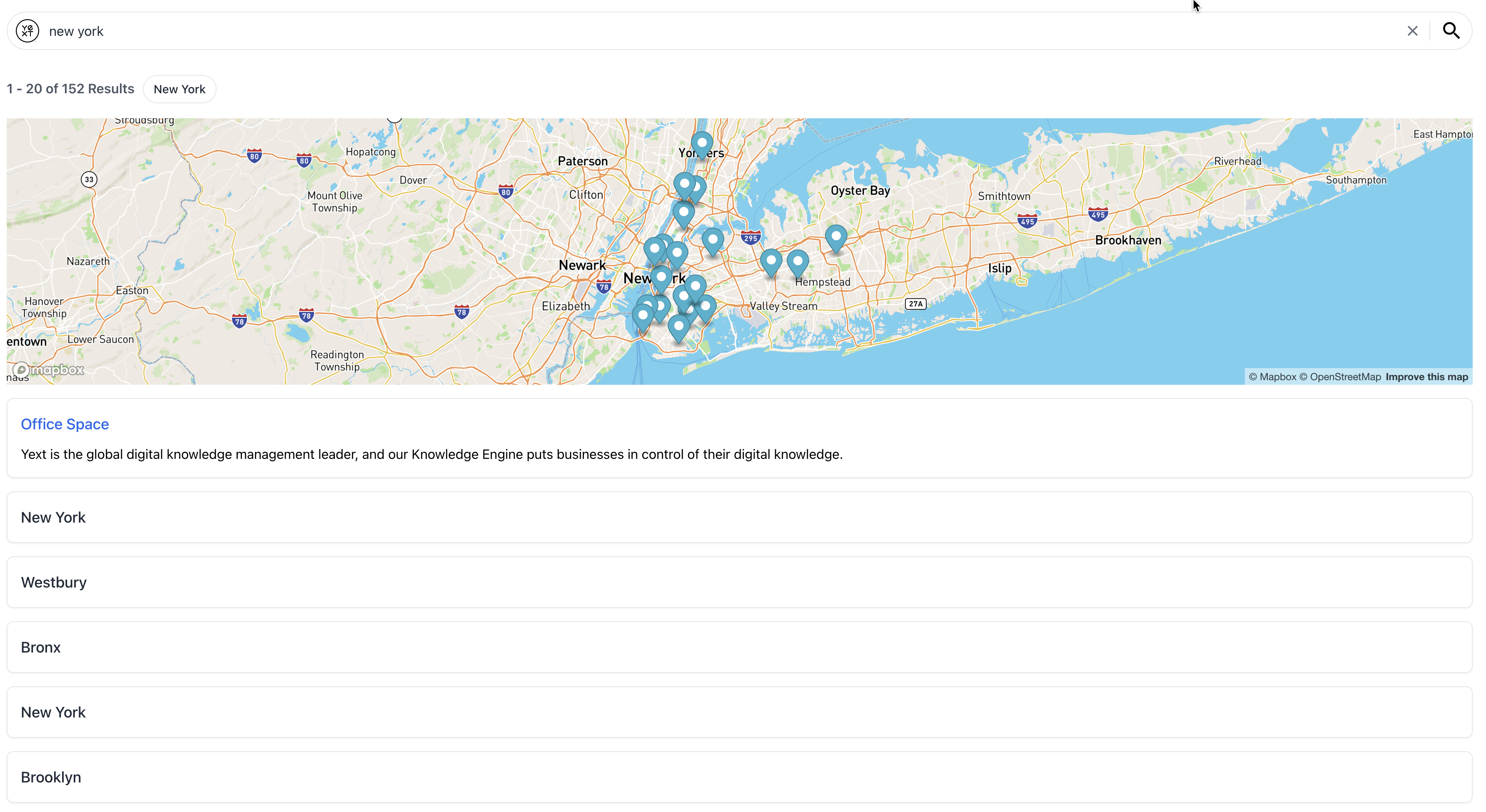
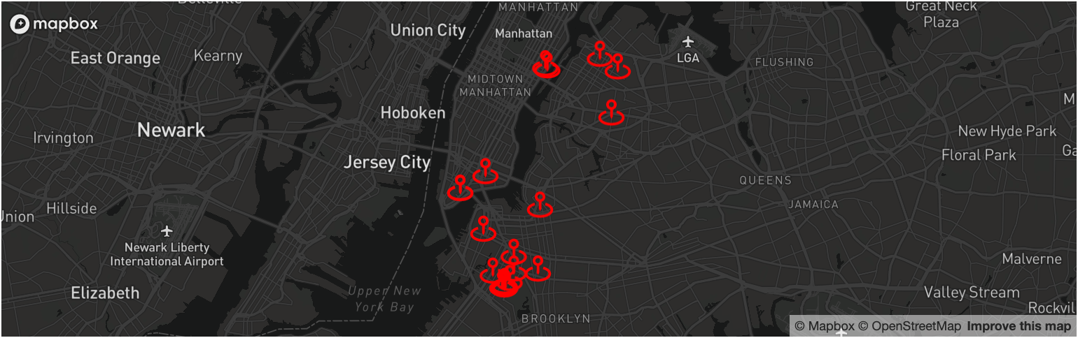
The MapboxMap component is a wrapper over the Mapbox GL JS library that makes it easy to display Yext Location Search results on an interactive map. This component is useful for building things like store locators.
Here’s what the the MapboxMap looks like:
Prerequisites
There are a few things you need before using this component:
- Mapbox Account and Access Token
- A Search experience that has at least one vertical with a geo-coordinate field
.env or another file that is included in your .gitignore.
Mapbox CSS Bundle
In order for the map to work as expected, the Mapbox CSS bundle needs to be imported at the top level of your application or wherever you’re using the MapboxMap component.
import "mapbox-gl/dist/mapbox-gl.css";Another option is to add the stylesheet link to your page:
<link
  href="
  https://api.mapbox.com/mapbox-gl-js/v2.9.2/mapbox-gl.css


"
  rel="stylesheet"
/>height property.
Basic Example
By default, the MapboxMap component will display the vertical results on the map using the yextDisplayCoordinate which is a field on every Location result. Each result will appear on the map as a pin.
import { useEffect } from "react";
import { useSearchActions } from "@yext/search-headless-react";
import {
  SearchBar,
  StandardCard,
  VerticalResults,
  MapboxMap,
} from "@yext/search-ui-react";
// Mapbox CSS bundle
import "mapbox-gl/dist/mapbox-gl.css";

const LocationsSearch = () => {
  const searchActions = useSearchActions();
  useEffect(() => {
    searchActions.setVertical("locations");
    searchActions.executeVerticalQuery();
  }, [searchActions]);

  return (
    <div className="p-4">
      <SearchBar />
      <div className="flex flex-col">
        <div className="mb-4 h-80">
          <MapboxMap mapboxAccessToken={process.env.REACT_APP_MAPBOX_API_KEY} />
        </div>
        <VerticalResults CardComponent={StandardCard} />
      </div>
    </div>
  );
};

export default LocationsSearch;
Maps and FilterSearch
It is common to use the MapboxMap component in conjunction with the FilterSearch component and a search vertical that has Location entities. The FilterSearch bar calls the Filter Search API on every keystroke and the results appear as an autocomplete dropdown.
You can use the searchFields prop to run the filter search on builtin.location and the most relevant locations based on the user’s query will appear in the dropdown. You can also pass a function to the onSelect prop to run a Vertical Search as soon as a dropdown is clicked.
import { useEffect } from "react";
import { useSearchActions } from "@yext/search-headless-react";
import {
  FilterSearch,
  StandardCard,
  VerticalResults,
  MapboxMap,
  OnSelectParams,
} from "@yext/search-ui-react";
import "mapbox-gl/dist/mapbox-gl.css";

const LocationsSearch = (): JSX.Element => {
  const searchActions = useSearchActions();
  useEffect(() => {
    searchActions.setVertical("locations");
    searchActions.executeVerticalQuery();
  }, [searchActions]);

  const onSelect = useCallback(
    (params: OnSelectParams) => {
      searchActions.setFilterOption({
        filter: params.newFilter,
        selected: true,
      });
      searchActions.executeVerticalQuery();
    },
    [filters, searchActions]
  );

  return (
    <div className="p-4">
      <FilterSearch
        placeholder="Locations"
        onSelect={onSelect}
        searchFields={[
          {
            entityType: "location",
            fieldApiName: "builtin.location",
          },
        ]}
      />
      <div className="flex flex-col">
        <div className="mb-4 h-80">
          <MapboxMap mapboxAccessToken={process.env.REACT_APP_MAPBOX_API_KEY} />
        </div>
        <VerticalResults
          CardComponent={StandardCard}
          displayAllOnNoResults={false}
        />
      </div>
    </div>
  );
};

export default LocationsSearch;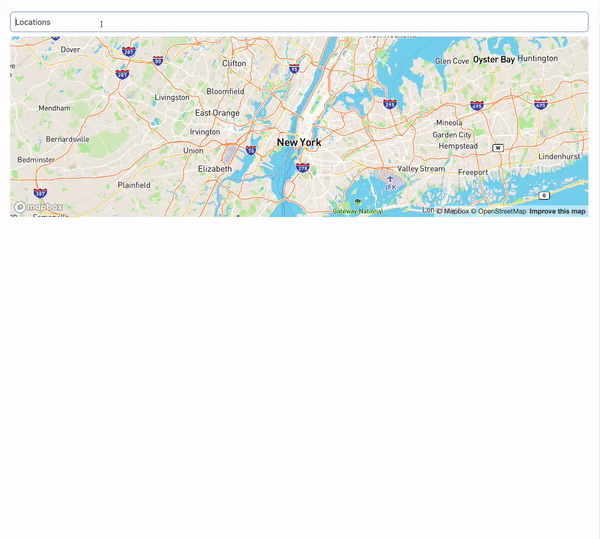
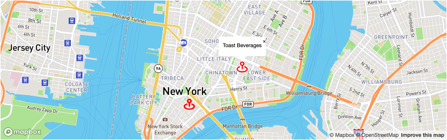
Custom Pin
Rather than use the default Mapbox pin, you can pass a custom component as the PinComponent prop to MapboxMap. The PinComponent can render a custom icon to match your site’s style and be configured to display a location popup on an event like a click or hover.
PinComponent is a generic type. This means that you can access all the fields in the result.rawData object in a type-safe manner by including the result type in the component declaration (e.g. PinComponent<Location>). You can learn more about types in Search UI React
here
.
First, create your pin component:
// you need to install react icons (npm i react-icons) to use this icon
import { BiMapPin } from "react-icons/bi";
import { PinComponent, Coordinate } from "@yext/search-ui-react";
import { Popup, LngLatLike } from "mapbox-gl";
import Location from "./types/locations";
import { useCallback, useEffect, useRef, useState } from "react";

// transforms the Yext Display Coordiate into the format that Mapbox expects
const transformToMapboxCoord = (coordinate: Coordinate): LngLatLike => ({
  lng: coordinate.longitude,
  lat: coordinate.latitude,
});

const MapPin: PinComponent<Location> = (props) => {
  const { mapbox, result } = props;

  // grab the coordinates from the result
  const yextCoordinate = result.rawData.yextDisplayCoordinate;

  // manage the open state of the popup with useState and useRef
  const [active, setActive] = useState(false);
  const popupRef = useRef(
    new Popup({ offset: 15 }).on("close", () => setActive(false))
  );

  useEffect(() => {
    // render the popup on the map when the active state changes
    if (active && yextCoordinate) {
      popupRef.current
        .setLngLat(transformToMapboxCoord(yextCoordinate))
        .setText(result.name || "unknown location")
        .addTo(mapbox);
    }
  }, [active, mapbox, result, yextCoordinate]);

  // create a callback to open the popup on click
  const handleClick = useCallback(() => {
    setActive(true);
  }, []);

  return (
    // return the pin component with the onClick handler
    <BiMapPin
      className="text-red"
      size={30}
      color={"red"}
      onClick={handleClick}
    />
  );
};

export default MapPin;
Then, pass the new component as the PinComponent prop:
<MapboxMap
  mapboxAccessToken={process.env.REACT_APP_MAPBOX_API_KEY}
  PinComponent={MapPin}
/>
Searching on Drag
On sites like
Yelp
, you can automatically run a search when the user drags to change the viewing area of the map. You can add this functionality by passing a custom function to the onDrag prop.
import { useCallback, useEffect } from "react";
import {
  Matcher,
  SelectableStaticFilter,
  useSearchActions,
  useSearchState,
} from "@yext/search-headless-react";
import {
  FilterSearch,
  StandardCard,
  VerticalResults,
  MapboxMap,
  OnDragHandler,
  OnSelectParams,
} from "@yext/search-ui-react";
import "mapbox-gl/dist/mapbox-gl.css";
import MapPin from "./MapPin";
import { LngLat, LngLatBounds } from "mapbox-gl";

const LocationsSearch = (): JSX.Element => {
  const searchActions = useSearchActions();
  useEffect(() => {
    searchActions.setVertical("locations");
  }, [searchActions]);

  const filters = useSearchState((state) => state.filters.static);

  const onDrag: OnDragHandler = useCallback(
    (center: LngLat, bounds: LngLatBounds) => {
      // get the distance from the center of the map to the top right corner
      const radius = center.distanceTo(bounds.getNorthEast());

      // filter out any existing location filters
      const nonLocationFilters: SelectableStaticFilter[] =
        filters?.filter(
          (f) =>
            f.filter.kind !== "fieldValue" ||
            f.filter.fieldId !== "builtin.location"
        ) ?? [];

      // create a new location filter based on the center of the map and the radius
      const nearFilter: SelectableStaticFilter = {
        selected: true,
        displayName: "Near Current Area",
        filter: {
          kind: "fieldValue",
          fieldId: "builtin.location",
          matcher: Matcher.Near,
          value: { ...center, radius },
        },
      };

      // update the static filters with the new location filter
      searchActions.setStaticFilters([...nonLocationFilters, nearFilter]);

      // execute the search
      searchActions.executeVerticalQuery();
    },
    [filters, searchActions]
  );

  const onSelect = useCallback(
    (params: OnSelectParams) => {
      searchActions.setFilterOption({
        filter: params.newFilter,
        selected: true,
      });
      searchActions.executeVerticalQuery();
    },
    [filters, searchActions]
  );

  return (
    <div className="p-4">
      <FilterSearch
        placeholder="Locations"
        onSelect={onSelect}
        searchFields={[
          {
            entityType: "location",
            fieldApiName: "builtin.location",
          },
        ]}
      />
      <div className="flex flex-col">
        <div className="mb-4 h-80">
          <MapboxMap
            mapboxAccessToken={process.env.REACT_APP_MAPBOX_API_KEY}
            PinComponent={MapPin}
            onDrag={onDrag}
          />
        </div>
        <VerticalResults
          CardComponent={StandardCard}
          displayAllOnNoResults={false}
        />
      </div>
    </div>
  );
};

export default LocationsSearch;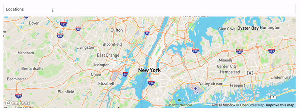
Mapbox Options
Under the hood, the Mapbox GL JS Map component exposes a series of options for customizing the behavior the map. You can see the complete list of options
here
. Search UI React exposes these options to the developer via the mapboxOptions prop.
The example below changes the sets a default zoom level, changes its style, and moves the Mapbox logo to the top left corner on the map:
<MapboxMap
  mapboxAccessToken={process.env.REACT_APP_MAPBOX_API_KEY}
  PinComponent={MapPin}
  mapboxOptions={{
    zoom: 10,
    style: "mapbox://styles/mapbox/dark-v10",
    logoPosition: "top-left",
  }}
/>
Customizations
Like the rest of our components, you can customize the elements of the Search Bar using the customCssClasses prop.
Component API
Check out the component properties in the Search UI React Github repo .