Custom Result Card Structure Code Examples | Yext Hitchhikers Platform
The following code snippets cover examples of changing the card structure, whether you’re adding more content or shifting components around.
For code snippets on styling result cards, check out the Custom Result Card Styling Code Examples reference doc.
Add New Fields
Add Email to Cards
In order to do this the right way, we’ll need to do three things:
1. Update the custom card’s component.js to pass through the Email field, as well as the details needed to successfully fire an Analytics event.
email: profile.emails ? profile.emails[0] : null,
emailEventOptions: this.addDefaultEventOptions(),
The email attribute passes in the first email address of the Emails field (if populated), otherwise returns null. Modify this to align with the field that stores your email addresses.
The emailEventOptions attribute just passes the standard data (entity ID, universal vs. vertical search, etc.) that allows us to fire an Analytics event.
2. Update the custom card’s template.hbs to add a section for Email that correctly formats the link.
First, we’ll create an {{> email}} partial. Add the below within the template.hbs file, preferably below the {{#*inline 'phone'}} partial.
{{#*inline 'email'}} {{#if card.email}}
<div class="HitchhikerLocationStandard-email">
  <a
    href="mailto:{{card.email}}"
    data-eventtype="EMAIL"
    data-eventoptions="{{json card.emailEventOptions}}"
    target="_blank"
  >
    {{card.email}}
  </a>
</div>
{{/if}} {{/inline}}
Here, we’ve added a new class HitchhikerLocationStandard-email that allows us to style this email in the future. We’re then adding a link - to create an email link, simply add mailto: in front of the email address. We’re also passing data-eventtype and data-eventoptions so that an EMAIL event fires when a user clicks on the link. Lastly, the text of the link will be the email itself, enclosed within the <a> tag.
Now that we’ve defined the partial, we need to reference it so it’s placed on the card. If you’re forking from a location-standard or professional-standard card, you can navigate to the contactInfo partial in your file and add the email partial underneath the address & phone.
{{#* inline "contactInfo"}}
<div class="HitchhikerLocationStandard-contactInfo">
  {{#if (any card.phone card.address card.email)}}
  <div class="HitchhikerLocationStandard-core">
    {{> address }}
    {{> phone }}
    {{> email }}
  </div>
  {{/if}}
You’ll see that we both added the card.email in the #if statement, as well as added the partial below the address and phone partials.
3. Optional - add CSS to update the link styling
Add the following to the answers.scss file:
.HitchhikerLocationStandard-email {
  color: var(--yxt-color-brand-primary);
  margin-top: 0.5rem;

  a {
    text-decoration: underline;

    &:hover {
      text-decoration: none;
    }
  }
}
Change Text Based on Boolean
You may want to use a boolean field to determine what text to display.
In this example, we have a “Work Remote” boolean field and want the subtitle of the card to display Yes/No depending on what the value is. You can do this using a JavaScript ternary operator:
subtitle: 'Work Remote: ' + (profile.workRemote ? 'Yes' : 'No')This is saying if profile.workRemote is true, then return ‘Yes’, else return ‘No’. You can also return a dynamic value by replacing ‘Yes’ and ‘No’ with the field to pull from.
Restructure Card
Use Conditional Placeholder Images
One common issue we’ve seen is gaps in data, especially for images such as for headshots.
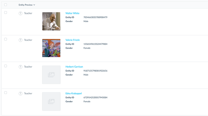
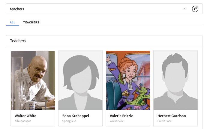
This example walks through using the JavaScript conditional operator to use placeholder images for any agents missing a headshot image, where the placeholder images differ by gender. In other words, the logic is as follows:
- If the
Headshotfield is populated, use that image. - If the
Headshotfield is empty and theGenderfield is set to Female, use the female placeholder image. - Otherwise, fall back to the generic placeholder image.
Learn more about null checks .
Add the following image property in the component.js file of the desired forked card:
return {
  title: profile.name, // The header text of the card
  subtitle: profile.c_area, // The sub-header text of the card
  image: profile.headshot ? Formatter.image(profile.headshot).url : (profile.gender === 'Female' ? 'https://a.mktgcdn.com/p-sandbox/y0iJHYFeCERihQg0qv7j88TBeEnpHq-v_BLyHiDXOb8/142x200.png' : 'https://a.mktgcdn.com/p-sandbox/6DD2AHZA1kbe8M9ZQGW_JOwXFyWNnRTMDJXIGxvQK-4/321x450.jpg'),
  ...
}
Display Multiple Components on the Same Line
To display multiple components on the same line, you’ll have to slightly modify the card template and add some CSS. In this example, we’re putting the title and subtitle next to each other.
Add a
divaround thetitleandsubtitlein the top portion of thetemplate.hbsfile you want to edit. It should look something like this:<div class="HitchhikerMenuItemStandard-body"> <div class="HitchhikerTitleWrapper"> {{> title }} {{> subtitle }} </div>
This will group the two together and allow you manipulate the layout with CSS styling. Also note we named the new div HitchhikerTitleWrapper but you can name it anything as long as you reference it correctly in the next step.
Add the following snippet to the
answers.scssfile to move thesubtitlenext to thetitle:.HitchhikerTitleWrapper { flex-direction: row; display: flex; }
You may need to toggle with the padding, margins, and line height after the fact to space them out properly.
Use a Custom Icon on FAQ Accordion Cards
You can change the toggle icon on the FAQ Accordion card from the default chevron to a custom icon using the following:
Fork the
faq-accordioncard and modify thetemplate.hbsfile to includeiconUrlrather thaniconName. It should look like this:<div class="HitchhikerFaqAccordion-icon js-HitchhikerFaqAccordion-icon{{#if card.isExpanded}} HitchhikerFaqAccordion-icon--expanded{{/if}}" data-component="IconComponent" data-opts='{"iconUrl": "https://www.brandname.com/themes/simple/images/arrow-down.svg"}' data-prop="icon"> </div>To make the icon rotate like the default chevron does, you will need to add this code to the
answers.scssfile:.HitchhikerFaqAccordion-icon { transition: all 400ms ease-in-out; } .HitchhikerFaqAccordion--expanded .HitchhikerFaqAccordion-icon { transform: rotate(-180deg); }
*Based on the image you’re using, you may also need to adjust the icon size.
Here is what the end result will look like:
![]()
Dynamically Access URL Parameters to Use in Cards
Sometimes, brands will want a URL parameter to be dynamically “passed through” to a Search experience. The following will allow you to pull any custom URL parameter(s) from when you initially arrive at the Search results page and append that same parameter to links in the Search experience.
Step 1: Add JavaScript to read and parse the parameter from your URL
Add the following code to your layouts > headincludes.hbs file. By adding the script here you’re making it available on every page of your experience.
<script>
  function getParameterByName(name, url = window.location.href) {
    name = name.replace(/[\[\]]/g, '\\$&');
    var regex = new RegExp('[?&]' + name + '(=([^&#]*)|&|#|$)'),
        results = regex.exec(url);
    if (!results) return null;
    if (!results[2]) return '';
    return decodeURIComponent(results[2].replace(/\+/g, ' '));
  }

  var [InternalParamName] = getParameterByName('[ExternalParamName ]');
</script>
Replace ExternalParamName with the name of the actual parameter and InternalParamName with an internal label that you will use to reference the parameter value within your config files.
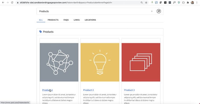
Say your brand uses a store parameter in the URL that is passed to the search results page, for example:

The user came to the search results page while looking at the website for the Berlin store. To access the parameter store, target it in the last variable declaration like so:
var storeParam = getParameterByName('store');Step 2: Add parameter variable to your card
Add the parameter variable to your front-end files depending on where you need it. In this case, we will append it to the title link of the product card, in the component.js file, to direct the user to the product page specific to the Berlin store:
return {
  title: profile.name,
  url: profile.landingPageUrl + '?store=' + storeParam,
  ...
}
This way, the title URLs going out of the Search experience will include the parameter that was initially passed to the search results page, allowing the brand to close an important analytical loop.
Notes:
- You can access multiple parameters by creating additional variables.
- If the designated parameter is missing from the URL, it will still be appended where specified, just with a null value.
CTAs
Add a Conditional CTA Based on Boolean
You can easily do this by adding a boolean to your component.js file, and modifying the Handlebars template to only show the third CTA if that boolean evaluates to true.
1. Update component.js
The first step is to pass the information about whether a provider is accepting patients. Add an attribute in your component.js file to store whether or not a provider is accepting new patients. If you use the profile field, when this is marked as ‘Yes’, the boolean will evaluate to true; if it’s marked as false or unpopulated, it will evaluate to false.
acceptingNewPatients: profile.acceptingNewPatients,You’ll also need to provide the data mapping for the third CTA.
CTA3: { // The tertiary call to action for the card
  label: 'Book Appointment',
  iconName: 'calendar',
  url: profile.c_primaryCTA.link,
  target: '_top',
  eventType: 'BOOK_APPOINTMENT',
  eventOptions: this.addDefaultEventOptions(),
  // ariaLabel: '',
}
2. Update template.hbs
The next step is to use this boolean to only show the tertiary CTA when acceptingNewPatients = true.
We can do this using an if statement in Handlebars. We’ll check if card.acceptingNewPatients evaluates to true; if so, we’ll add the tertiary CTA. You can see the modifications to the CTA partial below:
{{#*inline 'ctas'}}
{{#if (any (all card.CTA1 card.CTA1.url) (all card.CTA2 card.CTA2.url)(all card.CTA3 card.CTA3.url))}}
<div class="HitchhikerLocationStandard-ctasWrapper">
  {{> CTA card.CTA1 ctaName="primaryCTA" }}
  {{> CTA card.CTA2 ctaName="secondaryCTA" }}
  {{#if card.acceptingNewPatients}}
    {{> CTA card.CTA3 ctaname="tertiaryCTA"}}
  {{/if}}
</div>
{{/if}}
{{/inline}}
This will hide the CTA if acceptingNewPatients is not populated or false, and show it if it’s true.
Add Image CTAs to a Card
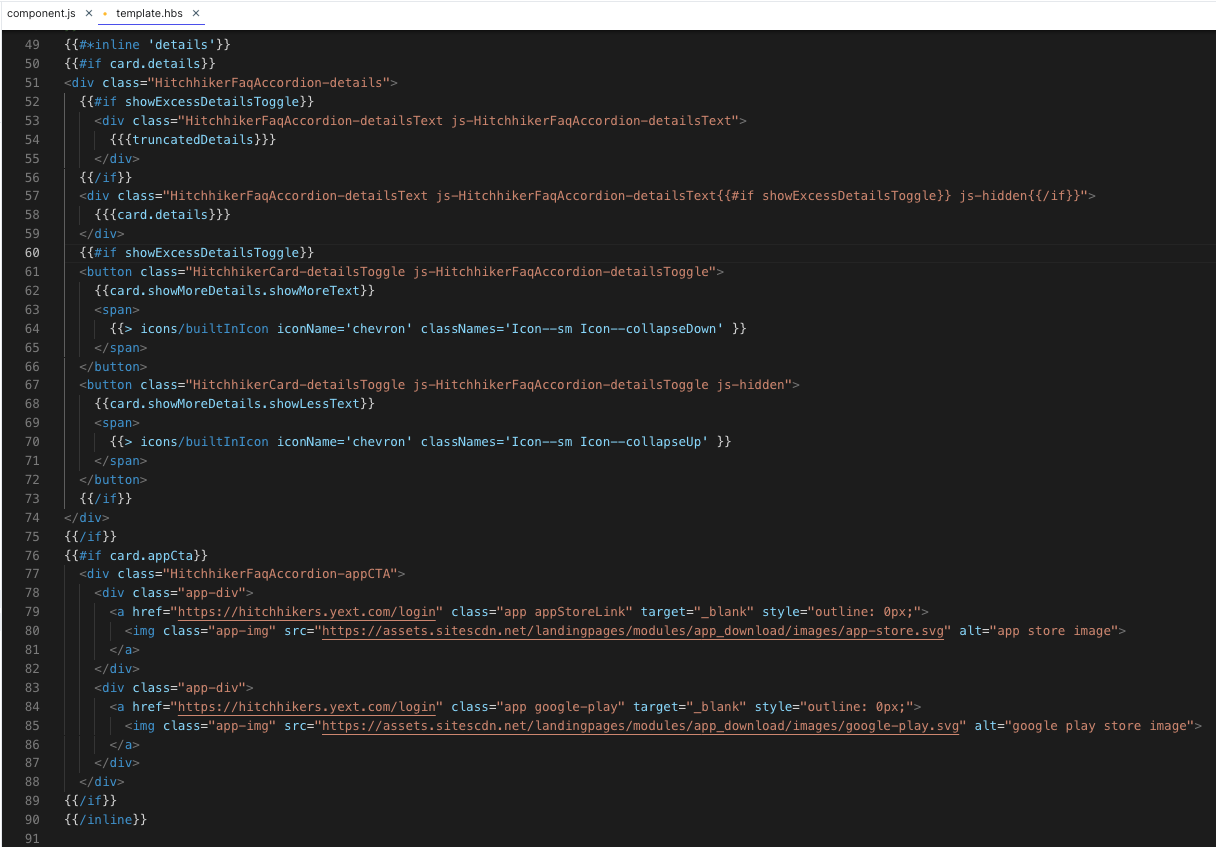
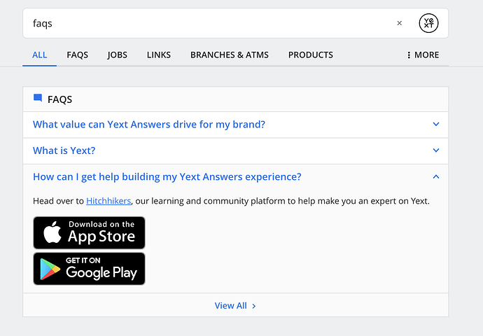
In the following example, we add the Apple App Store and Google Play Store buttons to a single FAQ card in lieu of regular CTAs. These buttons are images that link users to the apps to download. You can use this code snippet for any image CTAs you would like to use.
There are a few ways to do this. Since we are using the same two images (one for Apple App Store and one for Google Play Store) for every entity, the recommended approach we’ll walk through below is to add a conditional field in the Knowledge Graph. If it’s a “Yes”, then add the images to the card.
- Create a Yes/No field in the Knowledge Graph and call it something like
c_appCTA. In the
component.jsfile for the relevant card, add a data mapping for anappCTAproperty to thec_appCTAfield you just added, like so:return { ... appCTA: c_appCTA, CTA1: {} ... }In the card’s
template.hbsfile, add the new CTAs within a null check within the inline details of the card. Replace the HREF links to direct to the appropriate URLs for your apps. If you need to add more images, simply duplicate theapp-divdiv class.{{#if card.appCta}} <div class="HitchhikerFaqAccordion-appCTA"> <div class="app-div"> <a href="https://hitchhikers.yext.com/login" class="app appStoreLink" target="_blank" style="outline: 0px;"> <img class="app-img" src="https://assets.sitescdn.net/landingpages/modules/app_download/images/app-store.svg" alt="app store image"> </a> </div> <div class="app-div"> <a href="https://hitchhikers.yext.com/login" class="app google-play" target="_blank" style="outline: 0px;"> <img class="app-img" src="https://assets.sitescdn.net/landingpages/modules/app_download/images/google-play.svg" alt="google play store image"> </a> </div> </div> {{/if}}
The full result would appear as follows:
Add Two Sets of Image CTAs
Continuing the example, say you want to have two sets of these buttons, one for tablet apps and one for mobile apps. You can add some text to differentiate each set and duplicate the CTA divs like so. Be sure to update the link URLs.
{{#if card.appCta}}
<div class="HitchhikerFaqAccordion-appCTAContainer">
  <div class="HitchhikerFaqAccordion-appCTAWrapper">
    <div class="HitchhikerFaqAccordion-appCTAText">
      Tablet App:
    </div>
    <div class="HitchhikerFaqAccordion-appCTA">
      <div class="app-div">
        <a href="https://hitchhikers.yext.com/login" class="app appStoreLink" target="_blank" style="outline: 0px;">
          <img class="app-img" src="https://assets.sitescdn.net/landingpages/modules/app_download/images/app-store.svg" alt="app store image">
        </a>
      </div>
      <div class="app-div">
        <a href="https://hitchhikers.yext.com/login" class="app google-play" target="_blank" style="outline: 0px;">
          <img class="app-img" src="https://assets.sitescdn.net/landingpages/modules/app_download/images/google-play.svg" alt="google play store image">
        </a>
      </div>
    </div>
  </div>
  <div class="HitchhikerFaqAccordion-appCTAWrapper">
    <div class="HitchhikerFaqAccordion-appCTAText">
      Smartphone App:
    </div>
    <div class="HitchhikerFaqAccordion-appCTA">
      <div class="app-div">
        <a href="https://hitchhikers.yext.com/login" class="app appStoreLink" target="_blank" style="outline: 0px;">
          <img class="app-img" src="https://assets.sitescdn.net/landingpages/modules/app_download/images/app-store.svg" alt="app store image">
        </a>
      </div>
      <div class="app-div">
        <a href="https://hitchhikers.yext.com/login" class="app google-play" target="_blank" style="outline: 0px;">
          <img class="app-img" src="https://assets.sitescdn.net/landingpages/modules/app_download/images/google-play.svg" alt="google play store image">
        </a>
      </div>
    </div>
  </div>
</div>
{{/if}}
Then horizontally align each pair of CTAs in the answers.scss file with (you can do this with just the one set above as well):
.HitchhikerFaqAccordion-appCTA {
  display: flex;
}