

SearchBar | Yext Hitchhikers Platform
Check out this Storybook to visualize and test this component.
The search bar is usually the starting point for the user when they are looking for information on a website. The <SearchBar /> component allows a user to search for entities by entering any query that they want. The component operates just like the Google search bar.
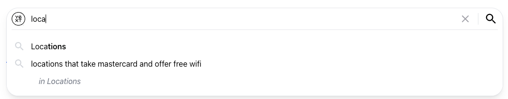
Here’s what the <SearchBar /> looks like:
Default onSearch Behavior
After the user enters a query into the search bar, they can press enter on their keyboard or click on the search icon 🔎 to trigger either a universal or vertical search. The input in the search bar is passed as the query parameter to either the Universal or Vertical Query API. Each keystroke triggers an Autocomplete search to help users complete searches faster.
Universal Search
When the verticalKey is not set in the SearchHeadless state, the search bar will execute a
Universal Search: Query API
request on search. On each keystroke in the <SearchBar/> input, a
Universal Search: Autocomplete API
request is made.
Vertical Search
When the verticalKey is set in the SearchHeadless state, the search bar will execute a
Vertical Search: Query API
request on search. On each keystroke in the <SearchBar /> input, a
Vertical Search: Autocomplete API
request is made.
Setting the Vertical Key in the State
The verticalKey can be set by passing it as a field in the HeadlessConfig object to provideHeadless:
import {
  SearchHeadlessProvider,
  provideHeadless,
} from "@yext/search-headless-react";
// ...other imports

const searcher = provideHeadless({
  apiKey: "YOUR_API_KEY",
  experienceKey: "YOUR_EXPERIENCE_KEY",
  locale: "en",
  verticalKey: "locations",
});

ReactDOM.render(
  <React.StrictMode>
    <SearchHeadlessProvider searcher={searcher}>
      <App />
    </SearchHeadlessProvider>
  </React.StrictMode>,
  document.getElementById("root")
);
Or by setting it with the useSearchActions hook:
import { useSearchActions } from "@yext/search-headless-react";

const App = (): JSX.Element => {
  const searchActions = useSearchActions();

  useEffect(() => {
    searchActions.setVertical("locations");
  }, []);
};
Basic Example
Assuming you have a search experience set up in your Yext account and have wrapped your application in a <SearchHeadlessProvider />, you can import and add the <SearchBar />:
import { SearchBar } from "@yext/search-ui-react";

const App = (): JSX.Element => {
  return (
    <div className="flex justify-center px-4 py-6">
      <div className="w-full max-w-5xl">
        <SearchBar />
      </div>
    </div>
  );
};

export default App;
When you start typing, you’ll see the Autocomplete results dropdown appear. If you press enter or click the search icon, you can open the network tab in your browser developer tools to see that a search API call was triggered.
Displaying Results
You can display search results by importing the <VerticalResults />
component
and <StandardCard /> component:
import {
  SearchBar,
  StandardCard,
  VerticalResults,
} from "@yext/search-ui-react";
import { useSearchActions } from "@yext/search-headless-react";

const App = (): JSX.Element => {
  const searchActions = useSearchActions();

  useEffect(() => {
    searchActions.setVertical("vertical_key");
  }, []);

  return (
    <div className="flex justify-center px-4 py-6">
      <div className="w-full max-w-5xl">
        <SearchBar />
        <VerticalResults CardComponent={StandardCard} />
      </div>
    </div>
  );
};

export default App;
Check out the <UniversalResults />
component
to learn how to display Universal Search results.
Placeholder Text
Any string can be passed to the placeholder prop to change the faded text that appears in the <SearchBar /> input box before the user starts entering a query:
<SearchBar placeholder="Search for Products..." />Changing Default onSearch Behavior
There may be times where you want to take additional steps before triggering a search request or change the default behavior all together.
One common use case is adding the query from the search bar to the URL:
import {
  onSearchFunc,
  SearchBar,
  StandardCard,
  VerticalResults,
  onSearchFunc,
} from "@yext/search-ui-react";
import { useSearchActions } from "@yext/search-headless-react";
import { useEffect } from "react";

const App = (): JSX.Element => {
  const searchActions = useSearchActions();

  useEffect(() => {
    searchActions.setVertical("products");
  }, []);

  const handleSearch: onSearchFunc = (searchEventData) => {
    const { query } = searchEventData;
    searchActions.executeVerticalQuery();
    const queryParams = new URLSearchParams(window.location.search);

    if (query) {
      queryParams.set("query", query);
    } else {
      queryParams.delete("query");
    }
    history.pushState(null, "", "?" + queryParams.toString());
  };

  return (
    <div className="flex justify-center px-4 py-6">
      <div className="w-full max-w-5xl">
        <SearchBar onSearch={handleSearch} />
        <VerticalResults CardComponent={StandardCard} />
      </div>
    </div>
  );
};

export default App;
Autocomplete
The autocomplete dropdown appears when the user focuses on the search bar. On each keystroke, an Autocomplete Search API is triggered. Autocomplete results appear in the following order:
- Recent Searches
- Universal Prompts (if
verticalKeyis not set) - Vertical Prompts
Clicking on an autocomplete dropdown item will update the query value and then trigger the onSearch function.
Recent Searches
Clicking into the <SearchBar /> will open the Autocomplete dropdown with the user’s most recent searches in order of recency.
Recent searches are isolated. This means:
- Recent Universal searches will appear in the Universal autocomplete dropdown.
- Recent searches on a given vertical will only appear for that specific vertical’s autocomplete dropdown.
A maximum of the most 5 recent searches will appear. This number can be reduced with the recentSearchesLimit prop:
<SearchBar recentSearchesLimit={2} />Or, recent searches can be removed completely with the hideRecentSearches prop:
<SearchBar hideRecentSearches />Vertical Links in Universal Autocomplete
You can add a link to the vertical key under the autocomplete result when using Universal Autocomplete with the showVerticalLinks prop:
<SearchBar showVerticalLinks />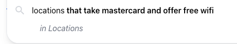
The vertical key string can be modified with the verticalKeyToLabelProp:
<SearchBar
  verticalKeyToLabel={(verticalKey) =>
    verticalKey === "Locations" ? "Stores" : verticalKey
  }
/>
Without further configuration, clicking the vertical key will set the result as the query and execute a Universal Search.
This can be changed by passing a function to the onSelectVerticalLink prop:
import { useSearchActions } from "@yext/search-headless-react";
import {
  SearchBar,
  StandardCard,
  VerticalResults,
  Pagination,
  CardProps,
  SectionProps,
} from "@yext/search-ui-react";
import "./index.css";

const App = (): JSX.Element => {
  const searchActions = useAnswersActions();

  const onSearch = (verticalKey?: string, query?: string) => {
    if (verticalKey) {
      searchActions.setVertical(verticalKey);
      searchActions.executeVerticalQuery();
    } else {
      if (query) {
        searchActions.executeUniversalQuery();
      }
    }
    setPathAndQueryParam(verticalKey, query);
  };

  const setPathAndQueryParam = (query?: string, verticalKey?: string) => {
    const queryParams = new URLSearchParams(window.location.search);
    let pathname = "";
    if (verticalKey) {
      pathname = `${verticalKey}?`;
    } else {
      pathname = "?";
    }

    if (query) {
      queryParams.set("query", query);
    } else {
      queryParams.delete("query");
    }

    history.pushState(null, "", pathname + queryParams.toString());
  };

  return (
    <div className="flex justify-center px-4 py-6">
      <div className="w-full max-w-5xl">
        <SearchBar
          onSearch={({ query, verticalKey }) => {
            onSearch(query, verticalKey);
          }}
          onSelectVerticalLink={({ verticalLink }) => {
            onSearch(verticalLink.query, verticalLink.verticalKey);
          }}
        />
        <UniversalResults
          verticalConfigMap={{
            stores: {},
            products: {},
            faqs: {},
          }}
        />
        <VerticalResults CardComponent={StandardCard} />
      </div>
    </div>
  );
};

export default App;
Autocomplete Limit
Users can customize the number of results displayed in the search autocomplete dropdown, which was previously hardcoded to a maximum of 10. This update provides greater control over the search UI, allowing you to optimize the density and layout of autocomplete suggestions for your end users.
To adjust this limit, edit these properties in the SearchBar component:
universalAutocompleteLimit: (optional, number) - sets the limit for universal searchesverticalAutocompleteLimits: (optional, Record// VERTICAL: <SearchBar verticalAutocompleteLimits={{'people': 5}} /> //UNIVERSAL: <SearchBar universalAutocompleteLimit={20} />
Visual Autocomplete
Visual Autocomplete is when the user is given an image preview of entities in the autocomplete dropdown. This is a common UX pattern on e-commerce websites where images of products will appear after the user starts to enter a query into the search bar.
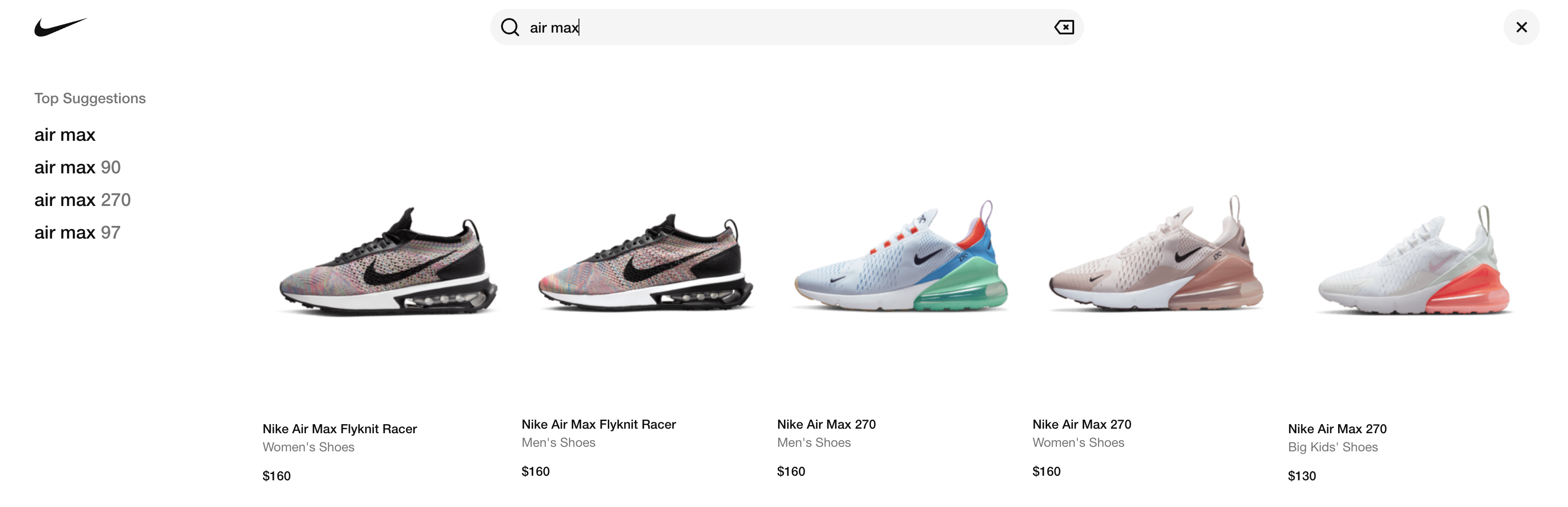
The Autocomplete API returns query suggestions and not the entities themselves. You can configure the <SearchBar /> component to make a Universal Search Query API request for entity previews with the visualAutocompleteConfig prop. The entities returned by this API call are then used to preview the entities in the autocomplete dropdown.
Check out this guide to learn how to configure visual autocomplete.
Customizations
Like the rest of our components, you can customize the elements of the Search Bar using the customCssClasses prop.
The example below overrides the component styling for border-radius.
In the
customCssClassesprop, givesearchBarContainera non-tailwind class name along with any utility classes you’ve added. For this example, we’ll give it a class name ofSearchBar-container:// search.tsx <SearchBar onSearch={onSearchFunc} placeholder="No more rounded edges for me!" customCssClasses={{ searchBarContainer: 'SearchBar-container', inputElement: 'py-4', }} />In your CSS file, use the
SearchBar-containerclass you’ve added to the search bar container to target the search bar itself, which is the descendant of the container div.We’ll also add a bit of styling to the nested inner div to ensure everything looks as expected. Here is an example which adjusts the border radius of the search bar:
/* styles.css */

.SearchBar-container > div {
  border-radius: 2px;
}

.SearchBar-container > div > div:first-child {
  height: 100%;
}
Component API
Check out the component properties in the Search UI React Github repo .