

StandardFacets (Deprecated) | Yext Hitchhikers Platform
Check out this Storybook to visualize and test this component.
The <StandardFacets /> component gives the end user the ability to further refine search results. Depending on the results that are returned, the user will see facet with a series of options they can select. If no results are returned in the query for a given facet option, that option will not appear.
Users can toggle a facet option checkbox on to further refine the search results. Within a single facet, if multiple options are selected (let’s call them option A and option B) the results will display any entities that contain either option A OR option B.
For more information about what facets are, take a look at the Facets training unit .
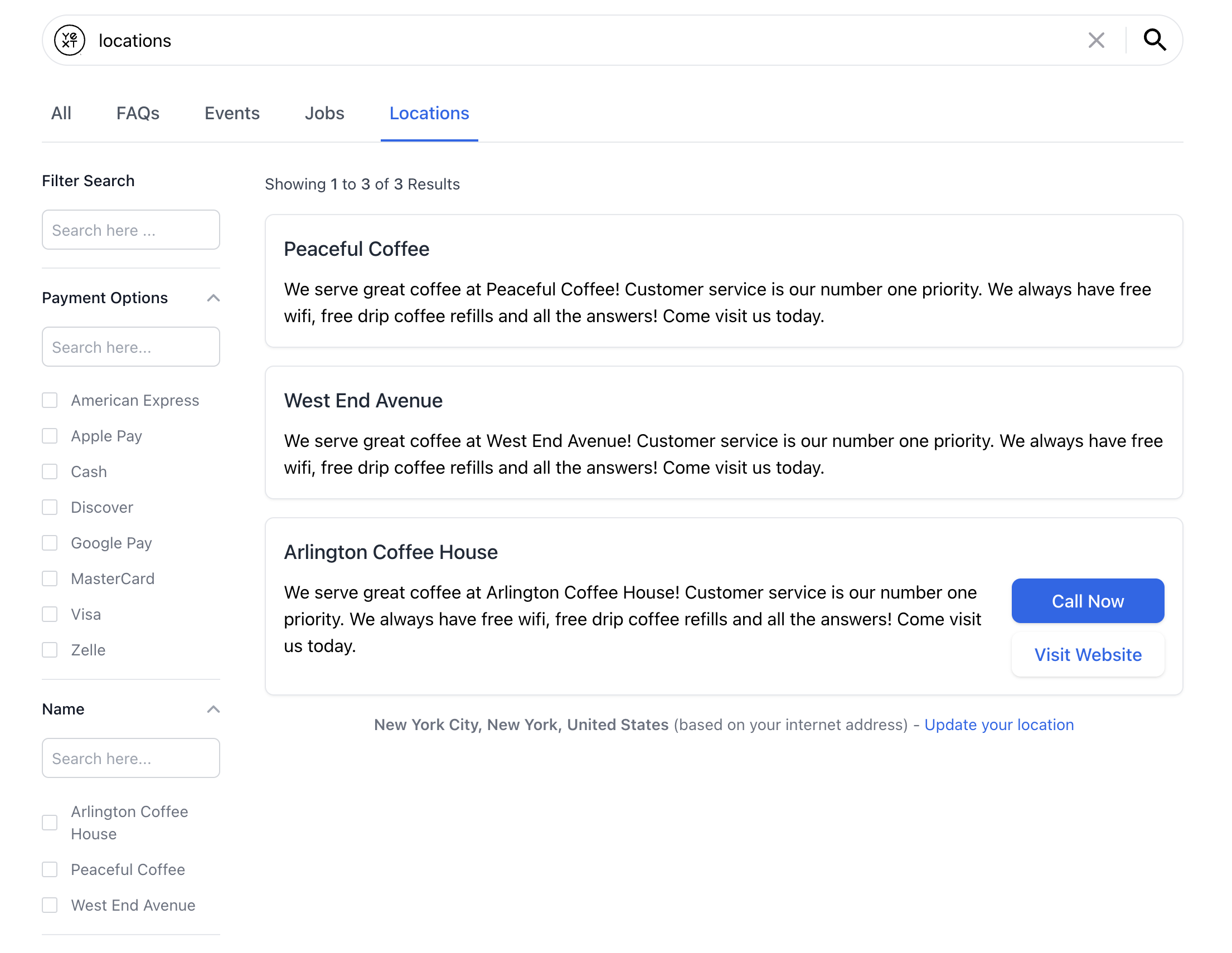
Here’s what what a <StandardFacets /> component looks like:
Basic Example
To make a field eligible as a facet, we need to make sure it’s set as a facet in the searchableFields attribute in the search configuration. This exposes the field in the API response and allows facets to be applied on that field. For example:
"verticals": {
    "products": {
      "entityTypes": [
        "product"
      ],
      "facets": {
        "fields": [
          {
            "fieldId": "price",
            "ranges": {
              "algorithm": "STATIC",
              "bucketLength": 6
            },
            "sortCriteria": "ASC"
          }
        ]
      }
}}
Once that’s done, you can use the <StandardFacets /> component.
<StandardFacets /> is typically placed next to <VerticalResults />. You’ll notice that some additional styling was applied to align the facets next to the results:
import { useSearchActions } from "@yext/search-headless-react";
import {
  SearchBar,
  StandardCard,
  StandardFacets,
  VerticalResults,
} from "@yext/search-ui-react";
import { useEffect } from "react";

function App() {
  const searchActions = useSearchActions();

  useEffect(() => {
    searchActions.setVertical("products");
  }, []);

  return (
    <div className="flex justify-center px-4 py-6">
      <div className="w-full max-w-5xl">
        <SearchBar />
        <div className="flex">
          <StandardFacets customCssClasses={{ container: "mr-10" }} />
          <VerticalResults
            customCssClasses={{ results: "flex-grow" }}
            CardComponent={StandardCard}
          />
        </div>
      </div>
    </div>
  );
}

export default App;
Excluding Certain Facets
The StandardFacet component will include all non-numerical facet fields by default. You might want to hide a certain facet (particularly if you want to display it as a
hierarchical facet
instead).
This example excludes a field called c_categories:
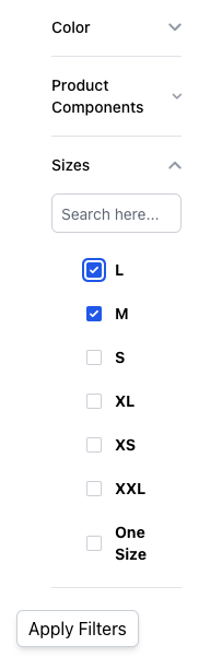
<StandardFacets excludedFieldIds={["c_categories"]} />Changing Default Behavior
By default, the searchOnChange prop is true , which means when a user clicks on a facet option, a search is run with that added filter applied to return new results. When searchOnChange is false , we need a way to conduct that search when the user is ready to apply the selected facets.
We can do this by adding an <ApplyFiltersButton /> component:
import {
  useAnswersActions,
  useAnswersState,
} from "@yext/answers-headless-react";
import {
  SearchBar,
  StandardCard,
  StandardFacets,
  VerticalResults,
  ApplyFiltersButton,
} from "@yext/answers-react-components";
import { useEffect } from "react";

function App() {
  const searchActions = useAnswersActions();

  const facetOptionCount =
    useAnswersState((state) => state.filters.facets?.flatMap((f) => f.options))
      ?.length ?? 0;

  useEffect(() => {
    searchActions.setVertical("locations");
  }, []);

  return (
    <div className="flex justify-center px-4 py-6">
      <div className="w-full max-w-5xl">
        <SearchBar />
        <div className="flex">
          <div>
            <StandardFacets
              customCssClasses={{ container: "mr-10" }}
              searchOnChange={false}
            />
            {facetOptionCount > 0 && (
              <ApplyFiltersButton customCssClasses={{ button: "mt-2" }} />
            )}
          </div>
          <VerticalResults
            customCssClasses={{ results: "flex-grow" }}
            CardComponent={StandardCard}
            allowPagination={false}
          />
        </div>
      </div>
    </div>
  );
}

export default App;
Resulting in an experience that looks like so:
Customizations
Like the rest of our components, you can customize the elements of the Standard Facets using the customCssClasses prop.
Component API
Check out the component properties in the Search UI React Github repo .